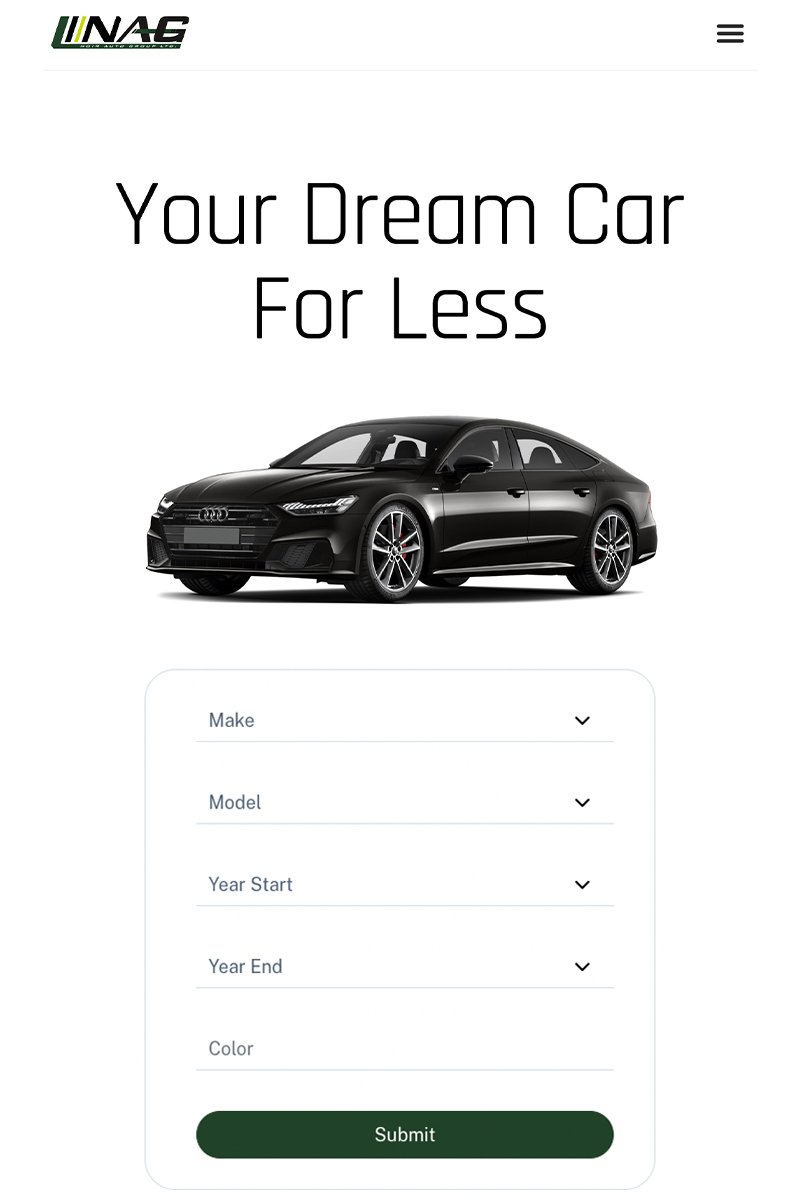
Noir Auto Group was started as a niche service finding vehicles for individuals who lack the time and desire to search for the car of their dreams.
The Challenge
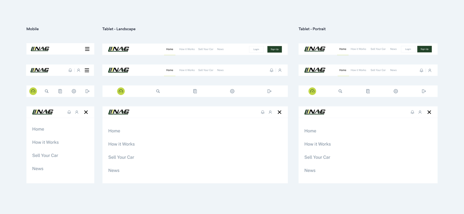
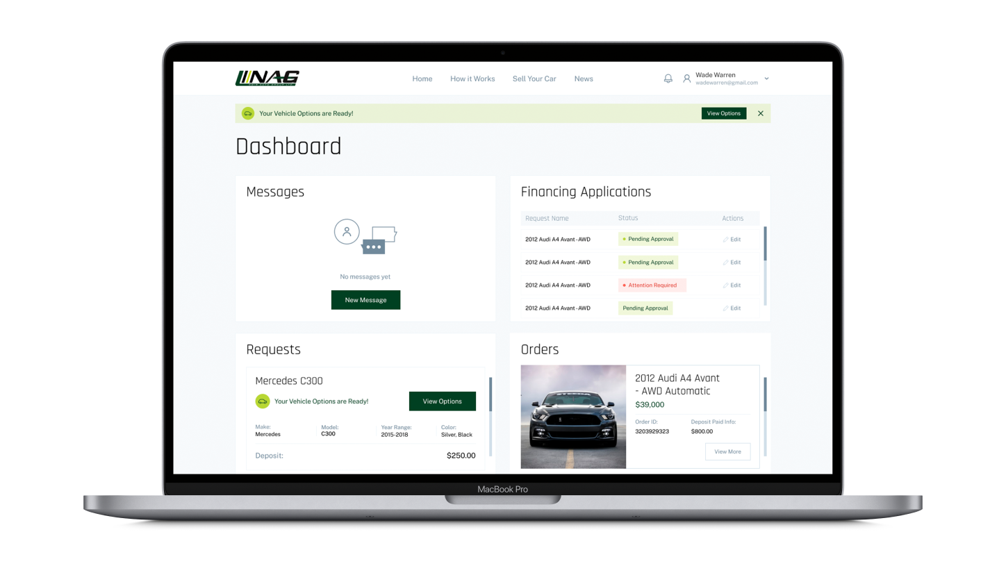
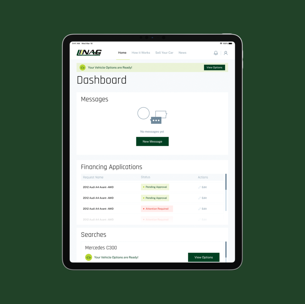
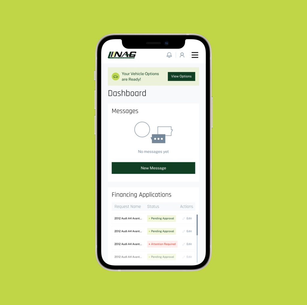
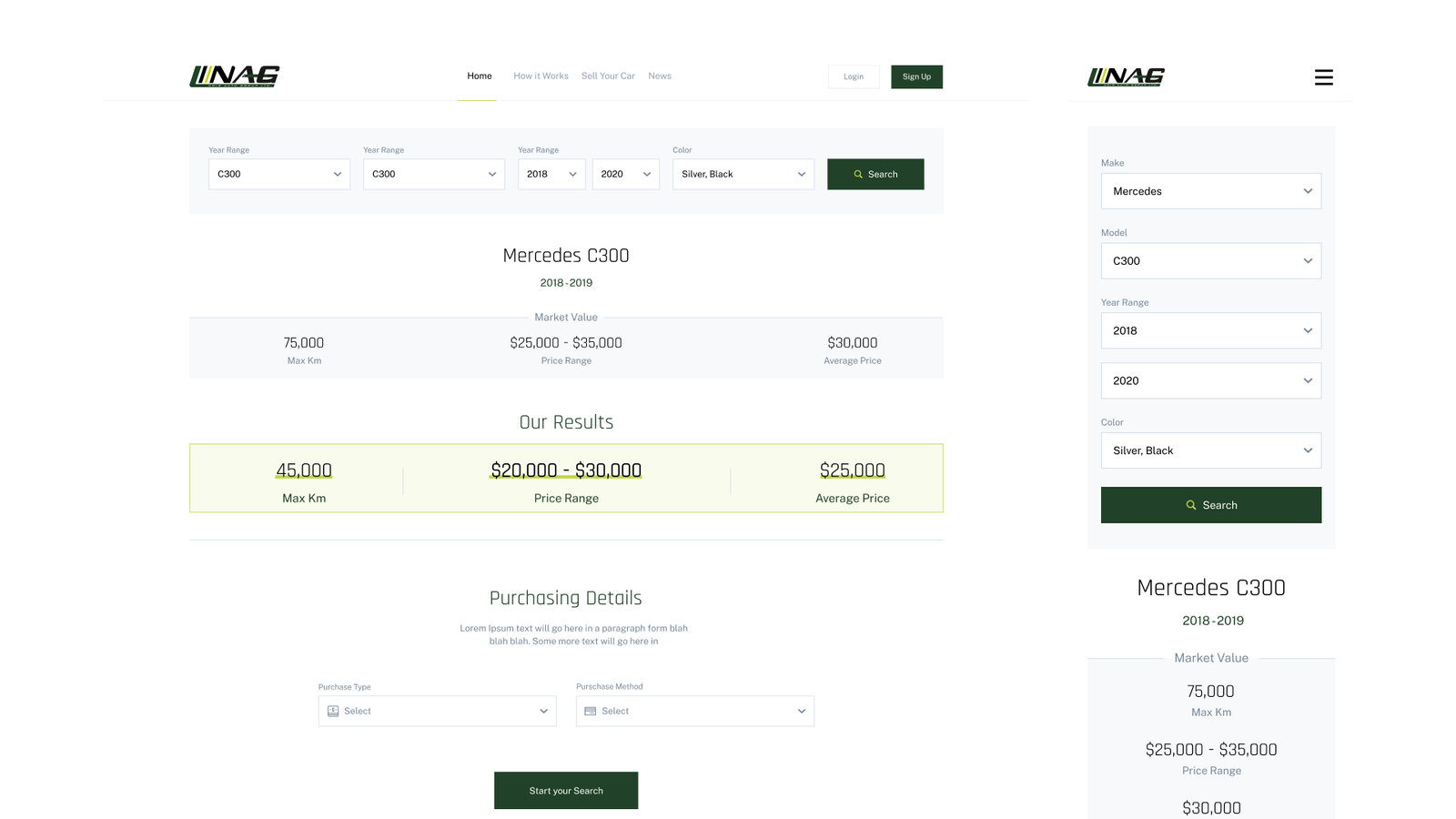
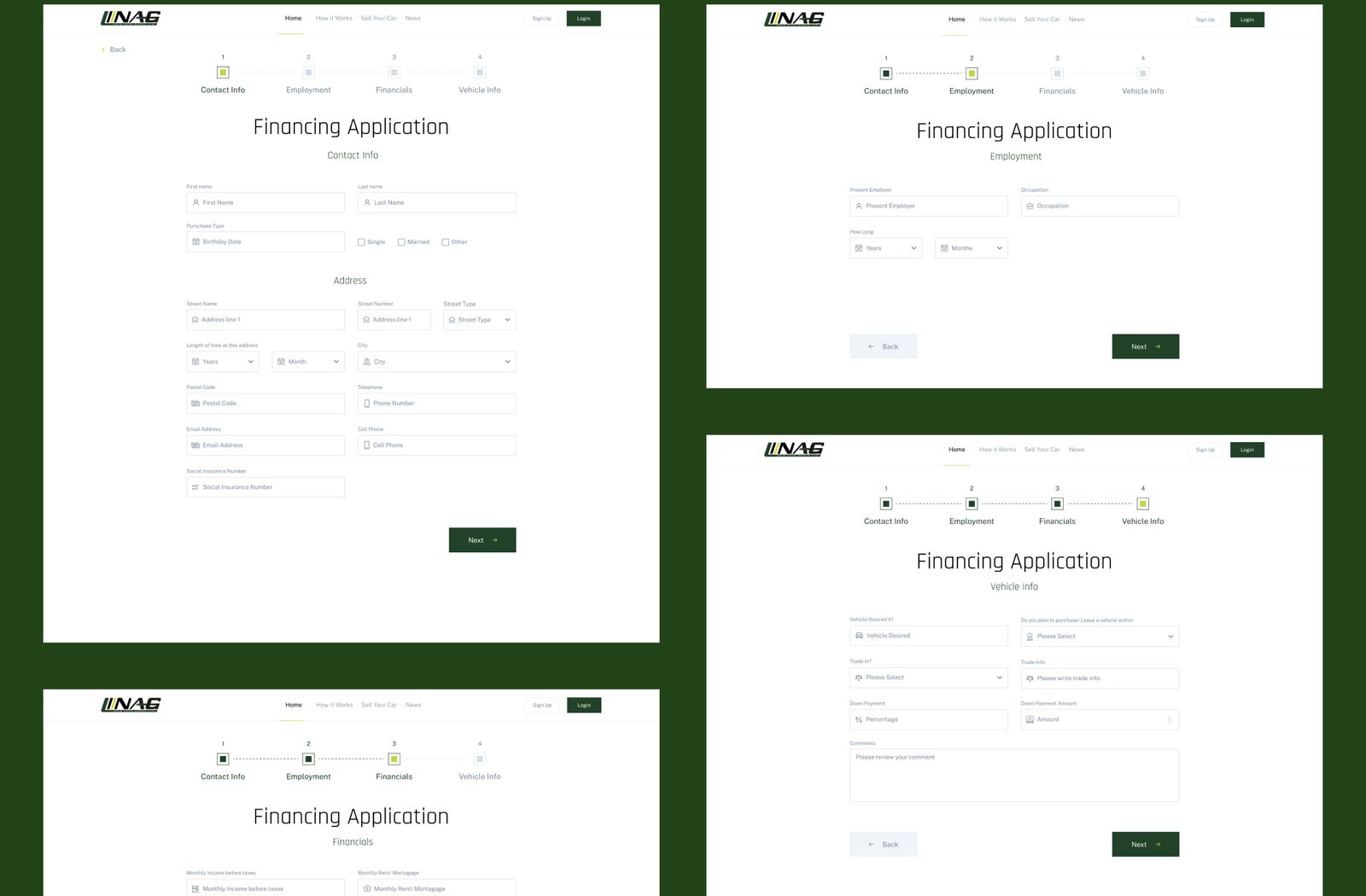
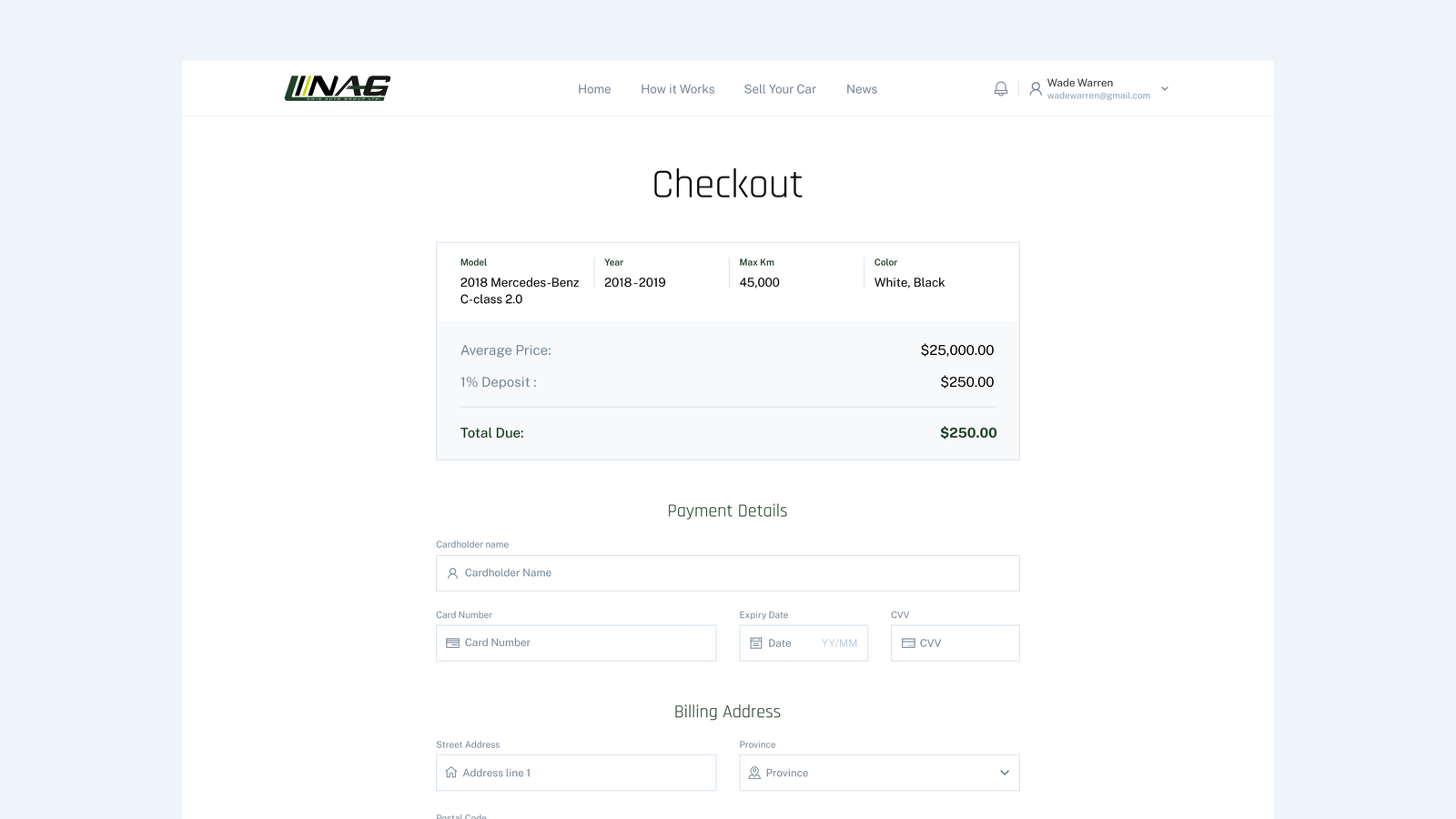
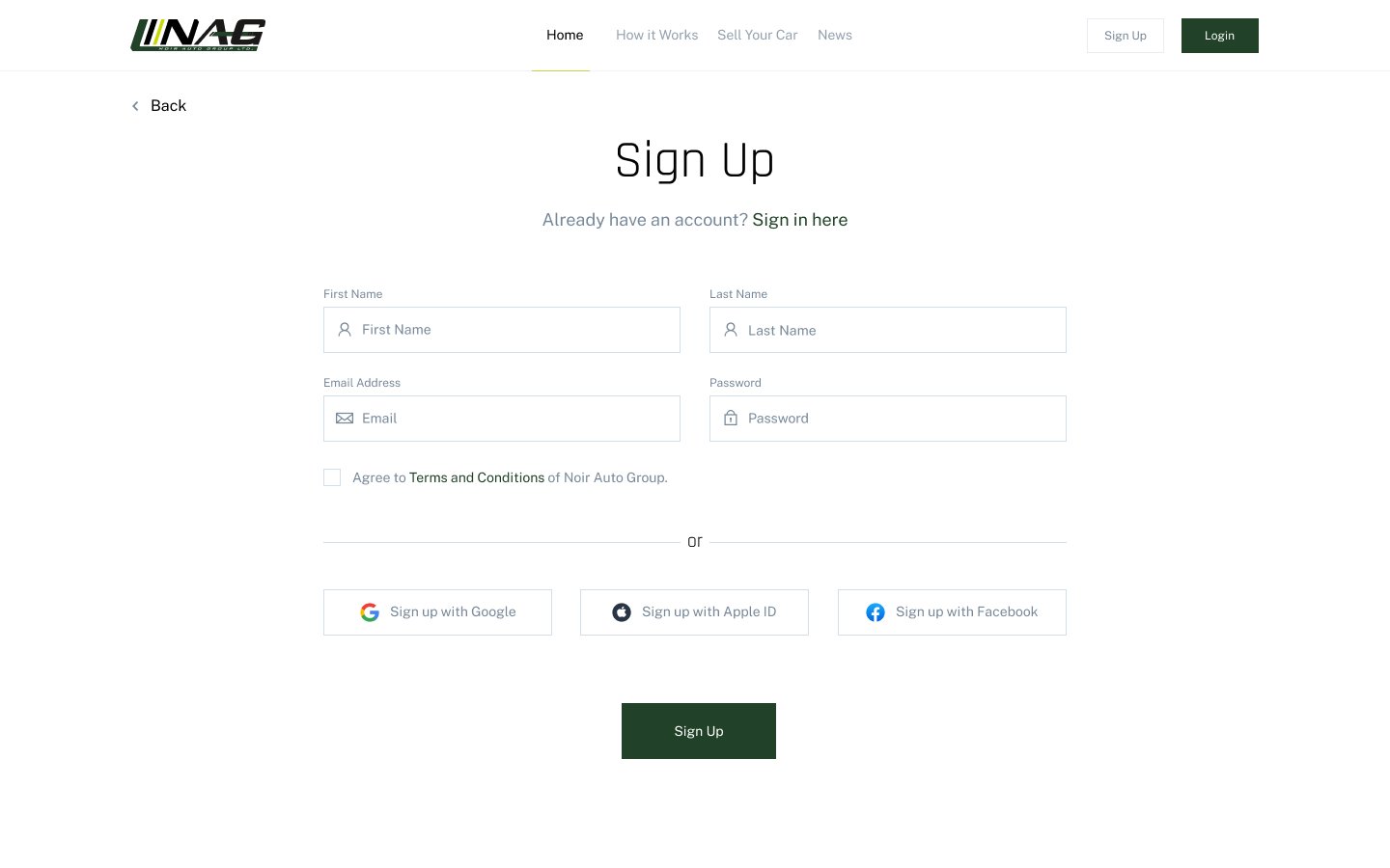
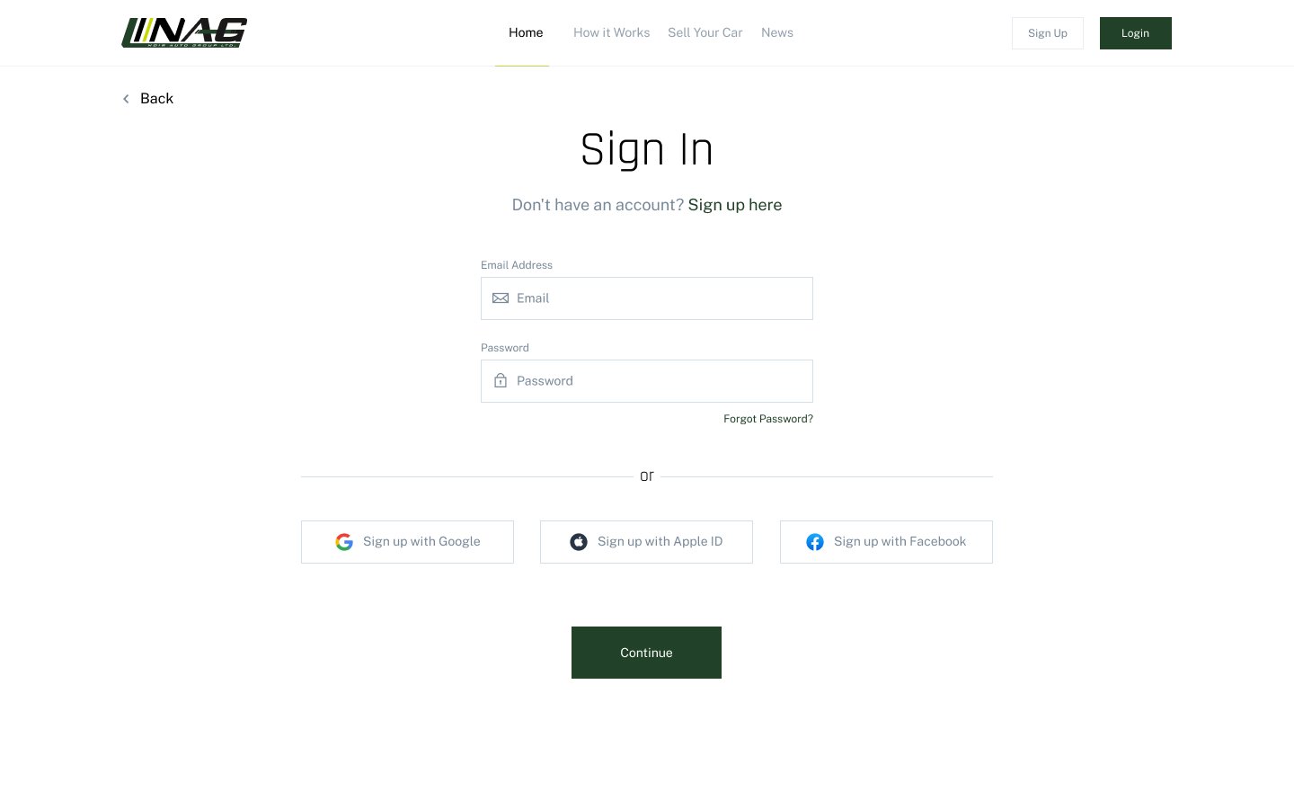
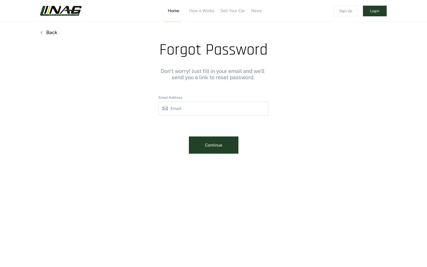
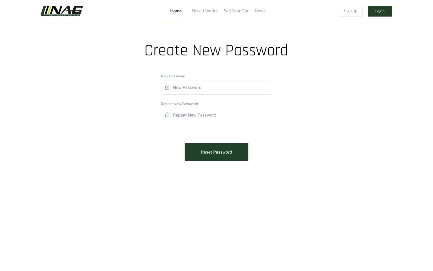
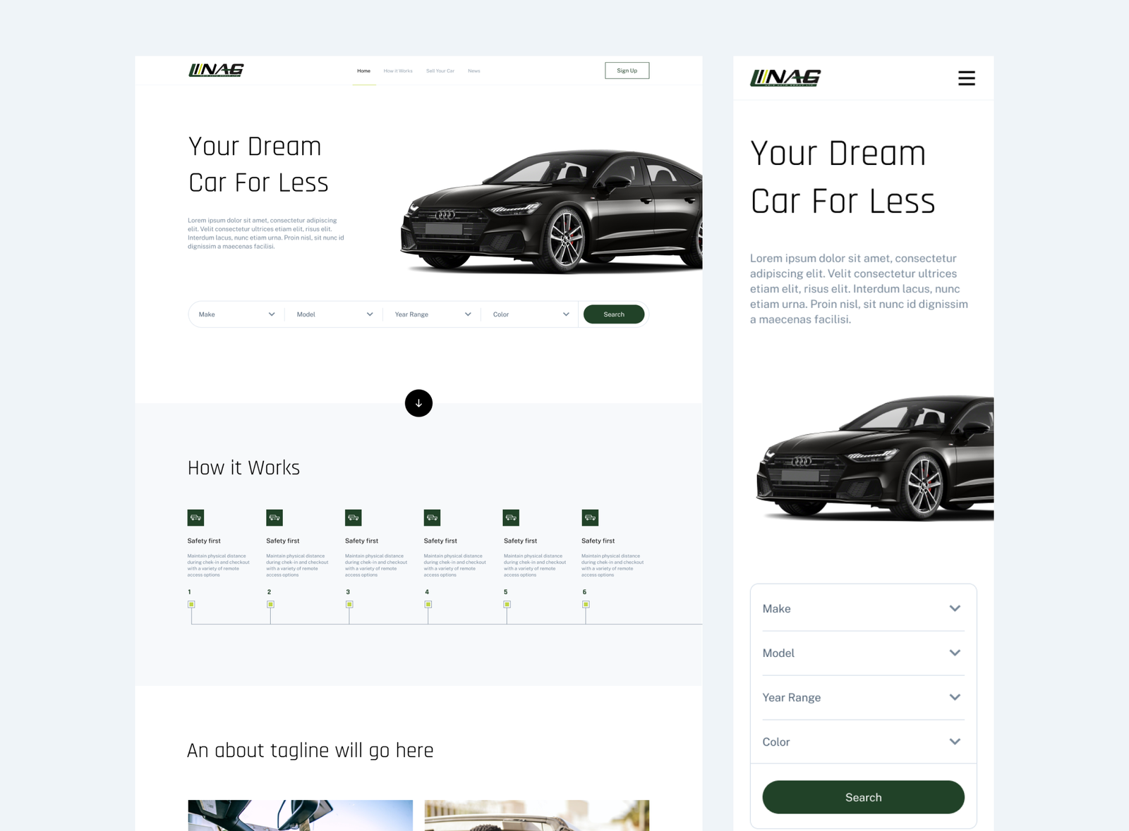
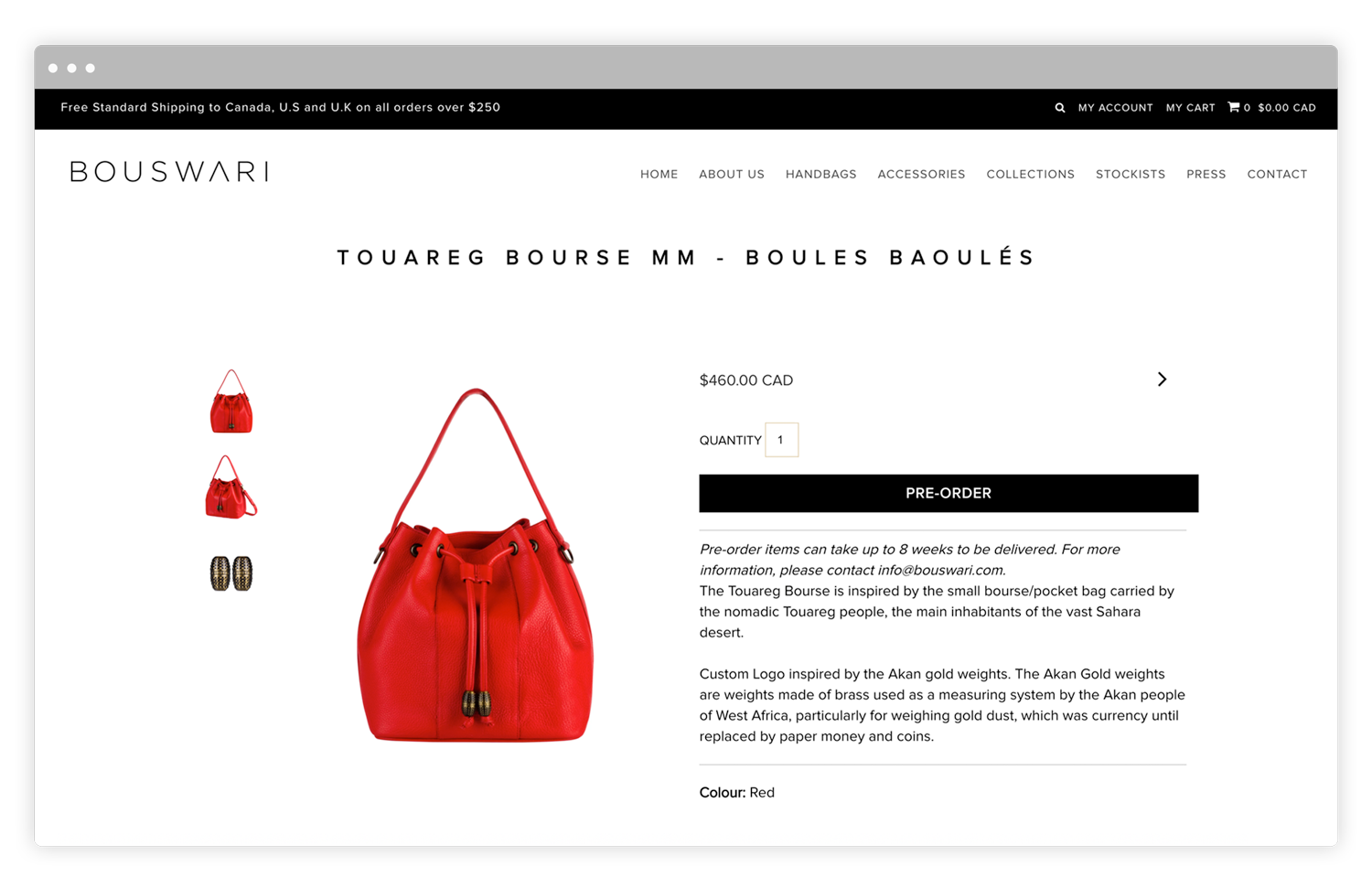
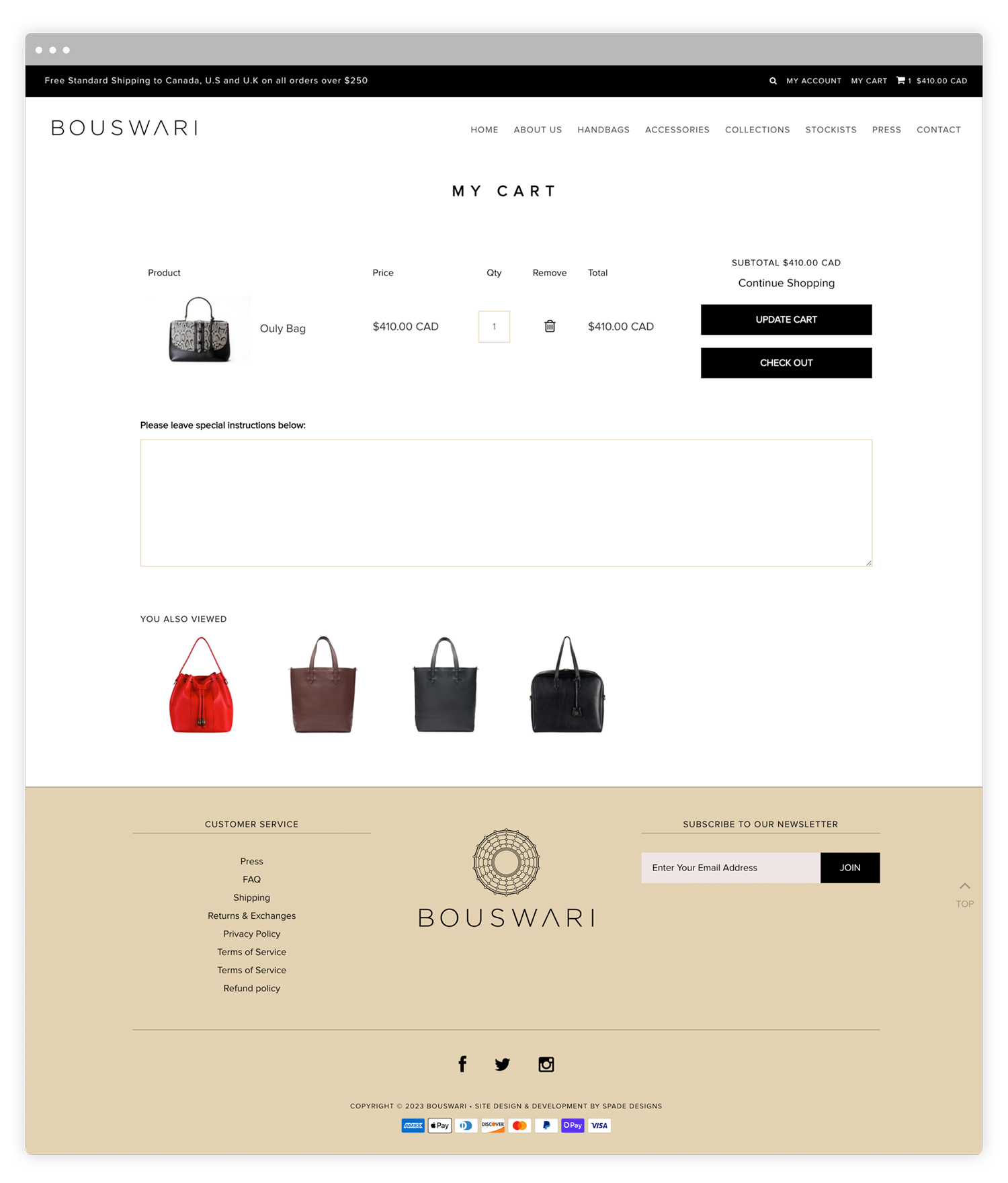
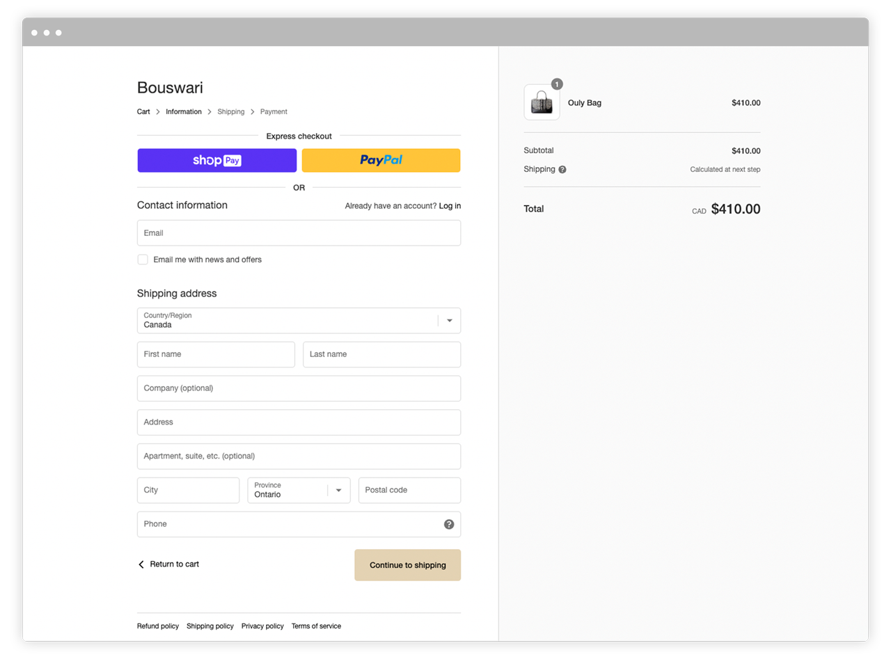
We were tasked with the challenge of designing a web application to facilitate the online process of Noir Auto Group’s customers submitting vehicle requests and all of the subsequent following steps. The user journey was complex as it involved several steps as the business’ vehicle finding process is unconventional. We mapped out a detailed yet simple user journey to make the user experience as enjoyable as possible.
Additionally, we were to create a marketing website that would promote and explain the web app.
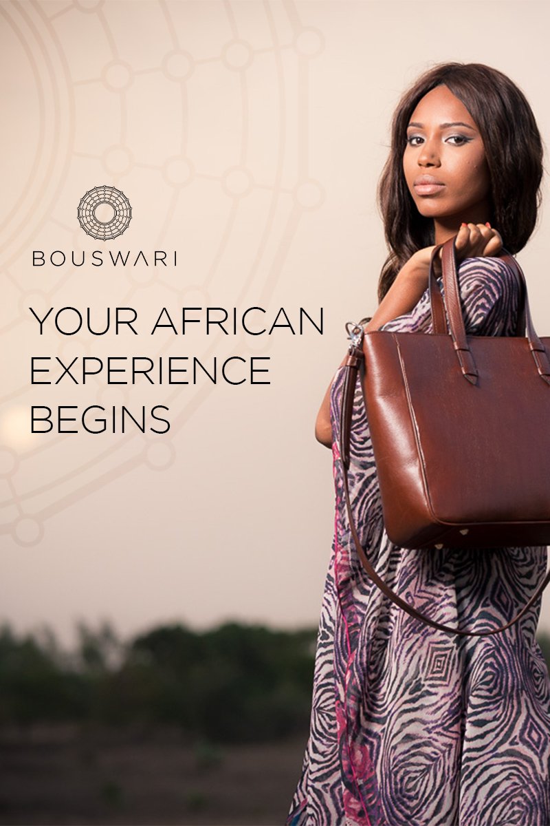
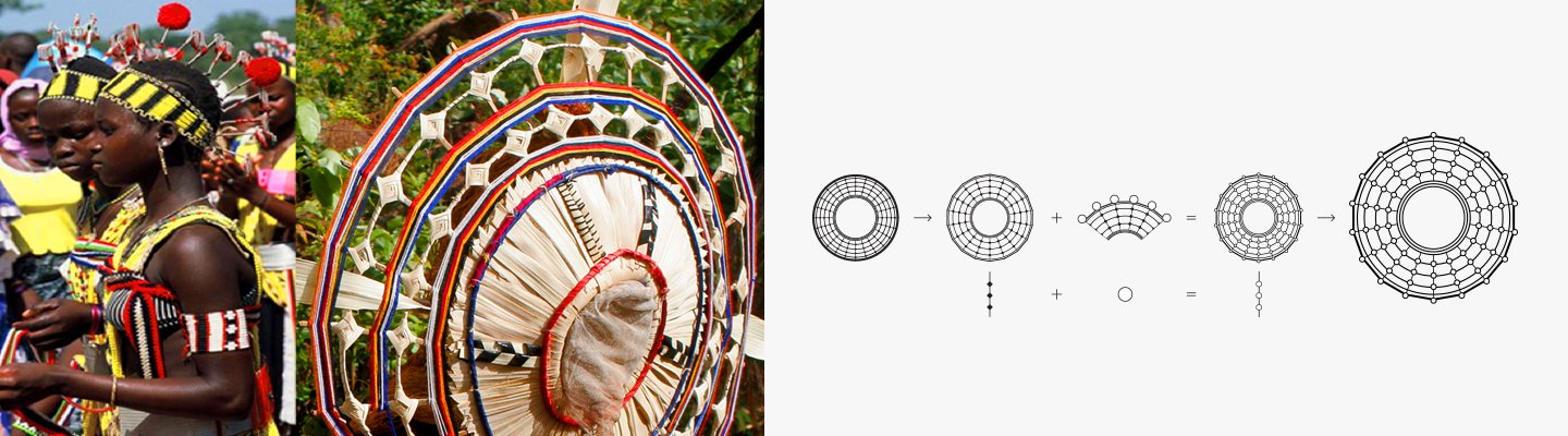
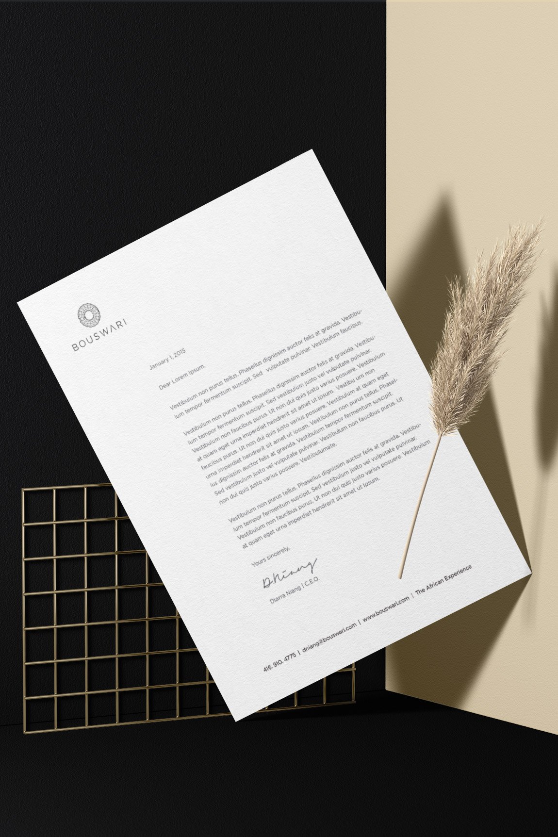
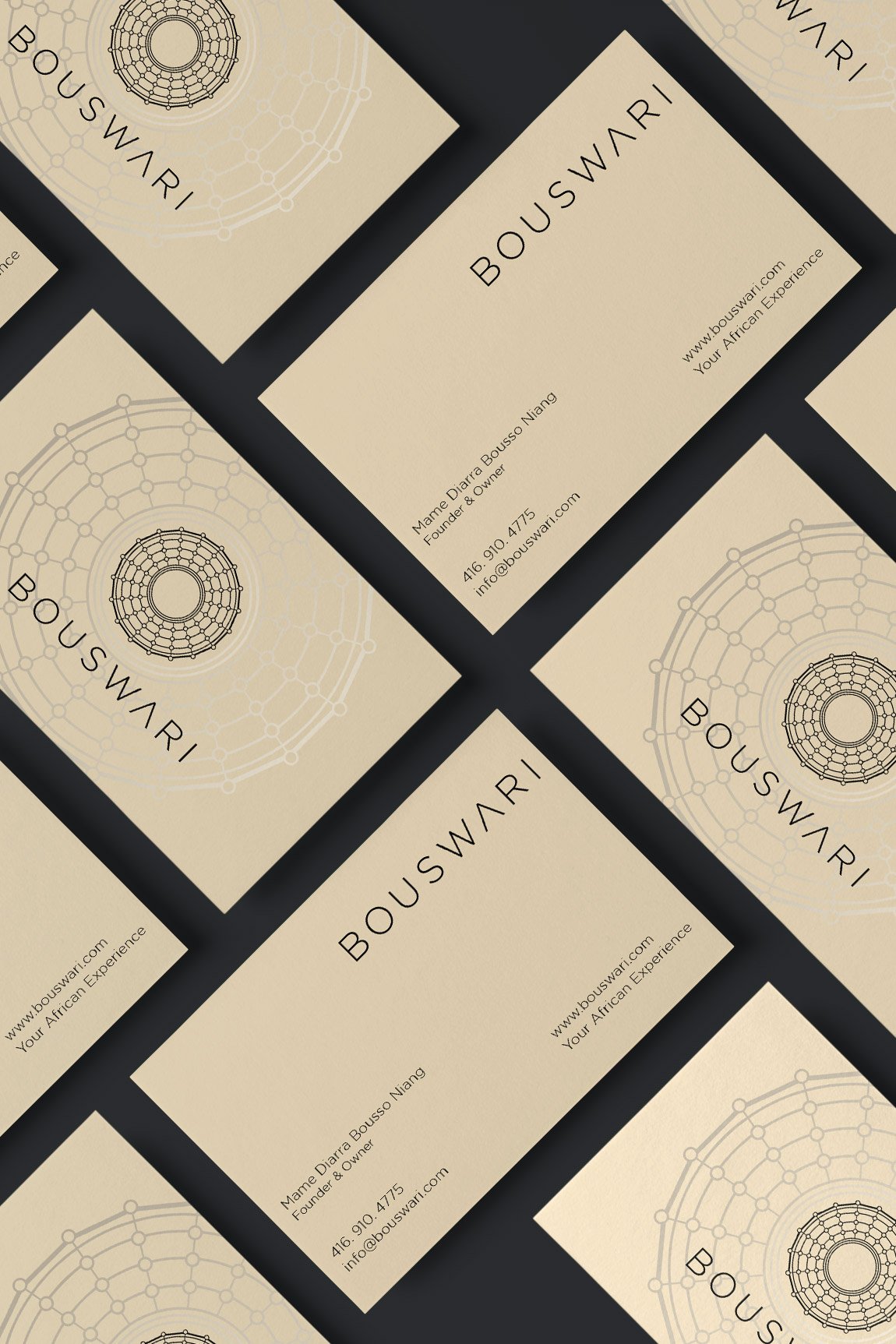
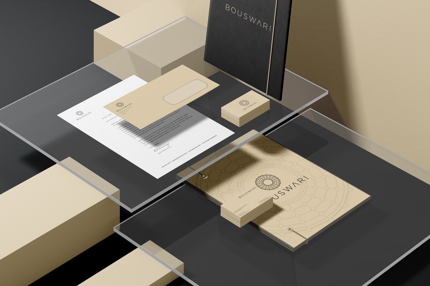
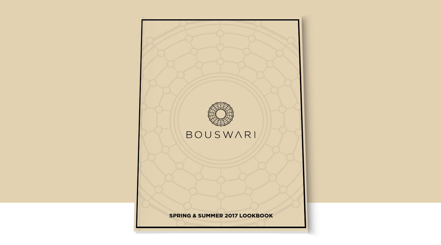
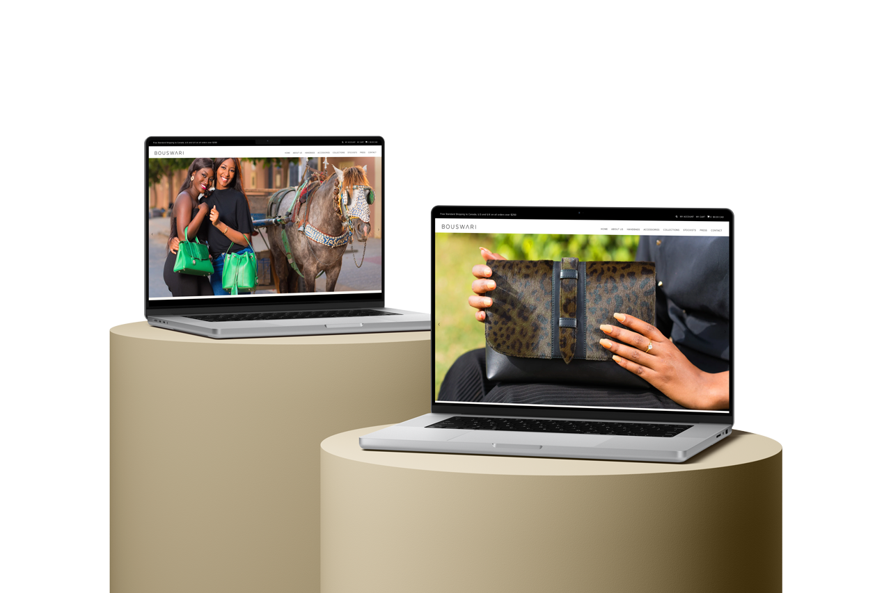
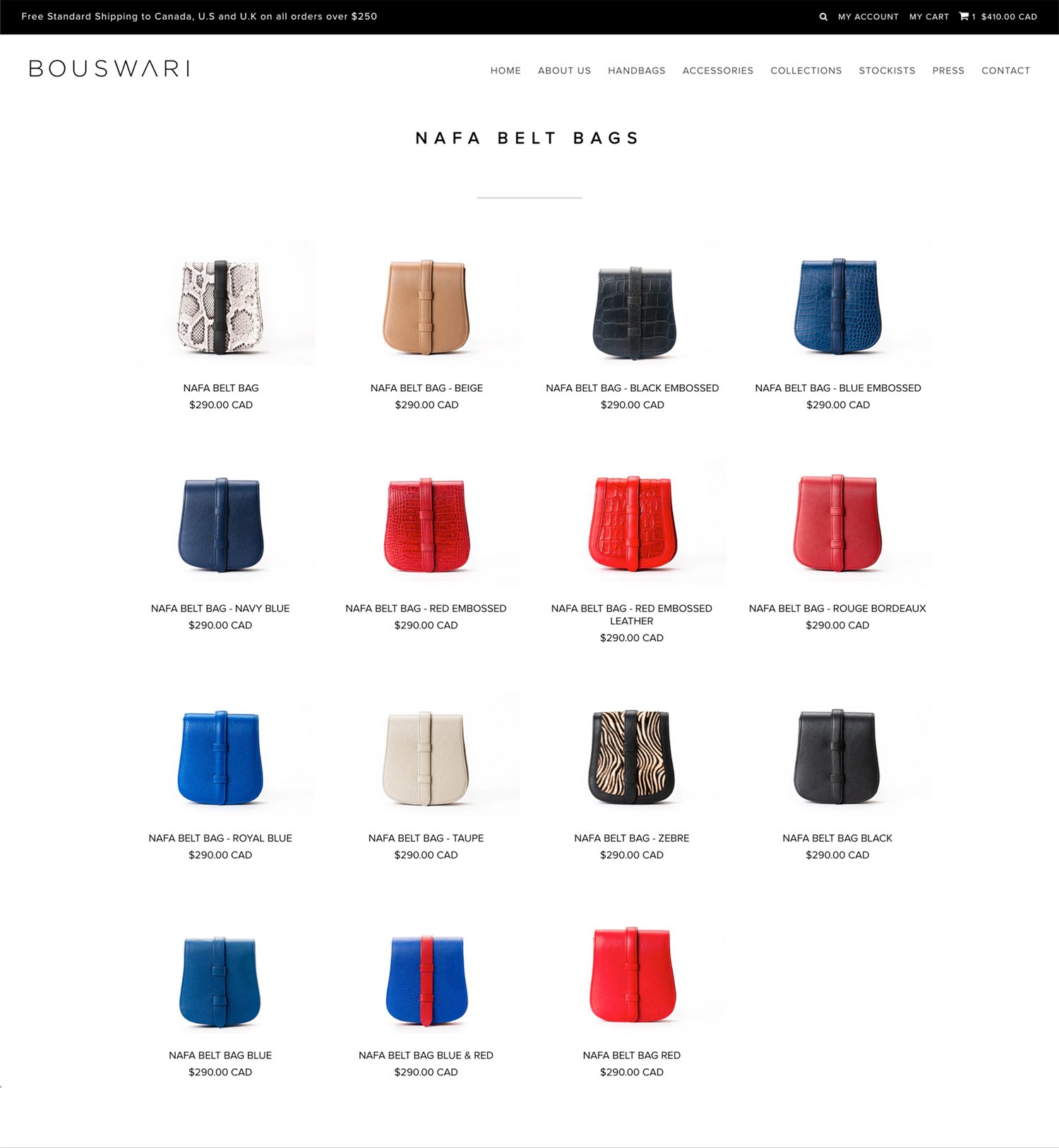
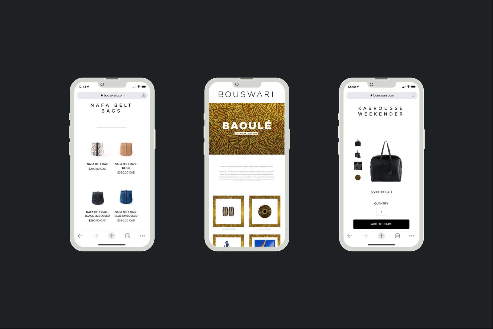
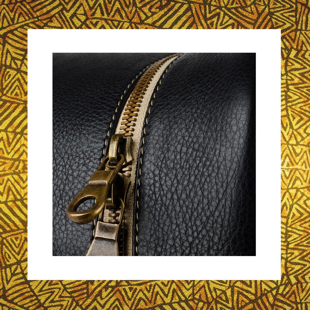
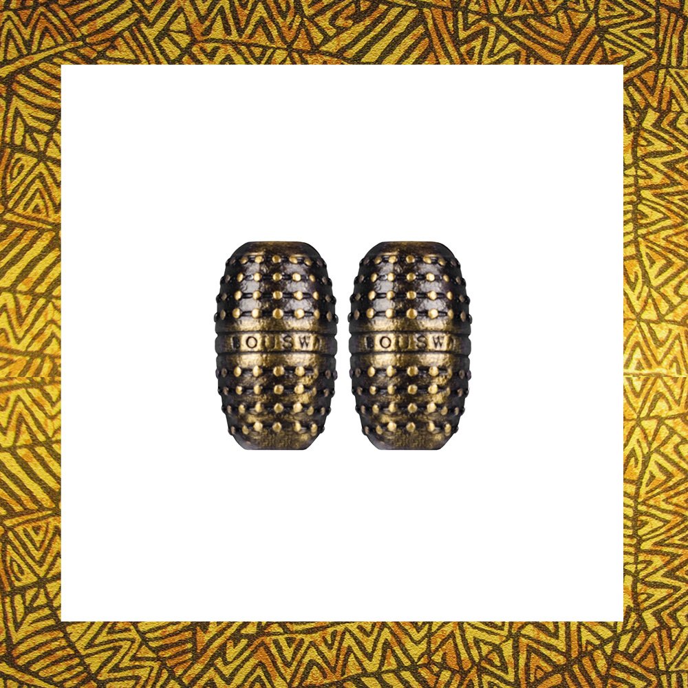
Bouswari is an African inspired upscale bag and pendant company. It sets itself apart from all other companies by combining Canadian & African expertise to create products of luxurious class manufactured primarily in Senegal. The Bouswari brand evokes a feeling of luxury from a fashion point of view. It has a minimalist feel to properly represent the products the company will be producing.
The Brand Identity
The Bouswari brand was designed to evoke a feeling of luxury from a fashion point of view. It has a minimalist feel to speak to its of the upper class target audience as well as to properly represent the products the company produces.
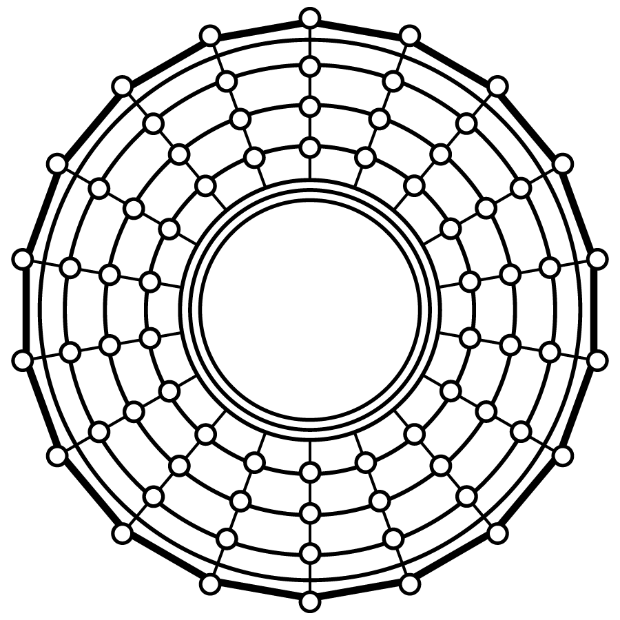
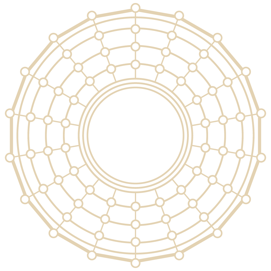
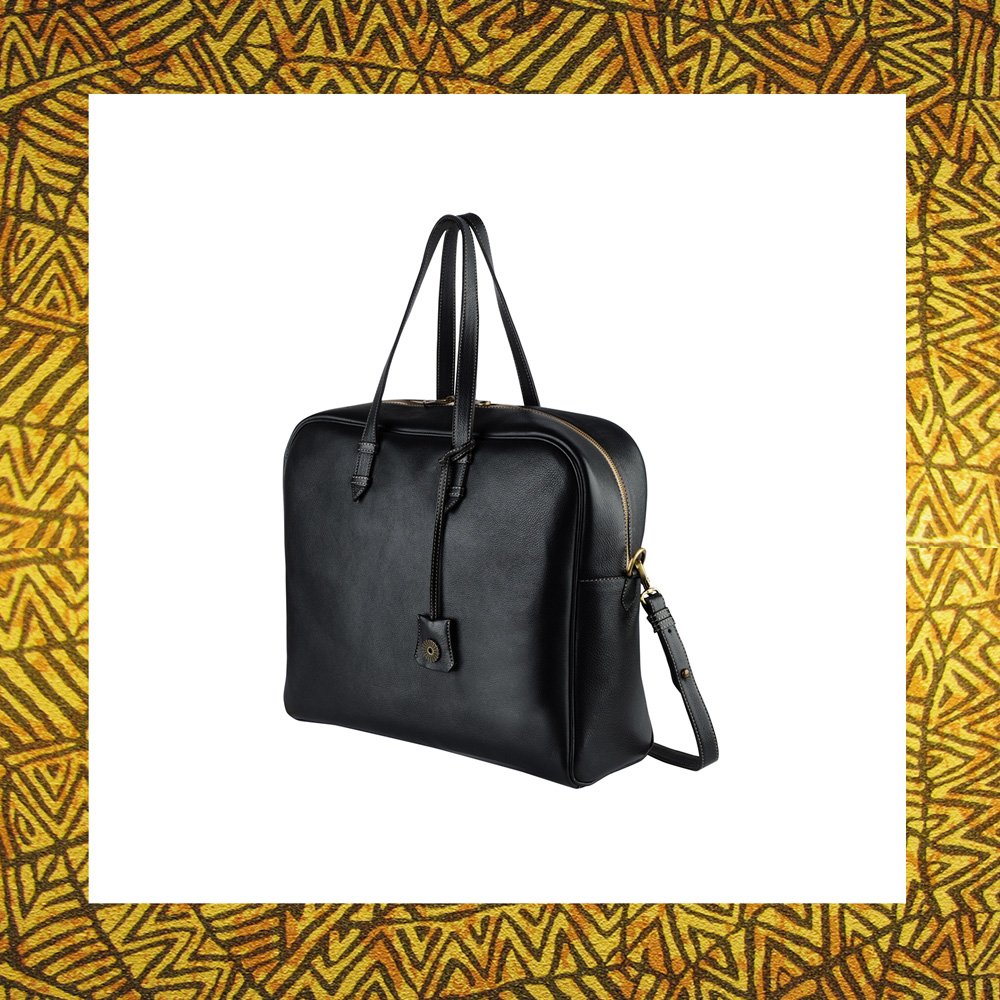
The Bouswari logomark is inspired by the headgear worn by Bassari men and women. During initiation feasts, both genders wear their best costumes. Men in particular wear elaborate straw headgear, depicted in our logo.
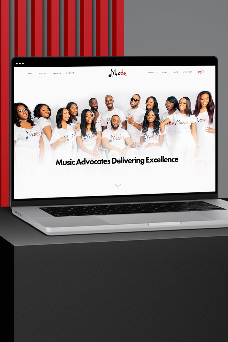
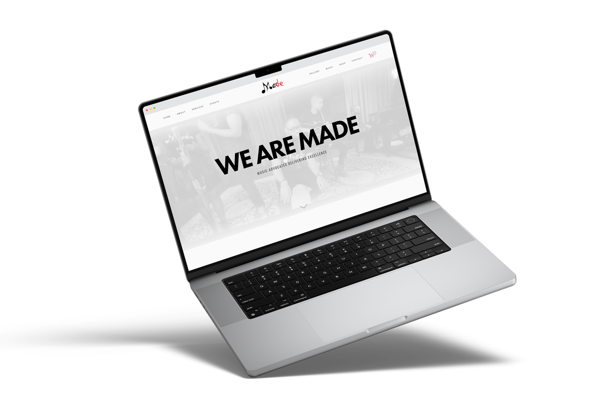
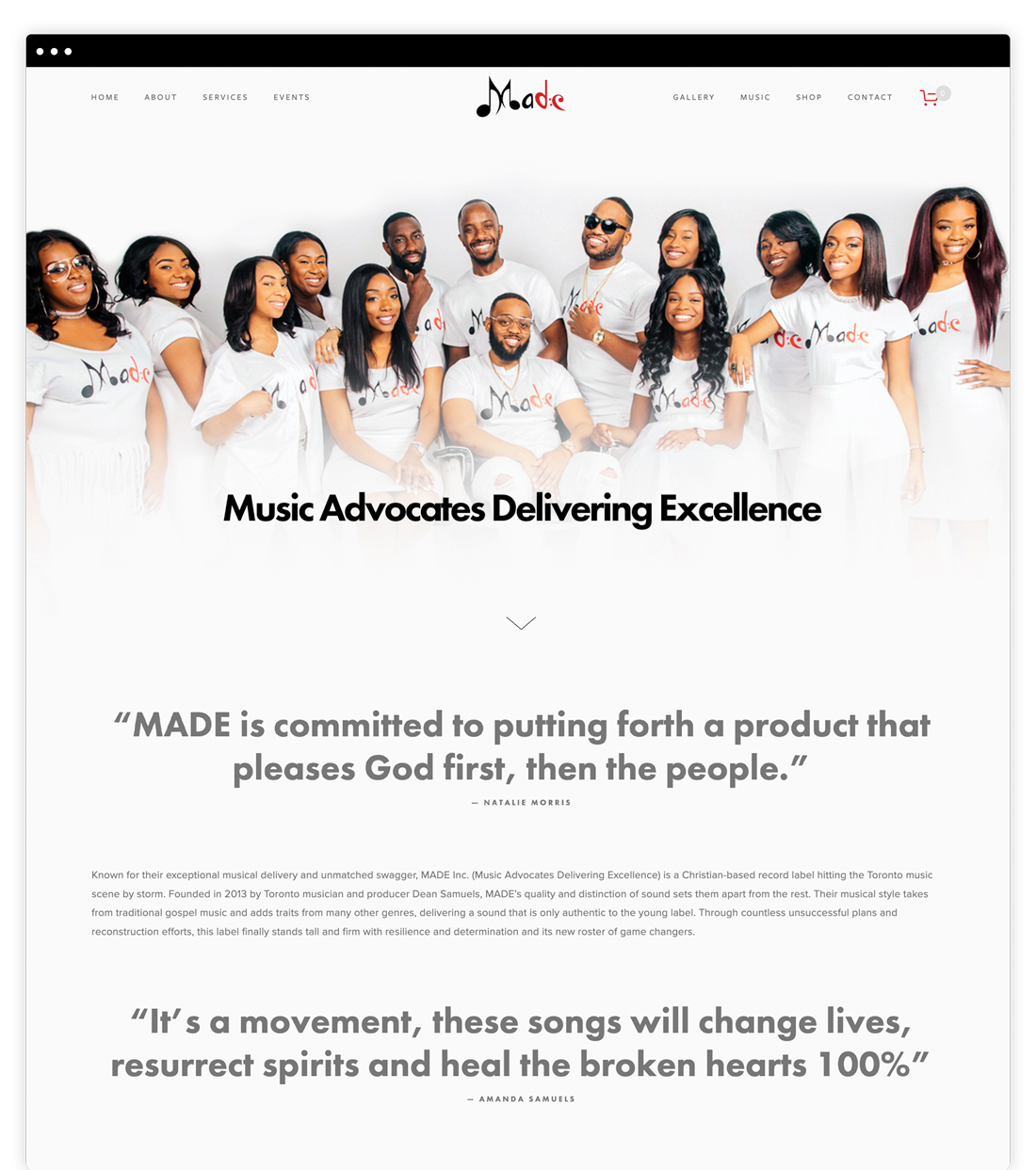
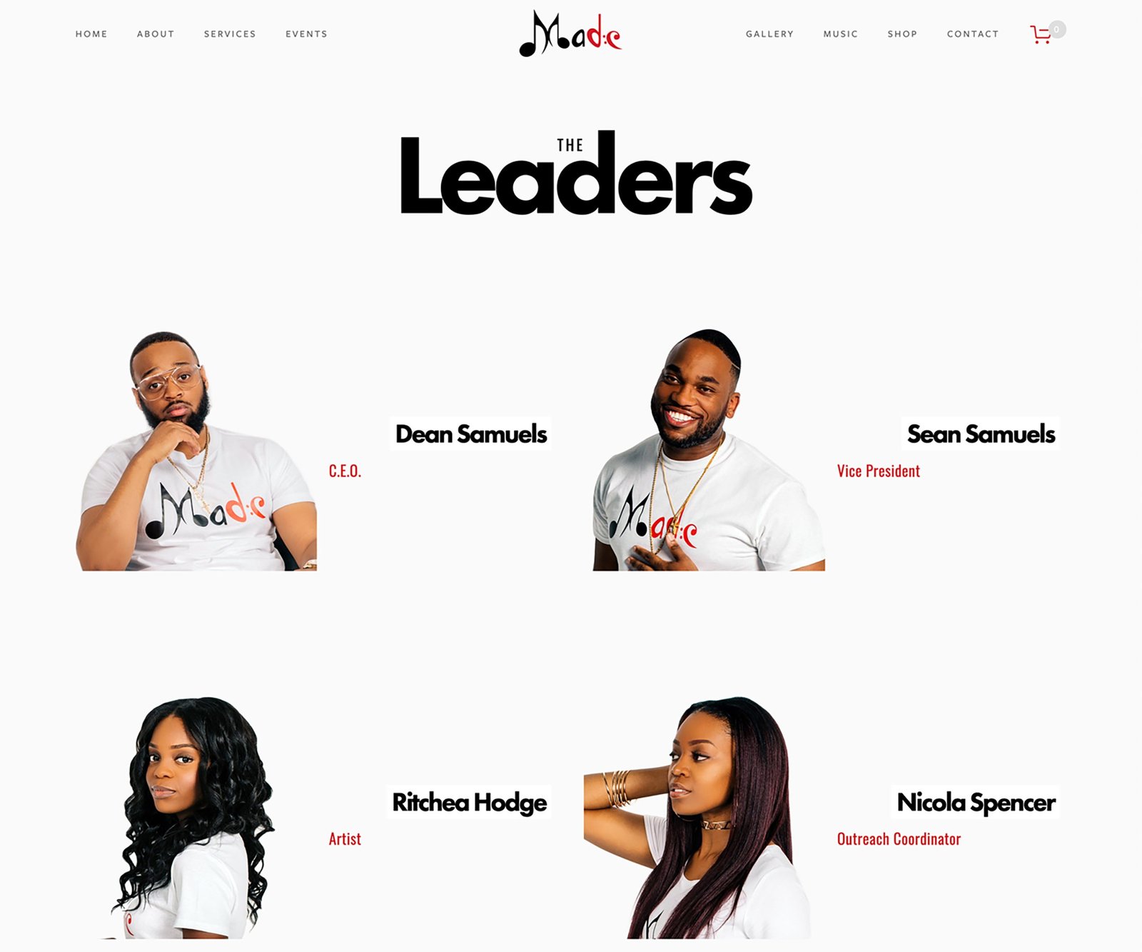
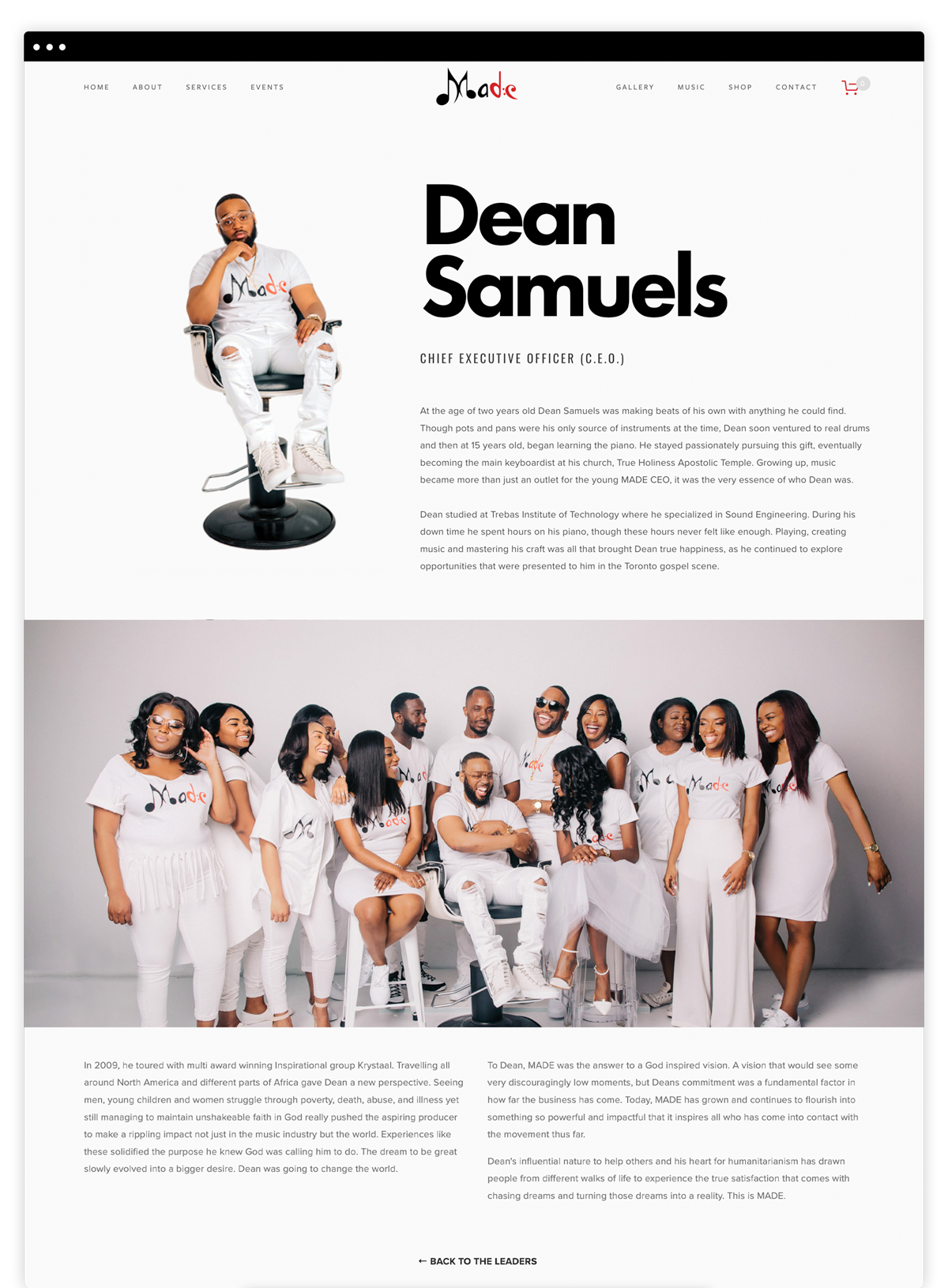
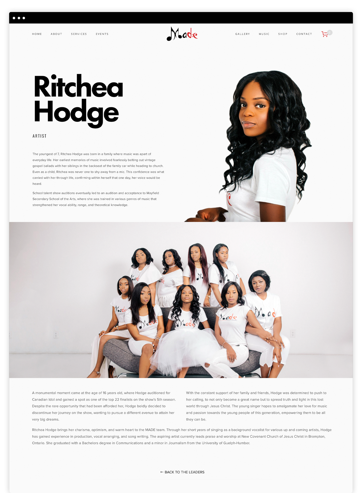
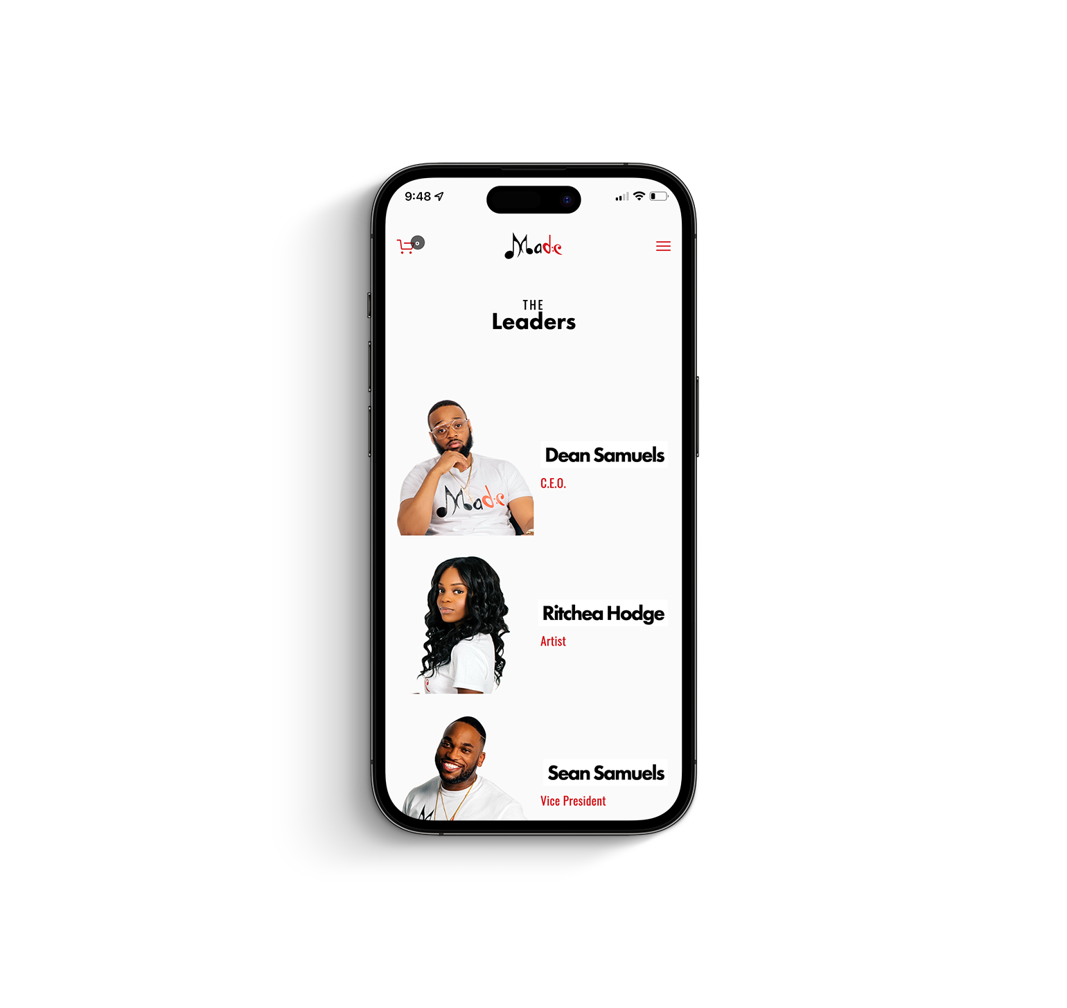
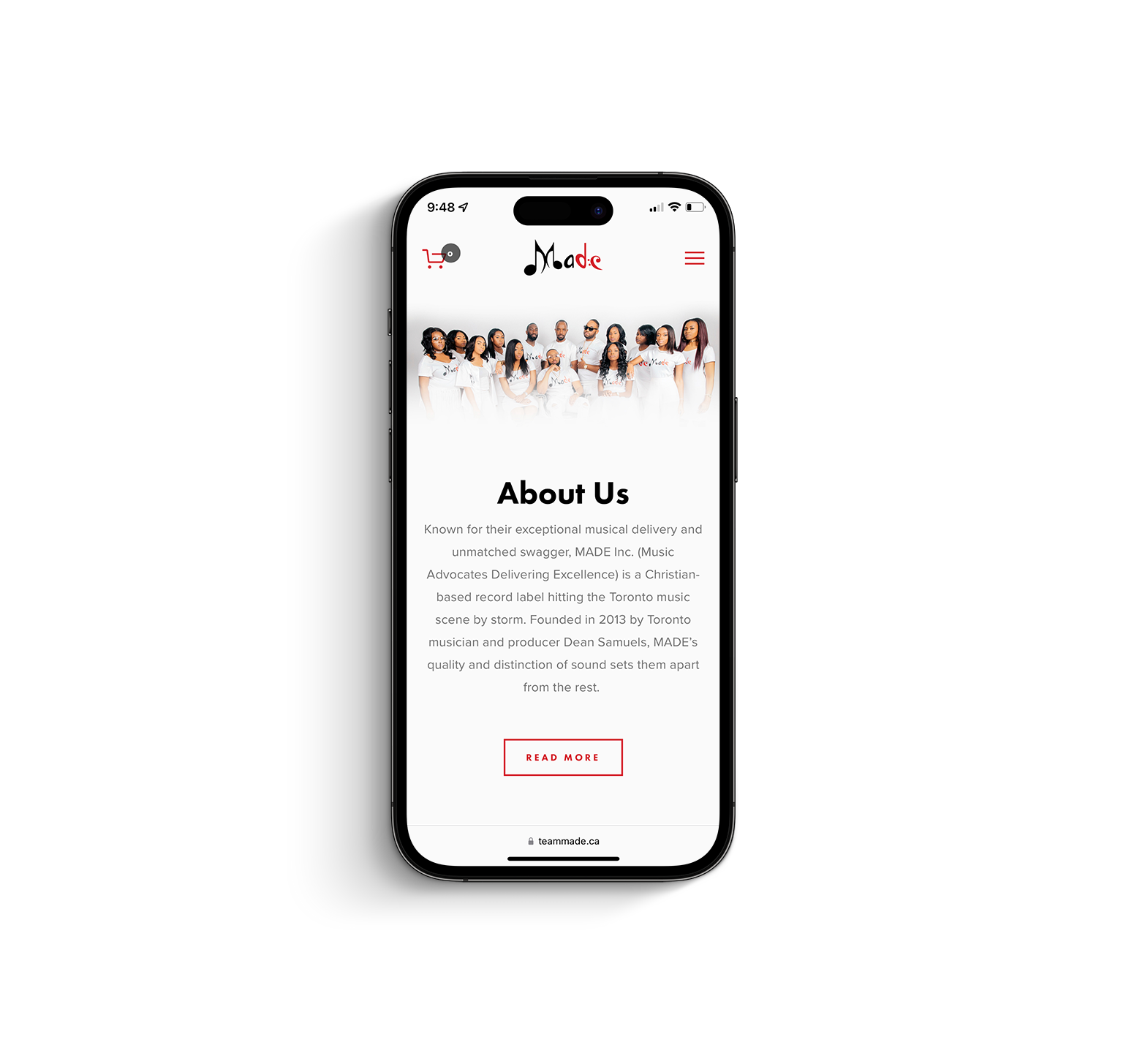
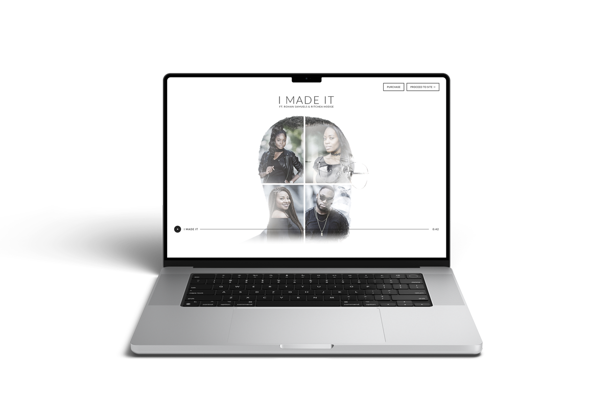
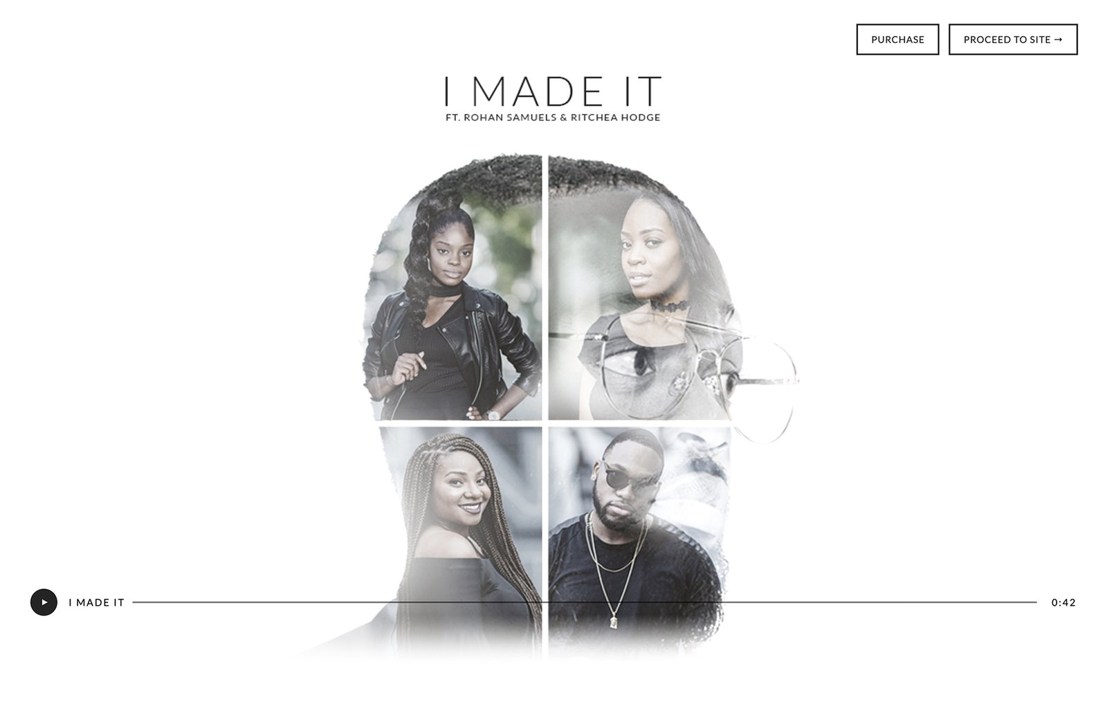
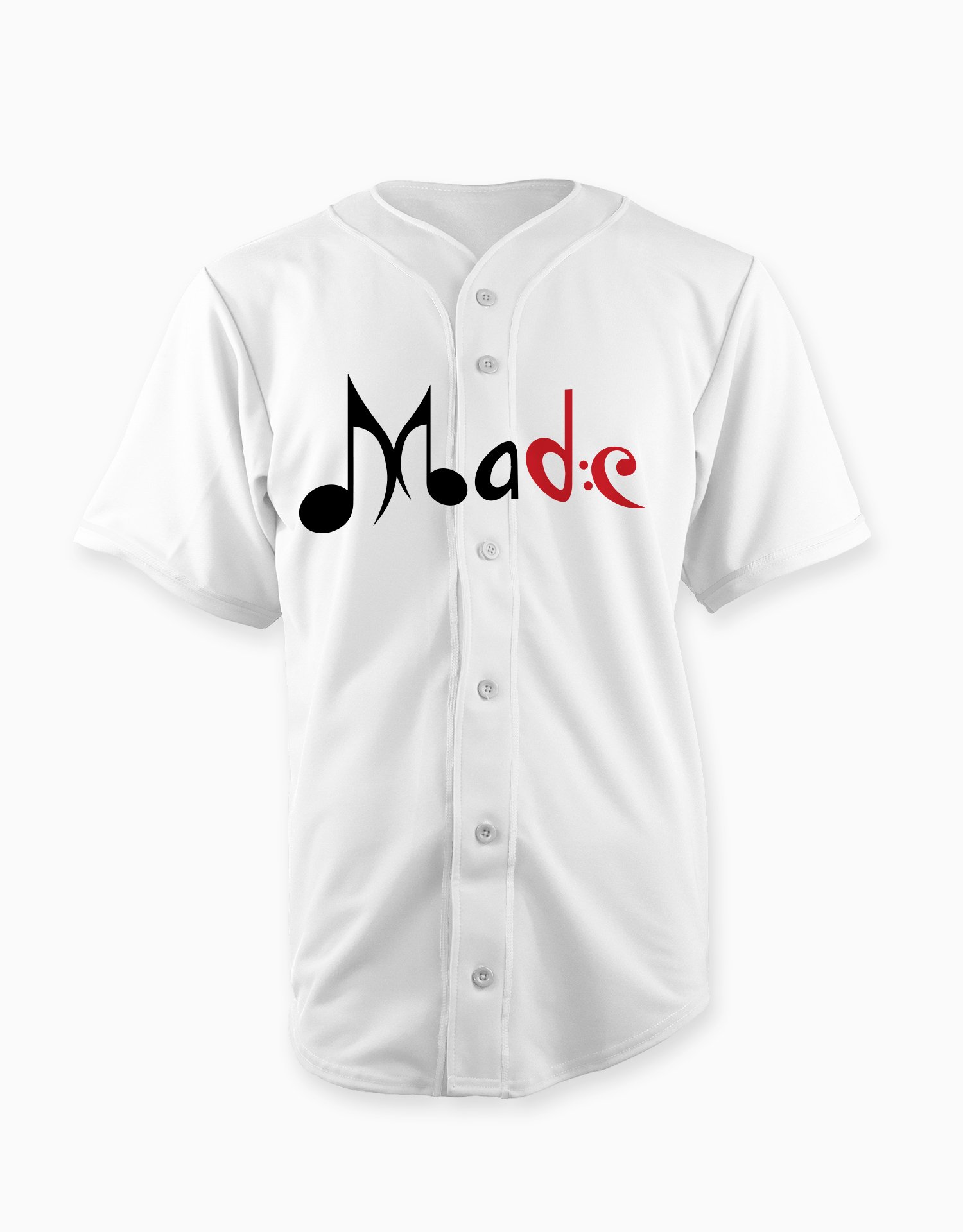
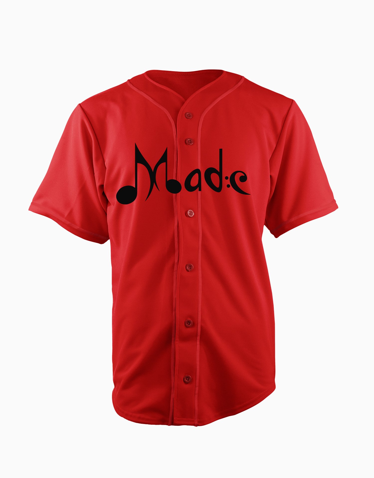
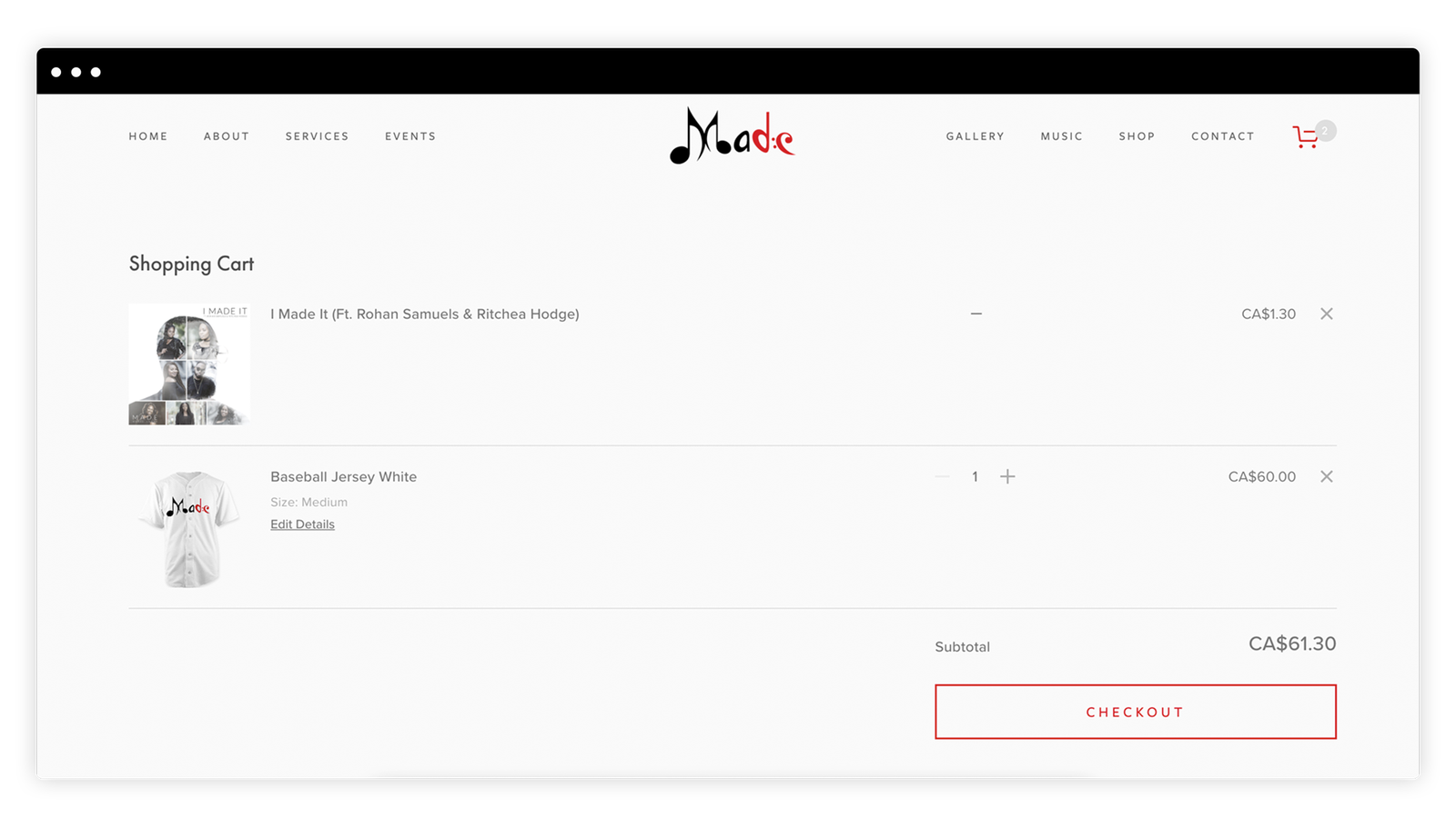
Known for their exceptional musical delivery and unmatched swagger, MADE Inc. (Music Advocates Delivering Excellence) is a Christian-based record label hitting the Toronto music scene by storm. Founded in 2013 by Toronto musician and producer Dean Samuels, MADE’s quality and distinction of sound sets them apart from the rest. Their musical style takes from traditional gospel music and adds traits from many other genres, delivering a sound that is only authentic to the young label. Through countless unsuccessful plans and reconstruction efforts, this label finally stands tall and firm with resilience and determination and its new roster of game changers.
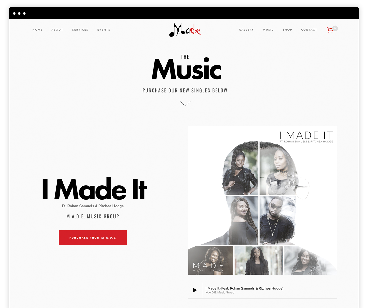
The Challenge
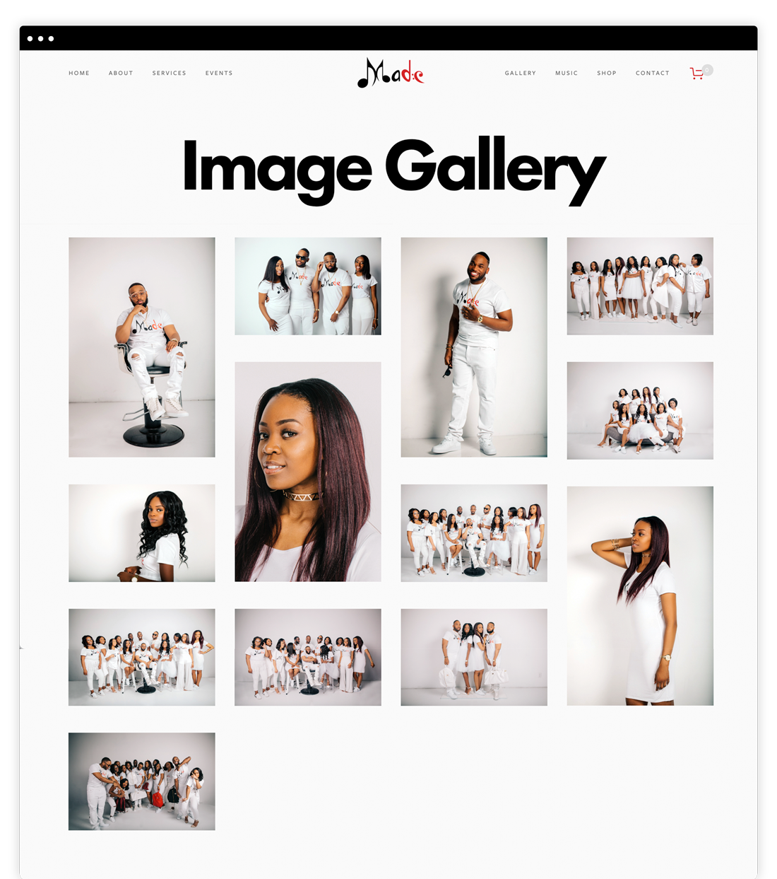
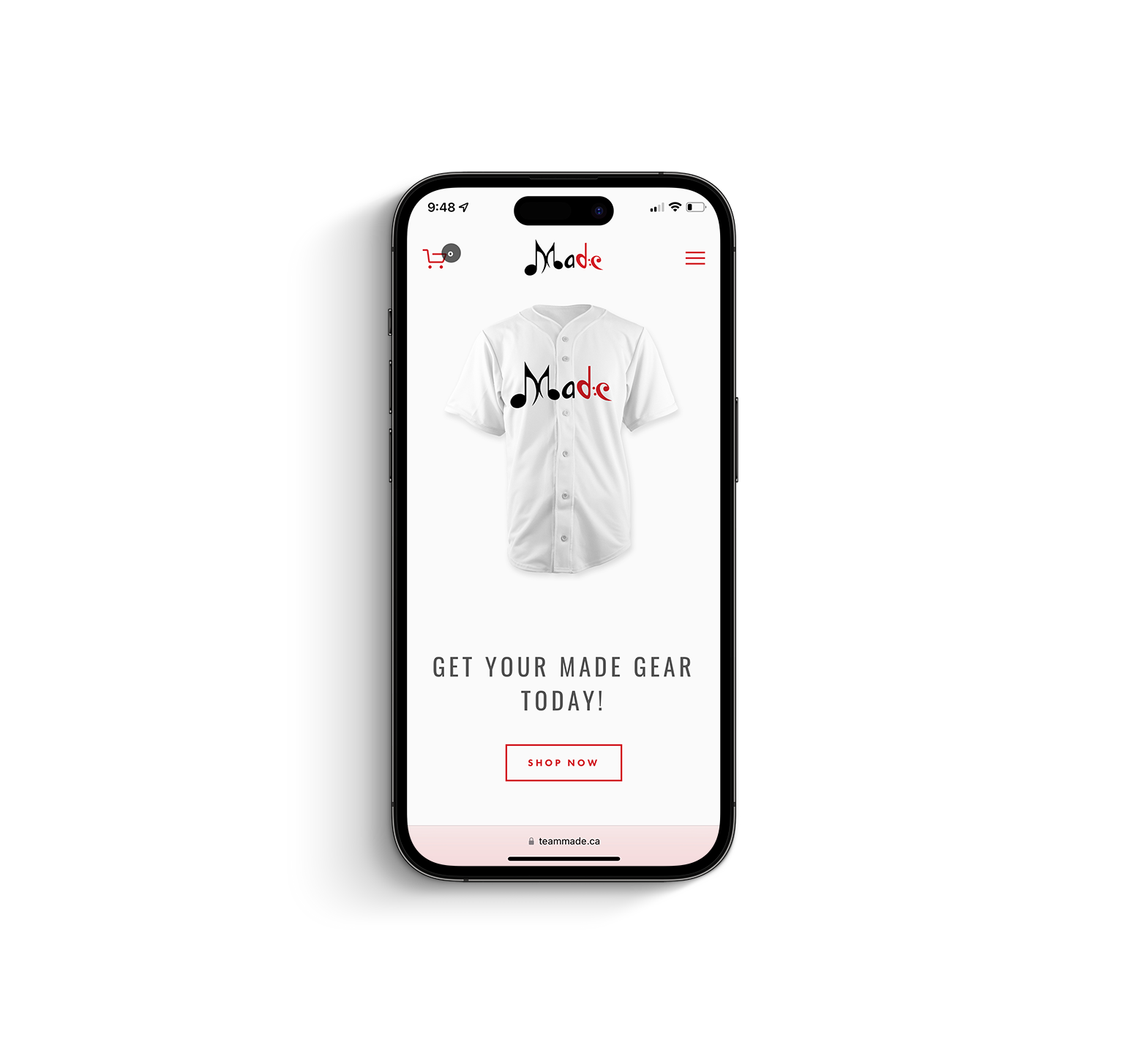
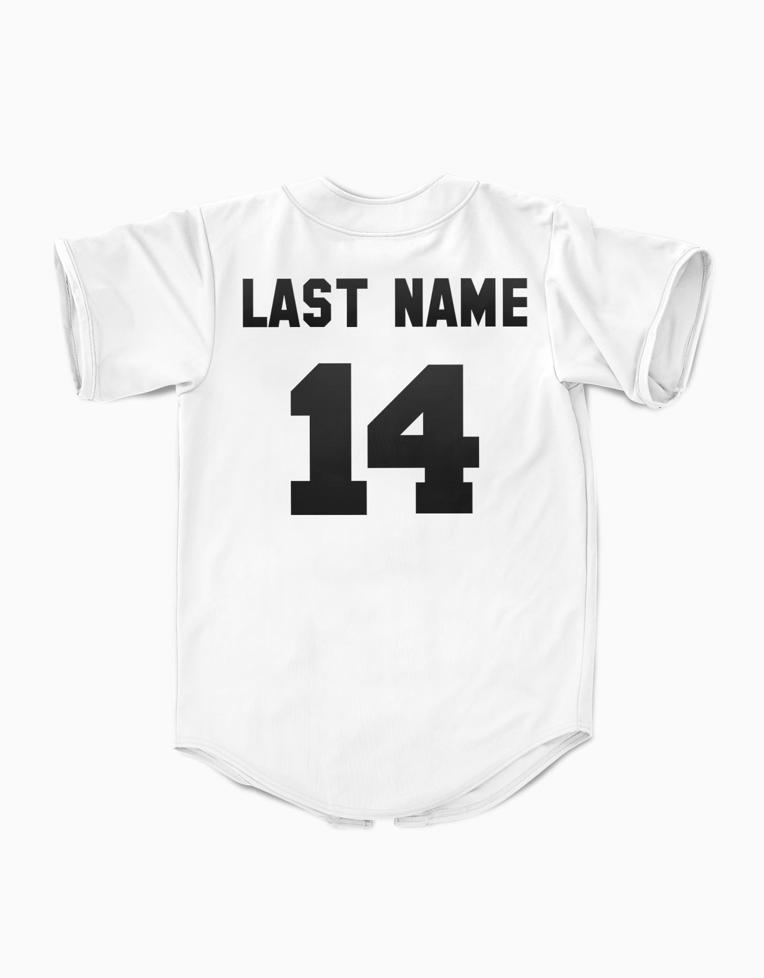
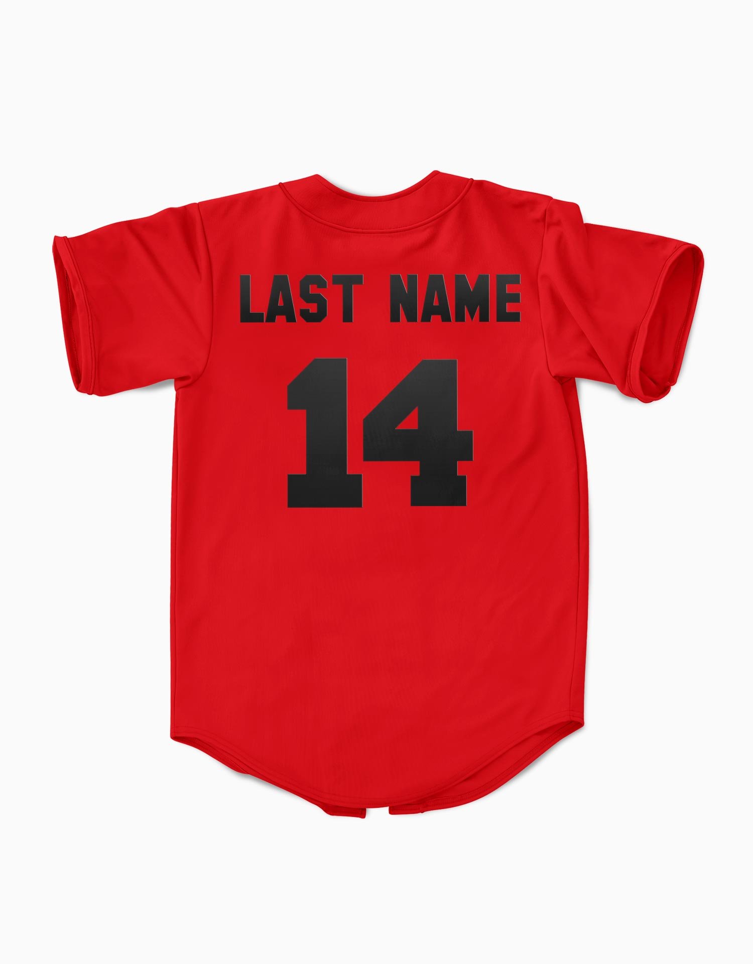
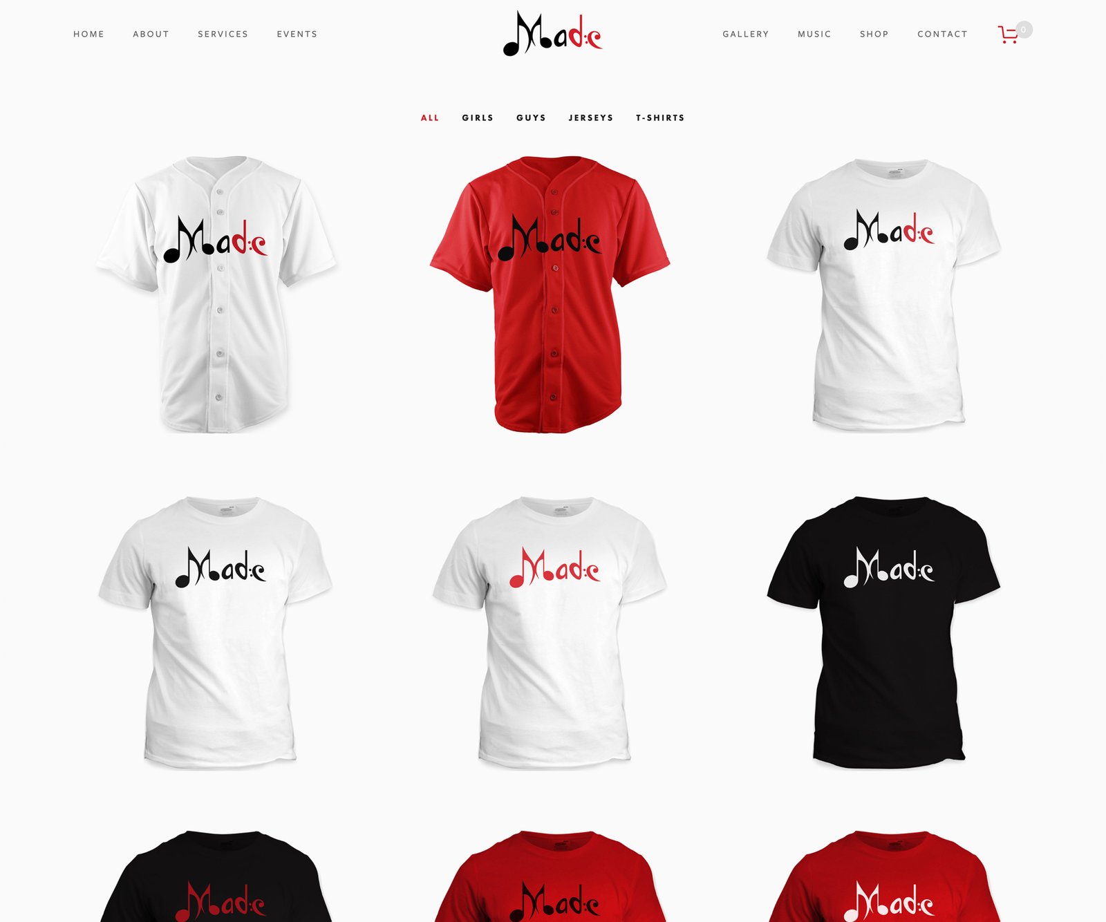
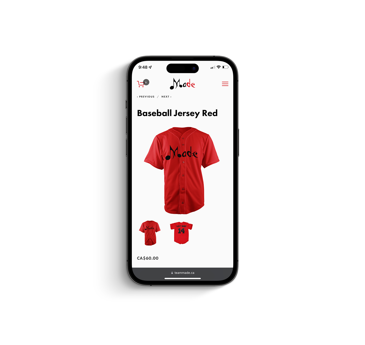
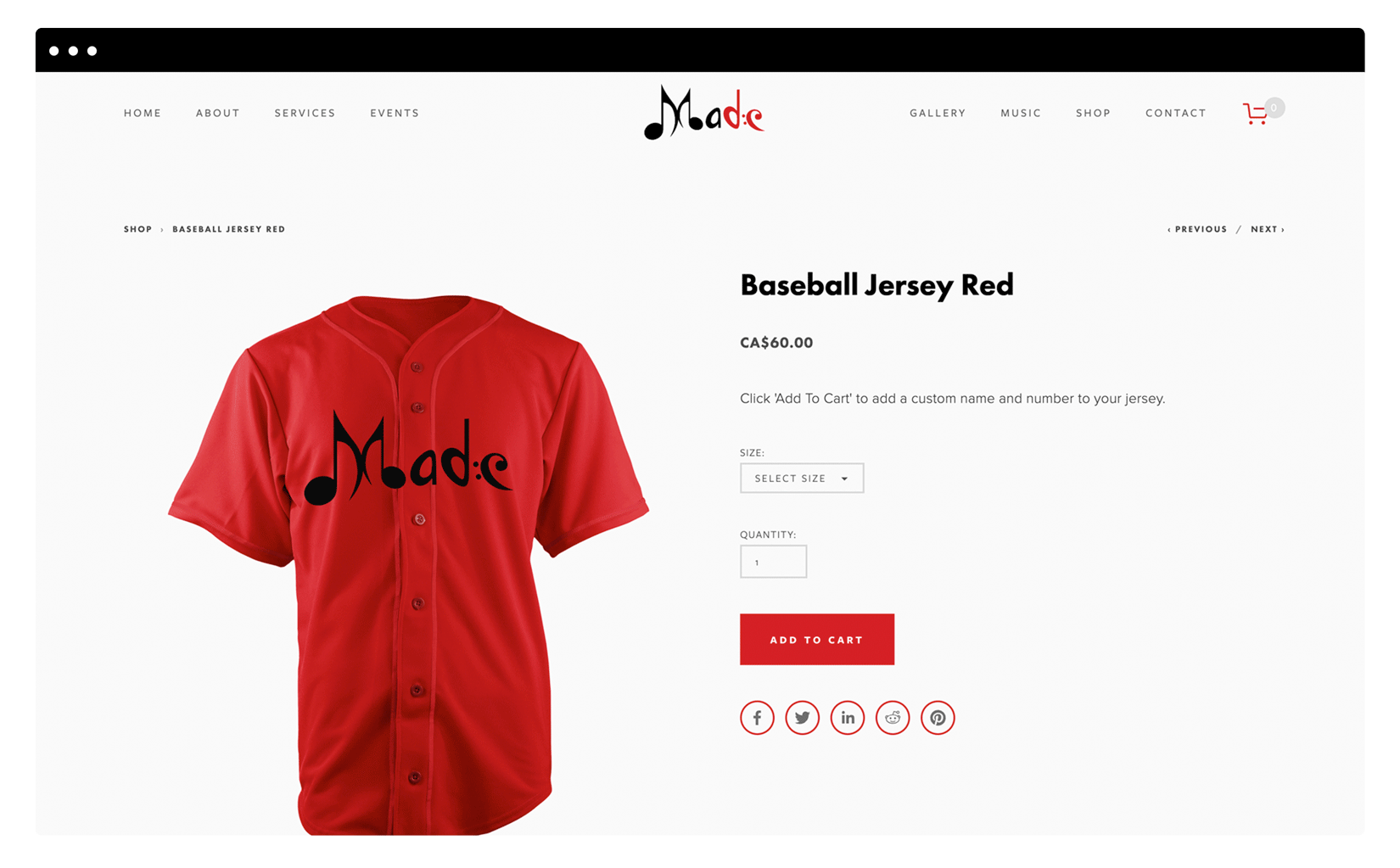
Having just recorded their first award winning single, Team Made was in need of a website that would act as the digital hub where their growing fanbase and visitors alike could not only learn more about the group, but also purchase their music and merchandise. The group has been known to be very meticulous with how they present themselves using and wearing alot of white, and I spoke to that via the overall aesthetic.
A modernized user experience for concrete ordering & logistics
Delivered
UX/UI Design
Web Design & Development
The Brand
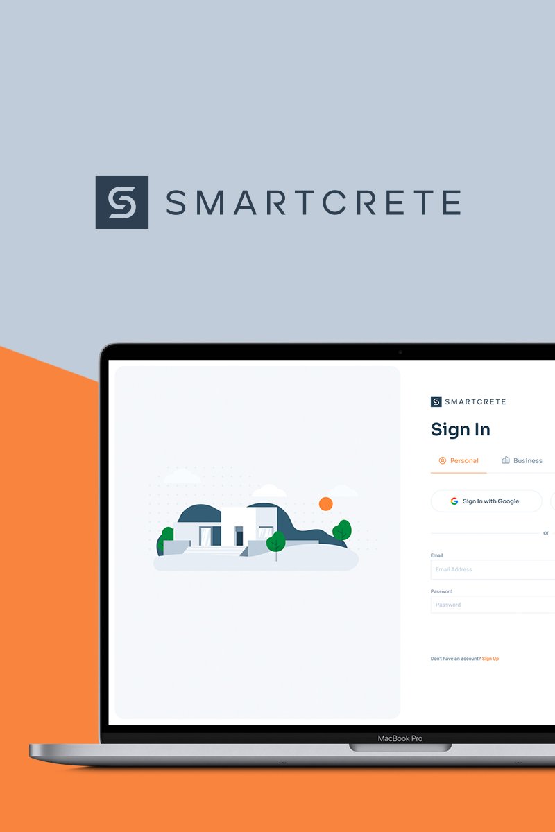
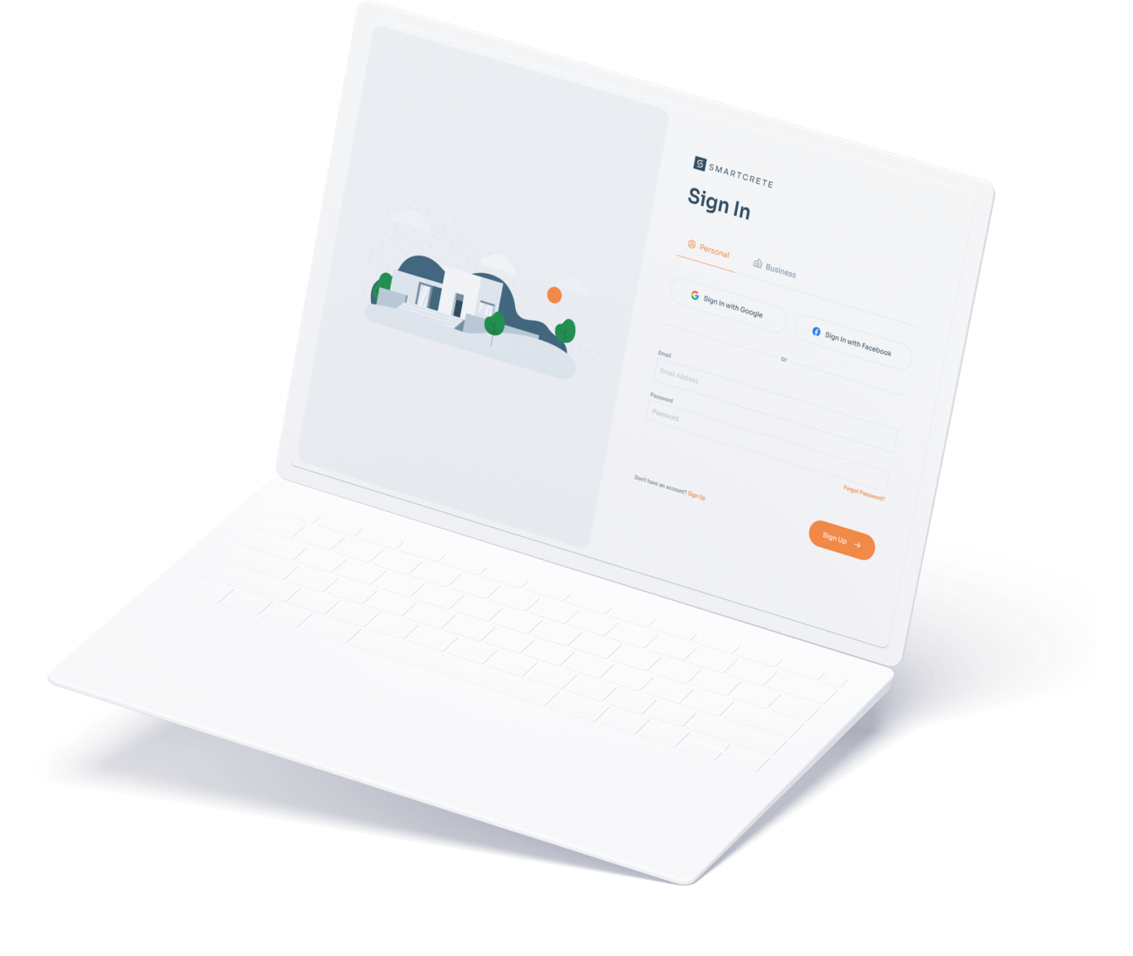
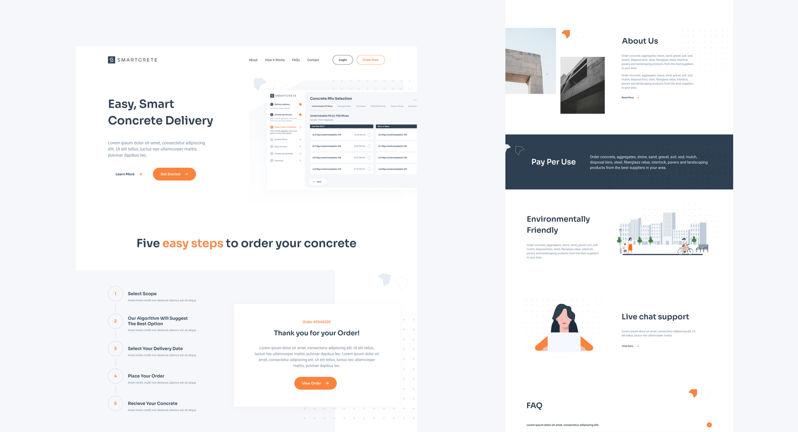
Smartcrete is a company specializing in delivering concrete to its customers using volumetric mixing trucks. Unlike most concrete companies, customers will be able to order their desired concrete online, creating an easier, modernized and more transparent user experience of ordering within the construction industry.
The Challenge
Approached by our client, GTA Concrete Connection Inc., our team was tasked with creating a brand identity for their new subsidiary company – Smartcrete. This was to be an identity for a new and modern construction company with a very strong focus on the digital space.
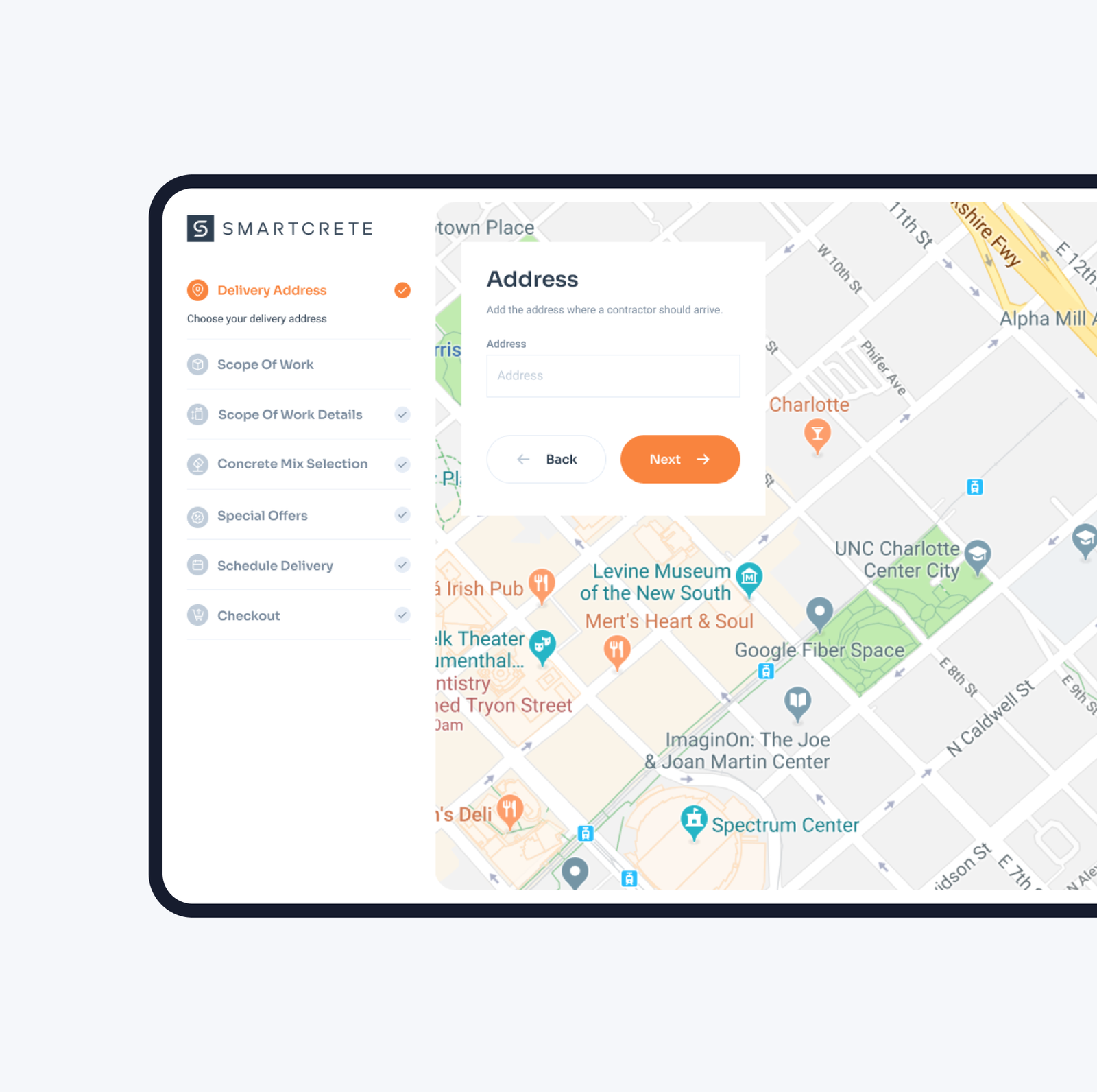
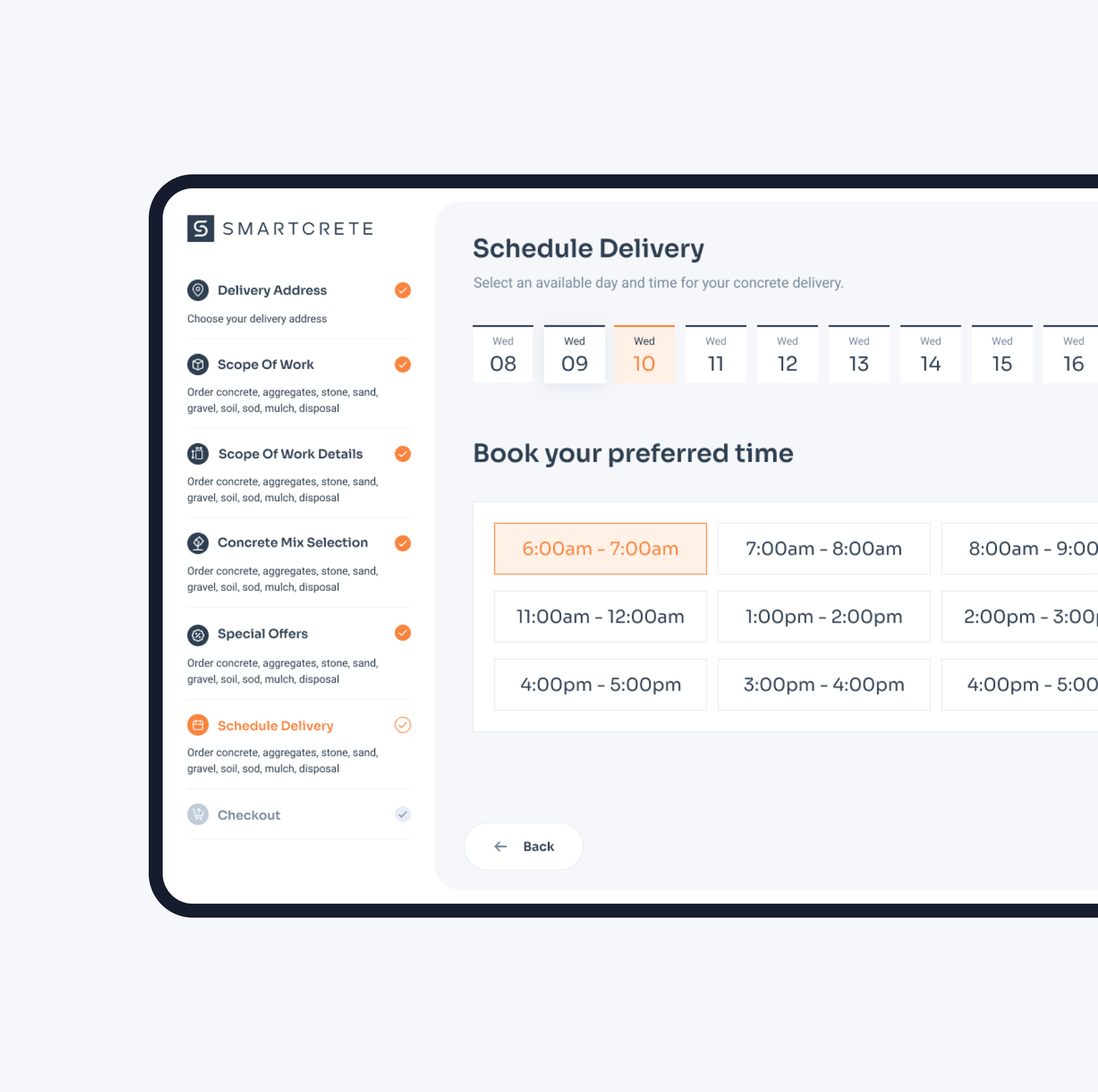
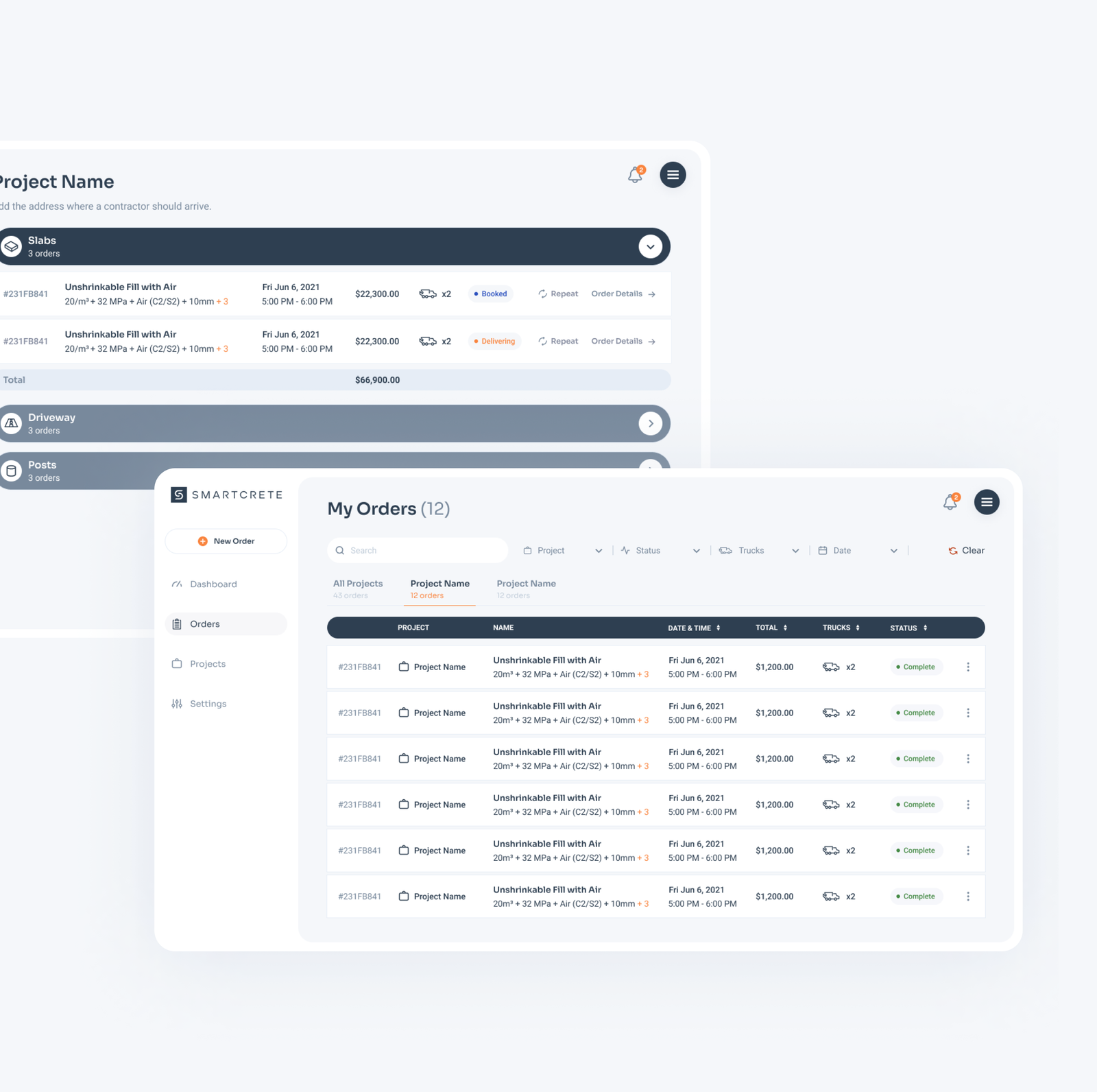
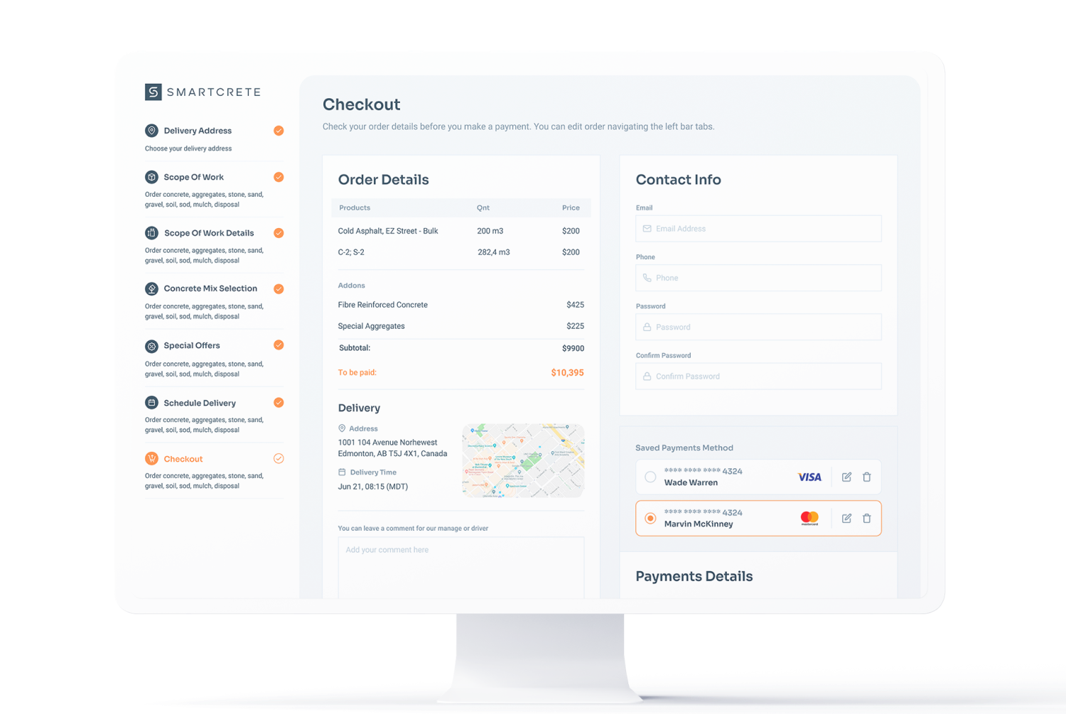
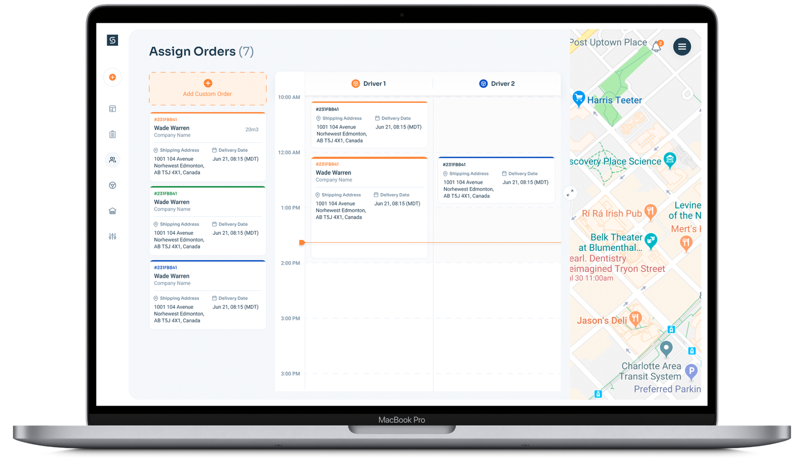
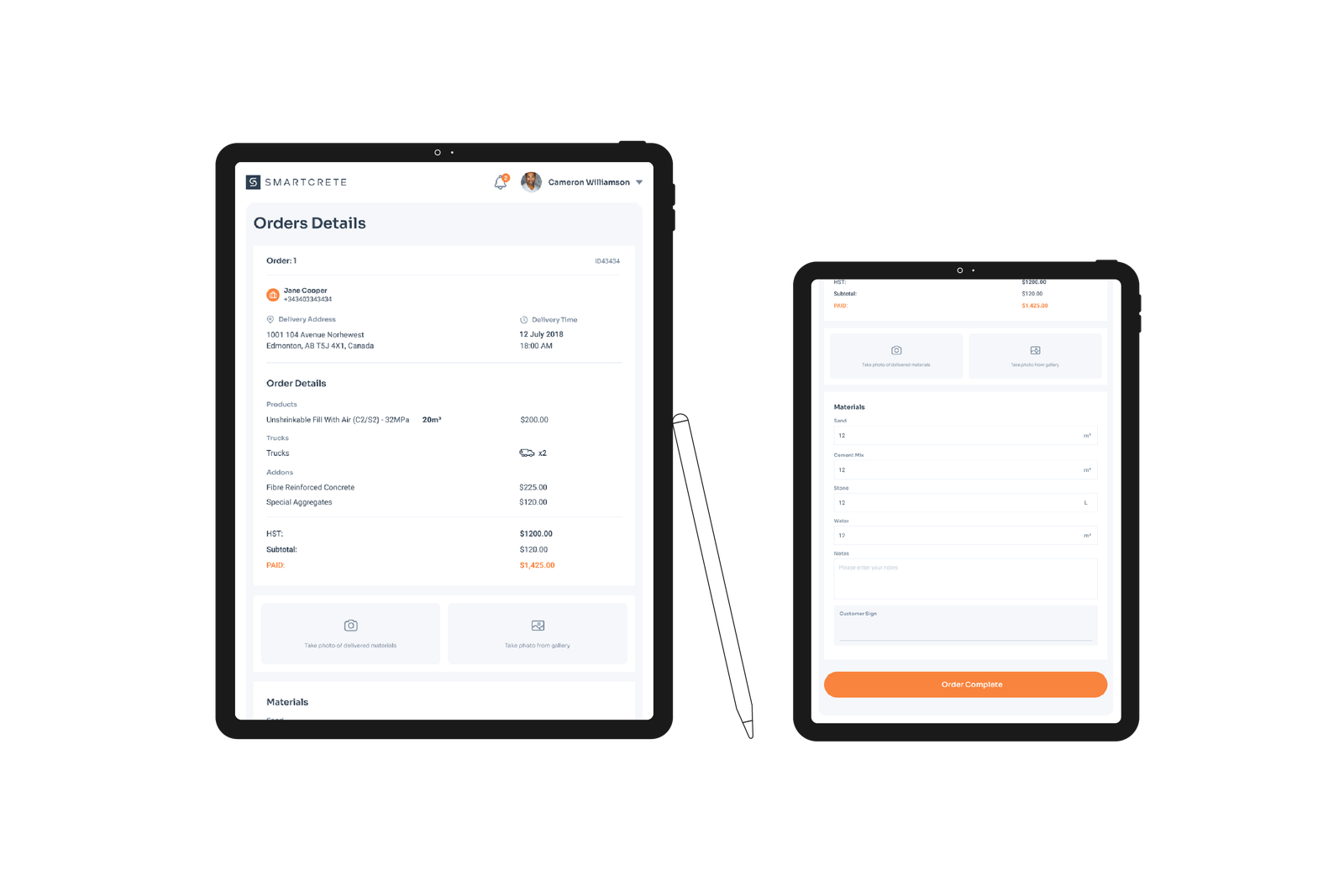
Additionally, we were to design and develop a web application that would house the company’s newly created proprietary algorithm that specifies how much concrete is needed by simply entering a few key dimensions of a project. The web app would also allow end users to place their concrete orders while allowing the internal staff to fulfill said orders. A tablet application for drivers to coordinate and fulfill orders was also to be created, and lastly, a standard marketing website to promote it all.
Brand Identity
Our approach for the identity was one that focused more so on the digital space. As pioneers of this business model within their industry we wanted to create as much credibility and trust between the brand to its target audience by presenting them as a tech company that delivered concrete as supposed to a concrete company that was in tech.
#2e3f51
#f9843e
#fff1e6
#78899c
#c0ccd9
#e6edf6
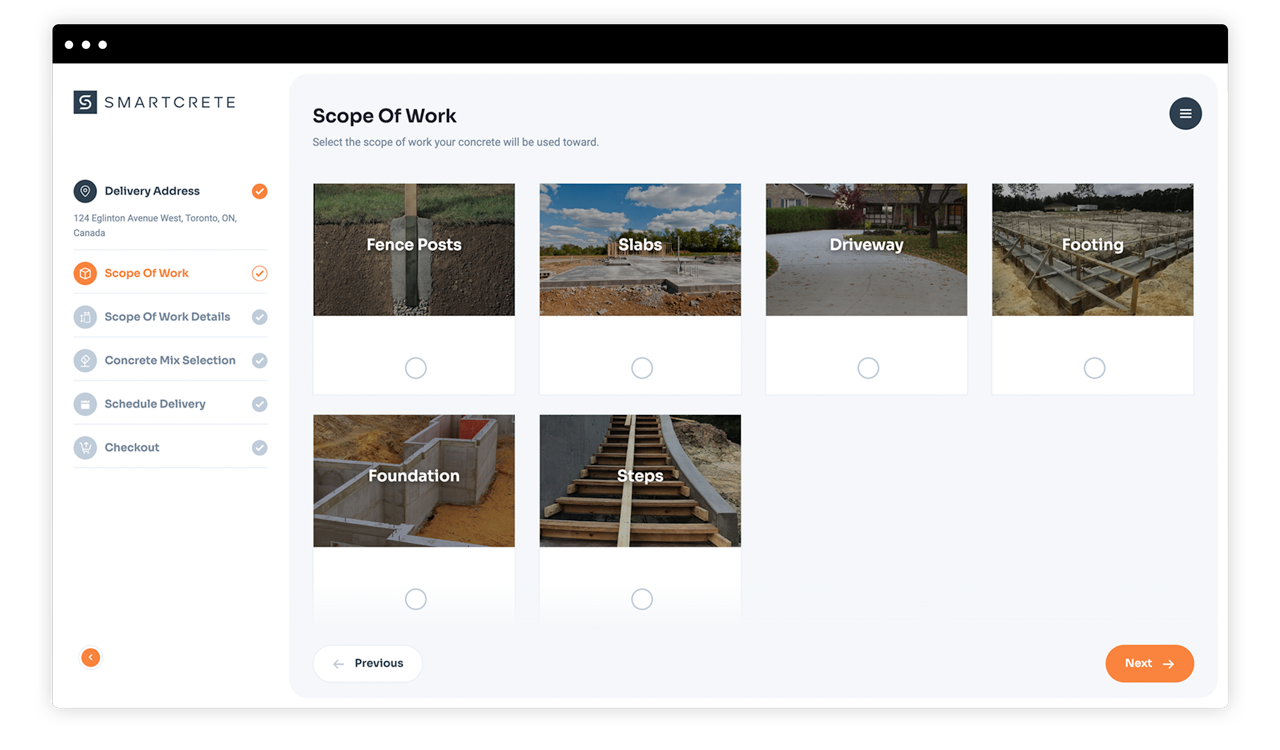
Web App
The traditional concrete ordering process has long been deemed as a nightmare user experience by customers. As a way to streamline said process, we redesigned it to be fully digital in which users can now order their concrete completely online while never having to talk to anyone. The 2 minute ordering process is made simple for both professionals and DIYers alike via Smartcrete’s proprietary algorithm.
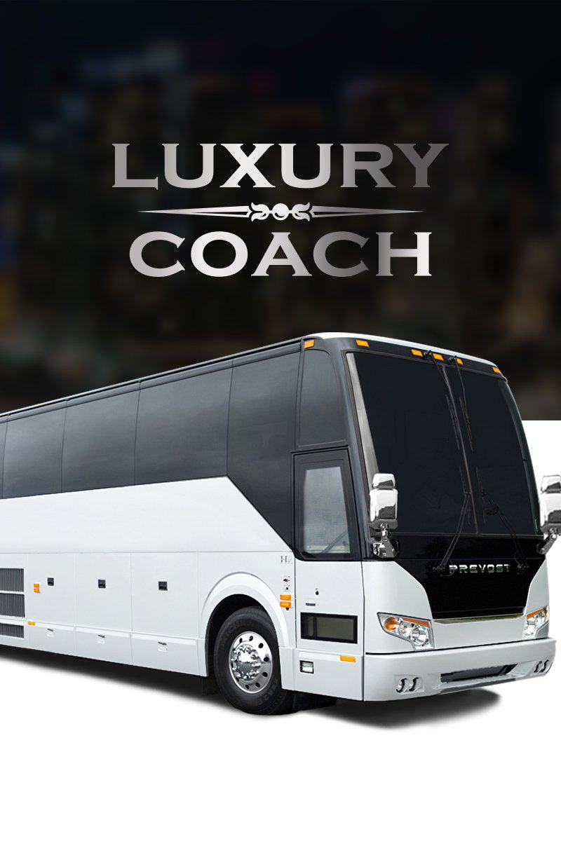
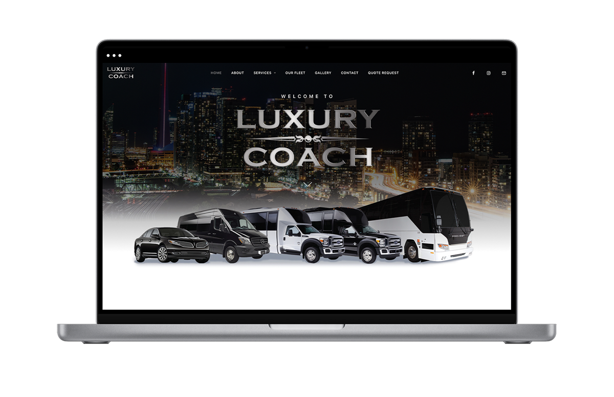
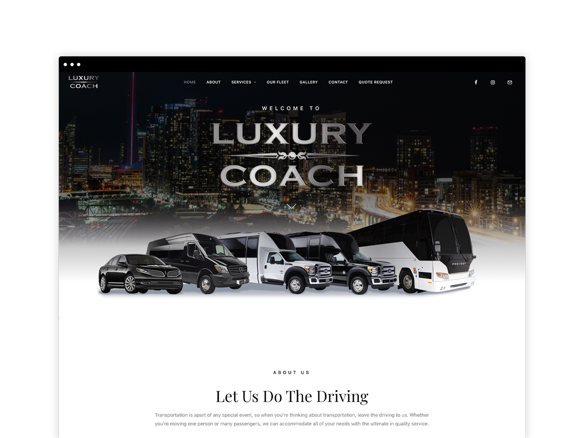
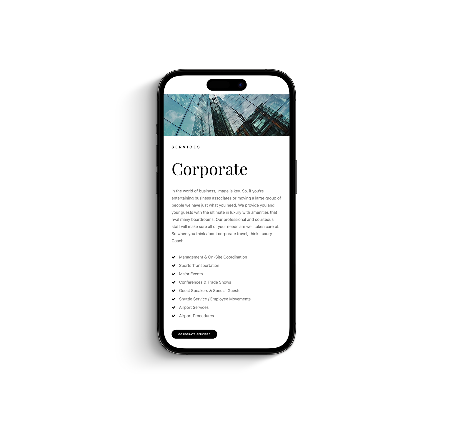
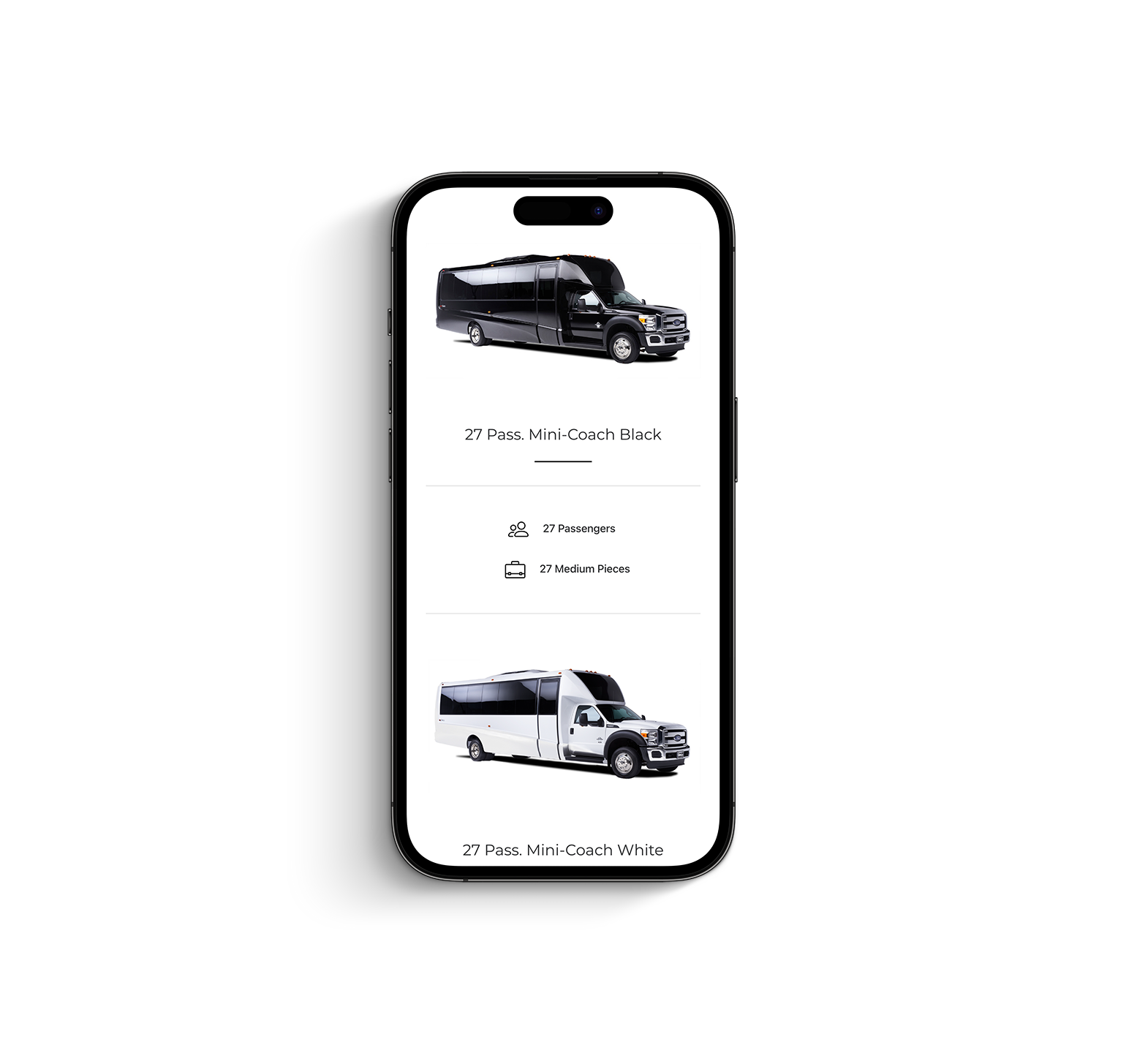
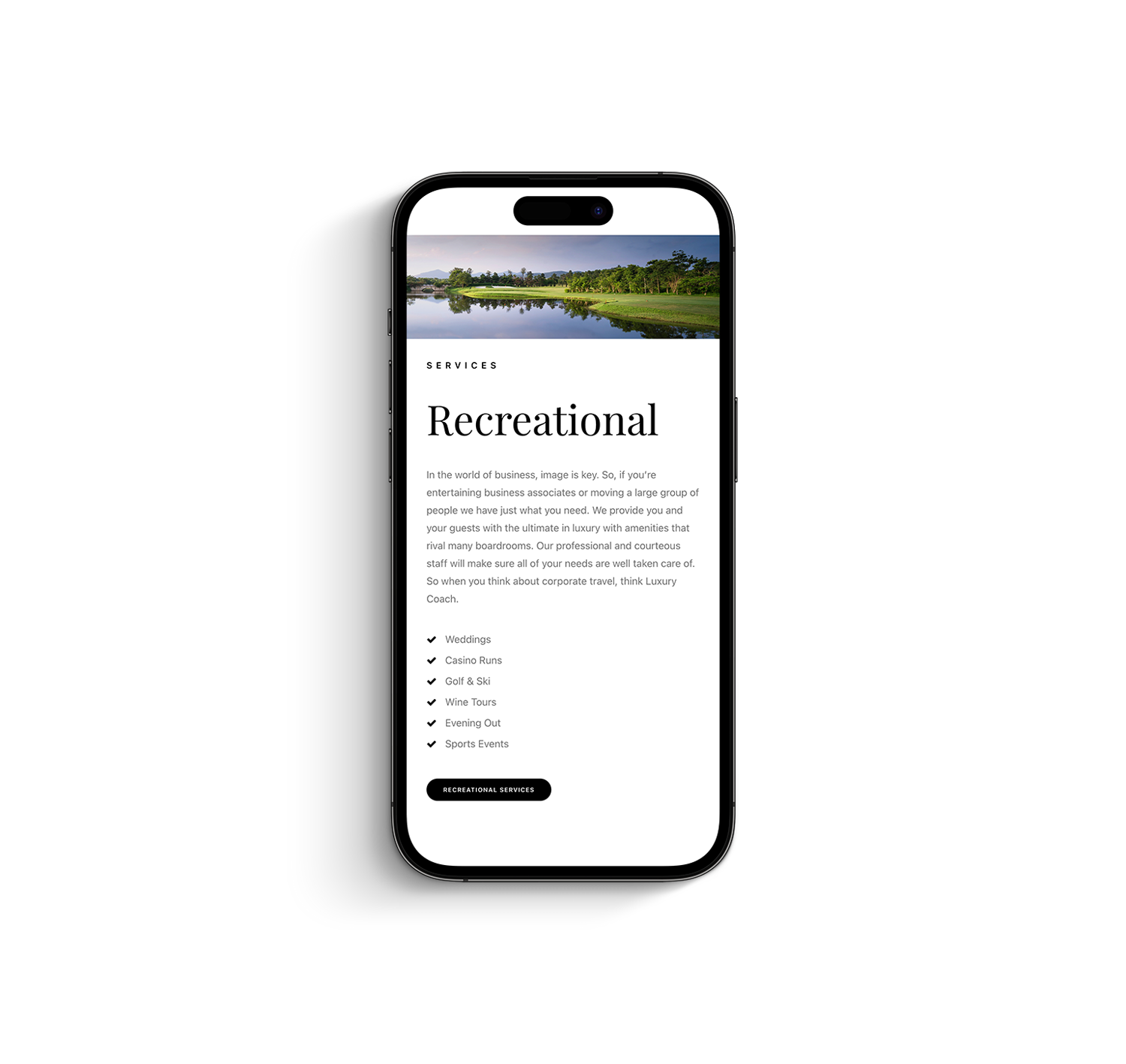
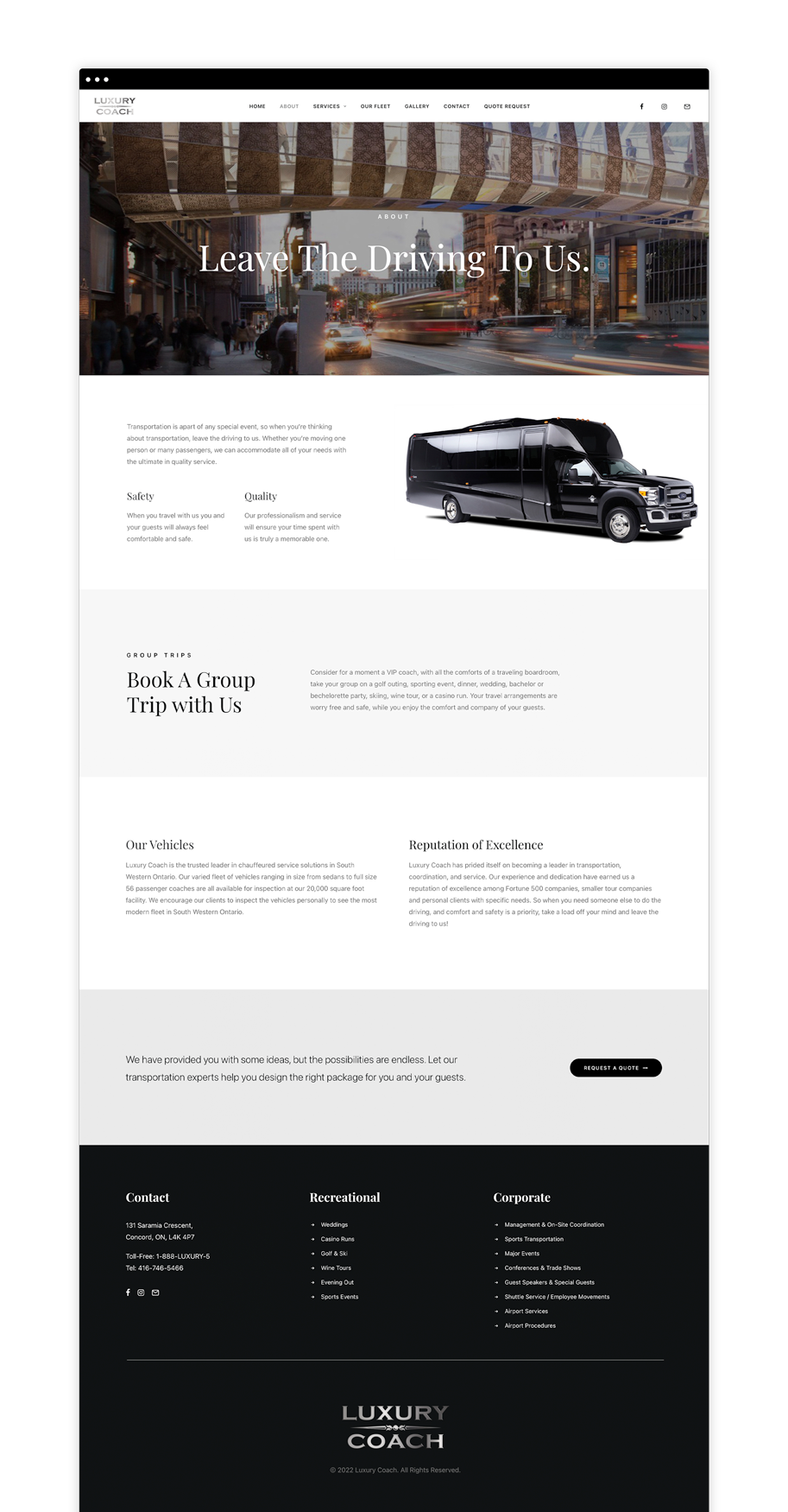
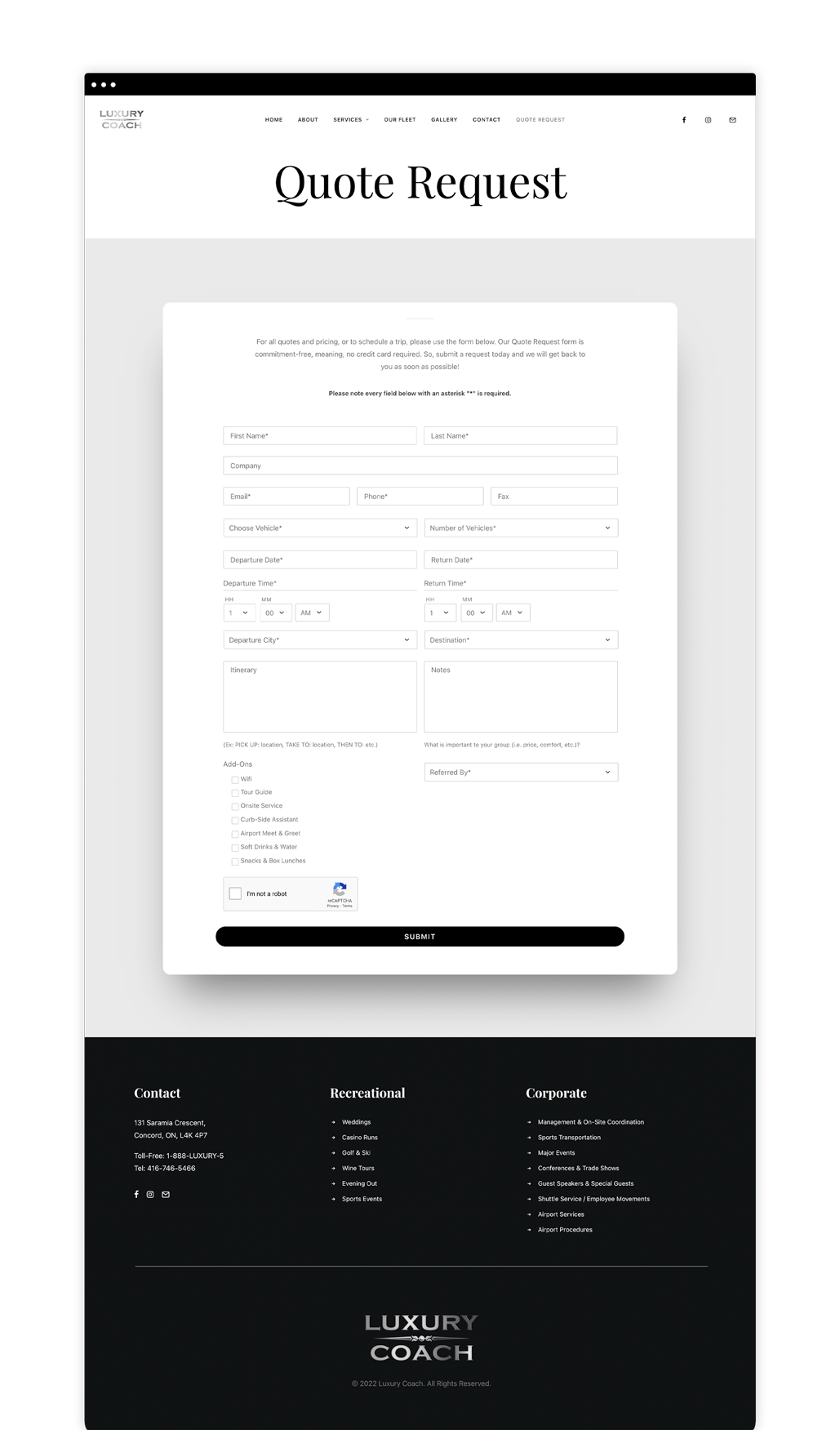
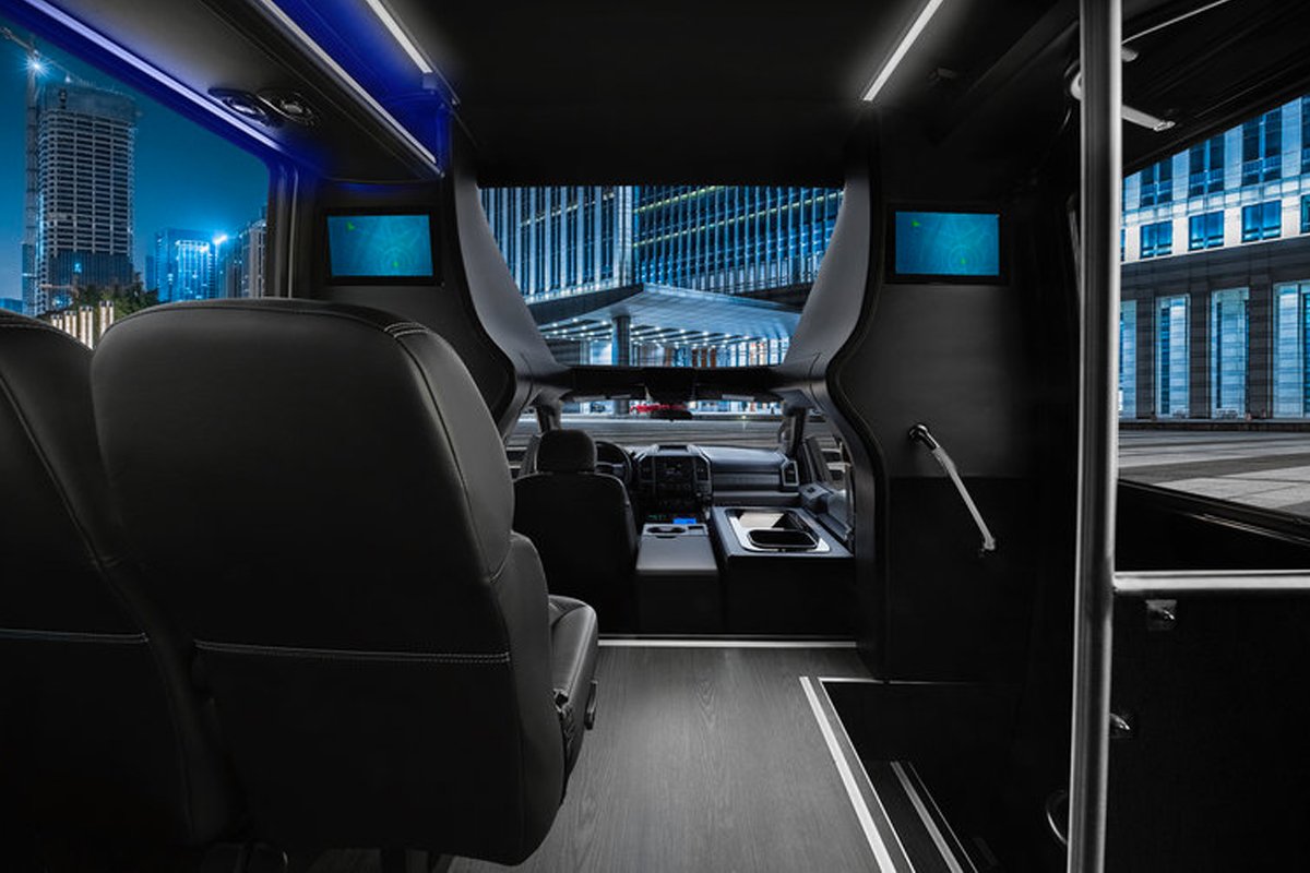
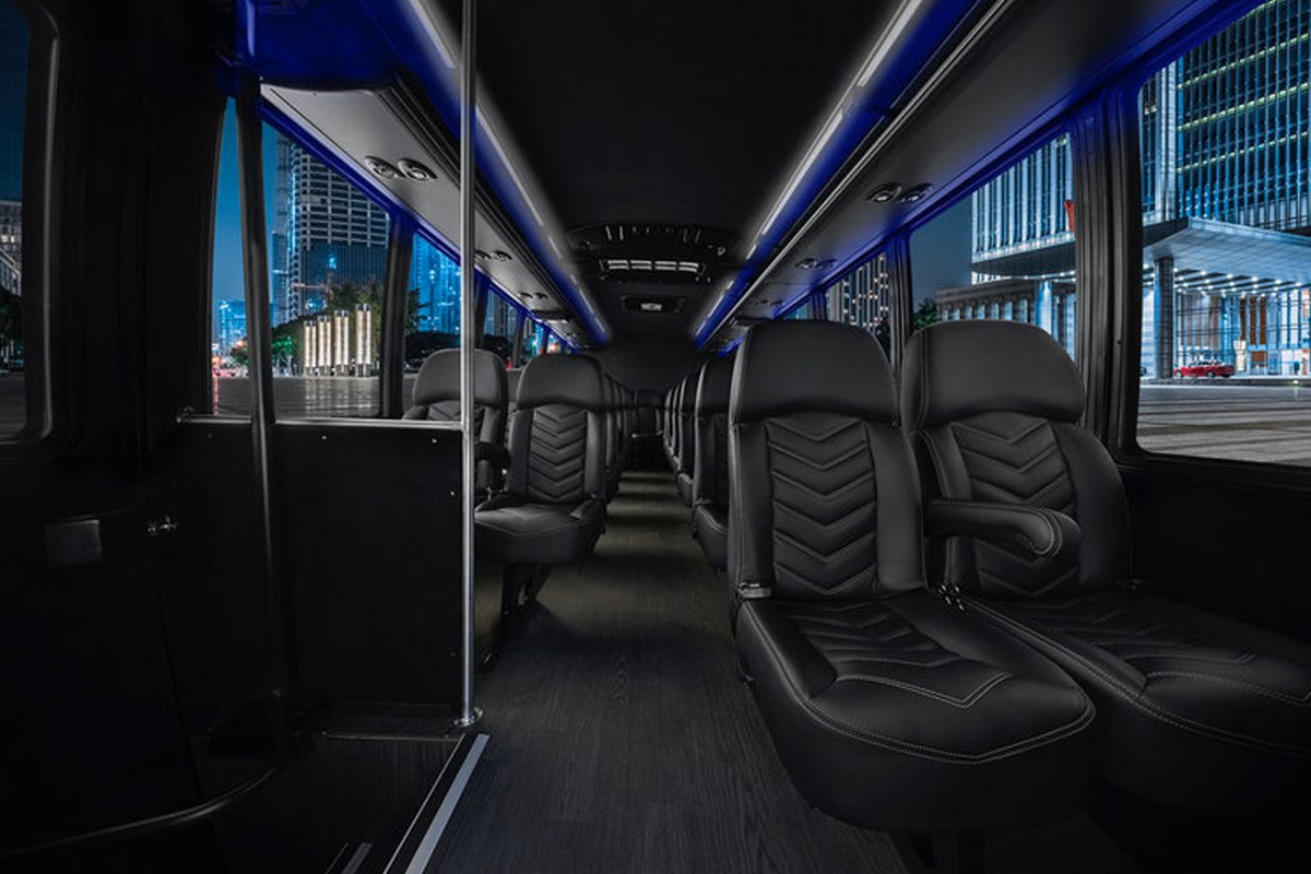
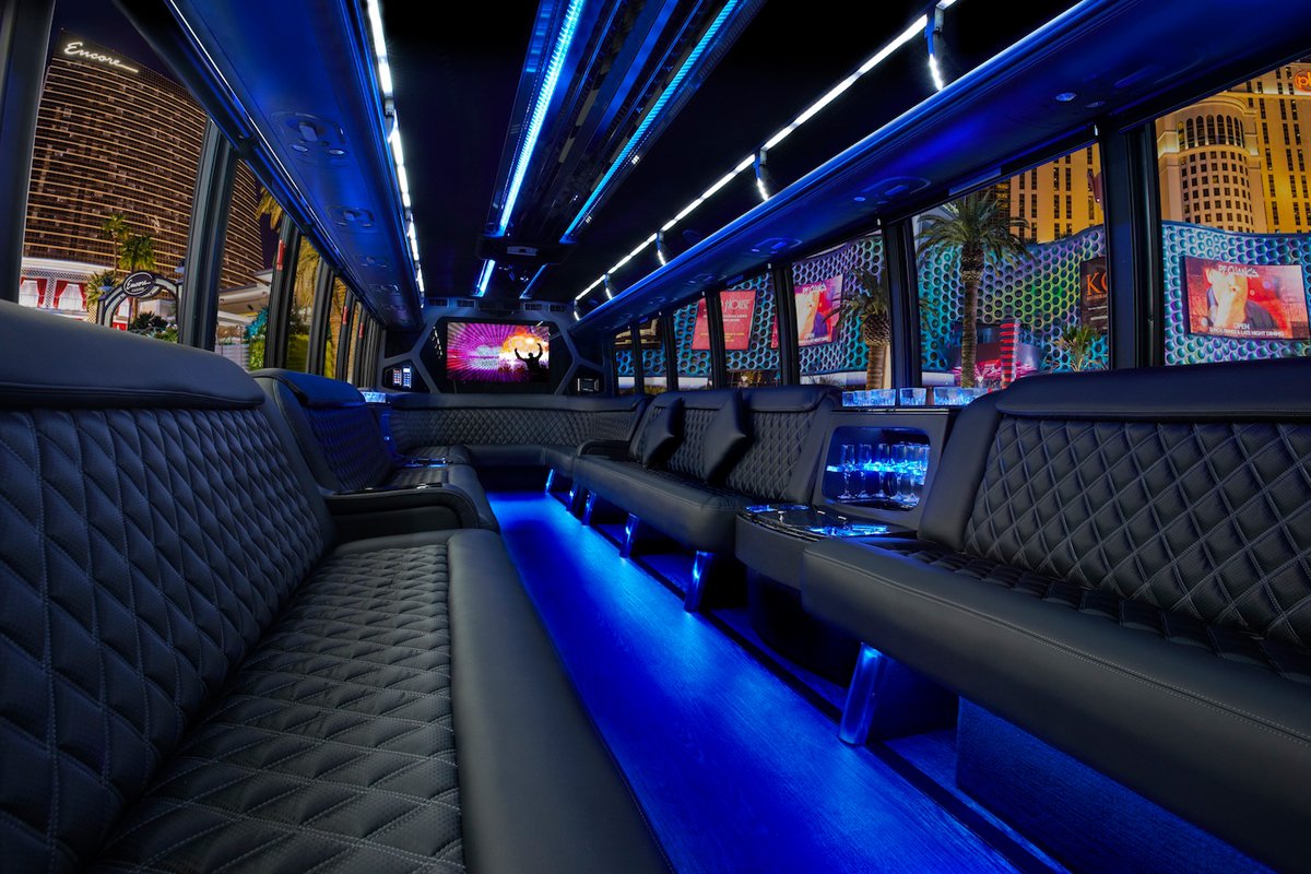
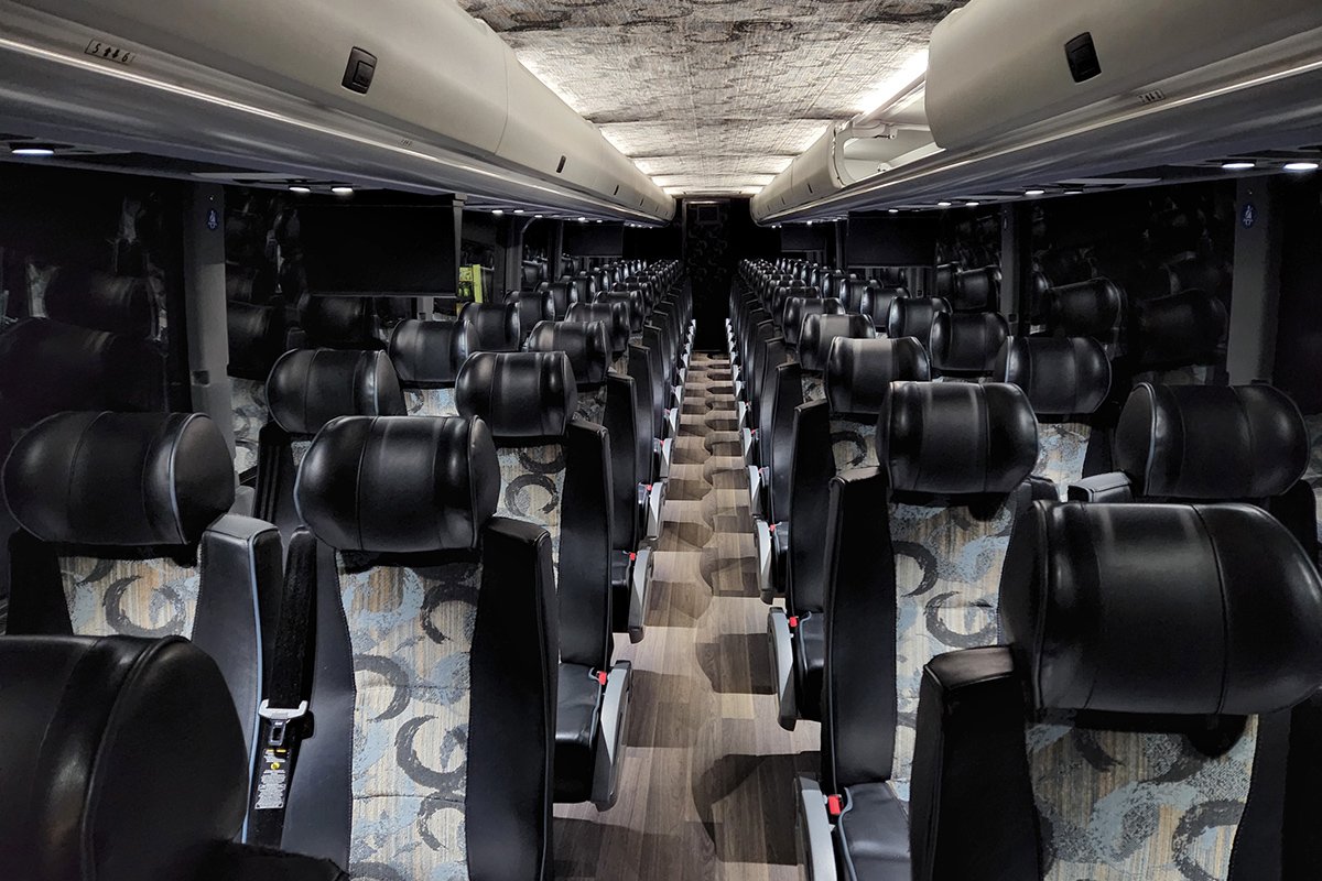
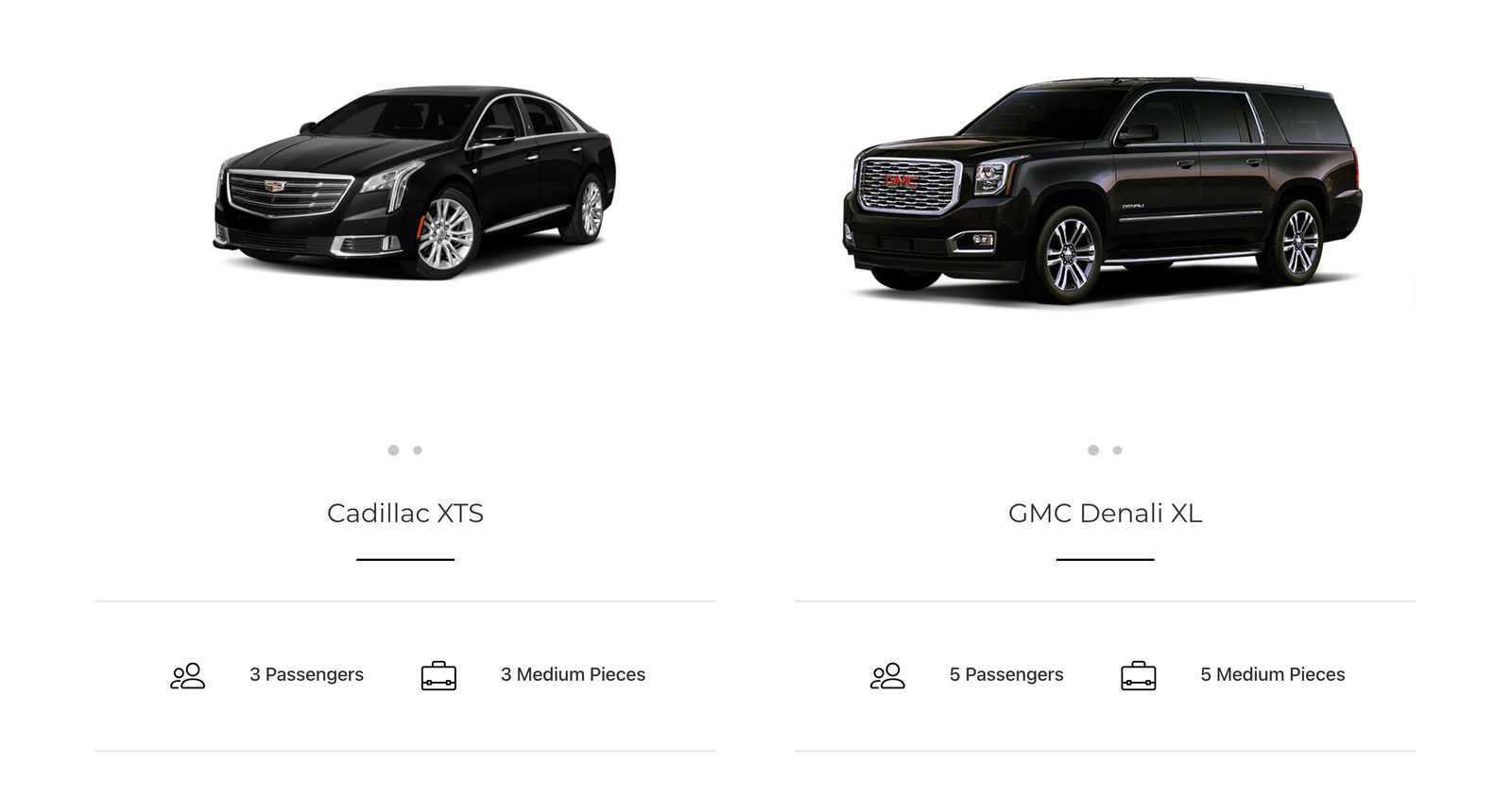
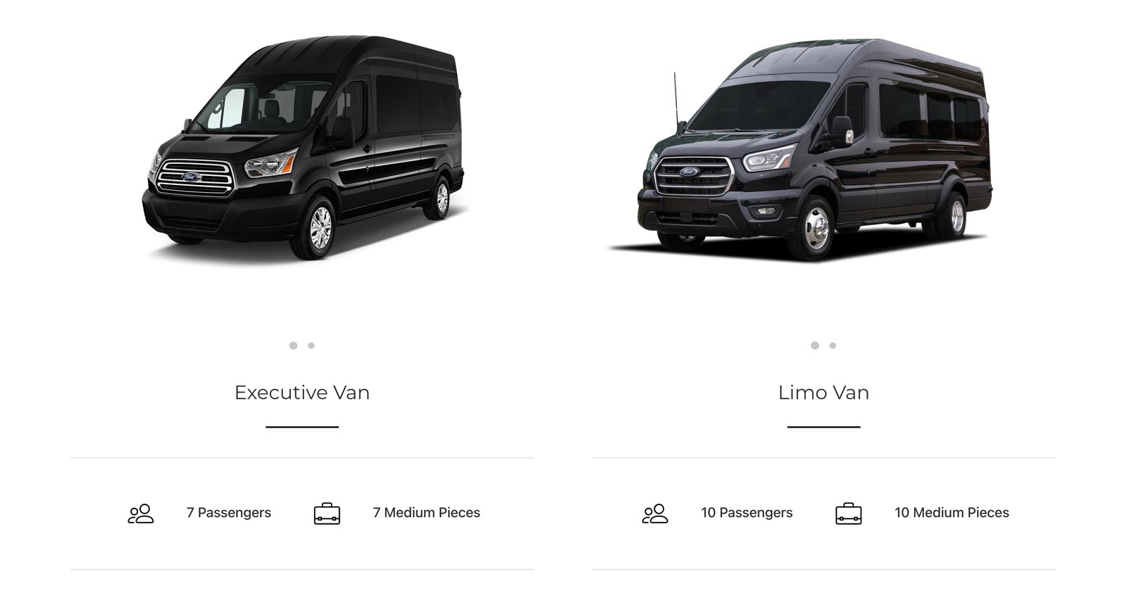
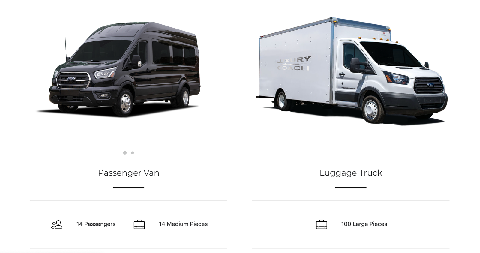
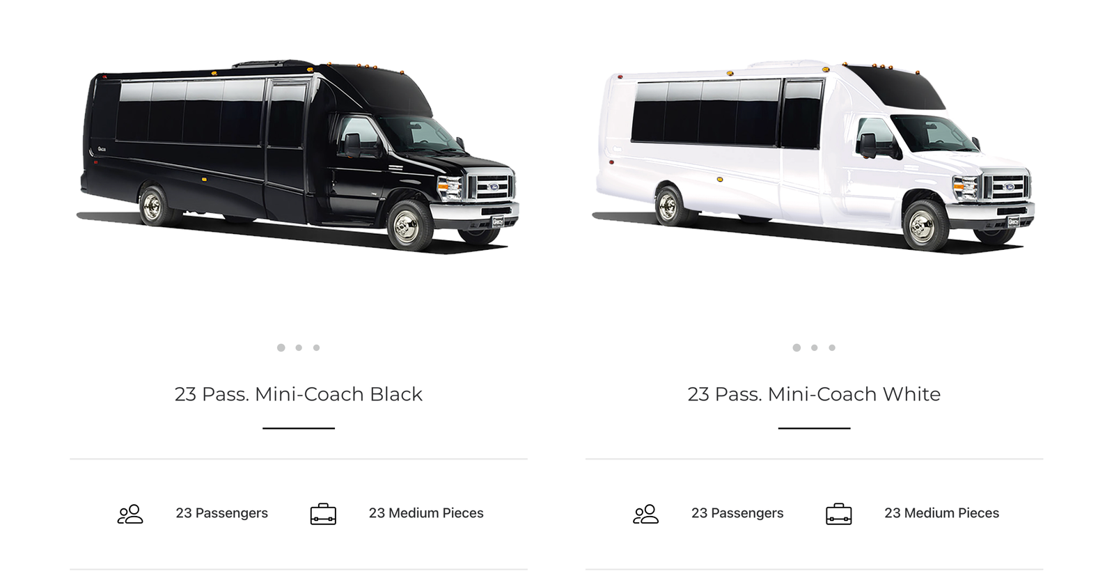
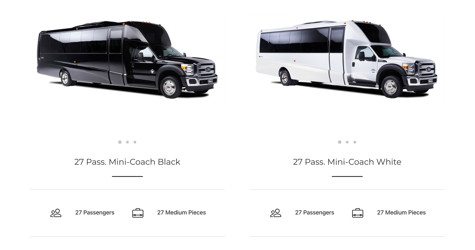
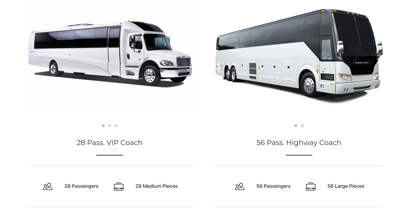
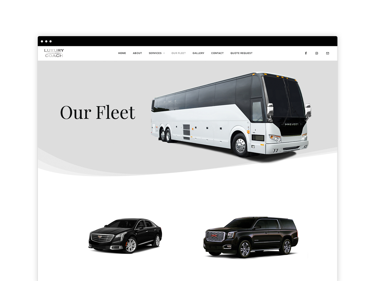
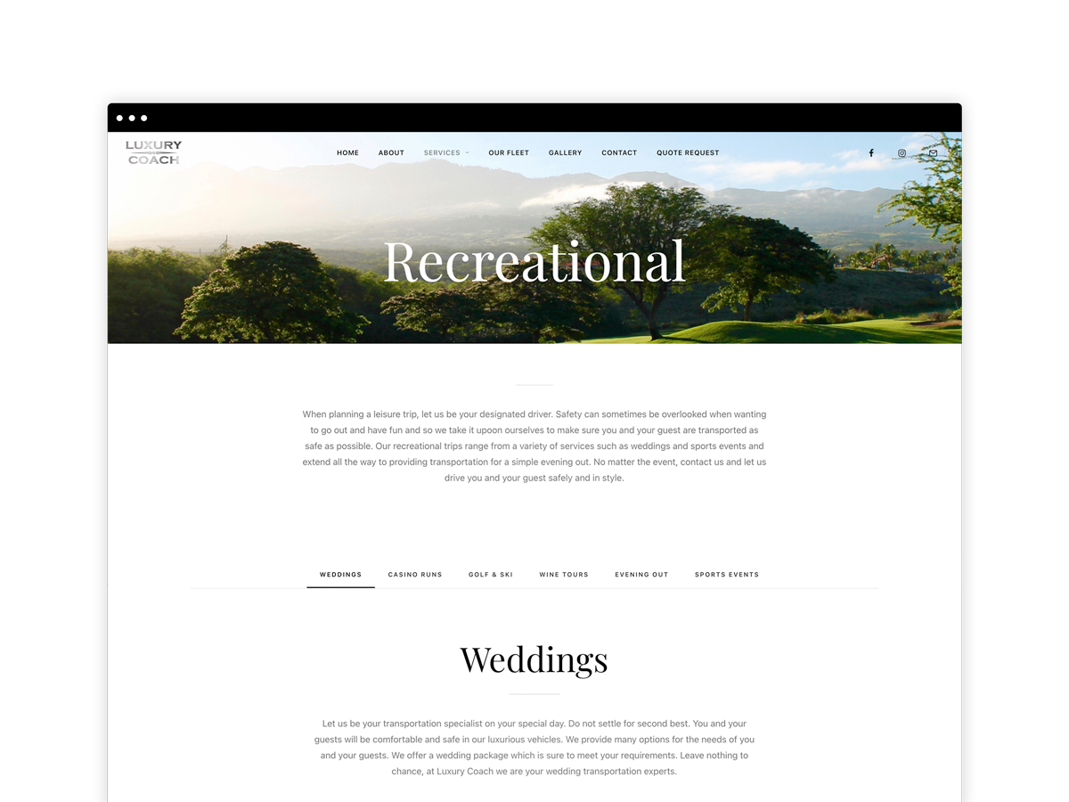
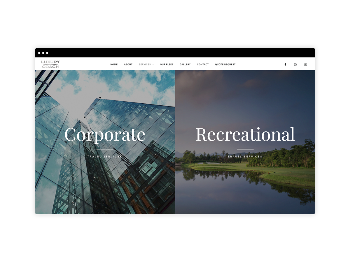
Luxury Coach is a trusted leader in chauffeured and coordination service solutions in South Western Ontario who’s fleet of vehicles ranges in size from sedans to full size 56 passenger coaches.
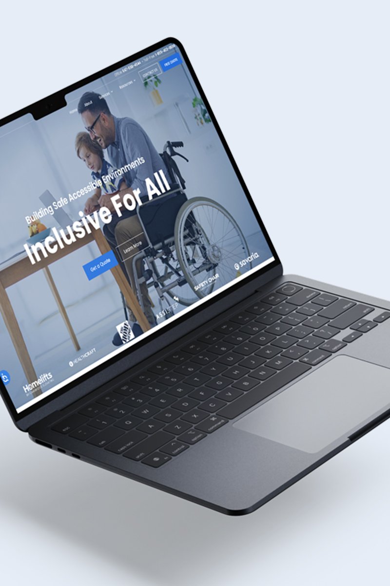
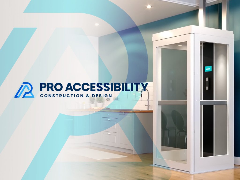
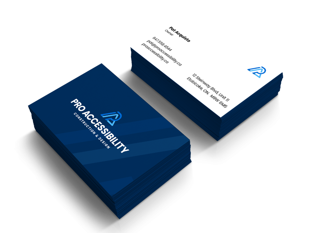
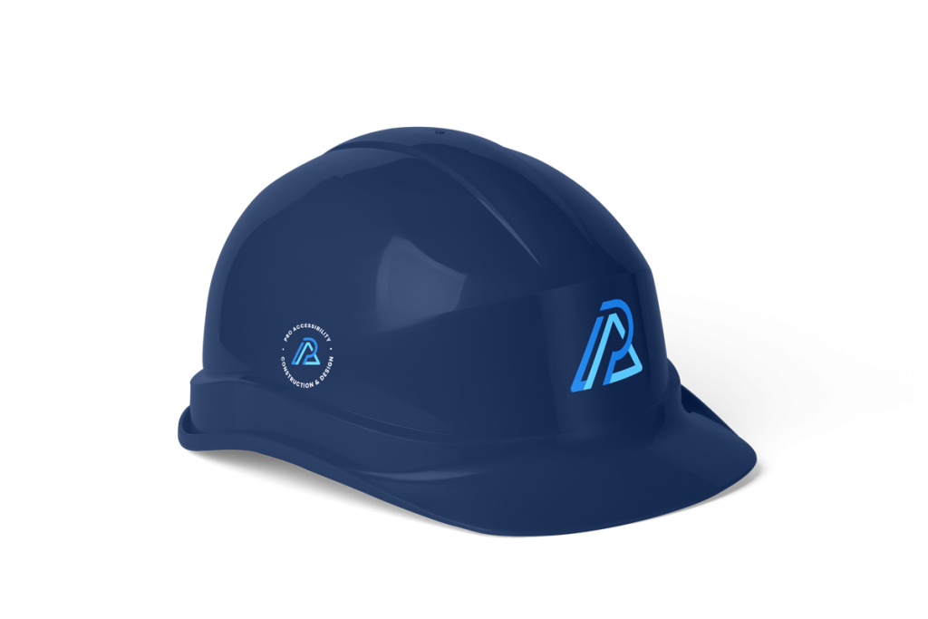
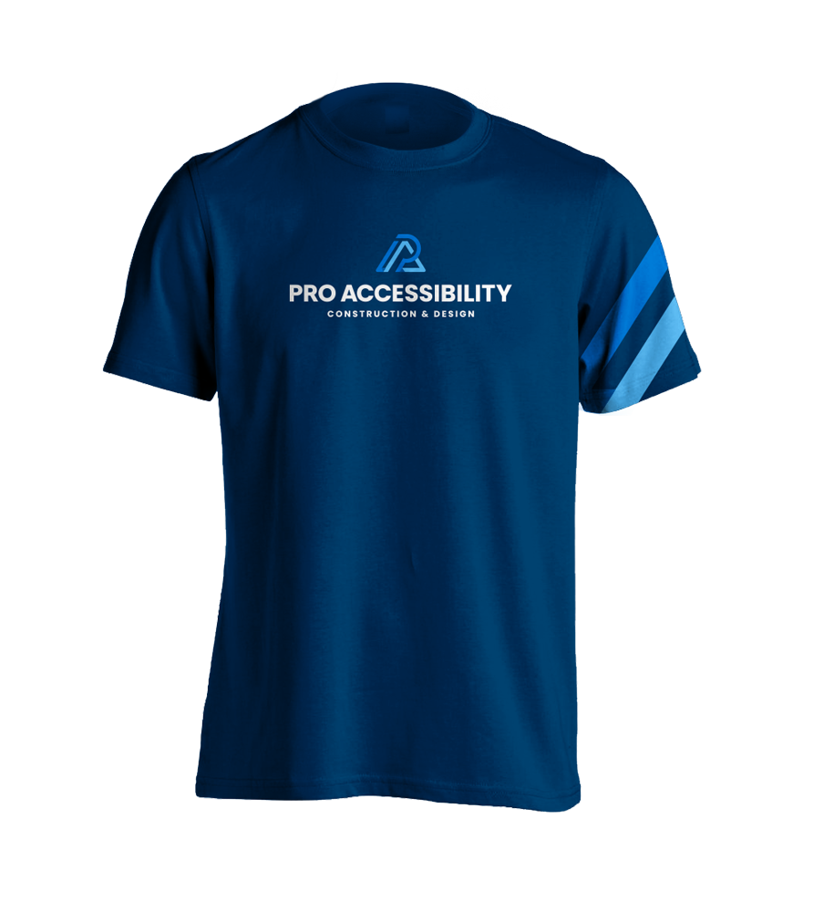
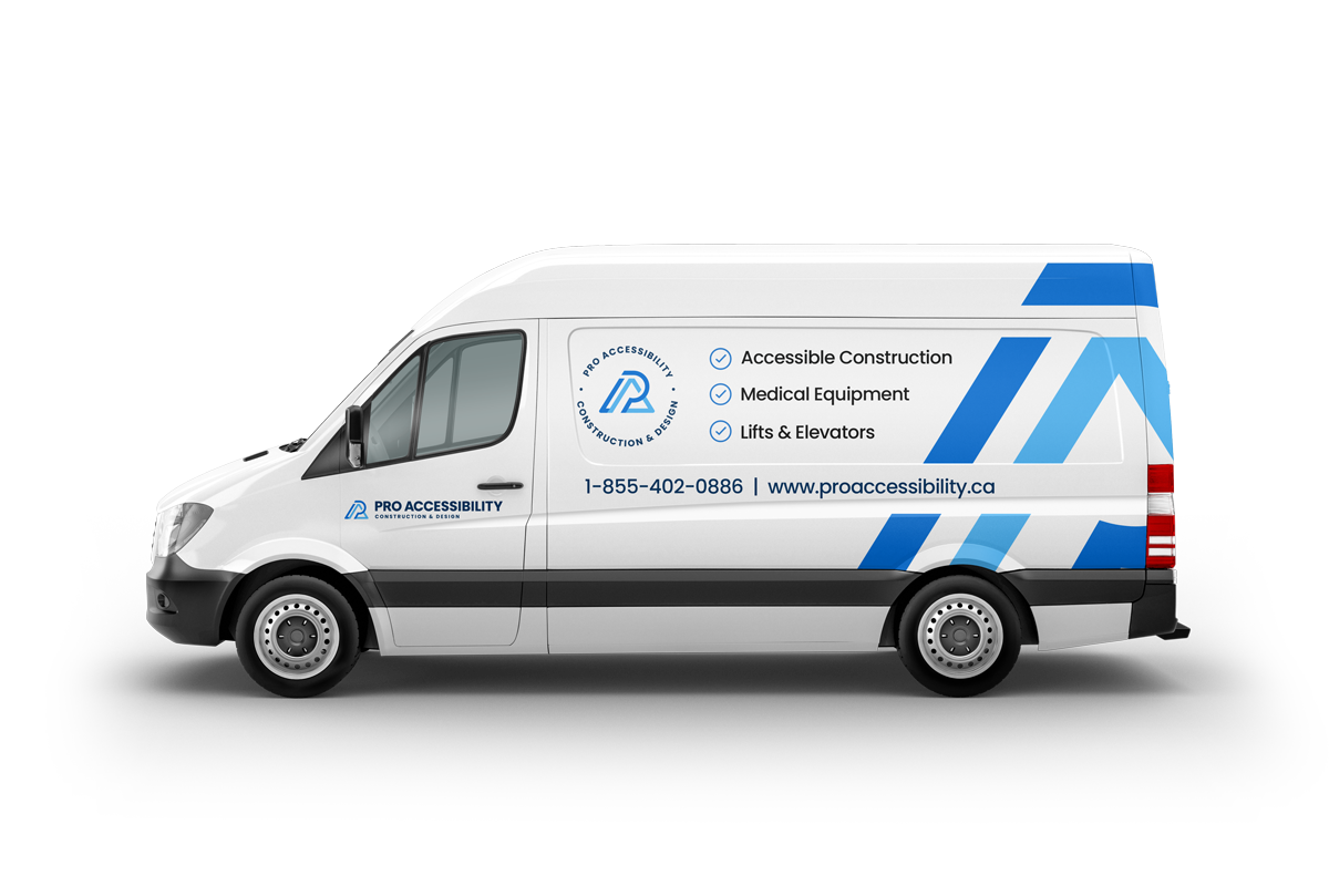
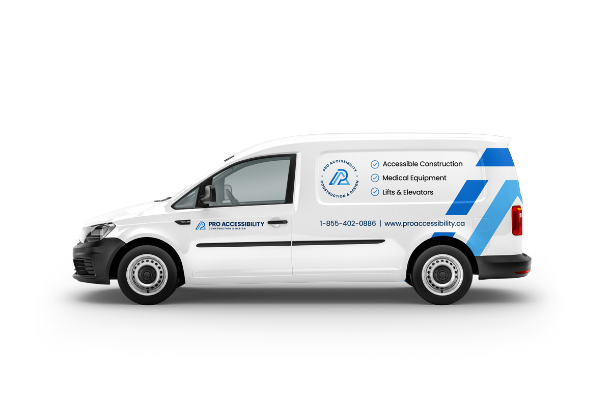
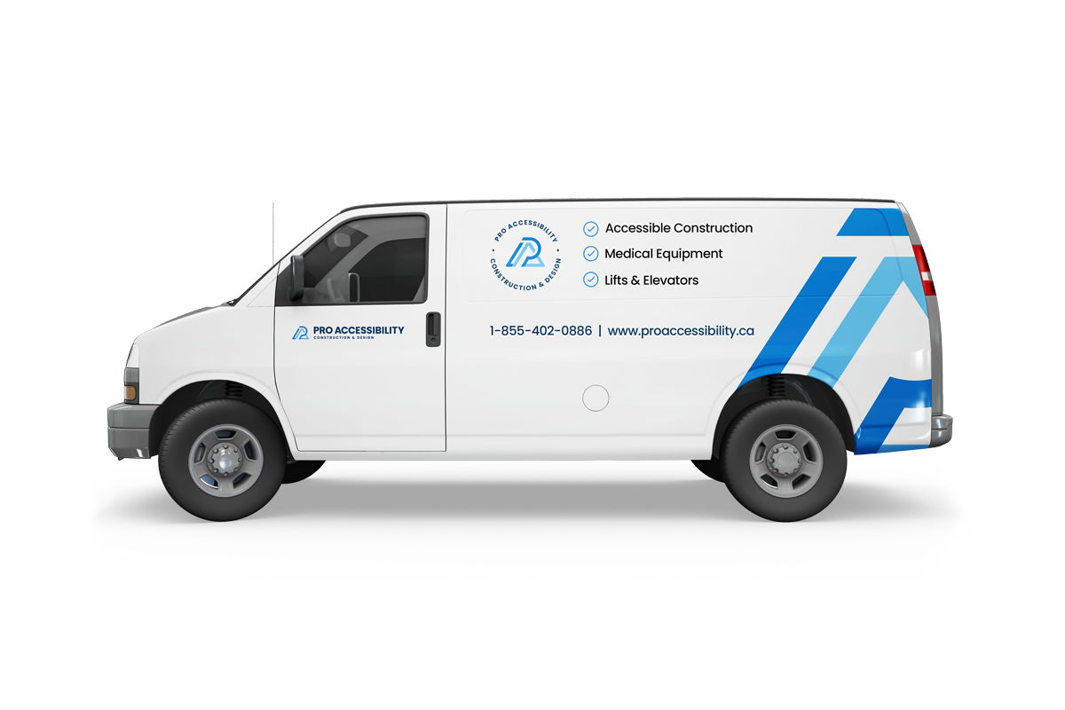
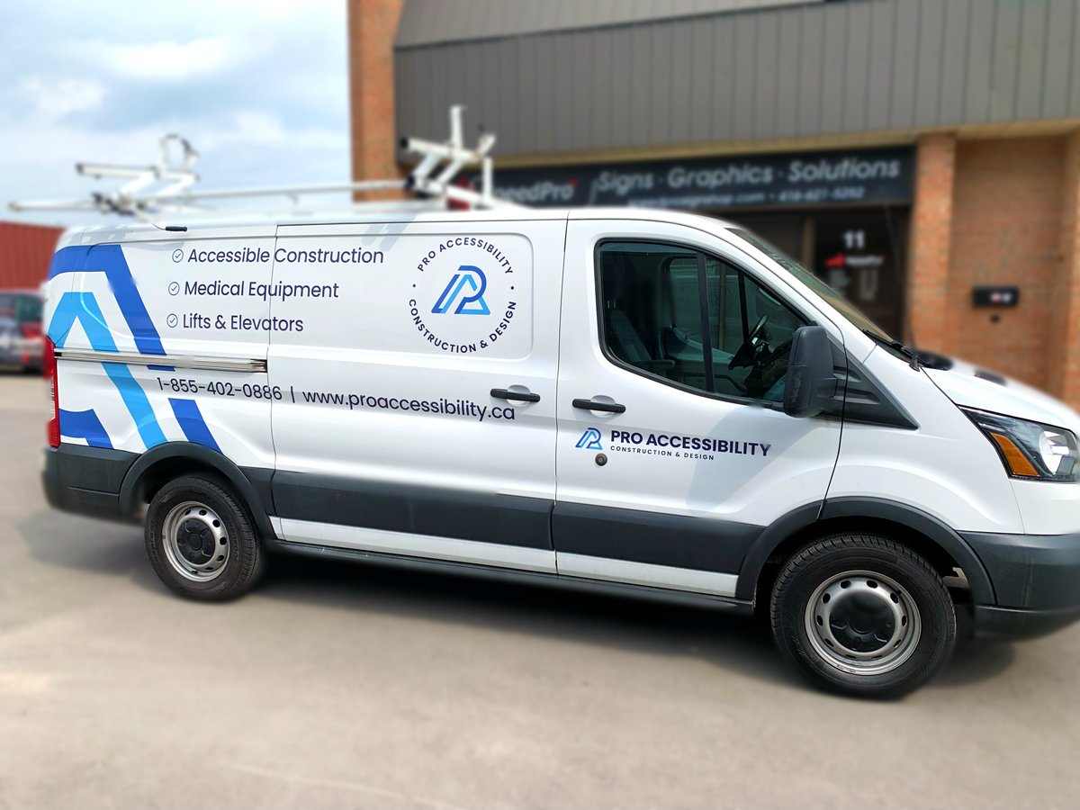
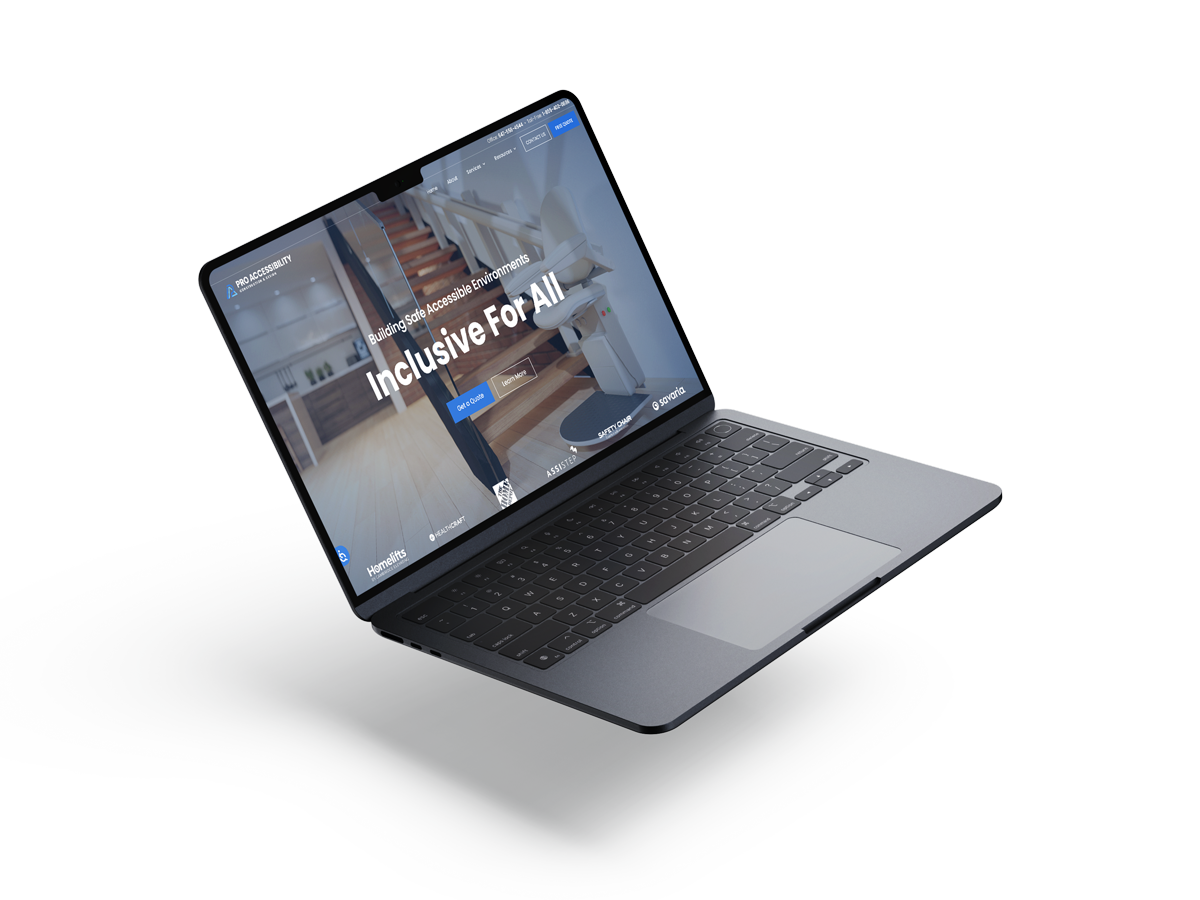
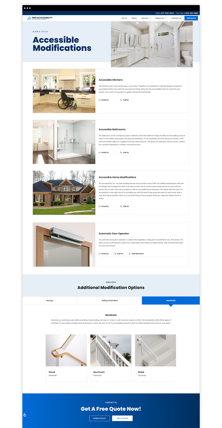
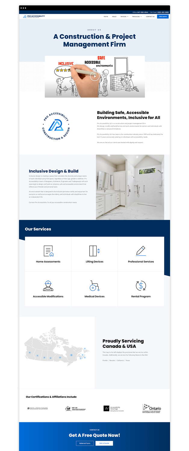
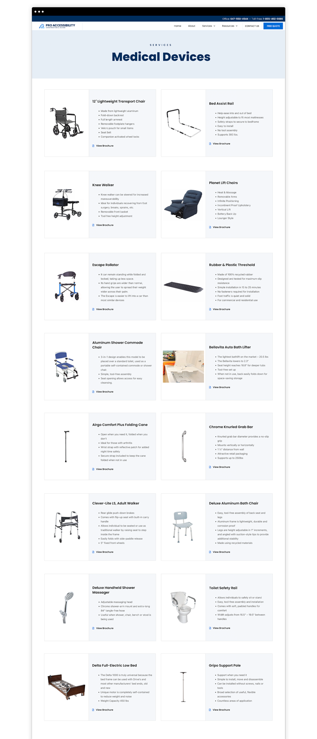
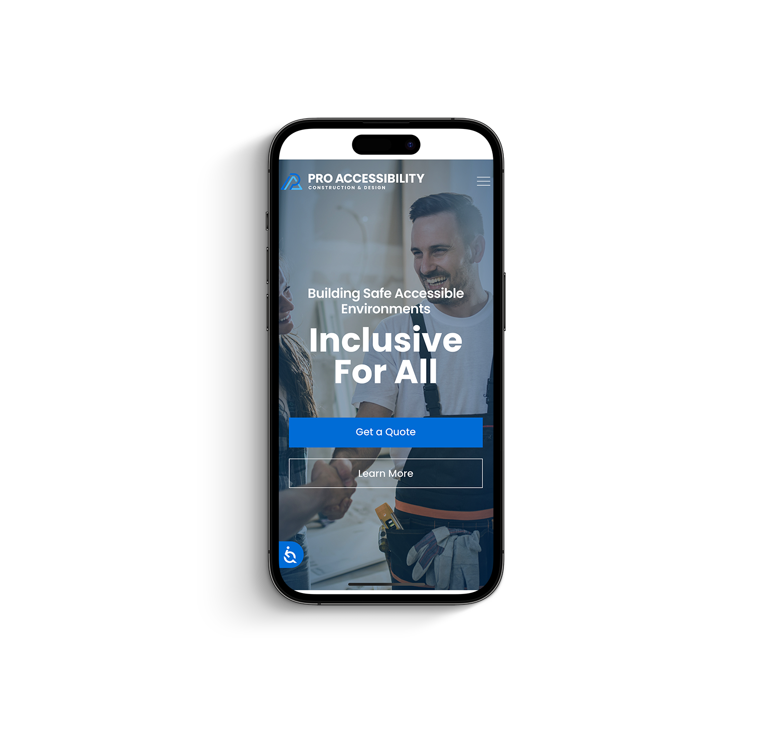
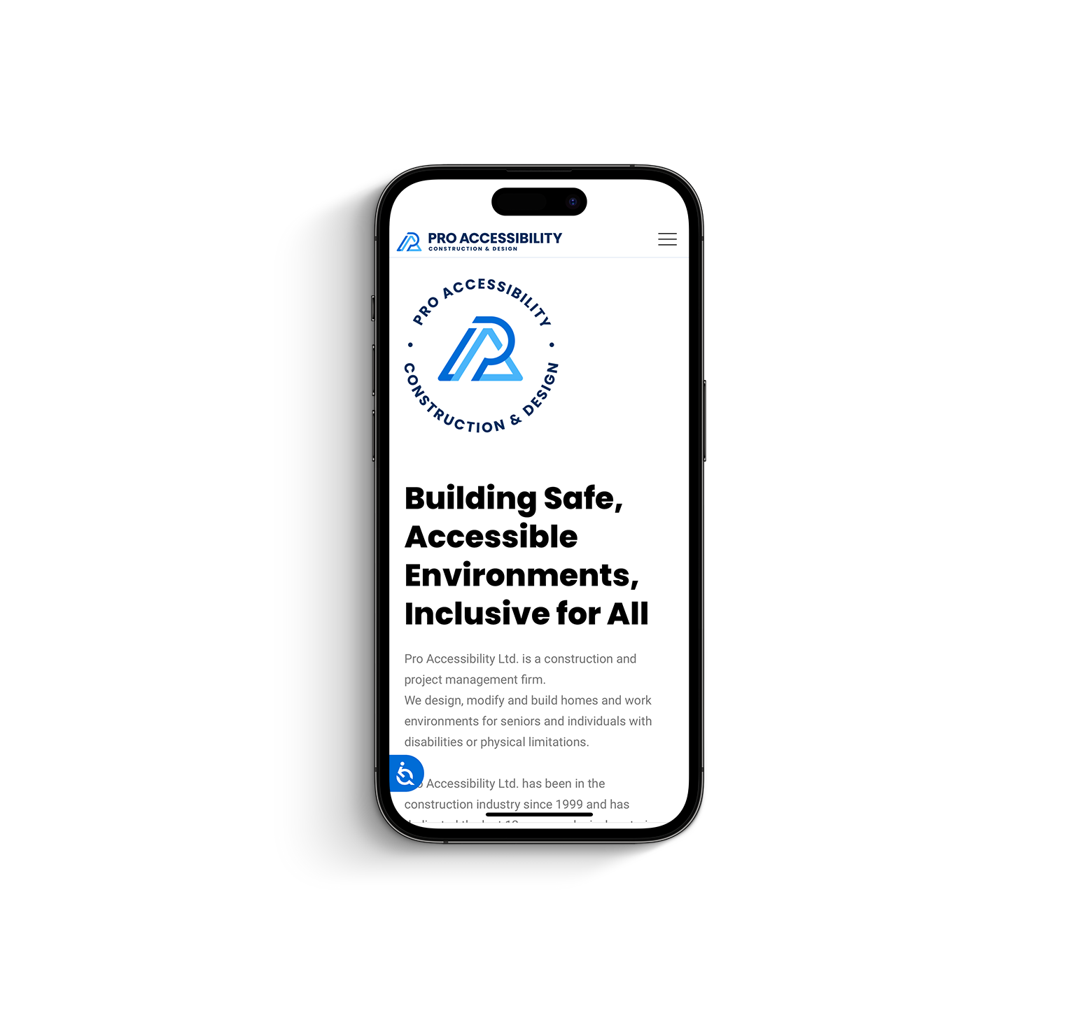
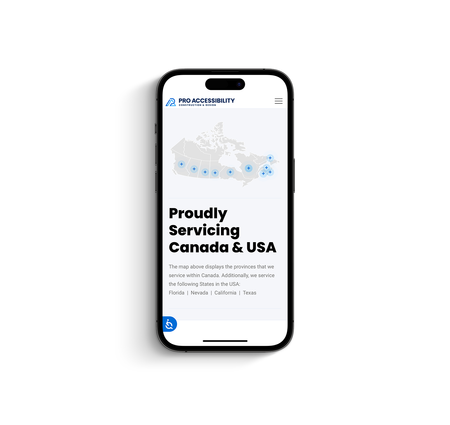
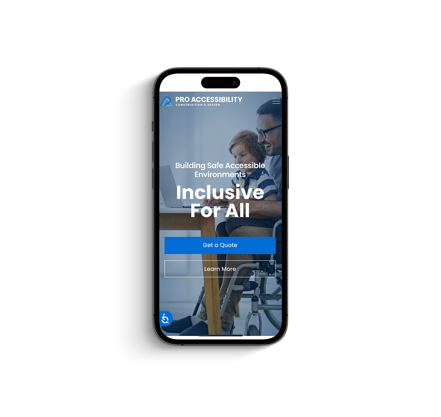
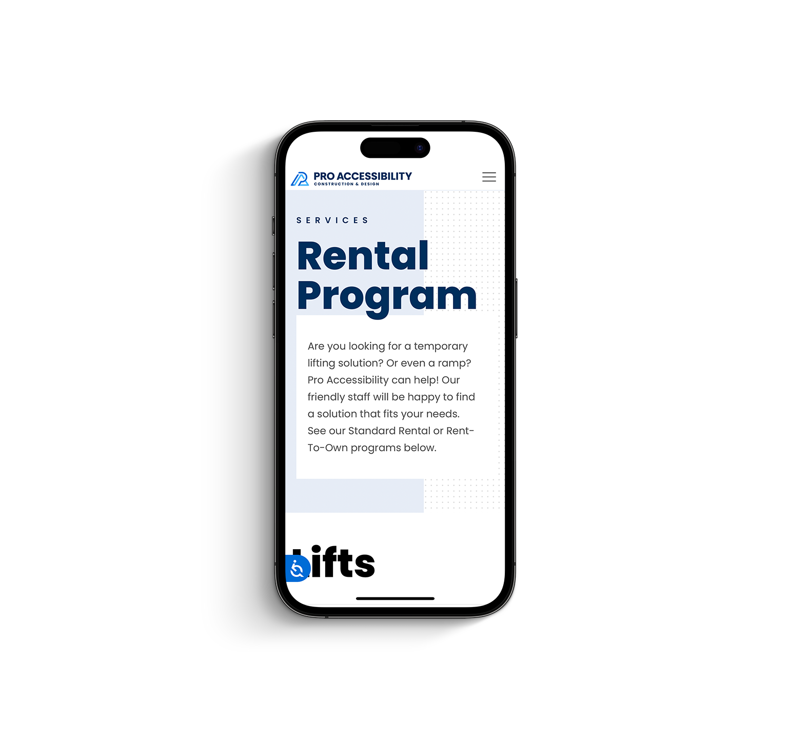
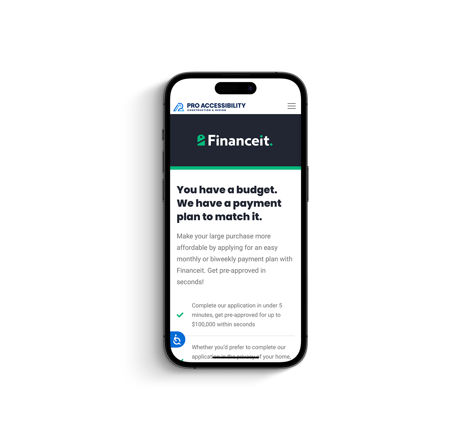
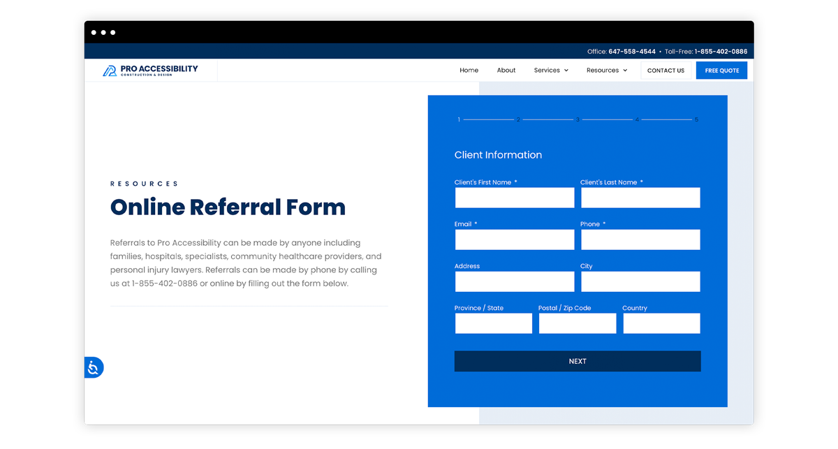
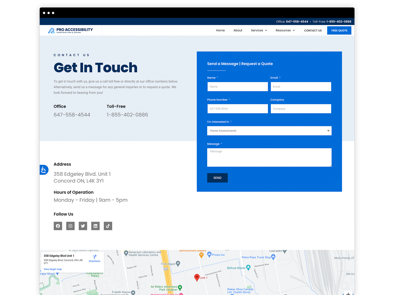
Pro Accessibility Ltd. is a construction and project management firm. They design, modify and build homes and work environments for seniors and individuals with physical and or mobility limitations.
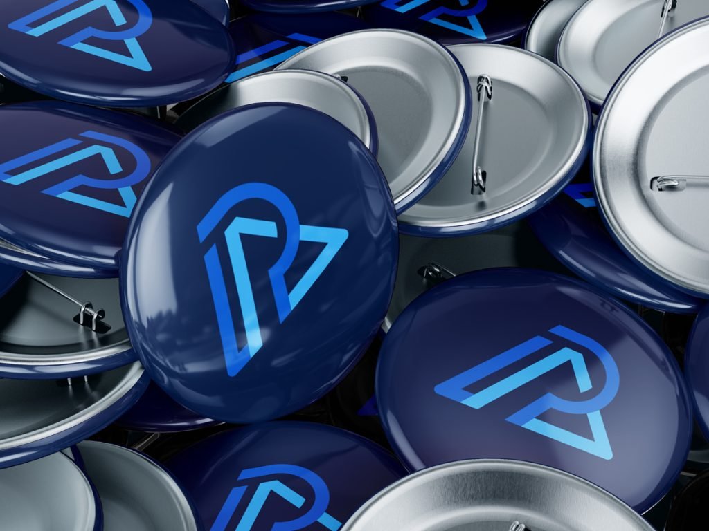
The Brand Identity
The Pro Accessibility logo was designed to embody two of the main values it provides its clients – mobility and structure. Angled lines were used to convey movement and mobility while the strong bold lines along with the letter ‘A’ represent structure. All in all, a ‘PA’ monogram was used to add individuality and character to the logo that will better be suited to represent the brand Pro Accessibility.