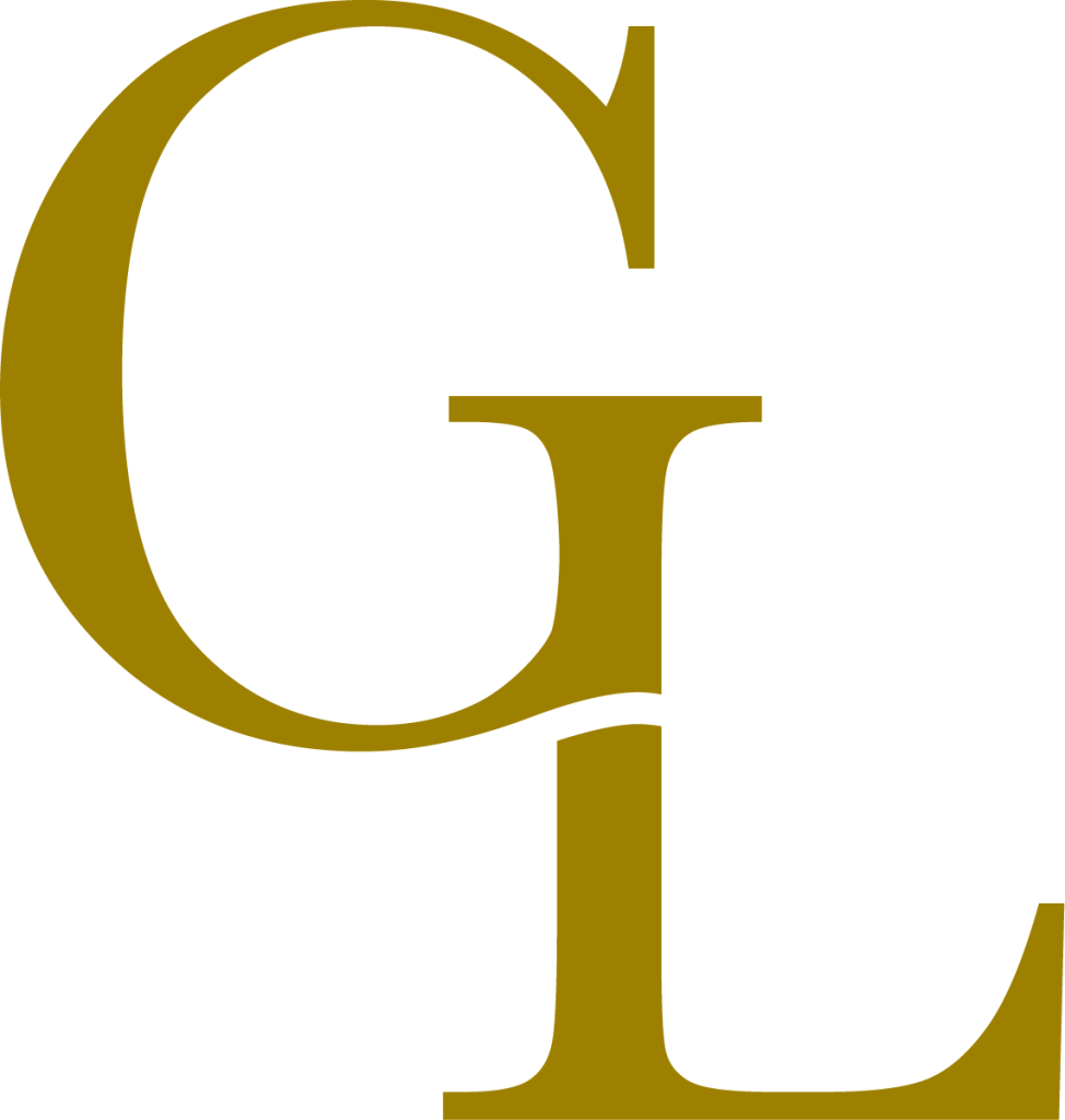
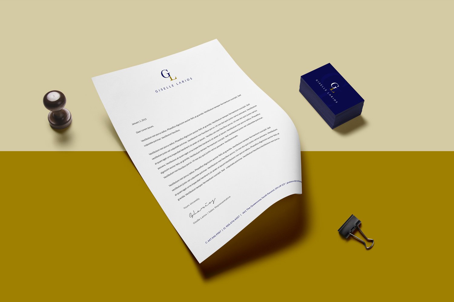
Giselle Larios is a brand representative of the Real Estate Sales Rep – Giselle Larios. Known for aiding clients in the buying and selling of real estate, the Giselle Larios’ brand prides itself on delivering excellent service with real results.
The Brand Identity
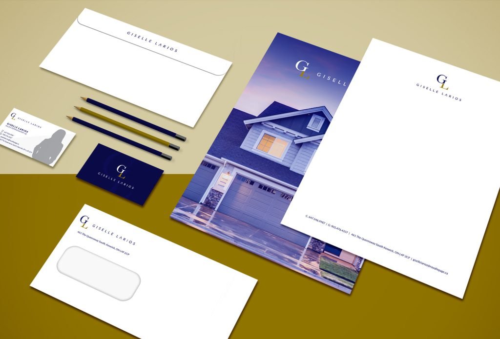
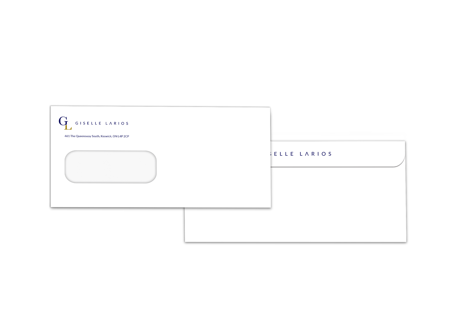
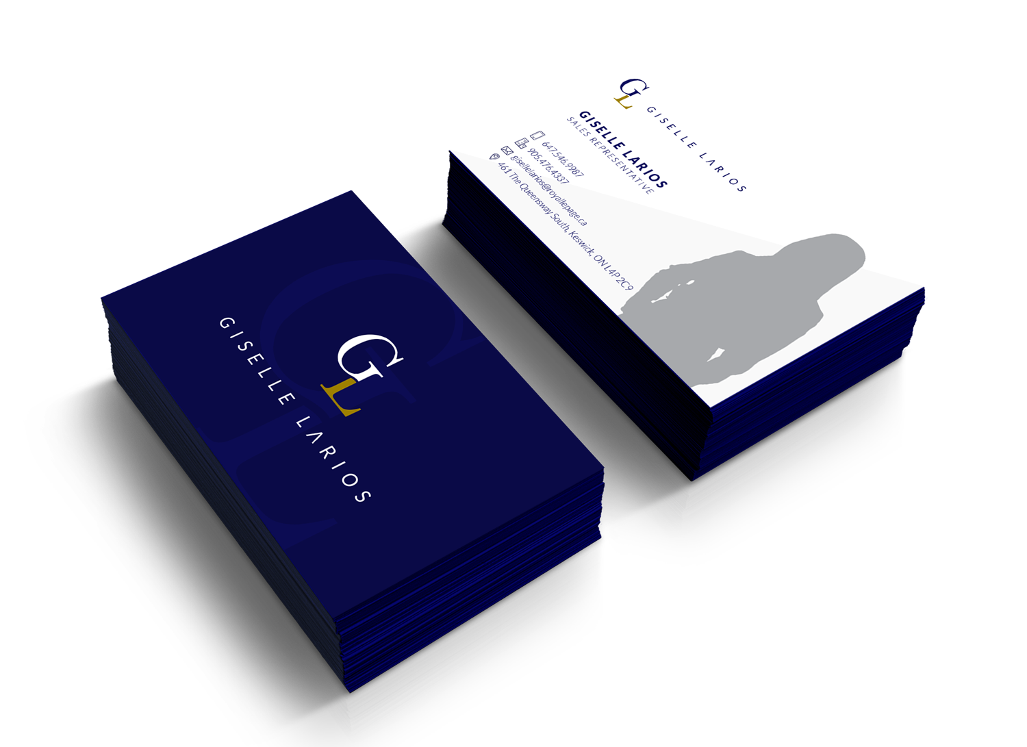
The Giselle Larios logo was designed to be one that is very direct and simple. A ‘GL’ monogram was used as the logomark to represent the initials of the face of the brand – Giselle Larios.
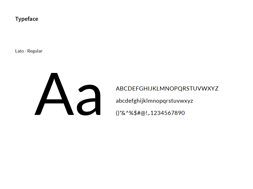
The typeface chosen was used to embody the modern persona of the brand while creating a functioning marriage between the logomark and logotype.
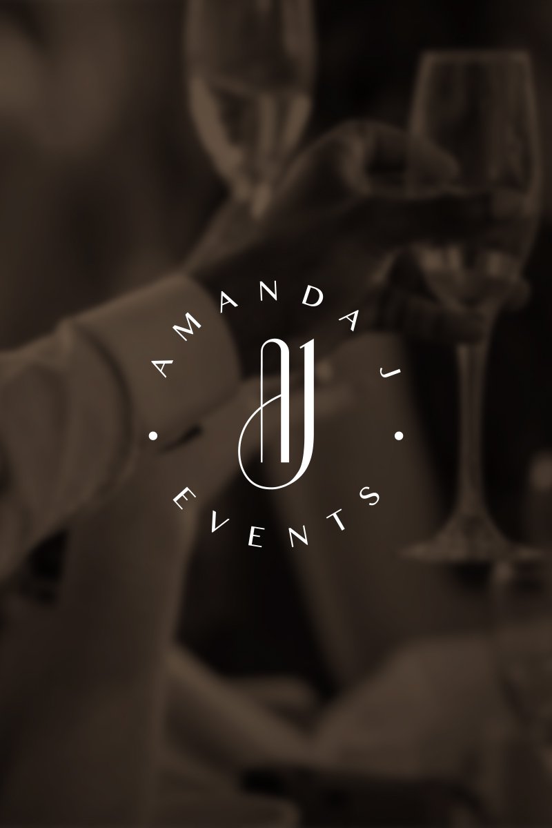
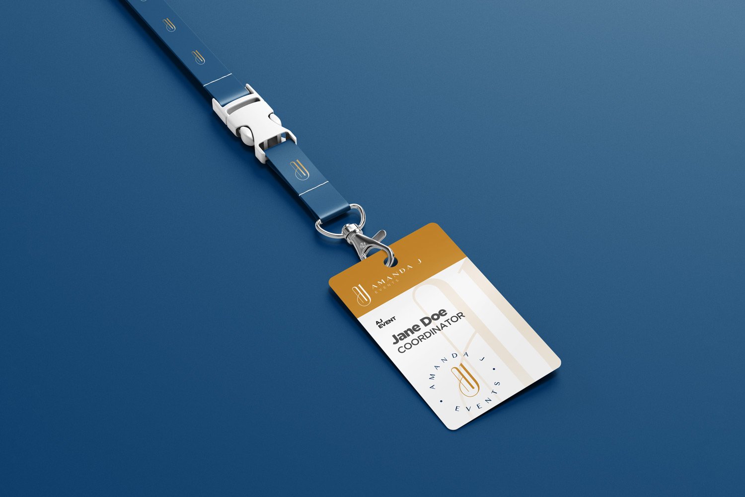
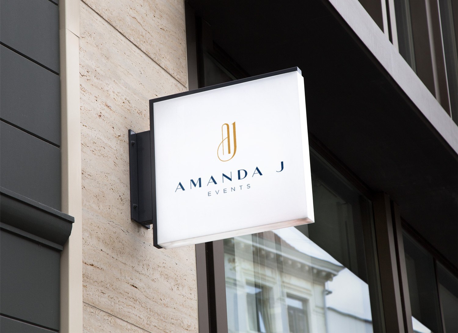
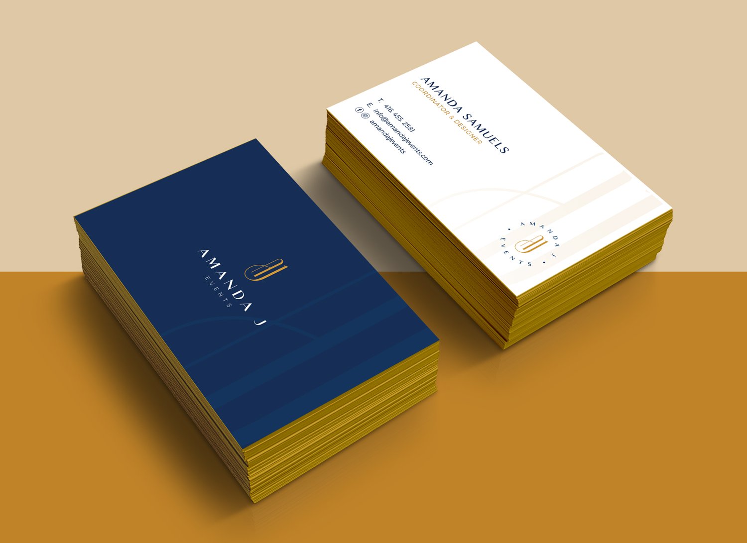
With a high focus on weddings and corporate events, Amanda J Events is an event planning brand centered around bringing its clients’ visions to life, while creating an unforgettable experience for the client to enjoy.
The Brand Identity
The Amanda J Events logo was designed to speak primarily to the modern day strong woman. An AJ monogram was used as the lettermark to represent ‘Amanda J’. The style and feel of the lettermark is strong in its boldness yet gracefully elegant and chic with its smooth curves.
The typeface chosen creates the perfect marriage between beauty and brains as its serious and corporate feel allows the logo to speak to both the corporate and creative worlds it will live in.
The colour palette of the brand is made primarily of a navy blue and gold. Together these 2 colours help to symbolize and psychologically reiterate some of the brand’s character traits. Aesthetically, the marriage between the colours is perfect, creating an unforgettable and subtly luxurious viewing experience.
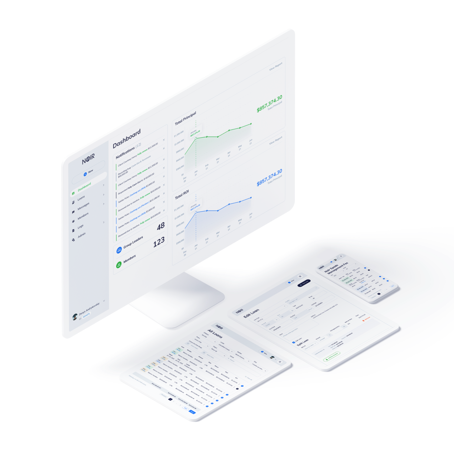
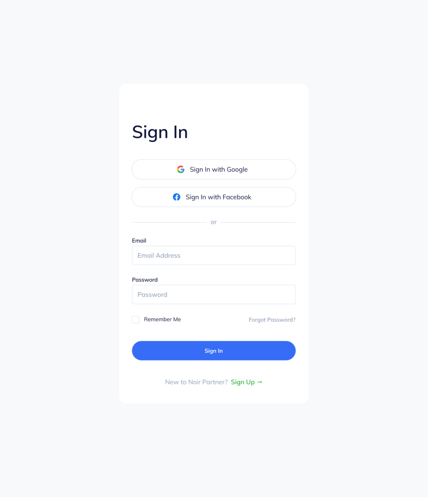
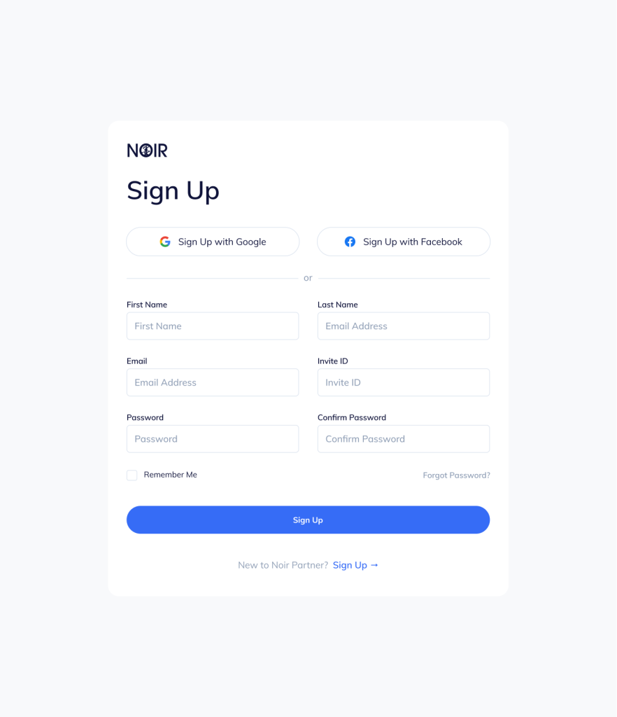
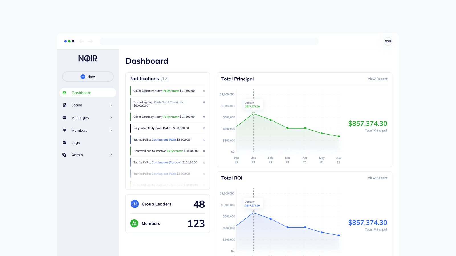
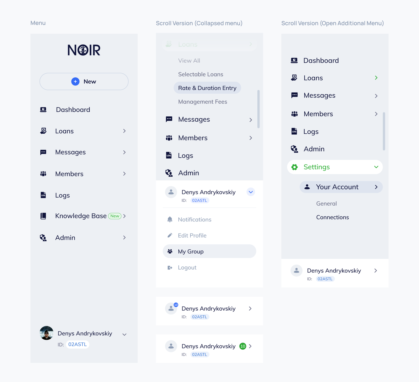
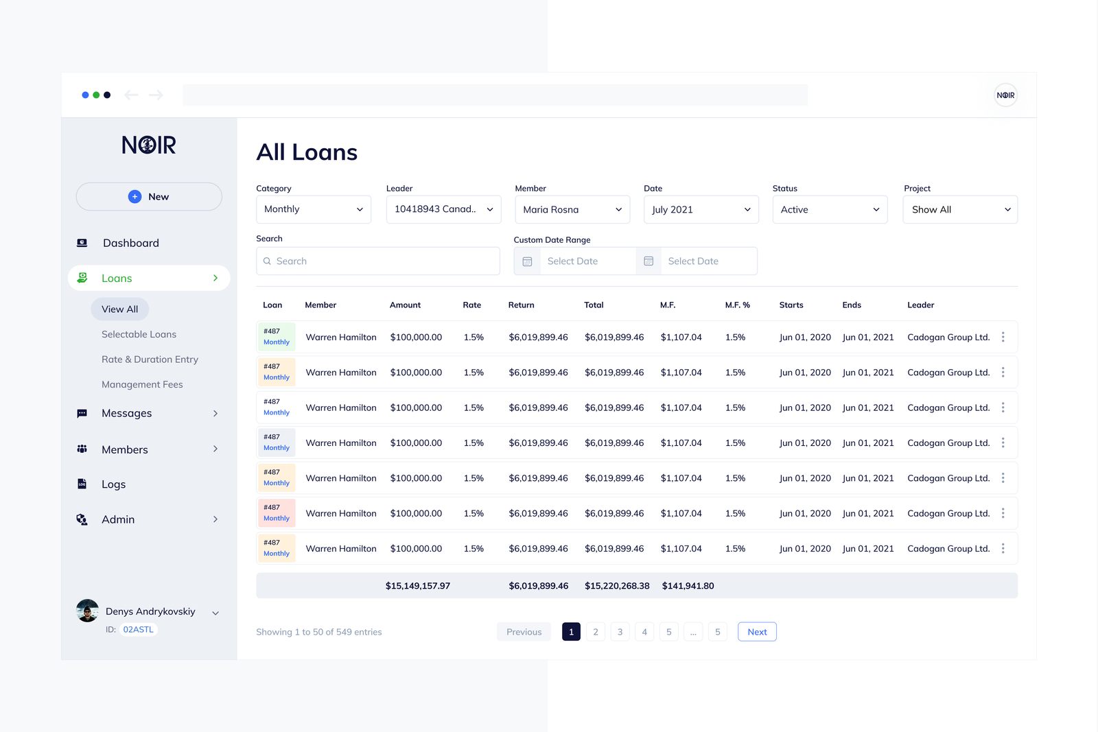
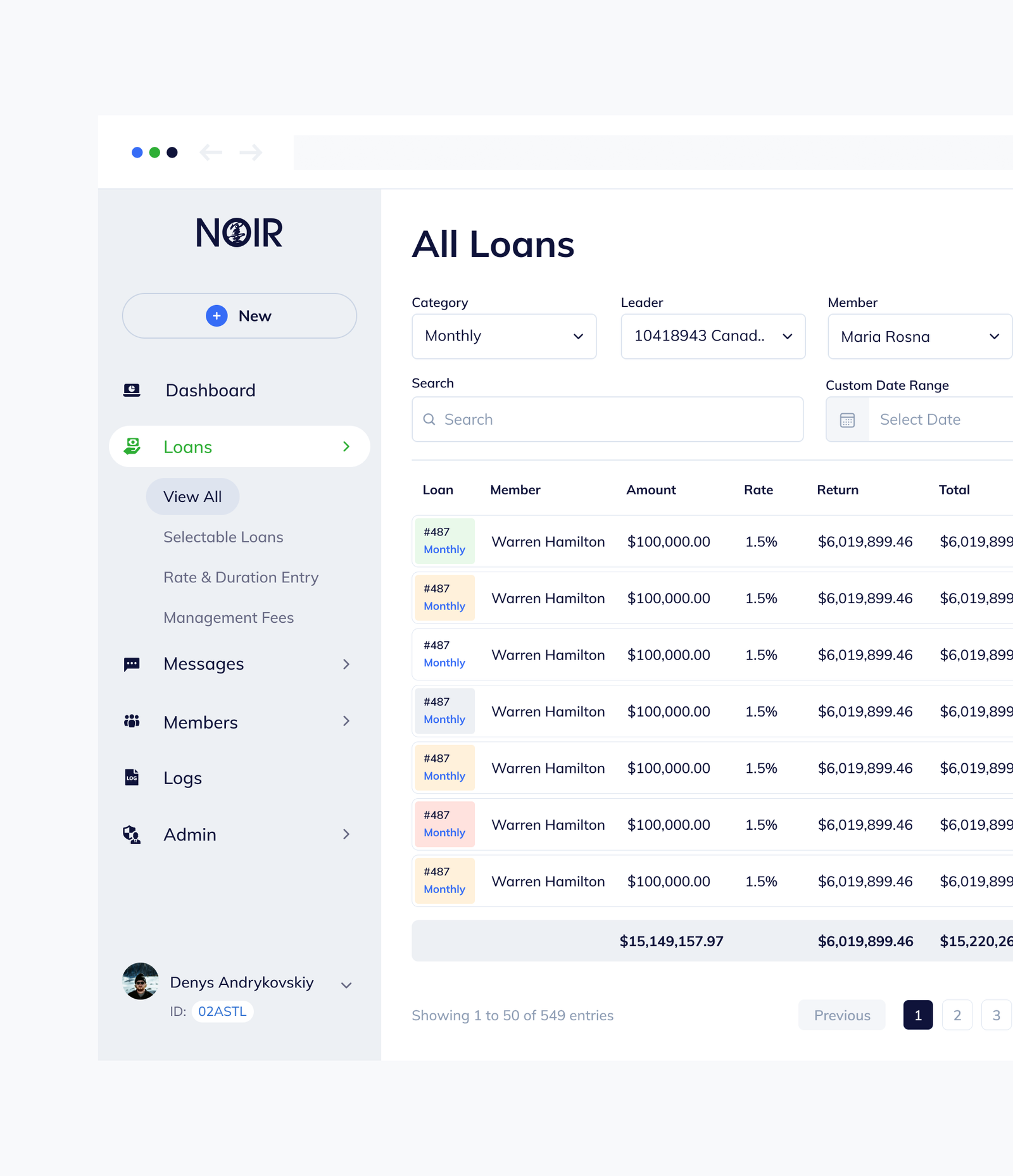
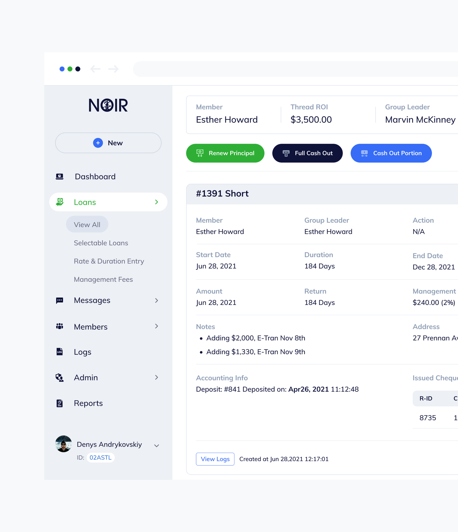
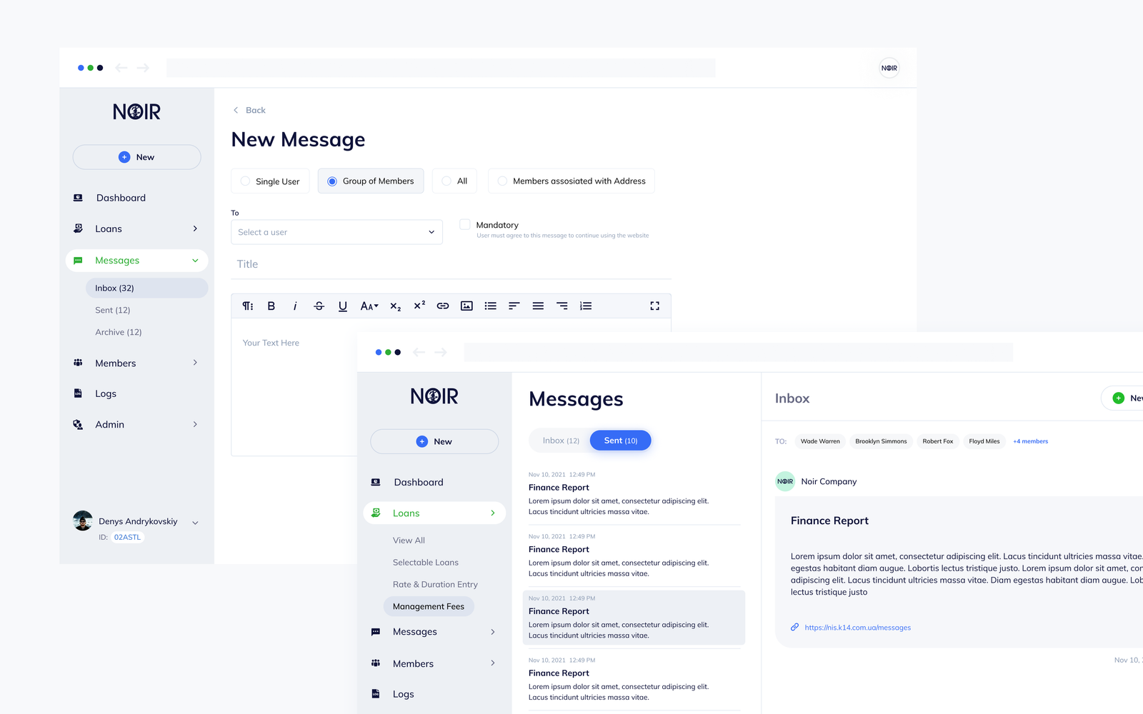
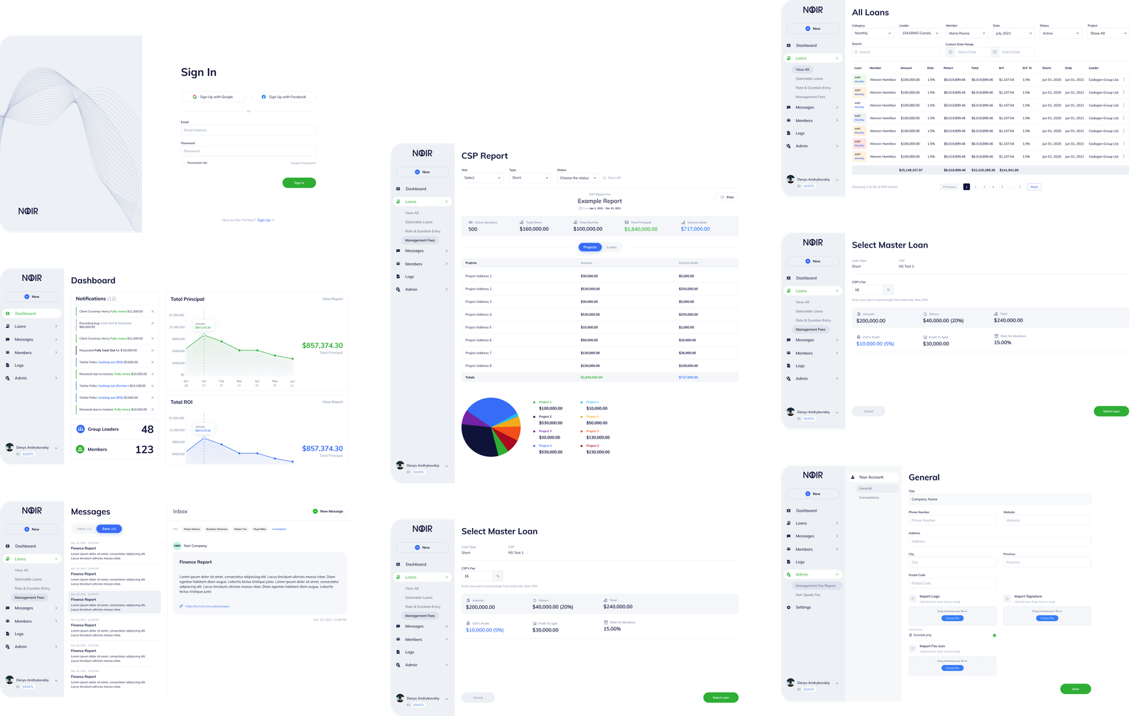
As a growing financial company, Noir Partner was in desperate need to create an online platform that would enable both them and their fast growing list of clients to manage all their investment and loan accounts.
Our Approach
As design team lead, our solution was to create a web application that would act as the one centralized location where all parties – lenders and investors would access everything pertaining to their financial accounts. Within the web application we created complex logic allowing users to manage, renew and cash out their investments. Some additional features we designed included in-app messaging, reports, user logs,member management and third party integrations.
The Result
As a result of the web application we created and our continued partnership and management of the platform, Noir Partner has been able to exponentially scale their company both in revenue and clientele, allowing them to enjoy steadied success.
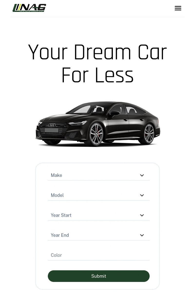
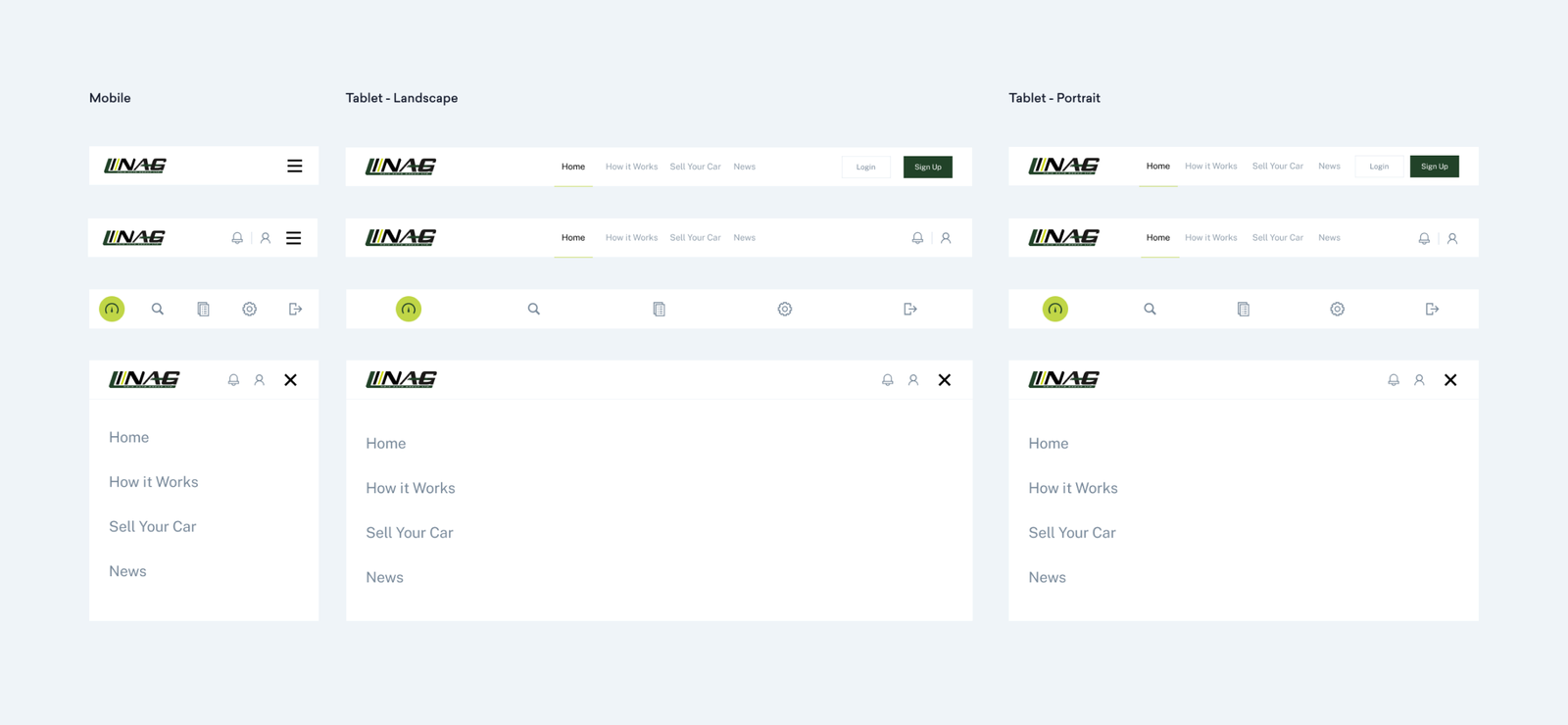
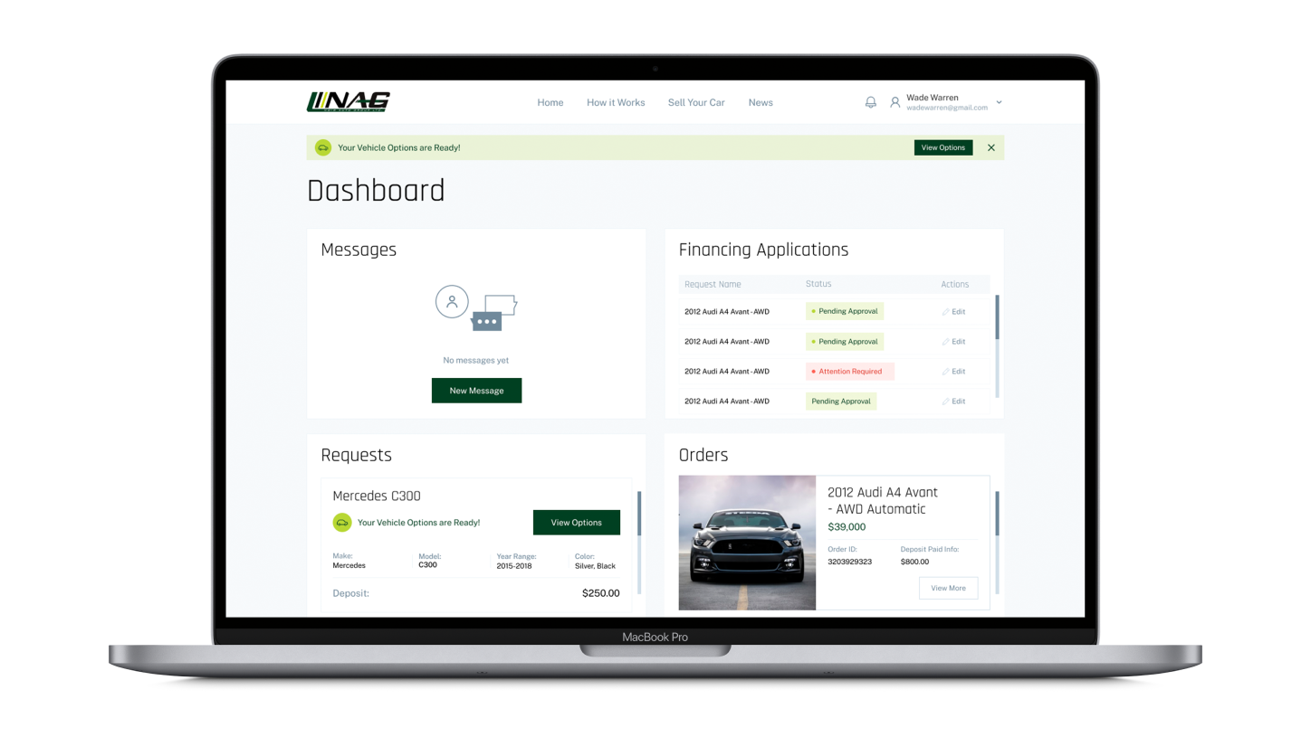
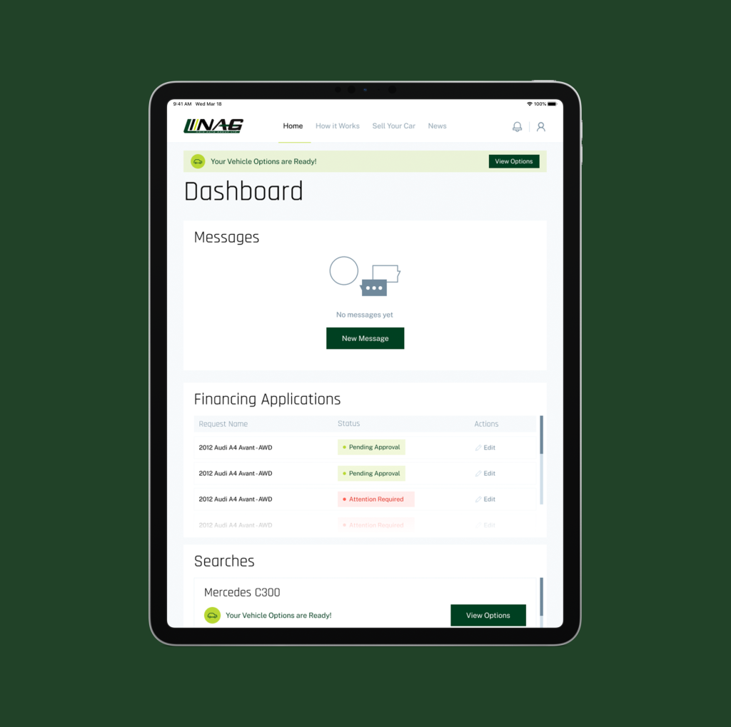
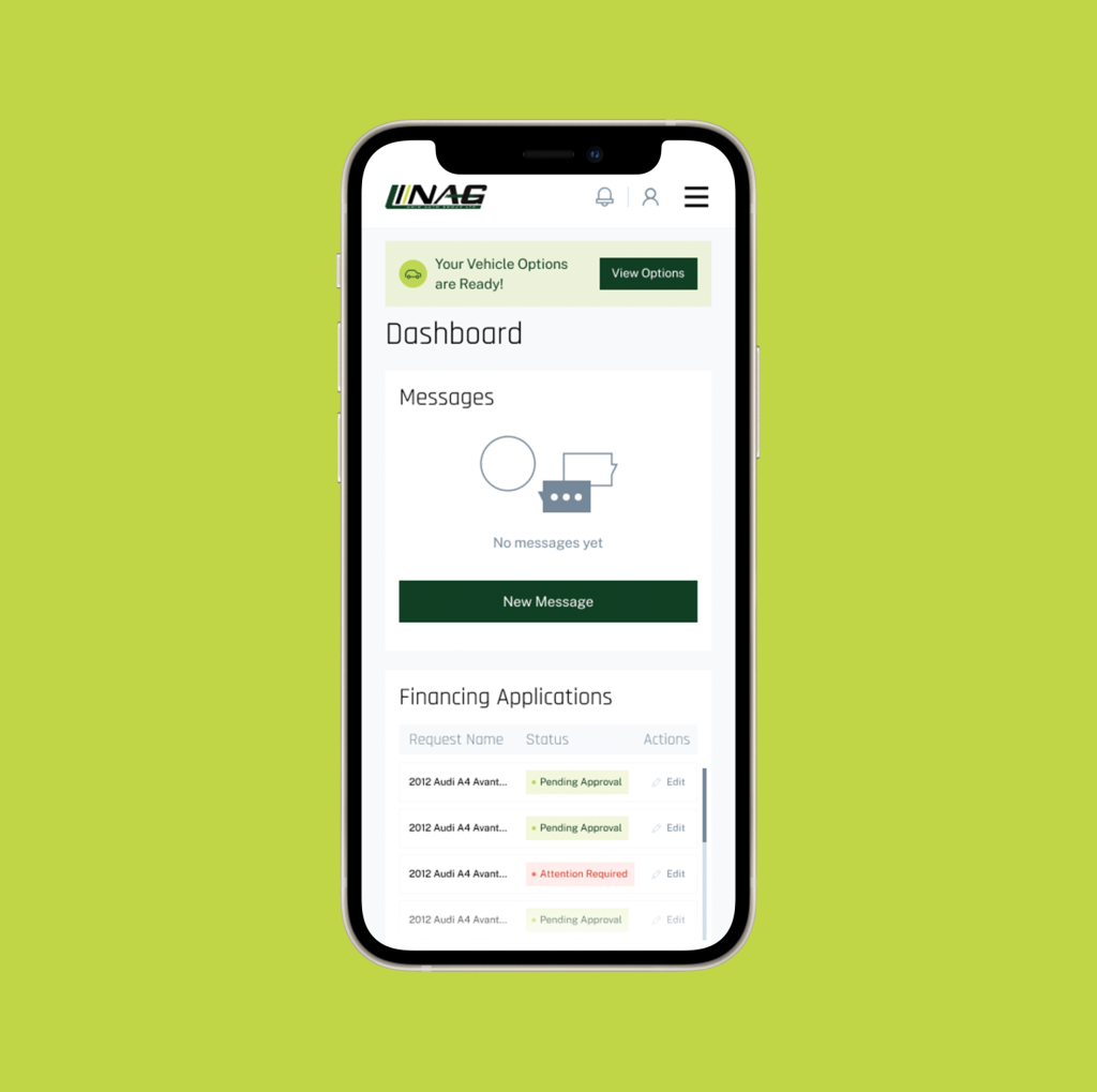
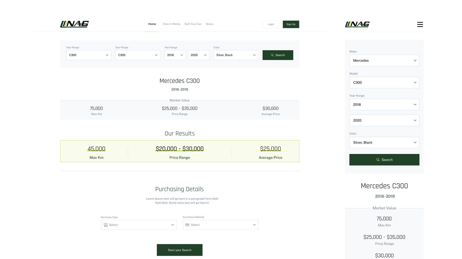
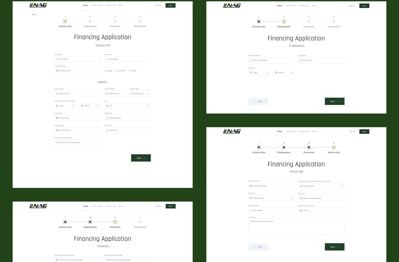
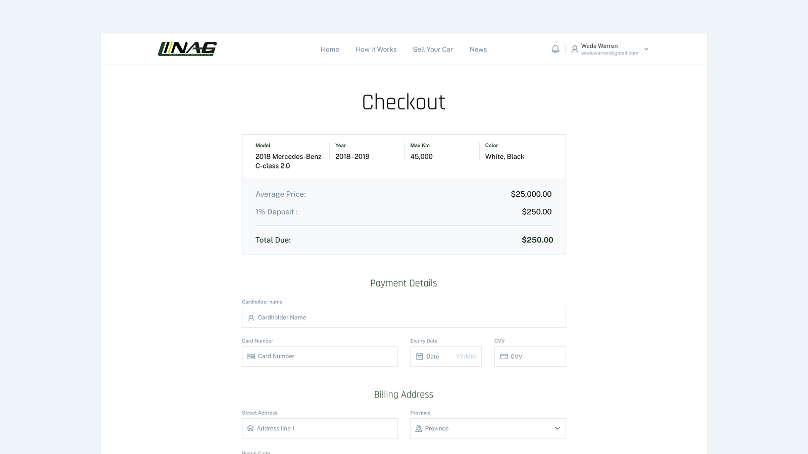
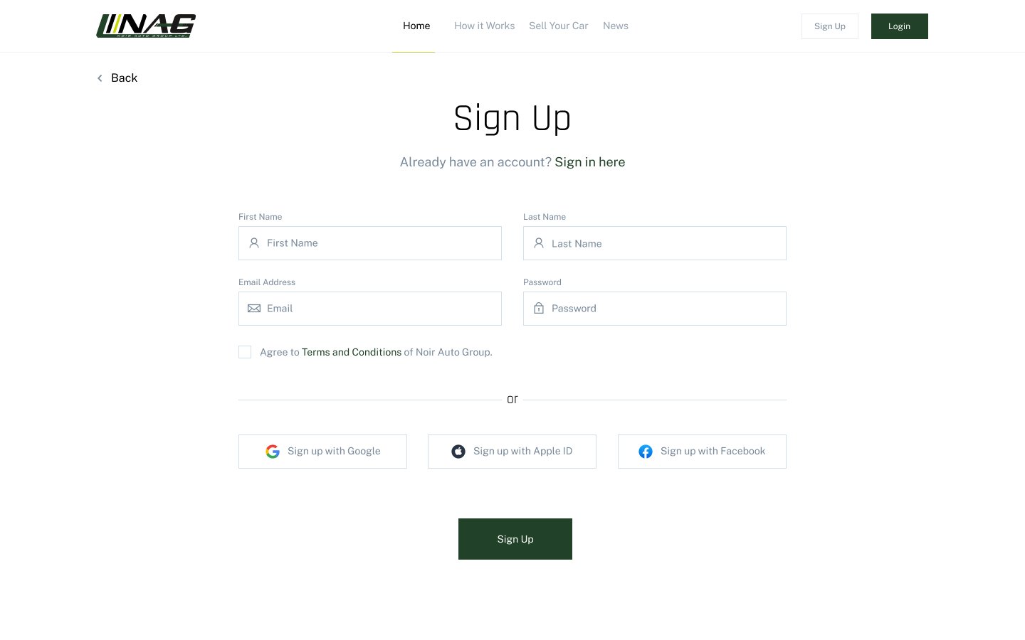
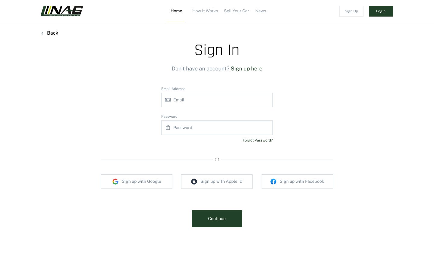
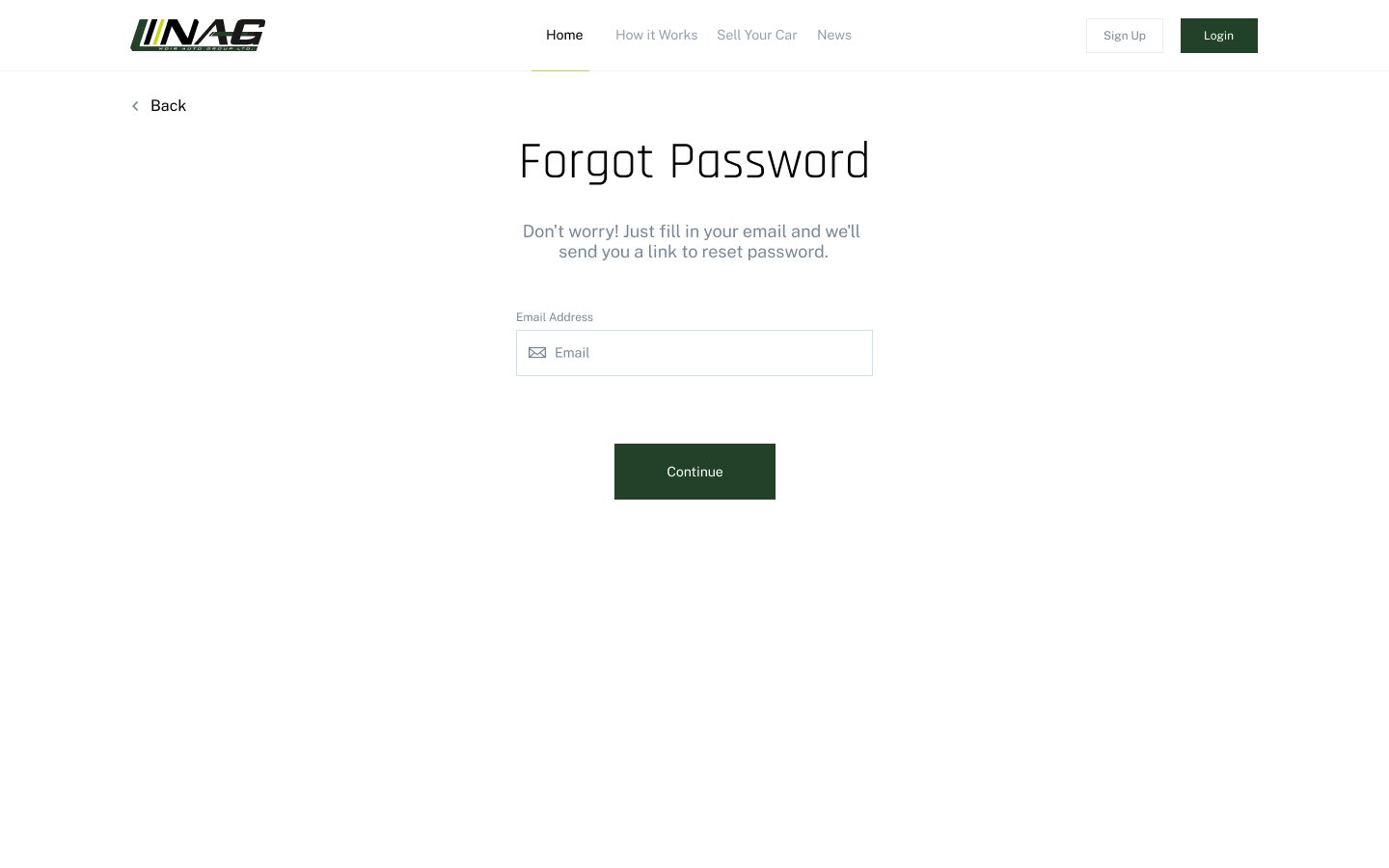
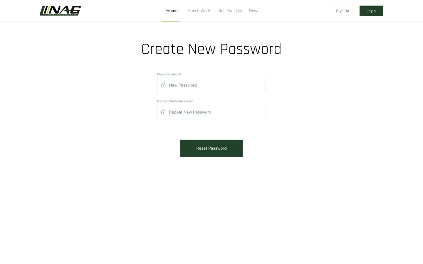
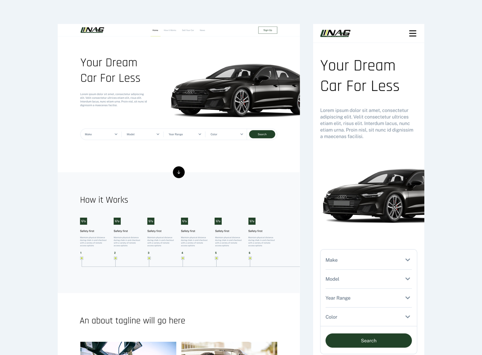
Noir Auto Group was started as a niche service finding vehicles for individuals who lack the time and desire to search for the car of their dreams.
The Challenge
We were tasked with the challenge of designing a web application to facilitate the online process of Noir Auto Group’s customers submitting vehicle requests and all of the subsequent following steps. The user journey was complex as it involved several steps as the business’ vehicle finding process is unconventional. We mapped out a detailed yet simple user journey to make the user experience as enjoyable as possible.
Additionally, we were to create a marketing website that would promote and explain the web app.
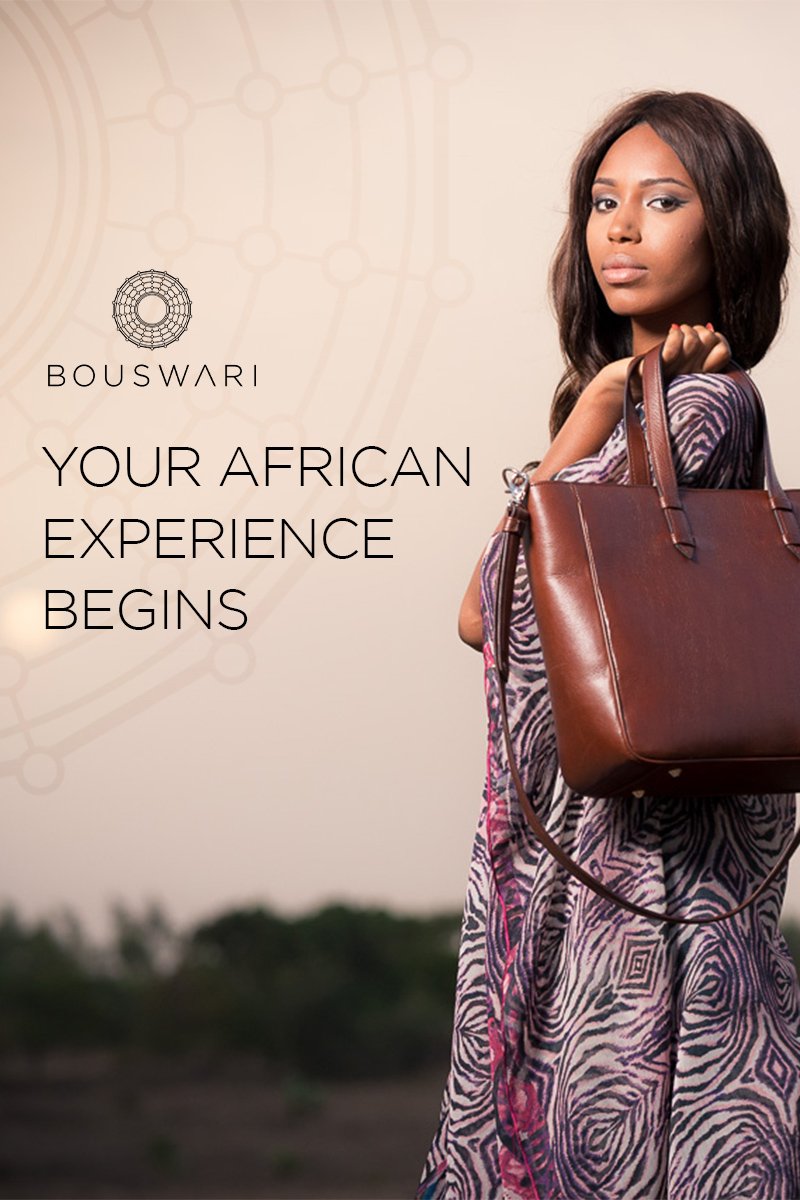
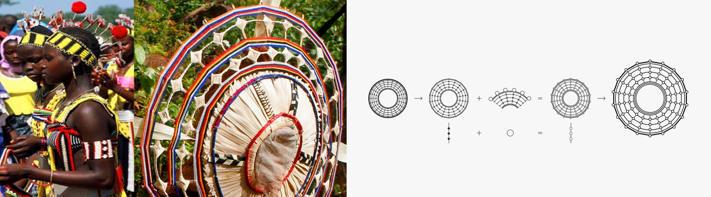
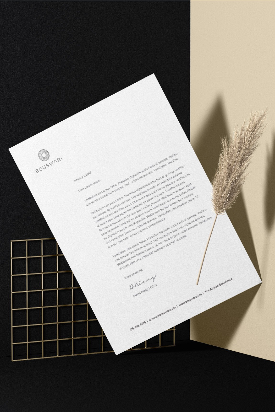
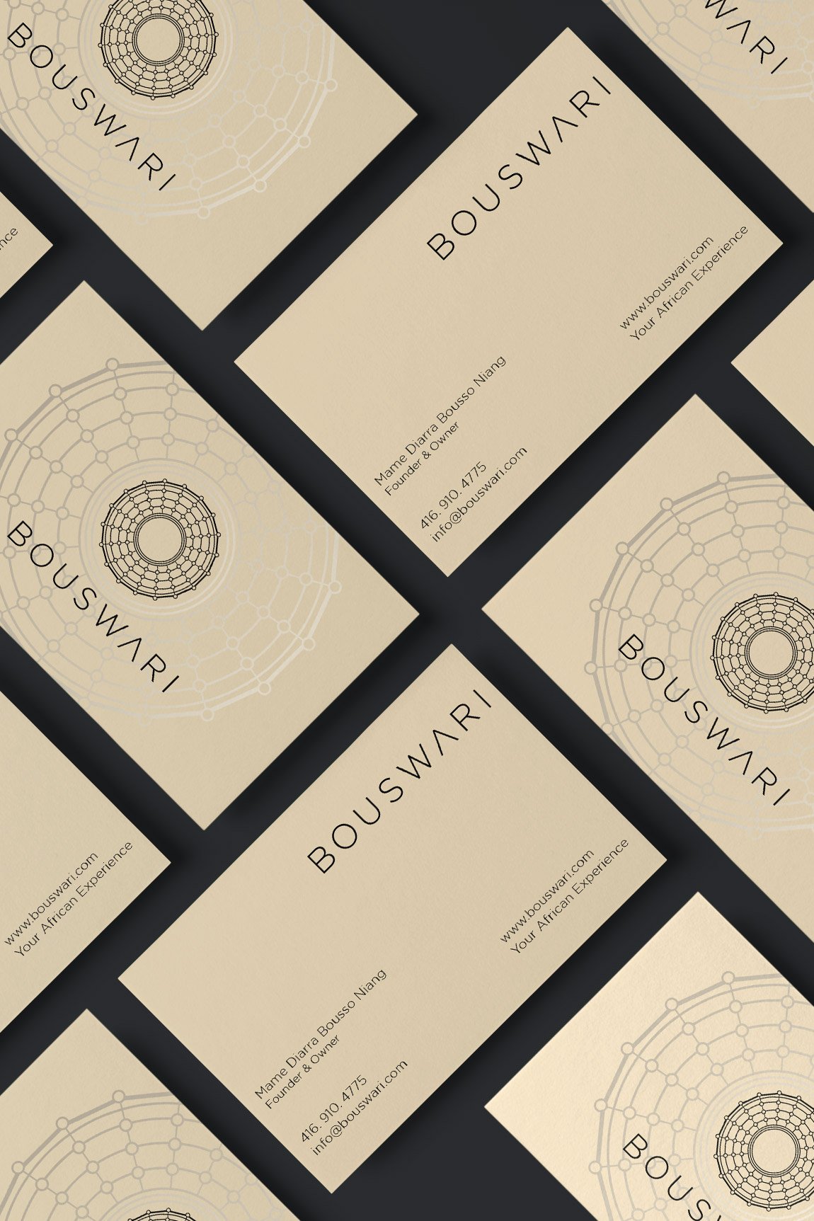
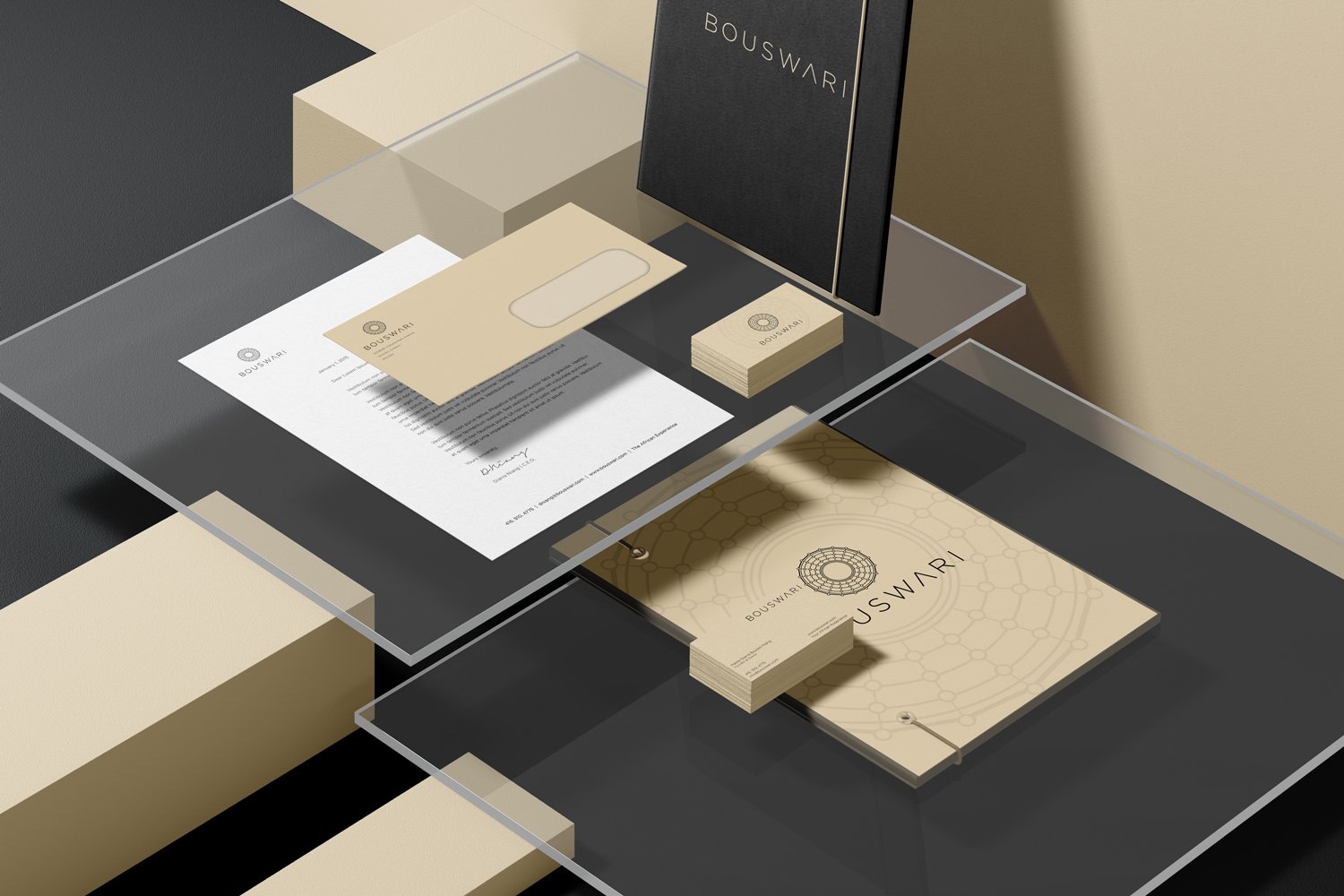
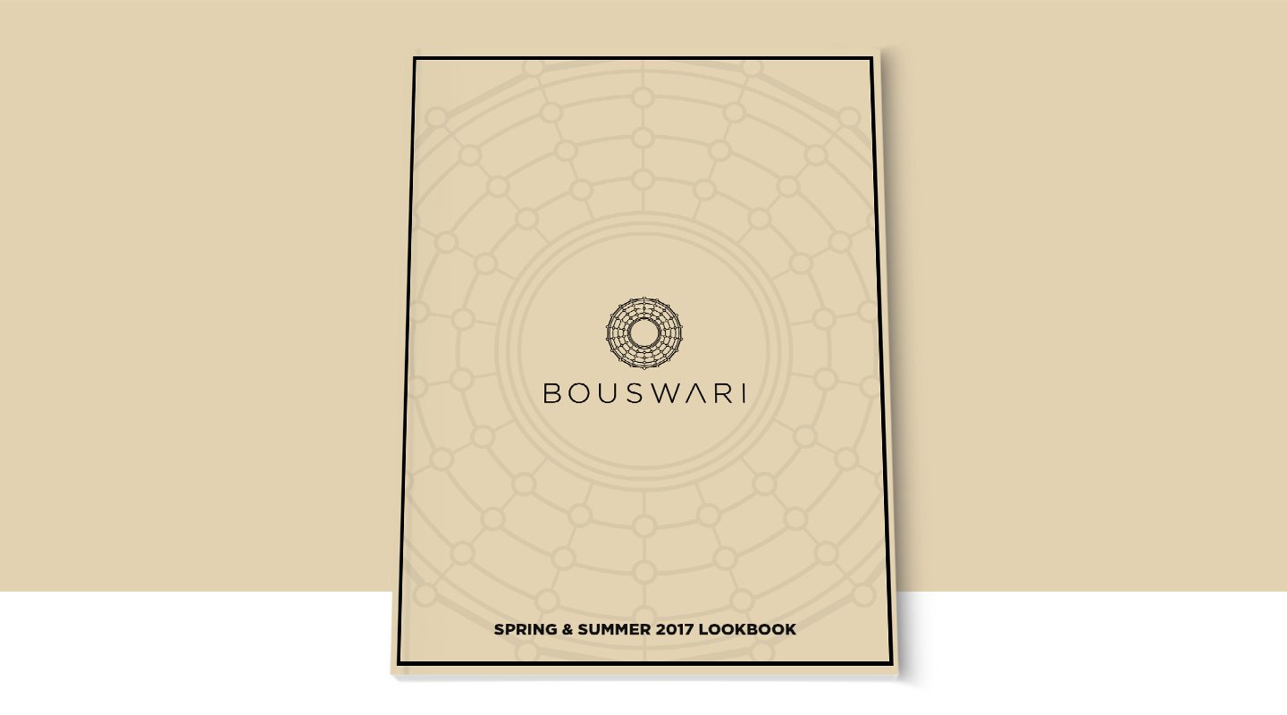
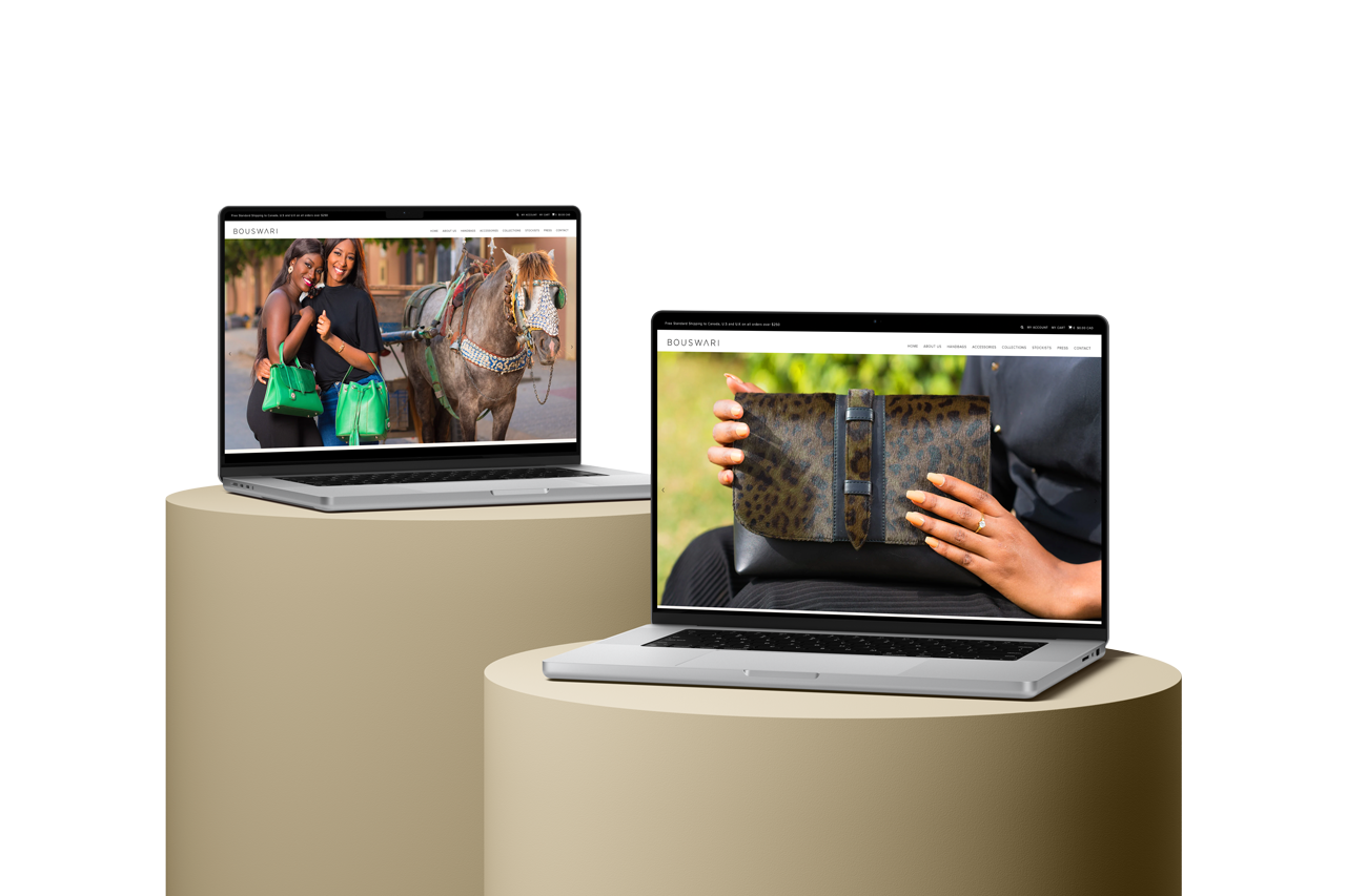
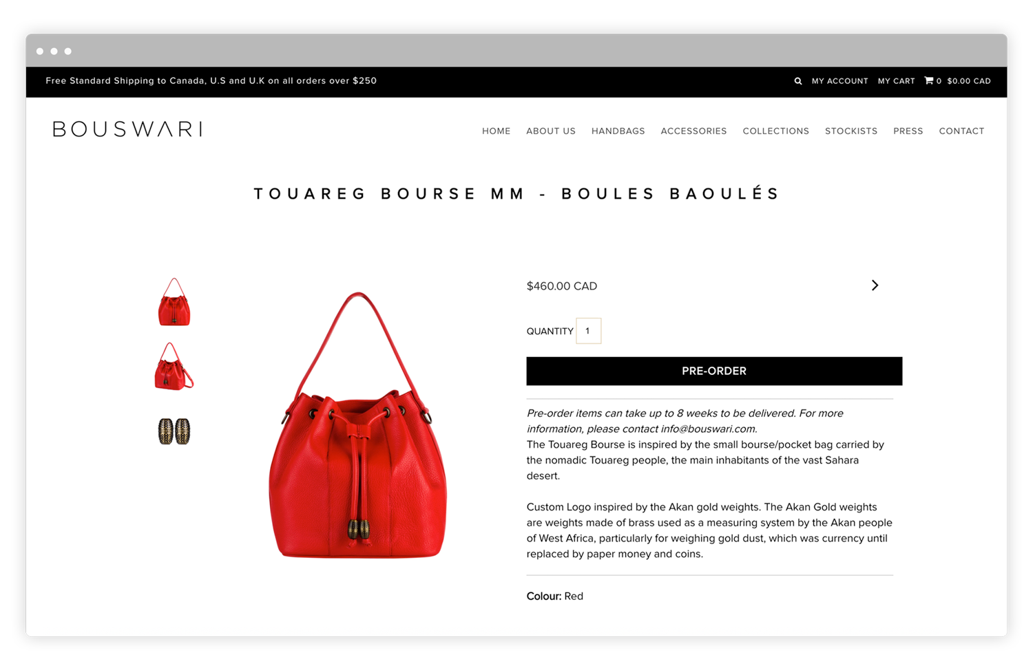
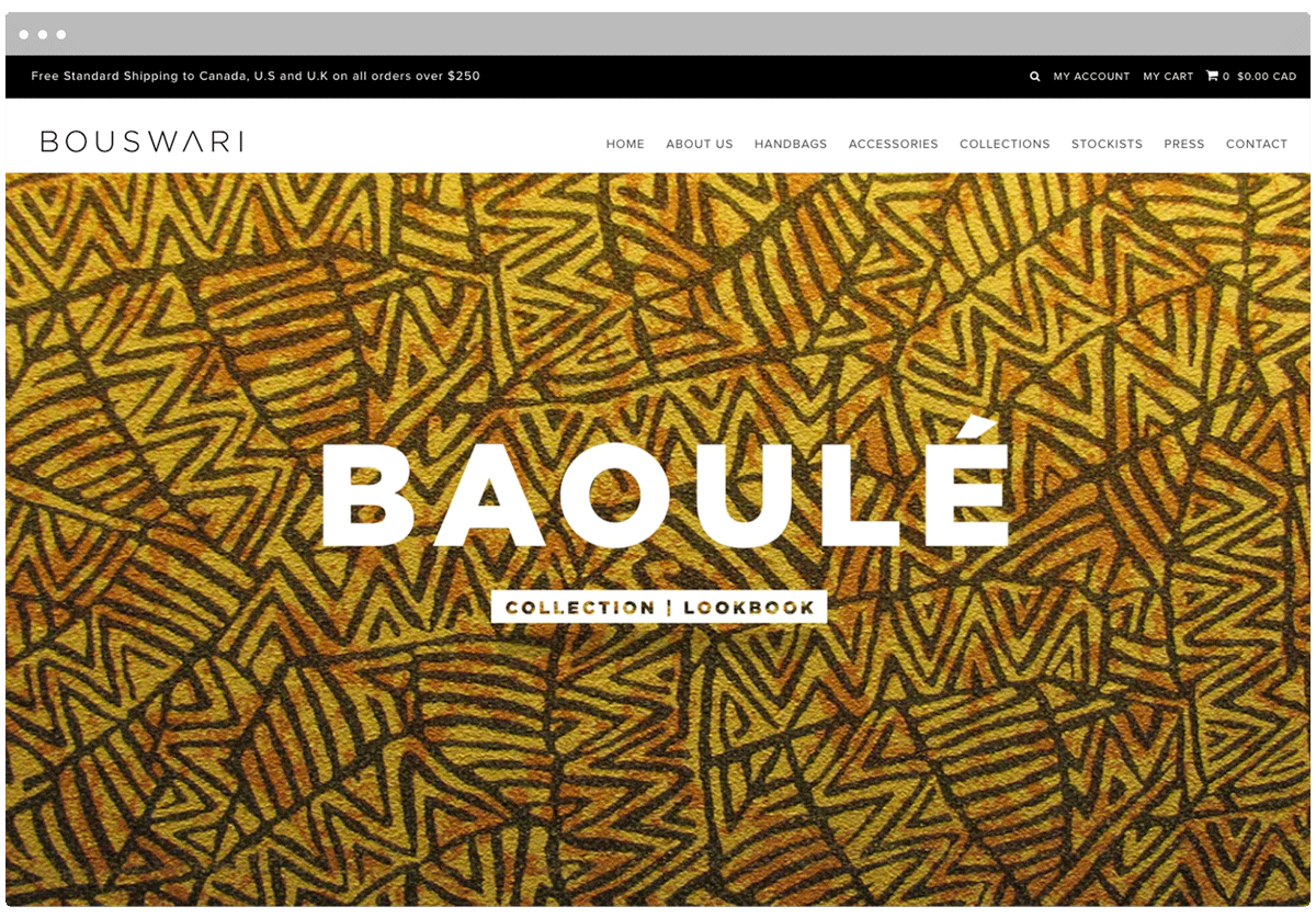
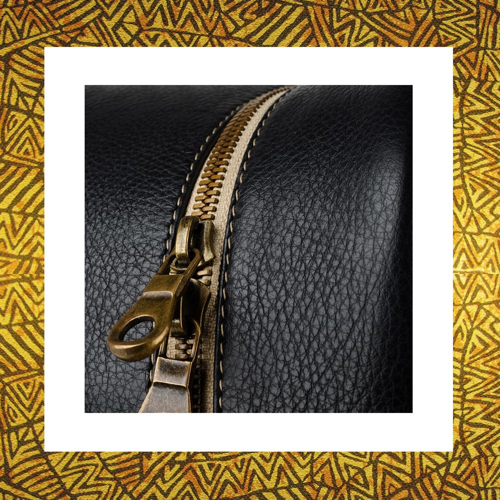
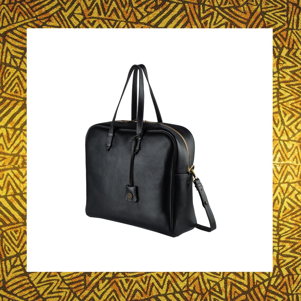
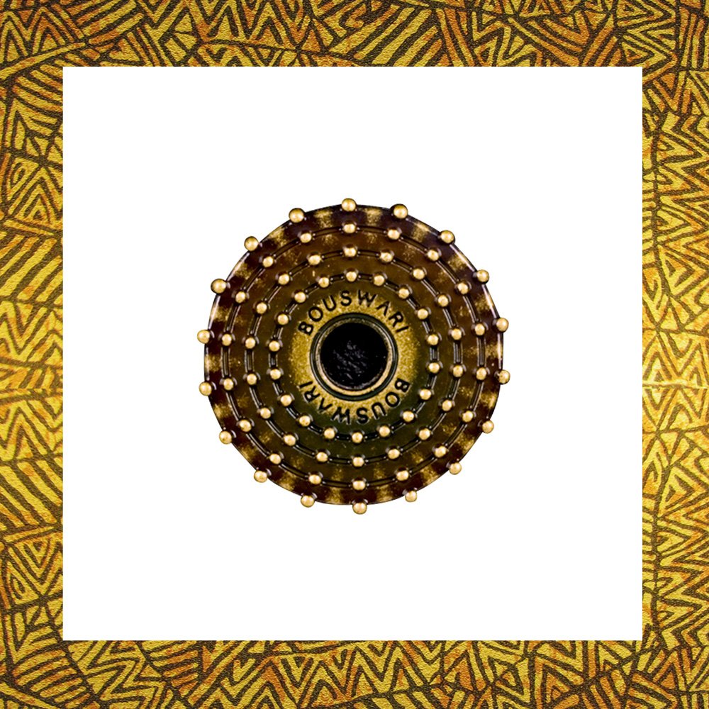
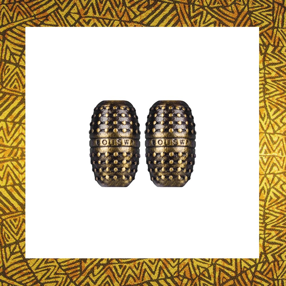
Bouswari is an African inspired upscale bag and pendant company. It sets itself apart from all other companies by combining Canadian & African expertise to create products of luxurious class manufactured primarily in Senegal. The Bouswari brand evokes a feeling of luxury from a fashion point of view. It has a minimalist feel to properly represent the products the company will be producing.
The Brand Identity
The Bouswari brand was designed to evoke a feeling of luxury from a fashion point of view. It has a minimalist feel to speak to its of the upper class target audience as well as to properly represent the products the company produces.
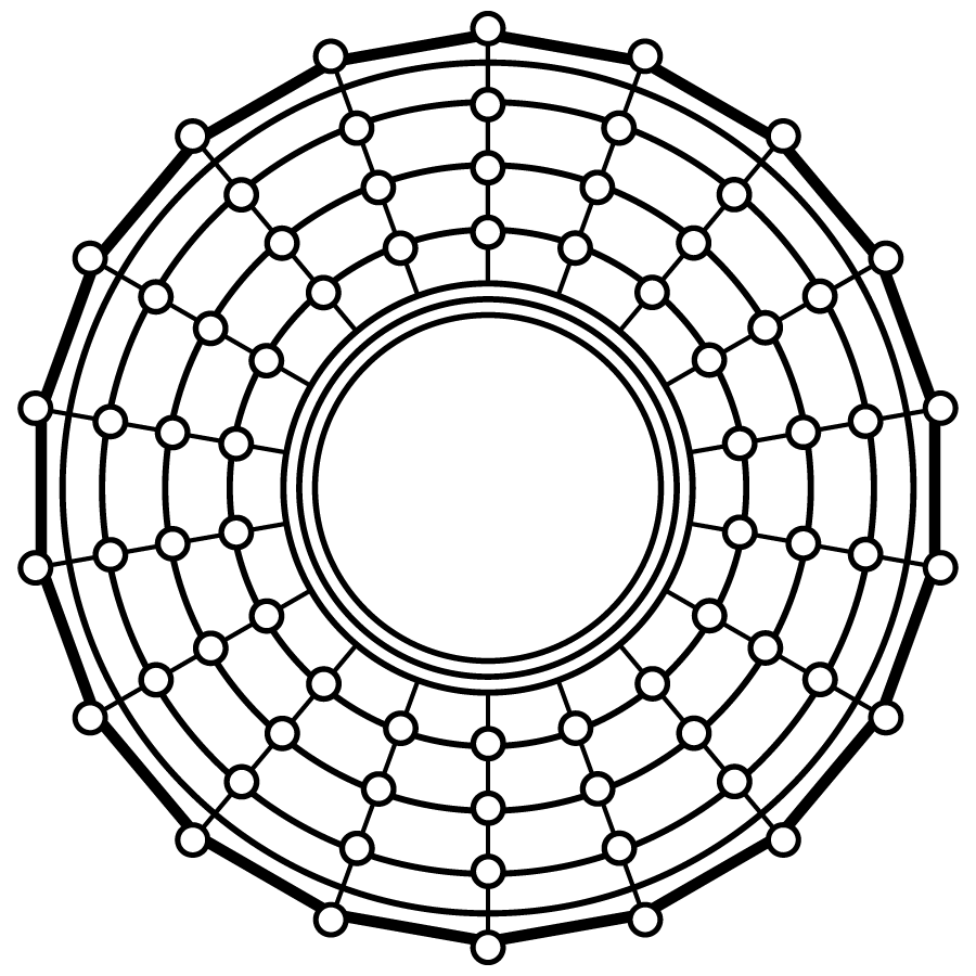
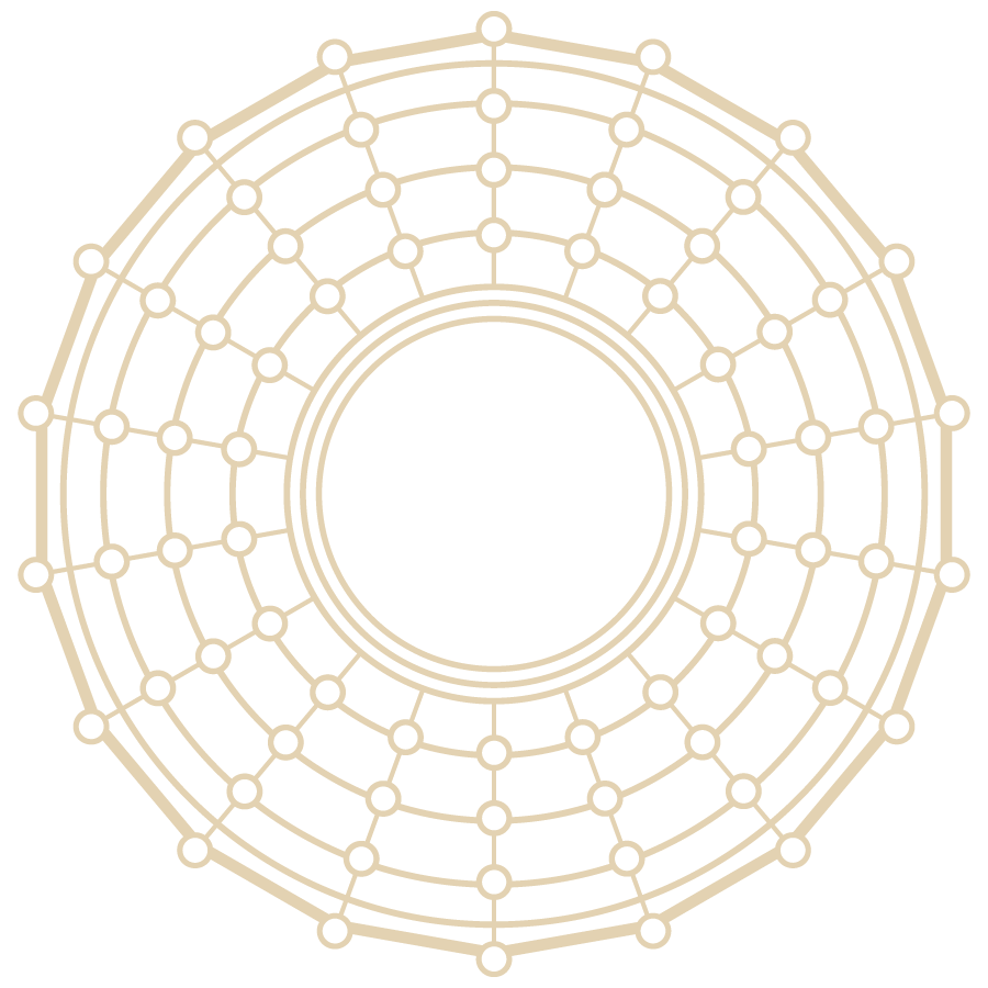
The Bouswari logomark is inspired by the headgear worn by Bassari men and women. During initiation feasts, both genders wear their best costumes. Men in particular wear elaborate straw headgear, depicted in our logo.
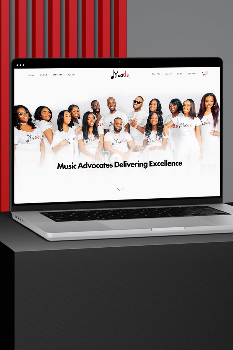
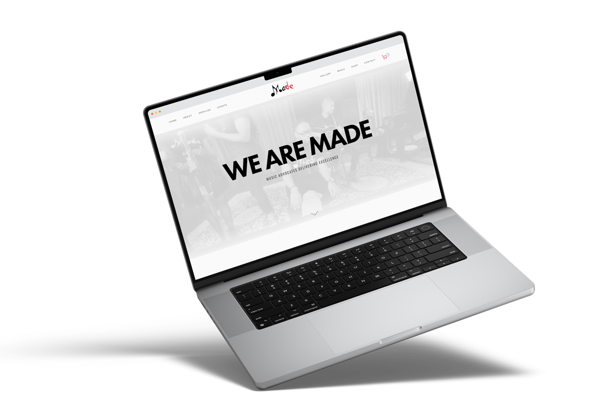
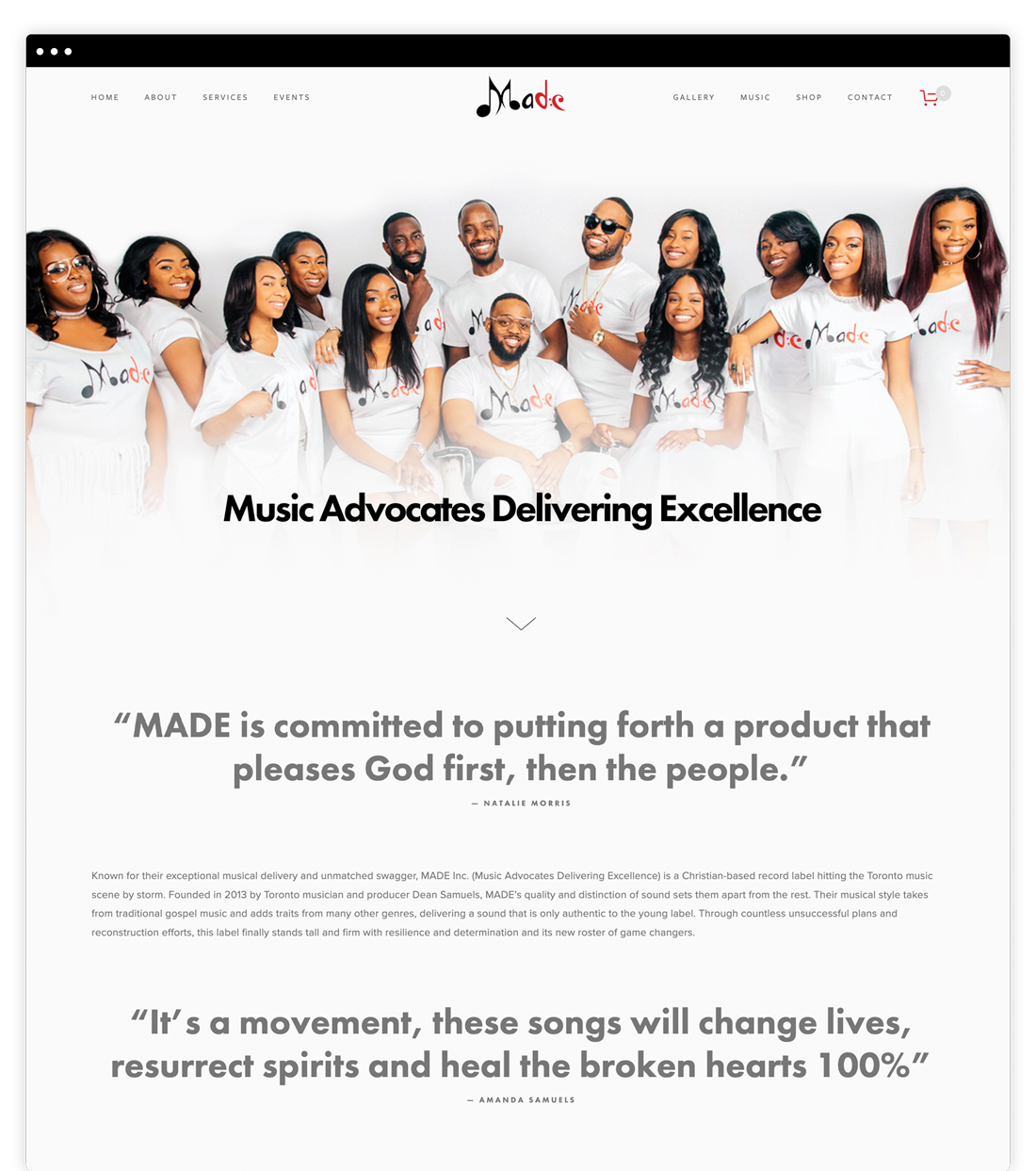
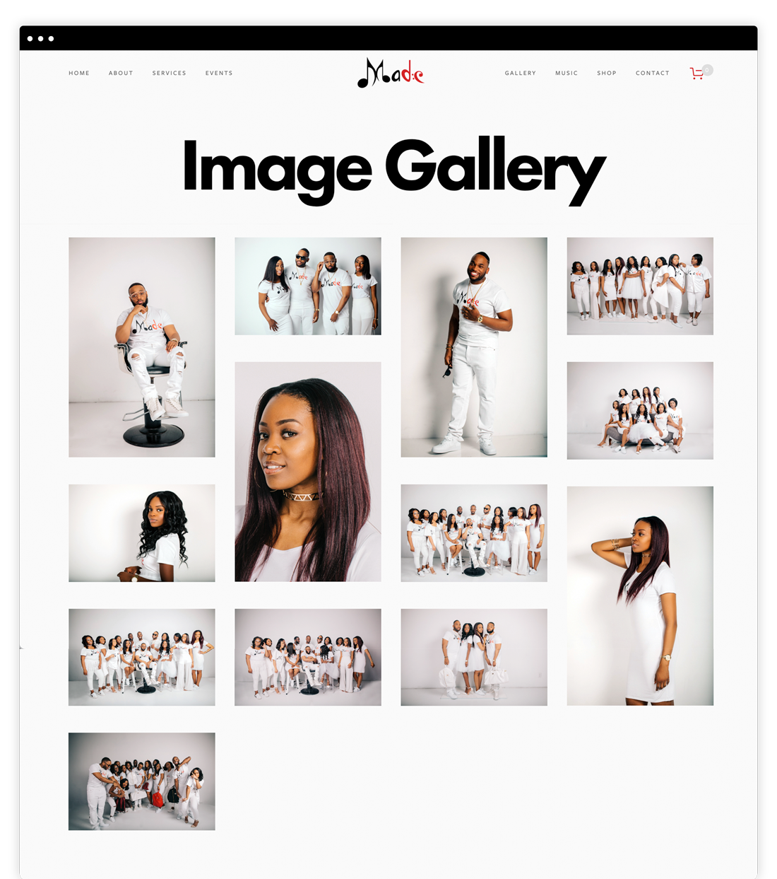
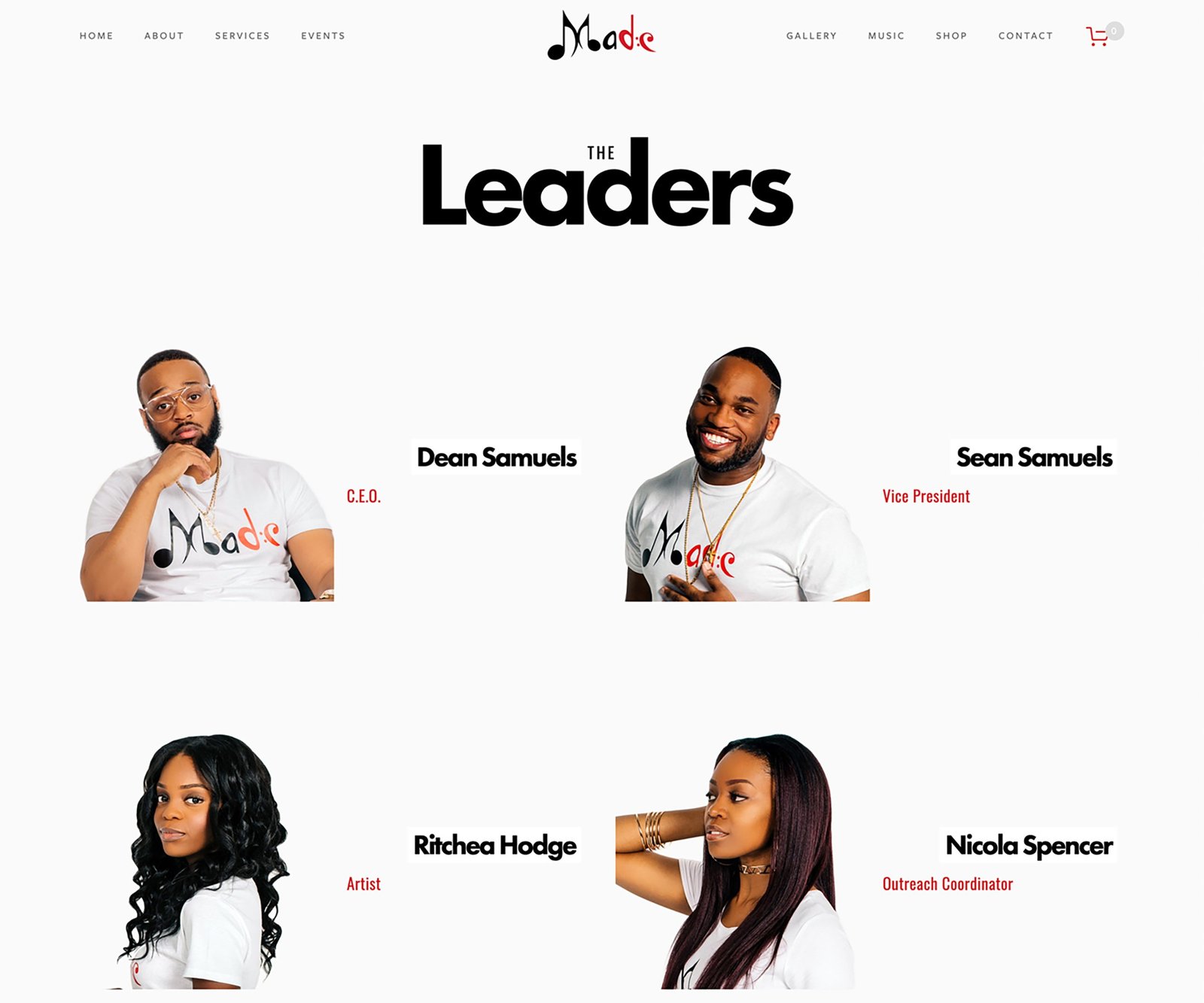
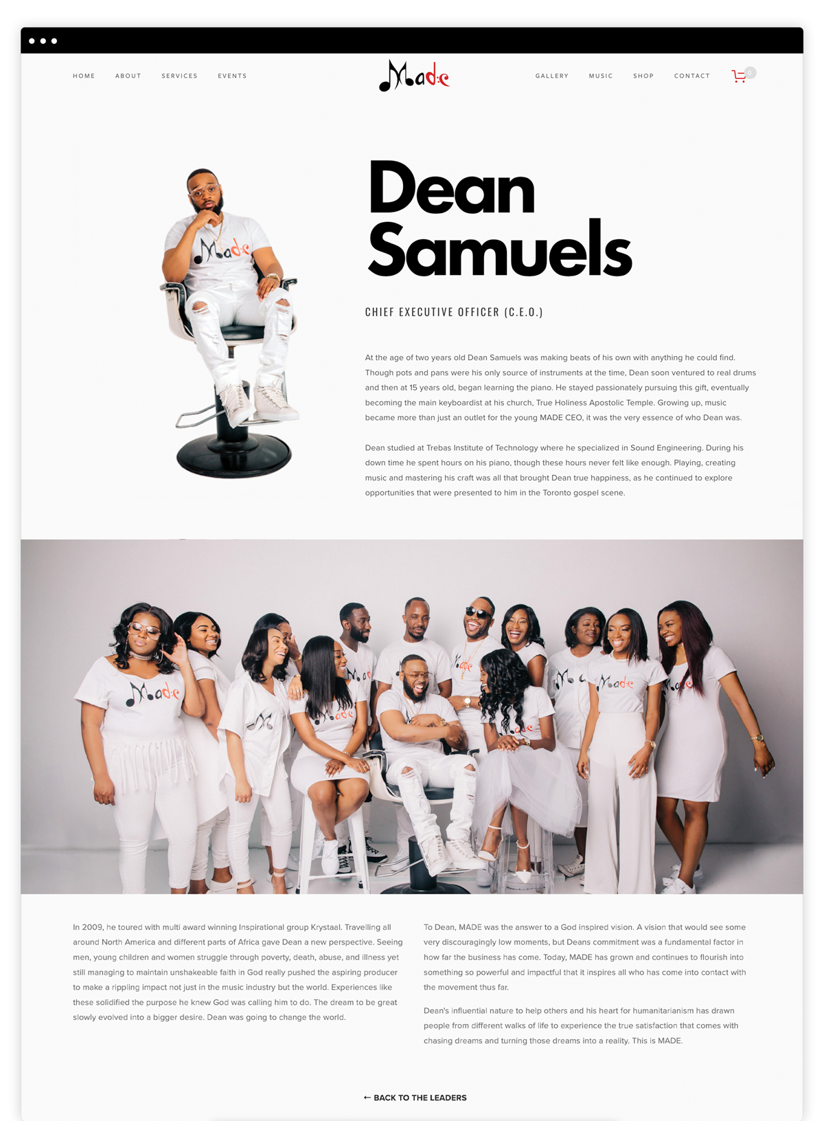
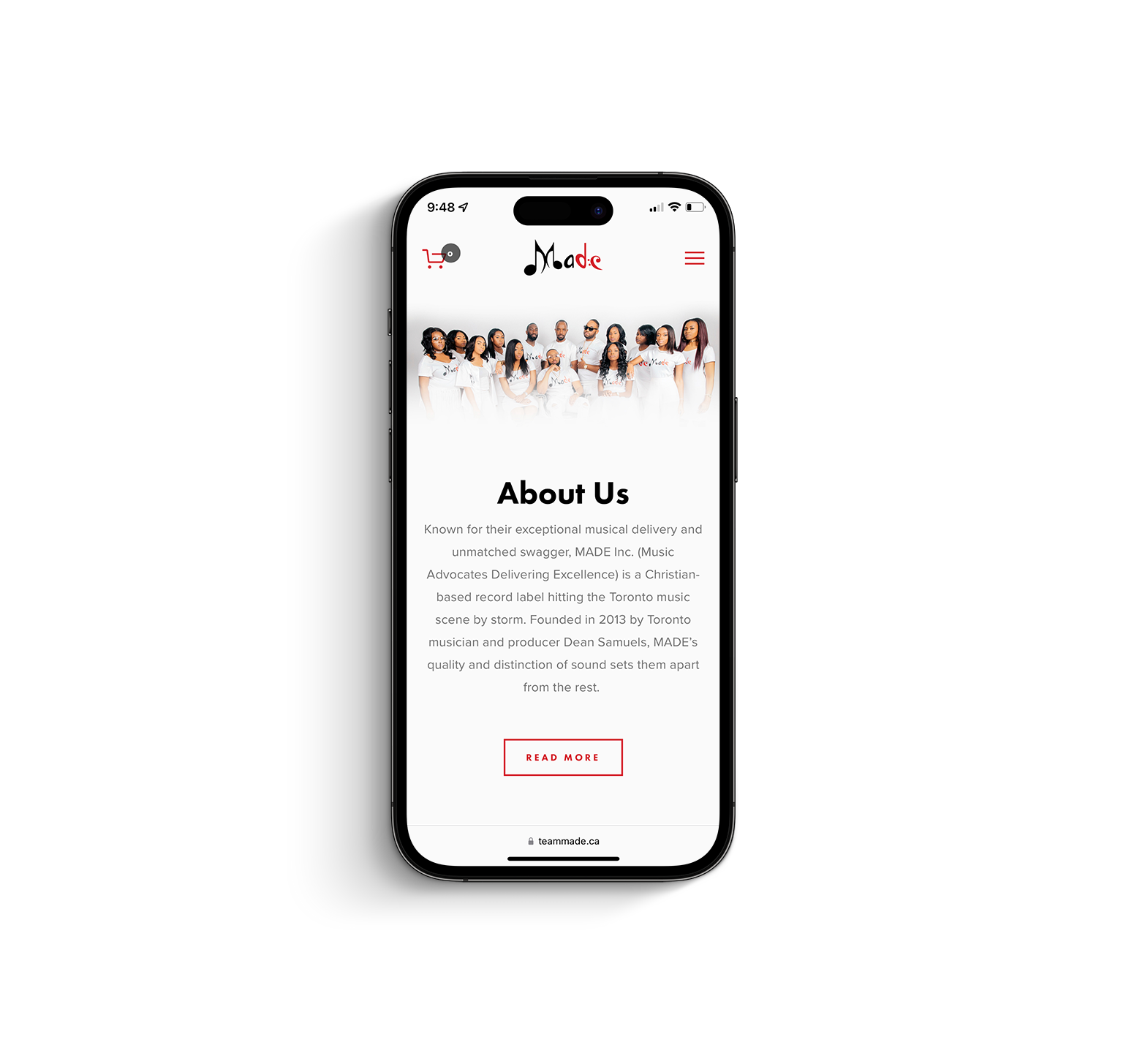
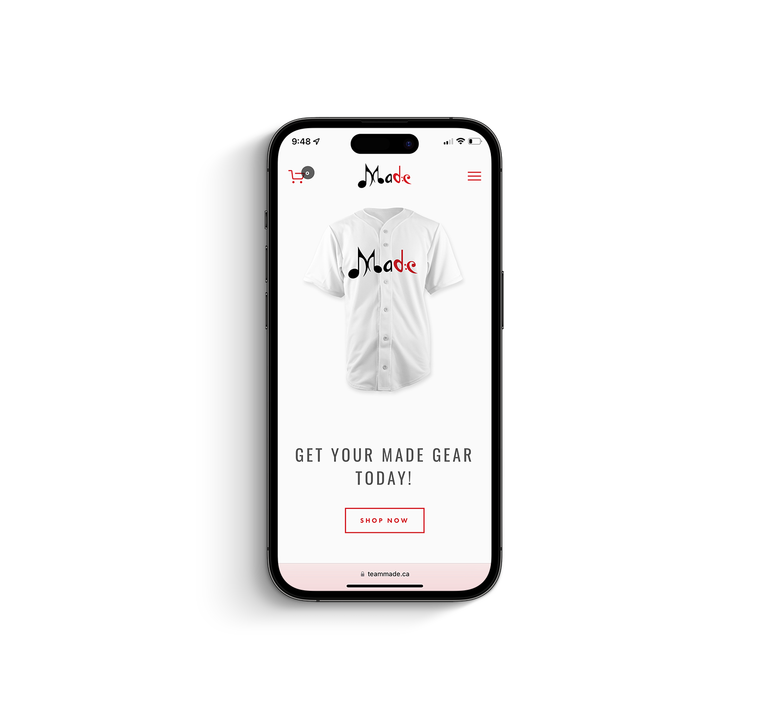
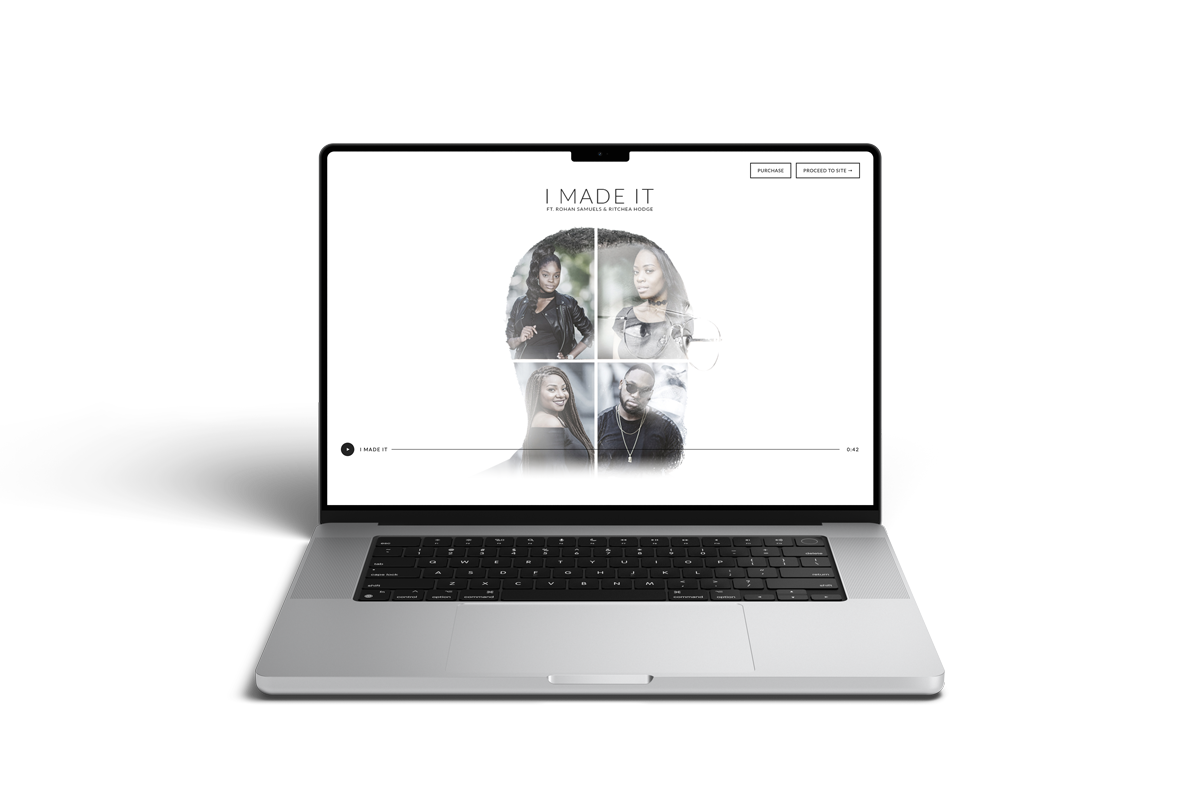
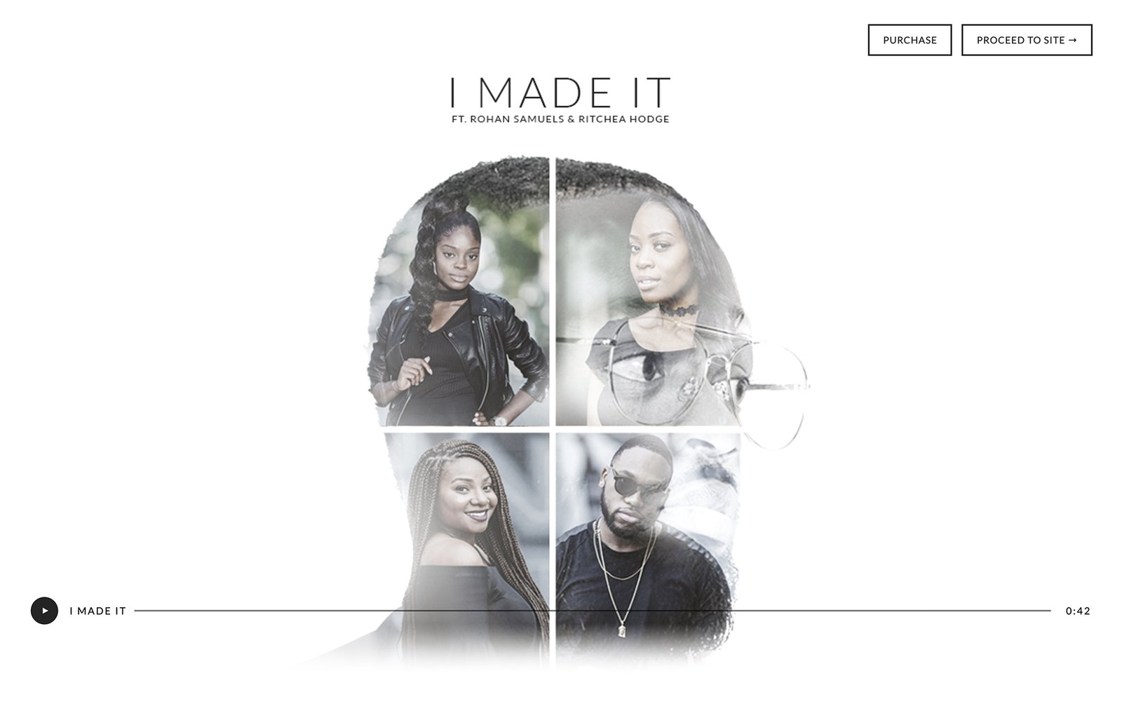
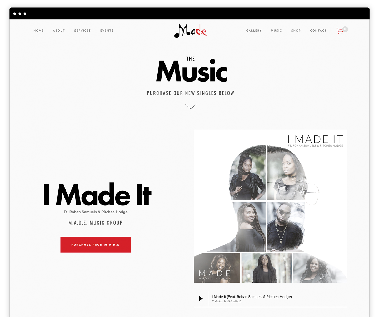
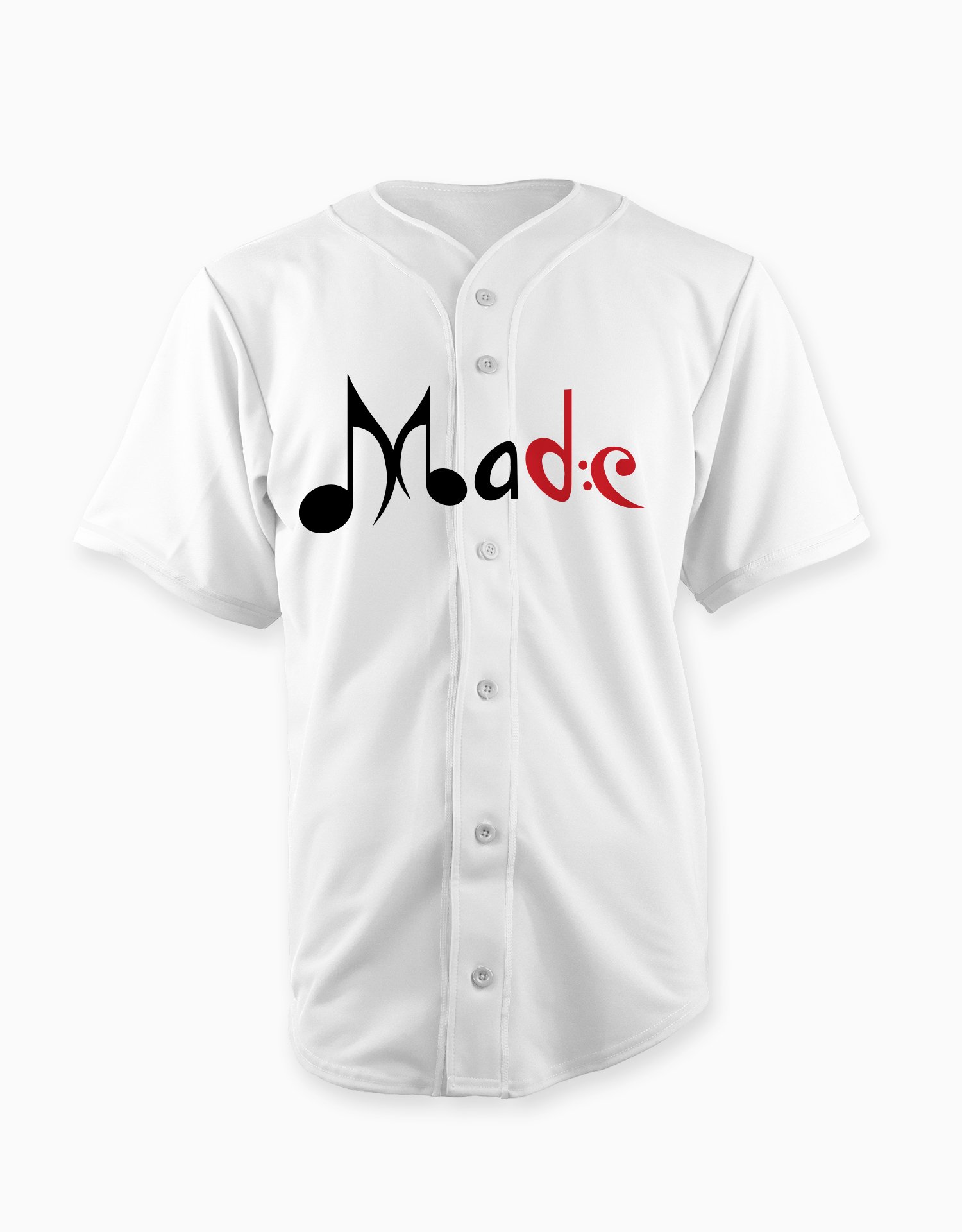
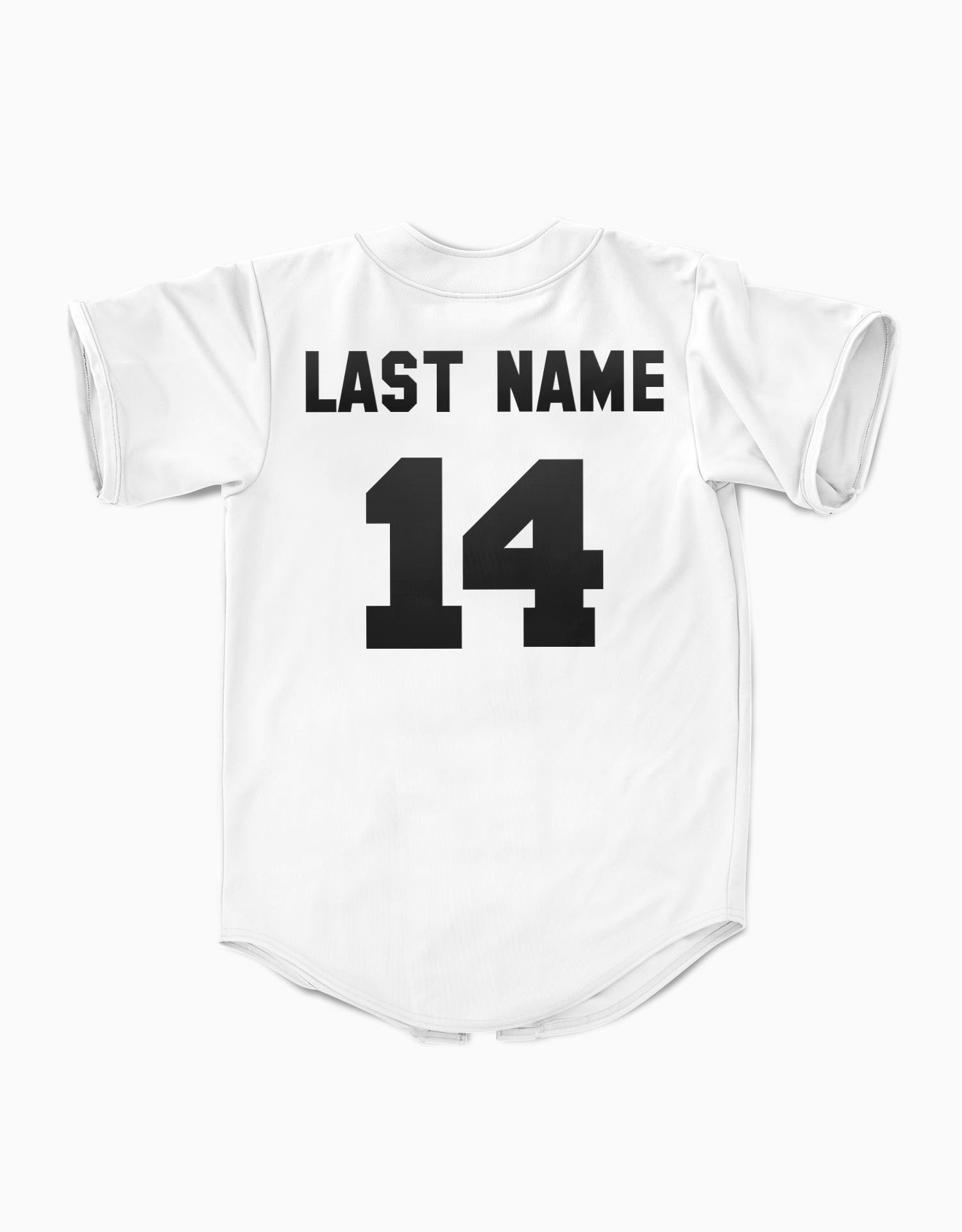
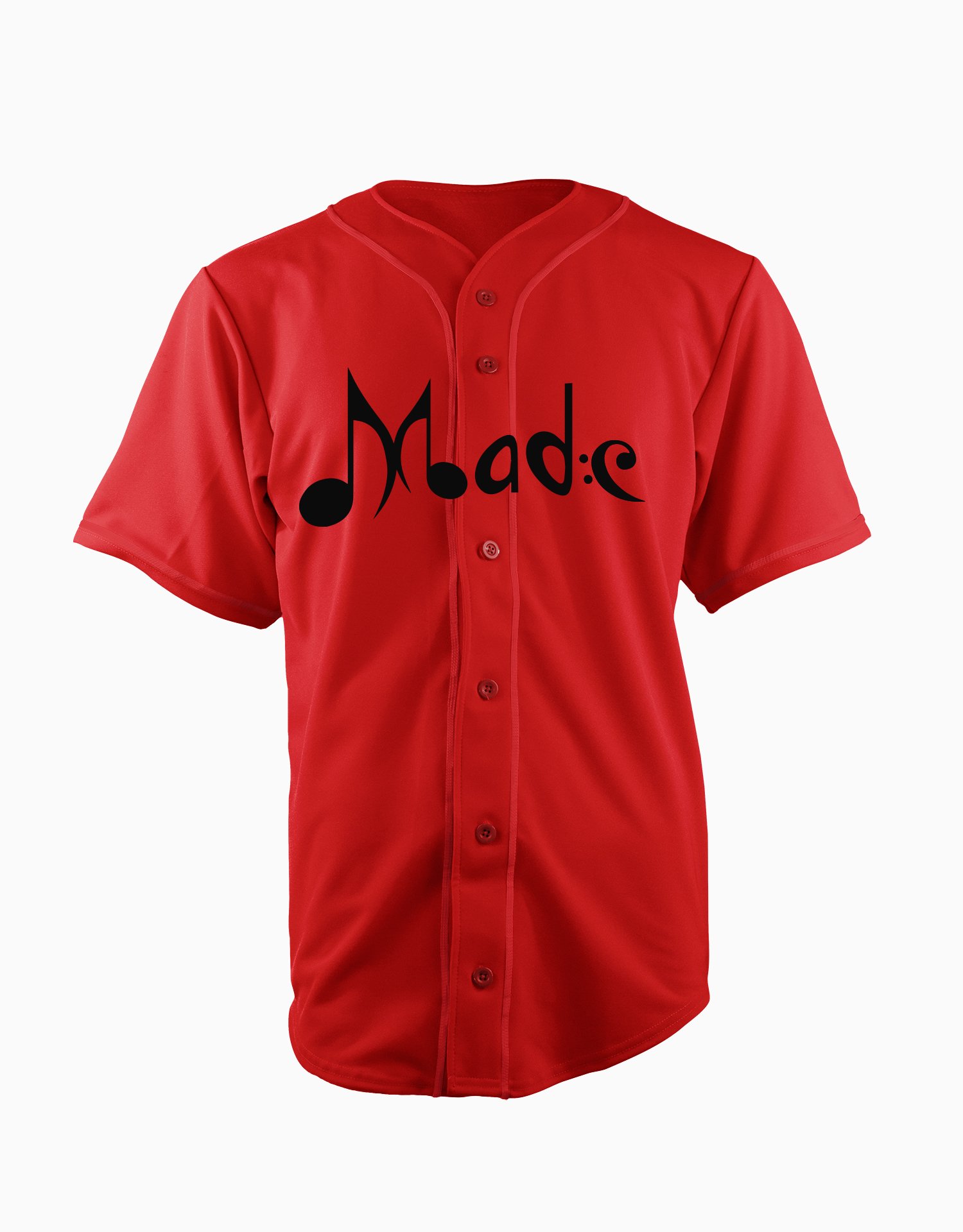
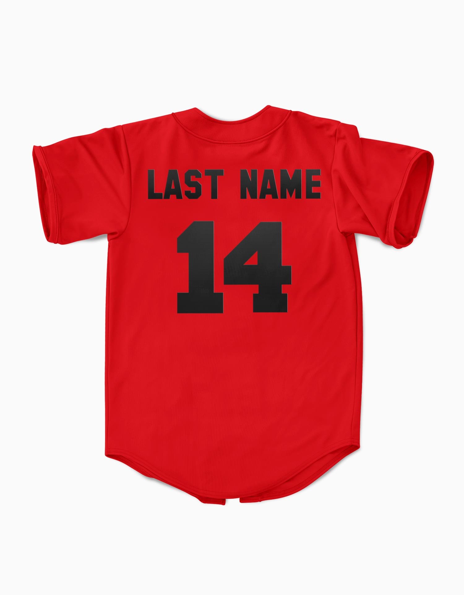
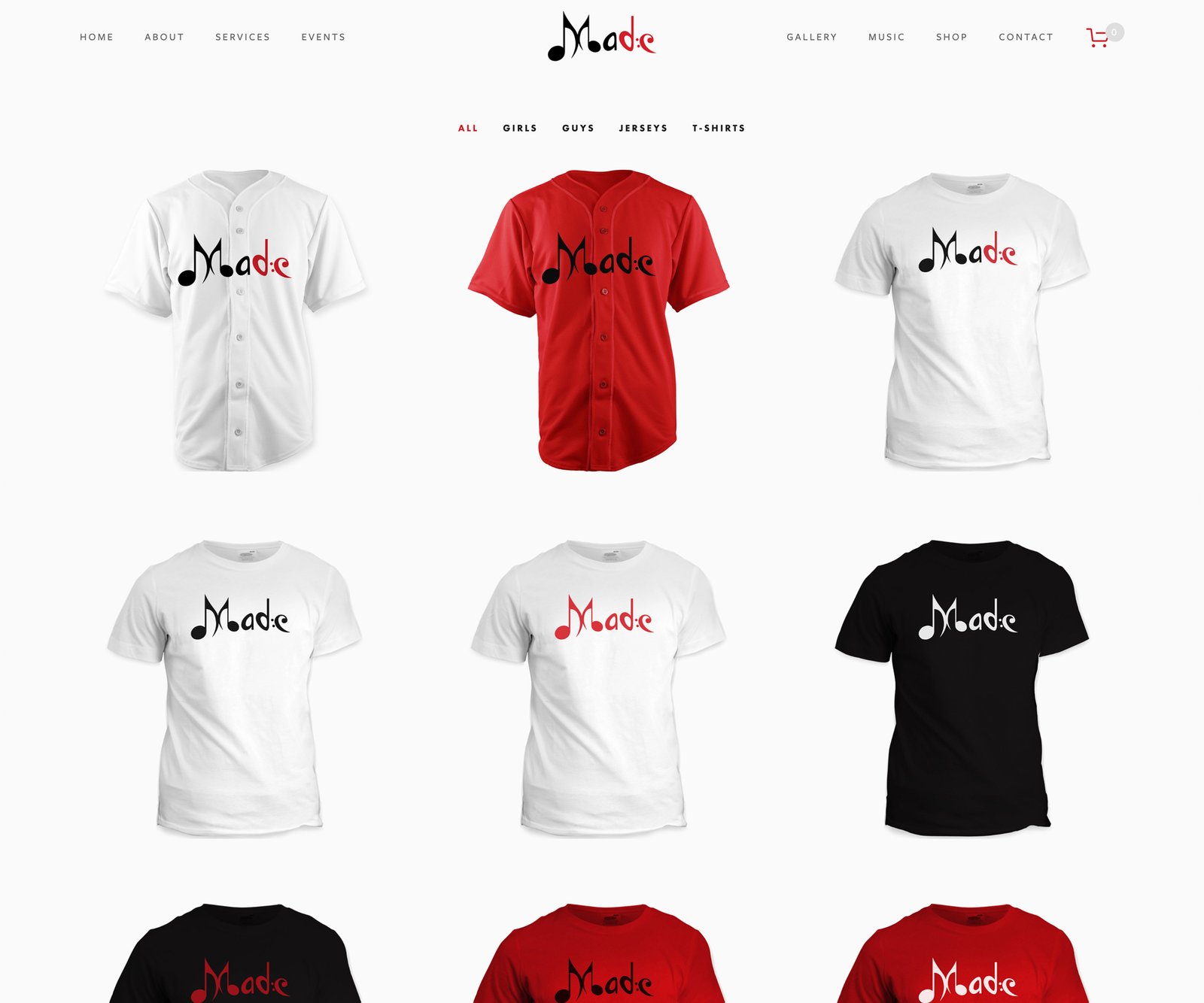
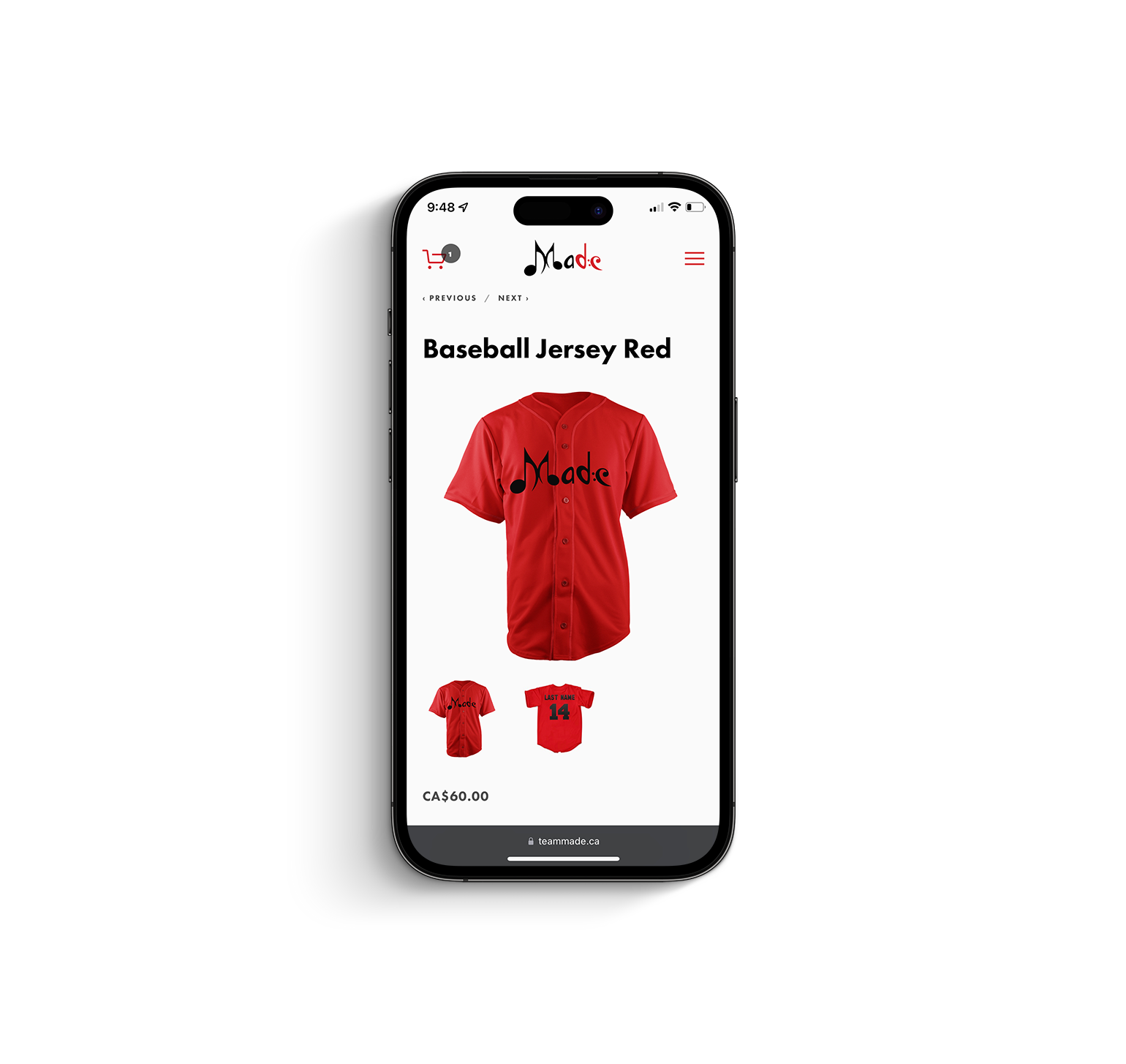
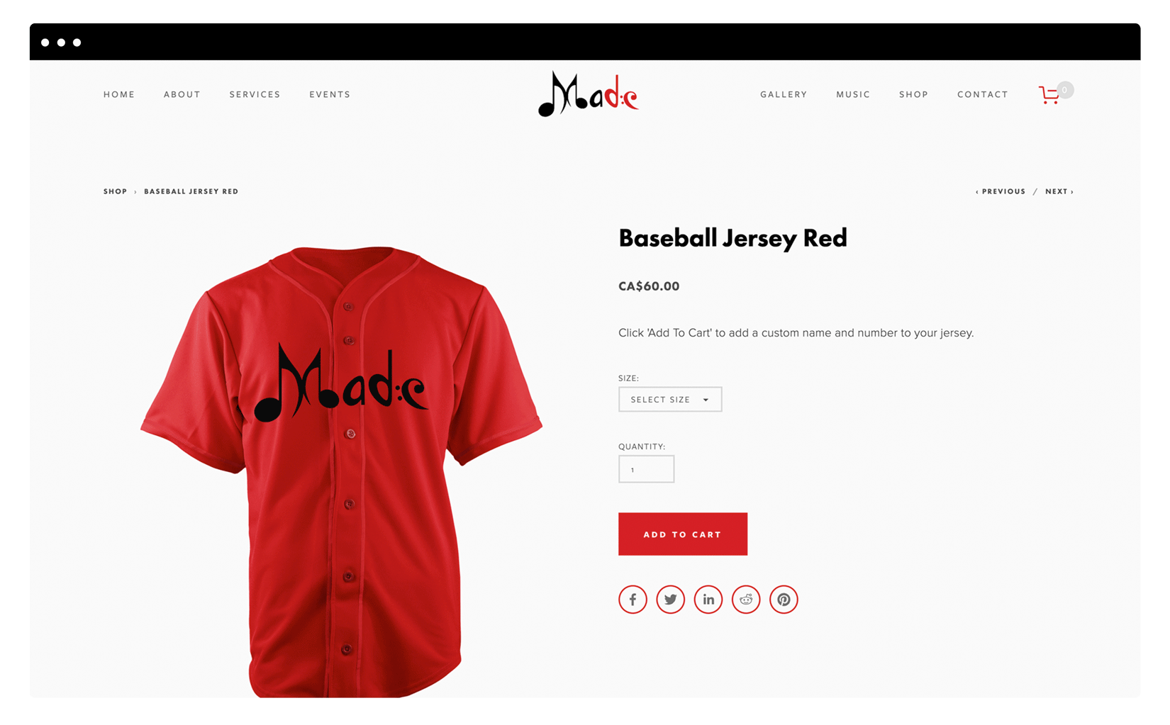
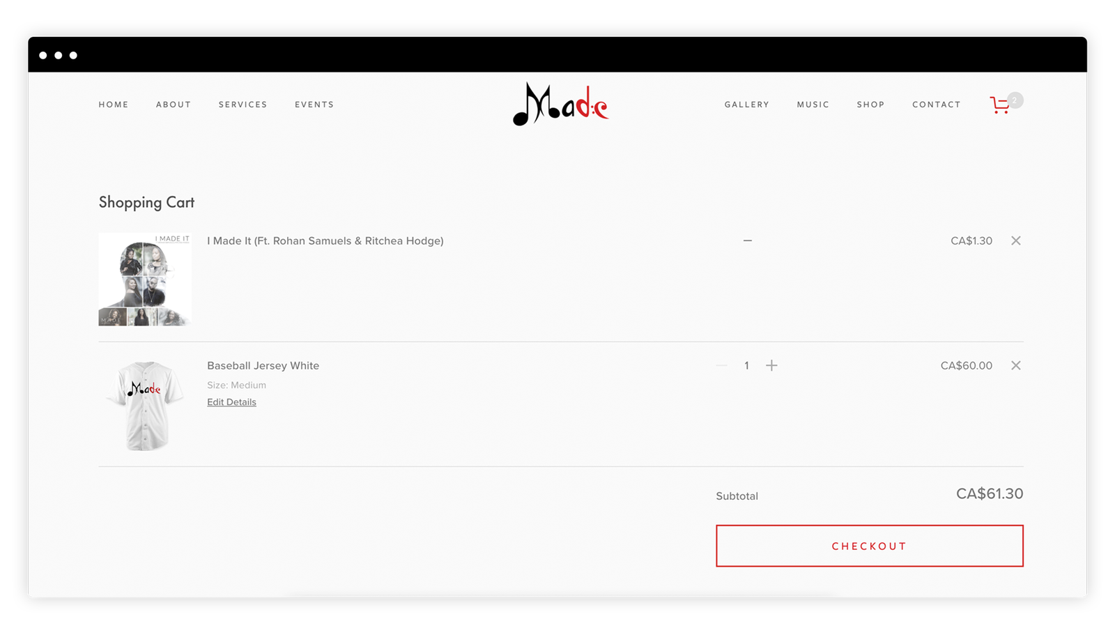
Known for their exceptional musical delivery and unmatched swagger, MADE Inc. (Music Advocates Delivering Excellence) is a Christian-based record label hitting the Toronto music scene by storm. Founded in 2013 by Toronto musician and producer Dean Samuels, MADE’s quality and distinction of sound sets them apart from the rest. Their musical style takes from traditional gospel music and adds traits from many other genres, delivering a sound that is only authentic to the young label. Through countless unsuccessful plans and reconstruction efforts, this label finally stands tall and firm with resilience and determination and its new roster of game changers.
The Challenge
Having just recorded their first award winning single, Team Made was in need of a website that would act as the digital hub where their growing fanbase and visitors alike could not only learn more about the group, but also purchase their music and merchandise. The group has been known to be very meticulous with how they present themselves using and wearing alot of white, and I spoke to that via the overall aesthetic.
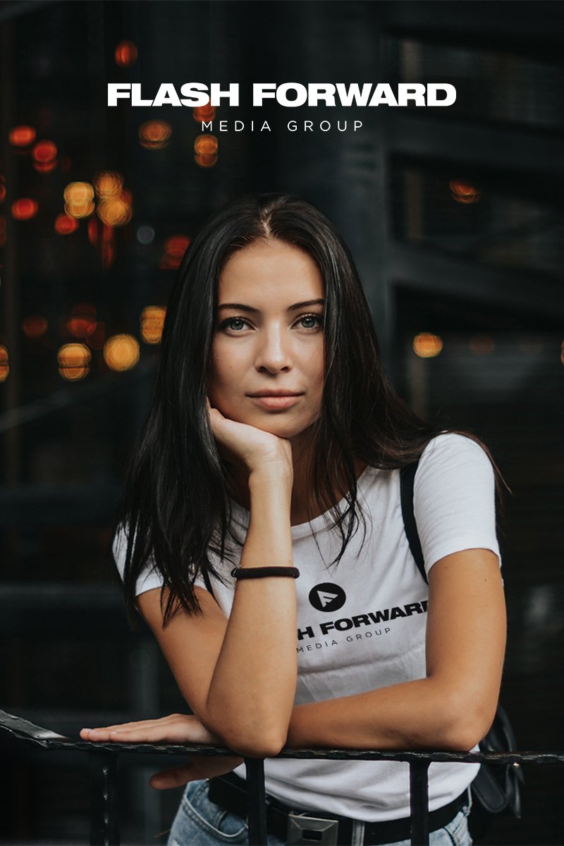
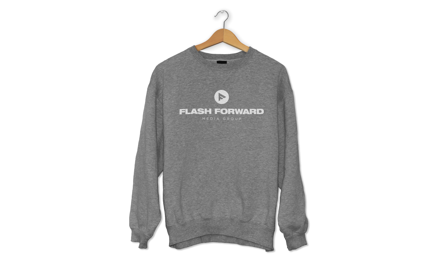
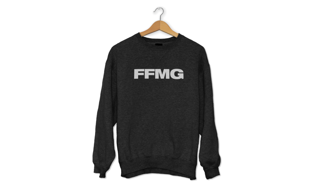
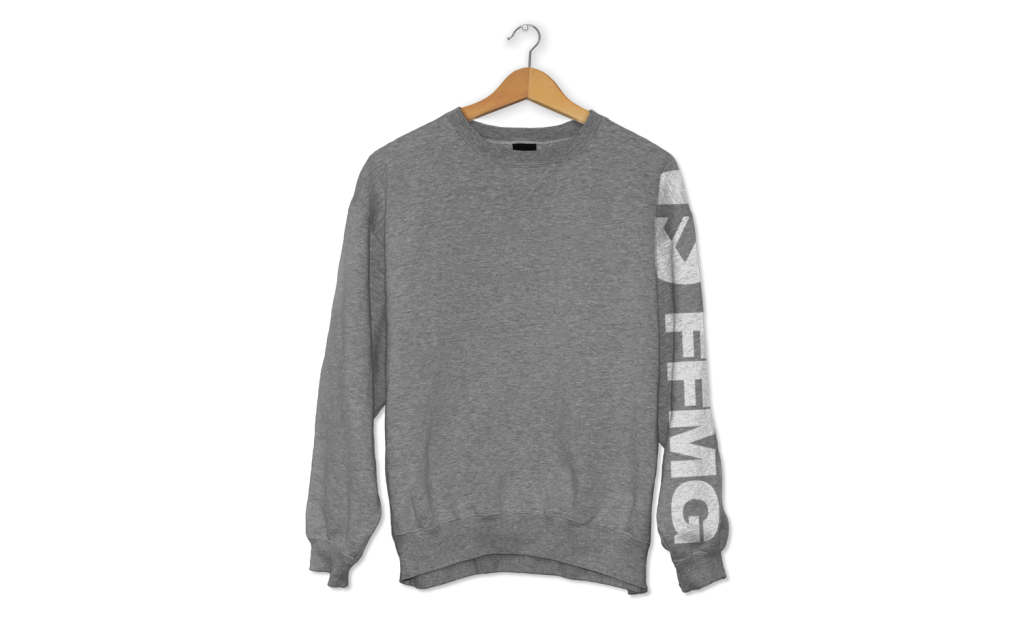
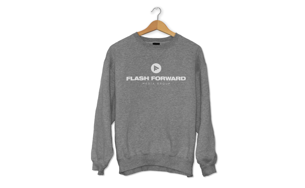
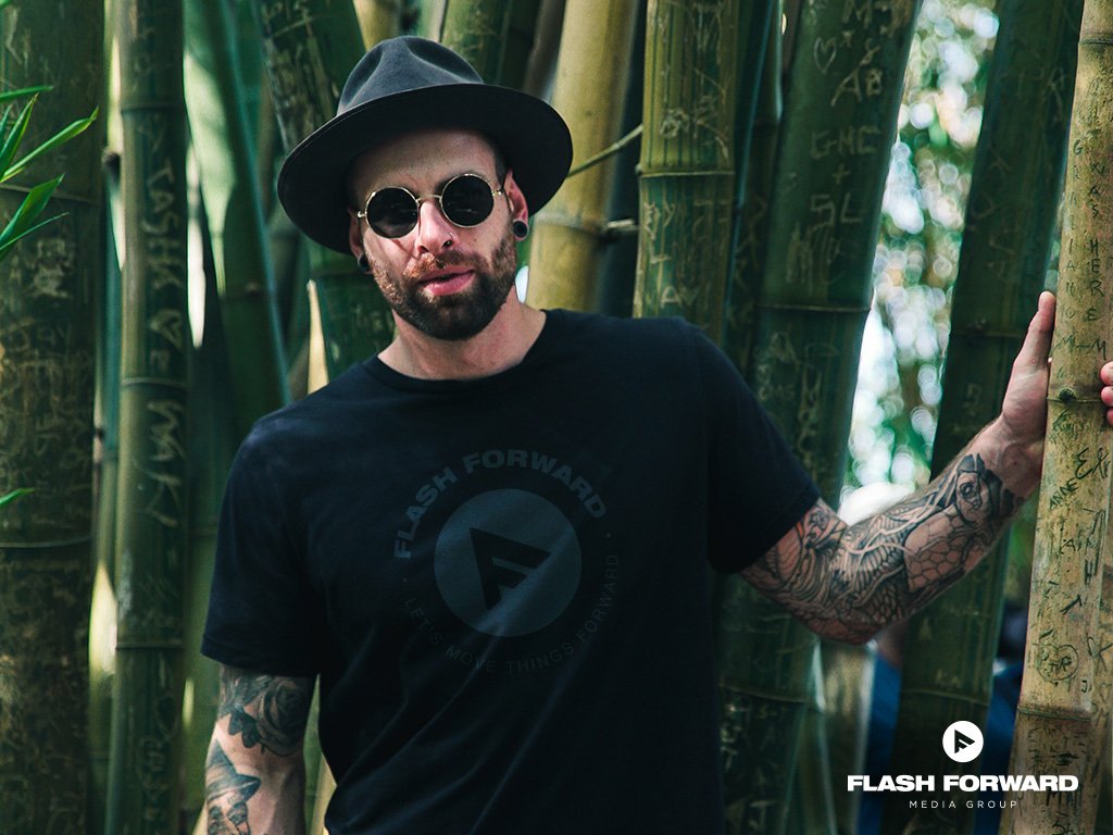
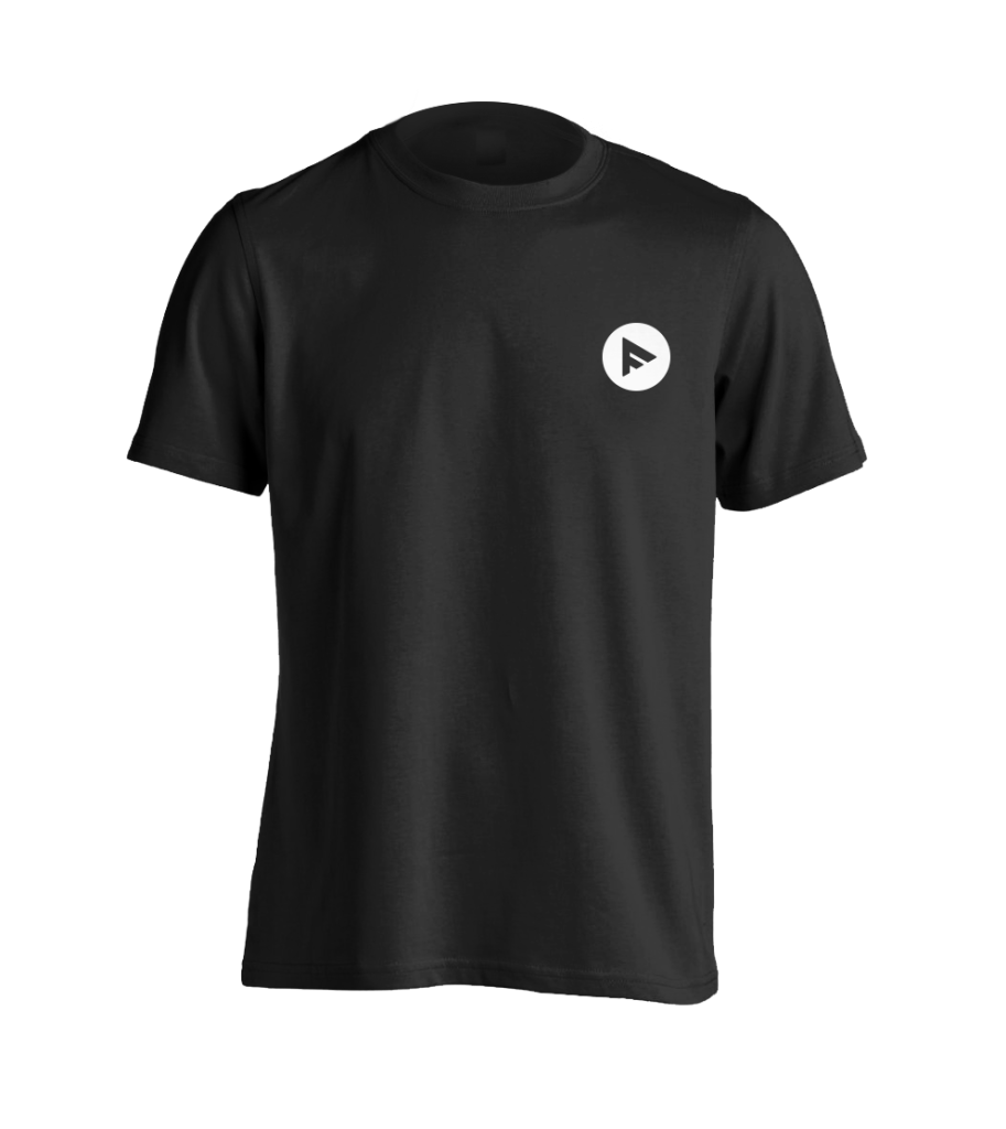
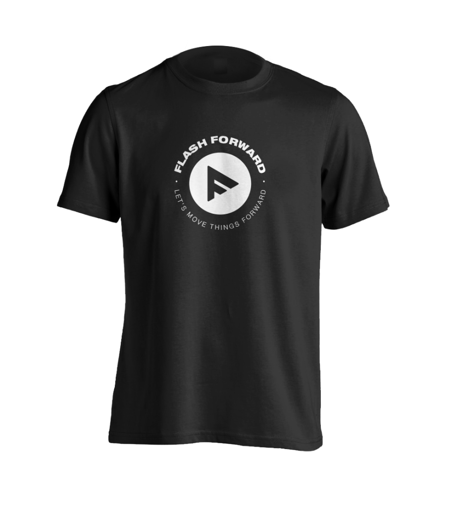
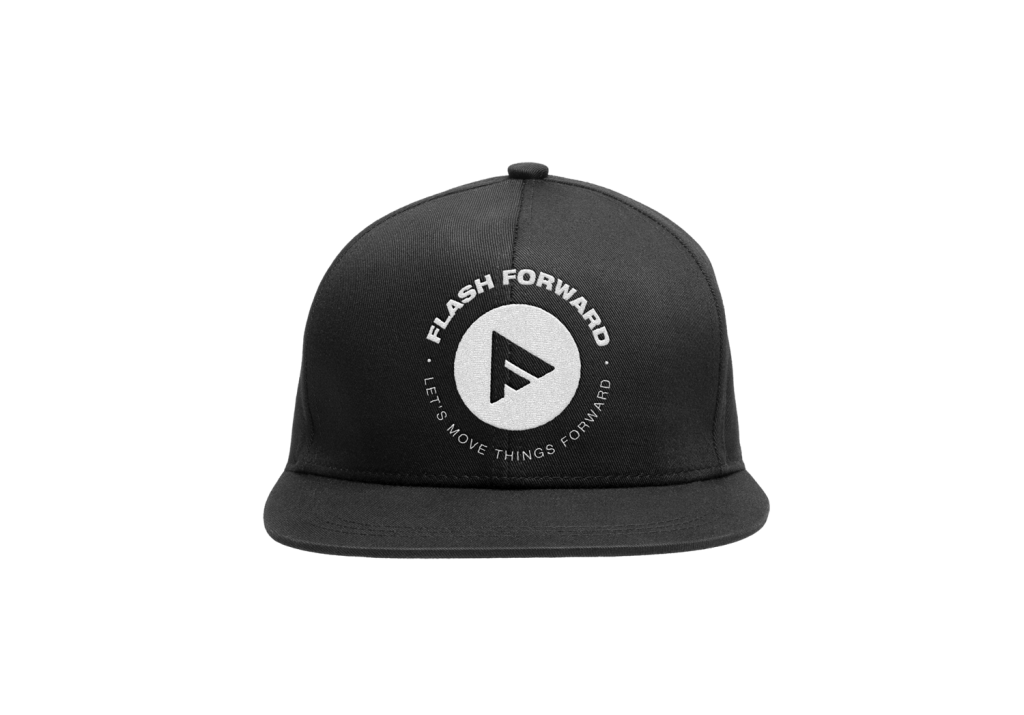
Flash Forward Media Group is a media production company specializing in high quality cinematography and looking to create merchandise for their growing fan audience.
The Brand Identity
With the main theme of Flash Forward Media Group (FFMG) being about moving forward, I elected to fuse the elements of a play button and the letter ‘F’. The play button speaks to the nature of the brand being a media & production company along with the theme of moving forward, while the letter ‘F’ is representative of the first letter of the brand’s name.
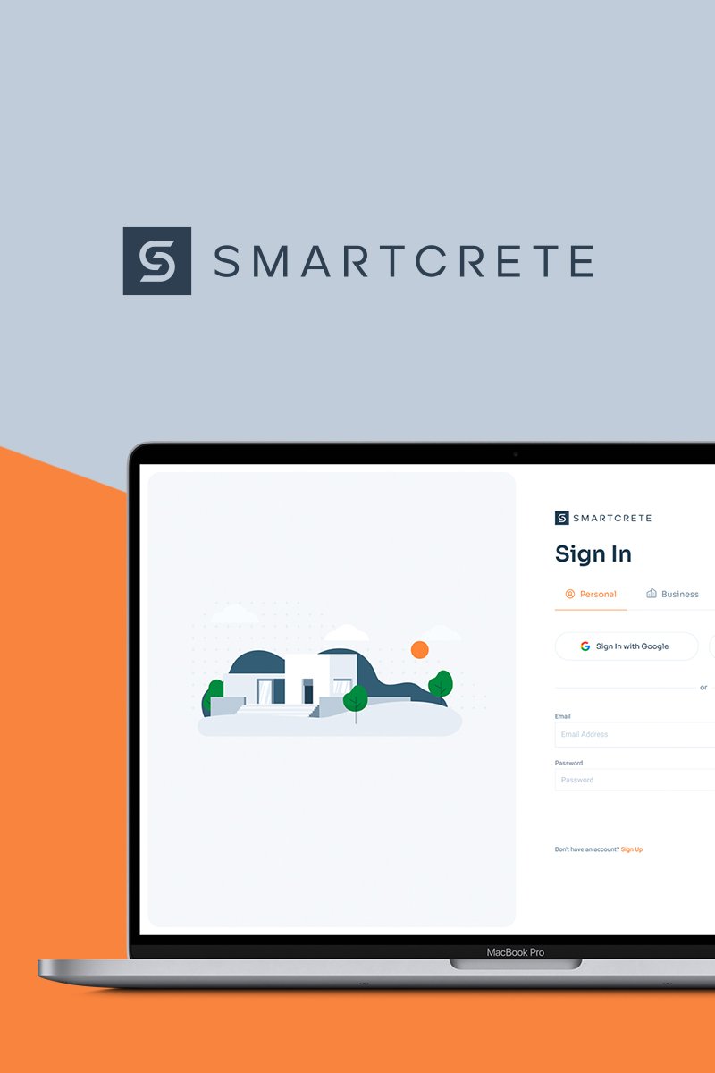
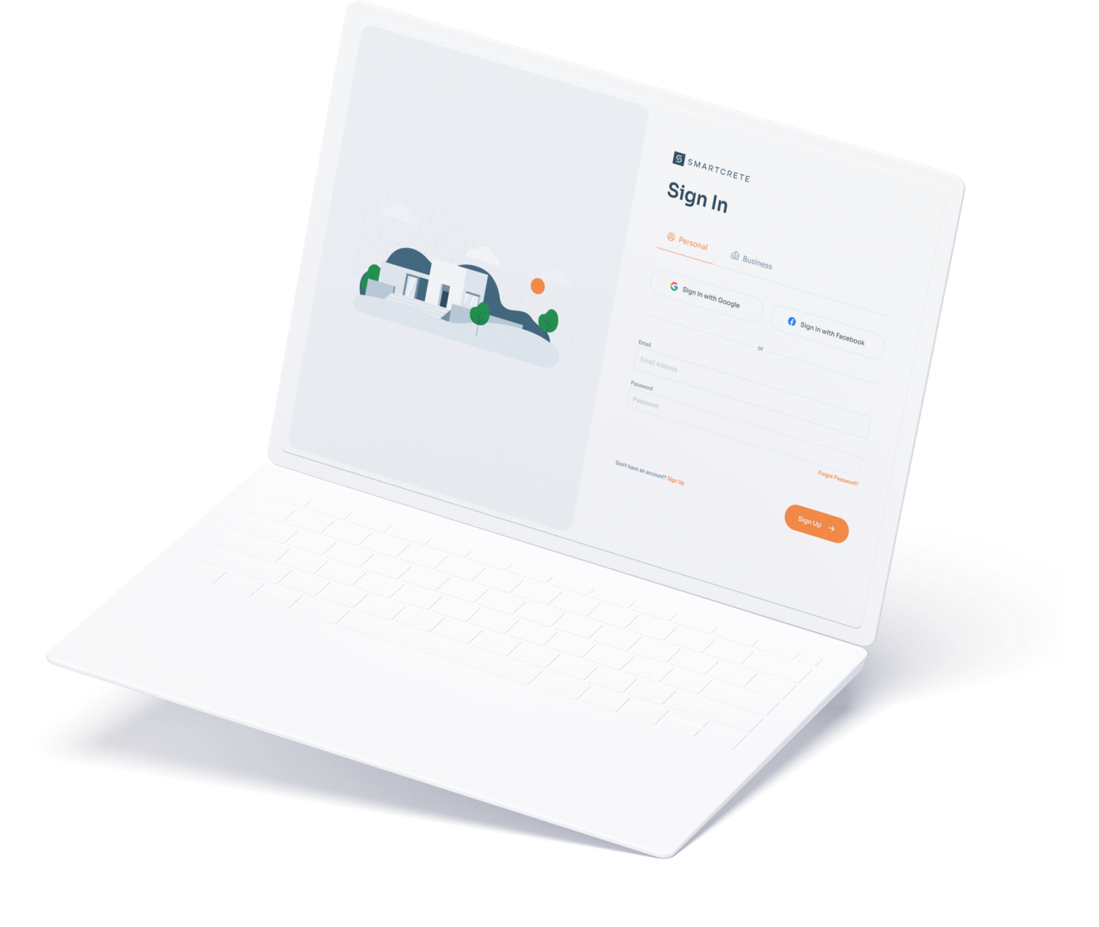
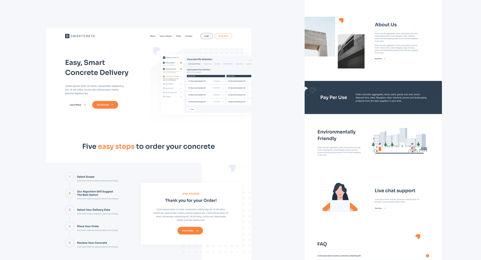
A modernized user experience for concrete ordering & logistics
Delivered
UX/UI Design
Web Design & Development
The Brand
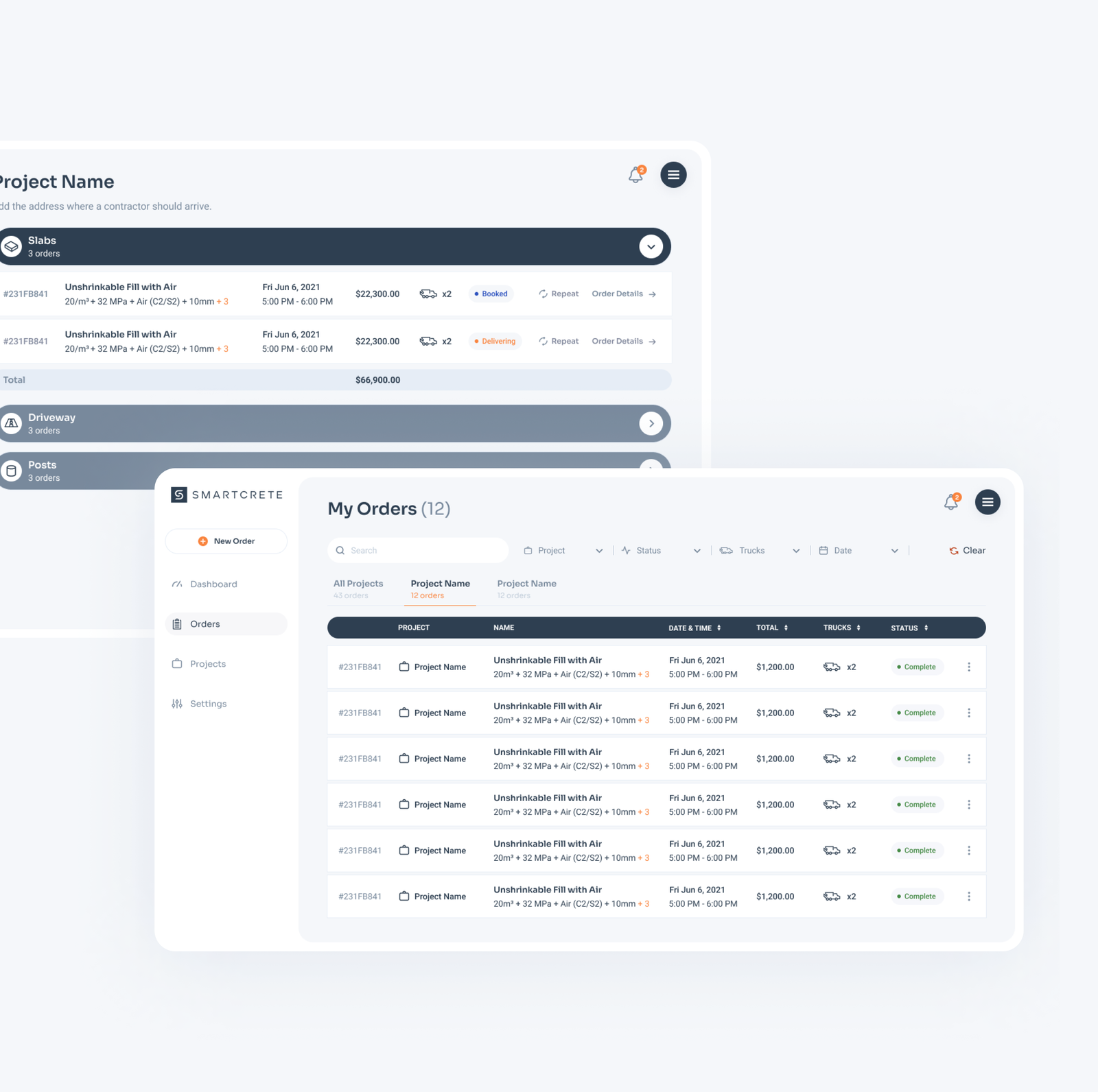
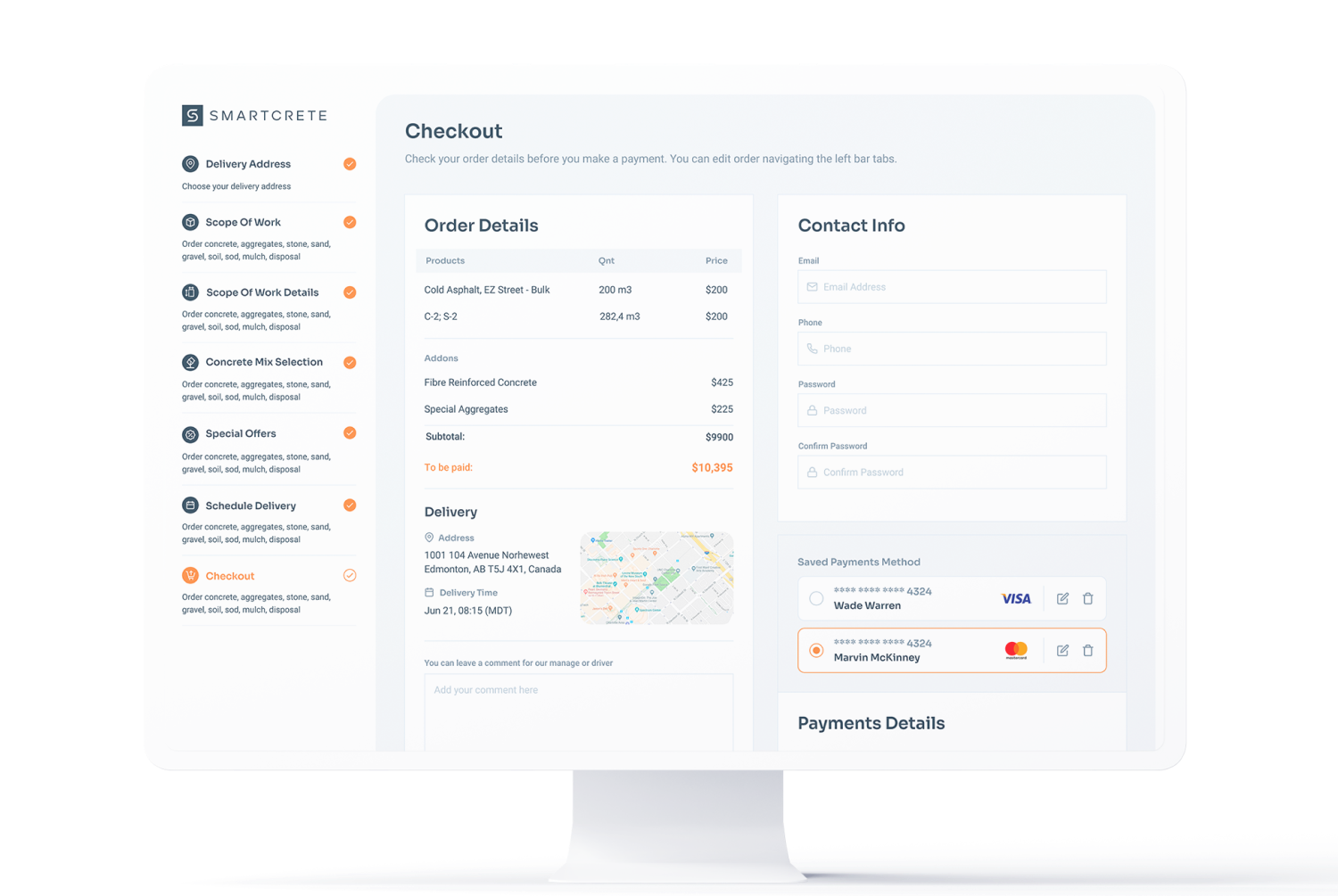
Smartcrete is a company specializing in delivering concrete to its customers using volumetric mixing trucks. Unlike most concrete companies, customers will be able to order their desired concrete online, creating an easier, modernized and more transparent user experience of ordering within the construction industry.
The Challenge
Approached by our client, GTA Concrete Connection Inc., our team was tasked with creating a brand identity for their new subsidiary company – Smartcrete. This was to be an identity for a new and modern construction company with a very strong focus on the digital space.
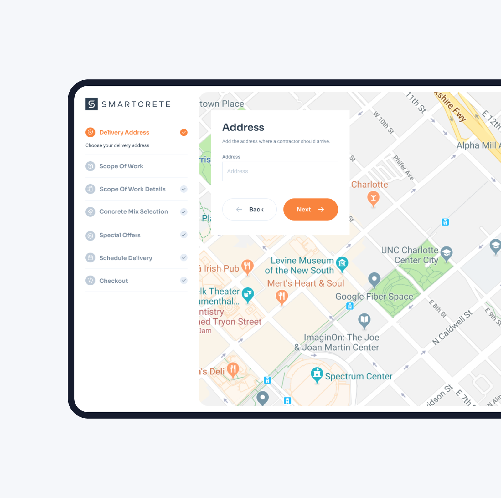
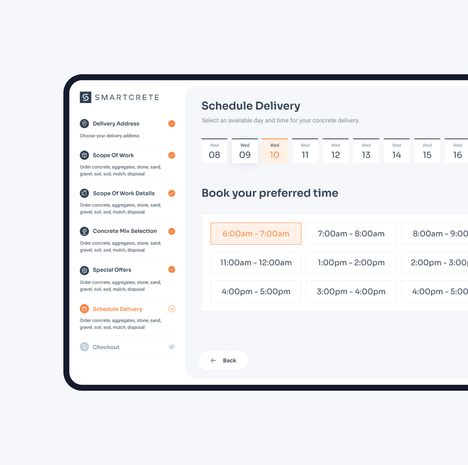
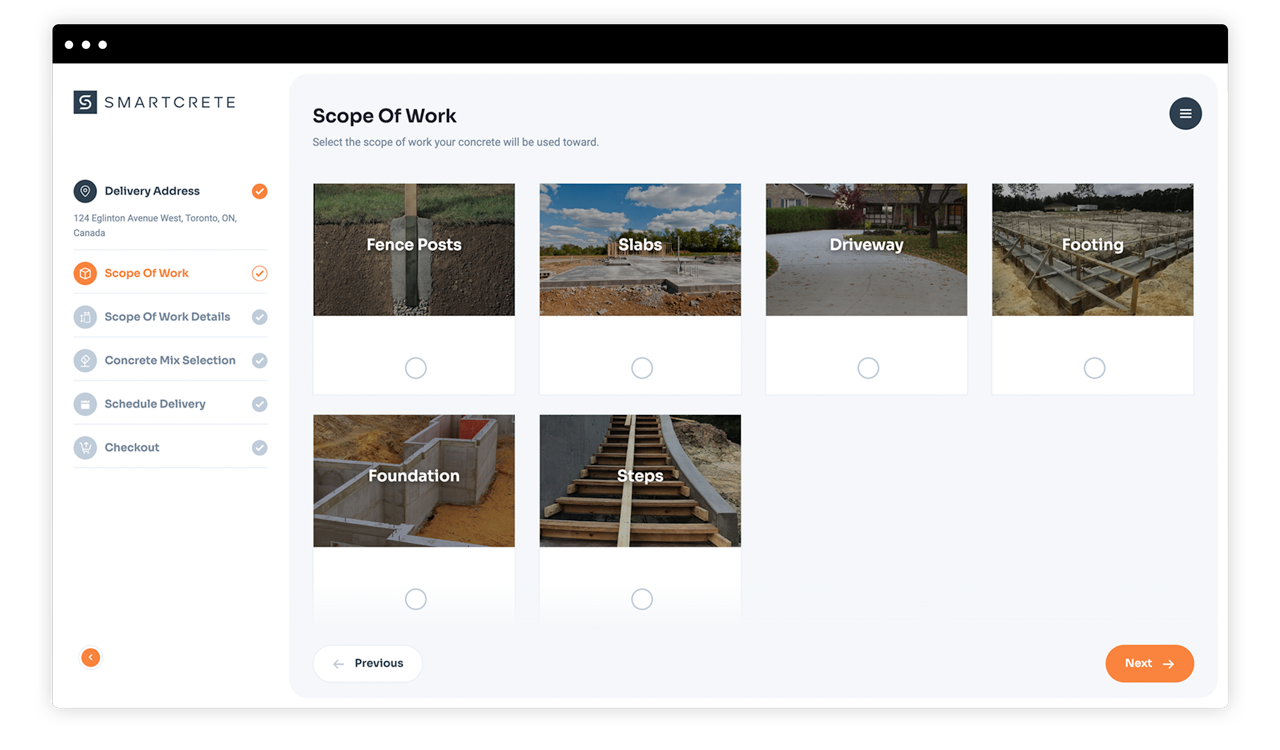
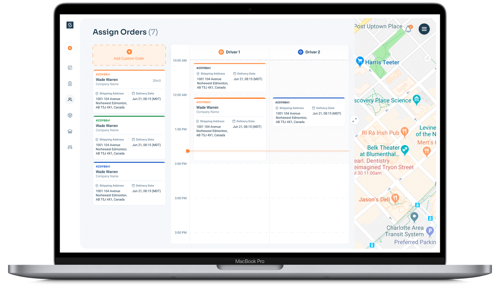
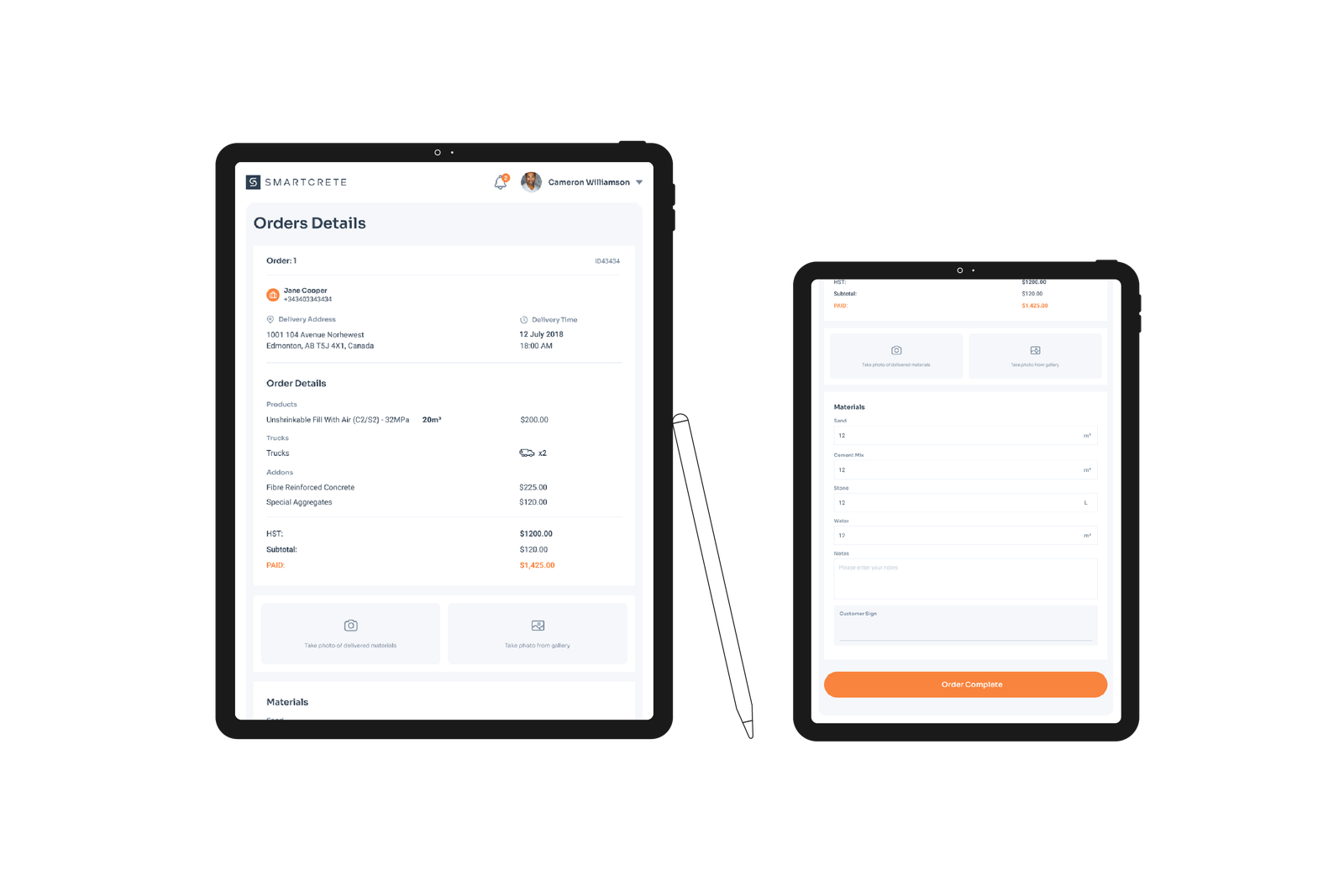
Additionally, we were to design and develop a web application that would house the company’s newly created proprietary algorithm that specifies how much concrete is needed by simply entering a few key dimensions of a project. The web app would also allow end users to place their concrete orders while allowing the internal staff to fulfill said orders. A tablet application for drivers to coordinate and fulfill orders was also to be created, and lastly, a standard marketing website to promote it all.
Brand Identity
Our approach for the identity was one that focused more so on the digital space. As pioneers of this business model within their industry we wanted to create as much credibility and trust between the brand to its target audience by presenting them as a tech company that delivered concrete as supposed to a concrete company that was in tech.
#2e3f51
#f9843e
#fff1e6
#78899c
#c0ccd9
#e6edf6
Web App
The traditional concrete ordering process has long been deemed as a nightmare user experience by customers. As a way to streamline said process, we redesigned it to be fully digital in which users can now order their concrete completely online while never having to talk to anyone. The 2 minute ordering process is made simple for both professionals and DIYers alike via Smartcrete’s proprietary algorithm.
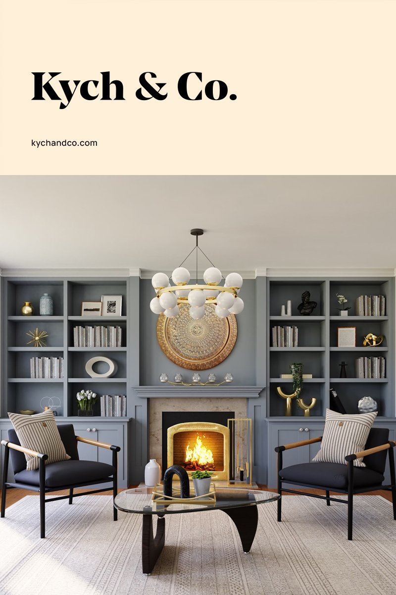
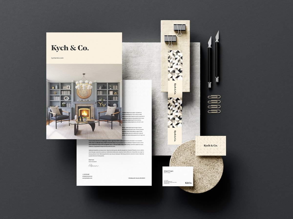
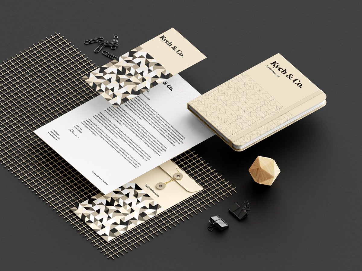
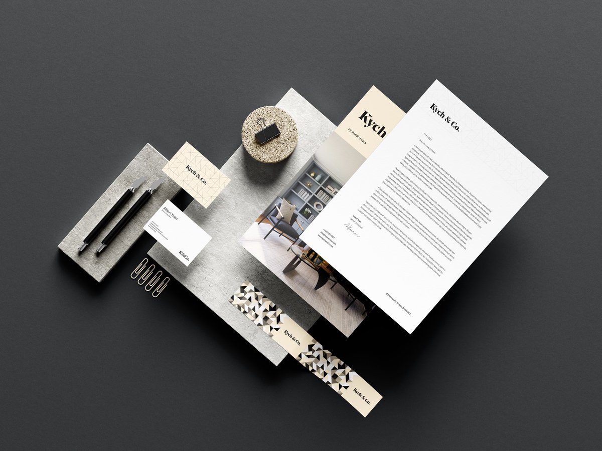
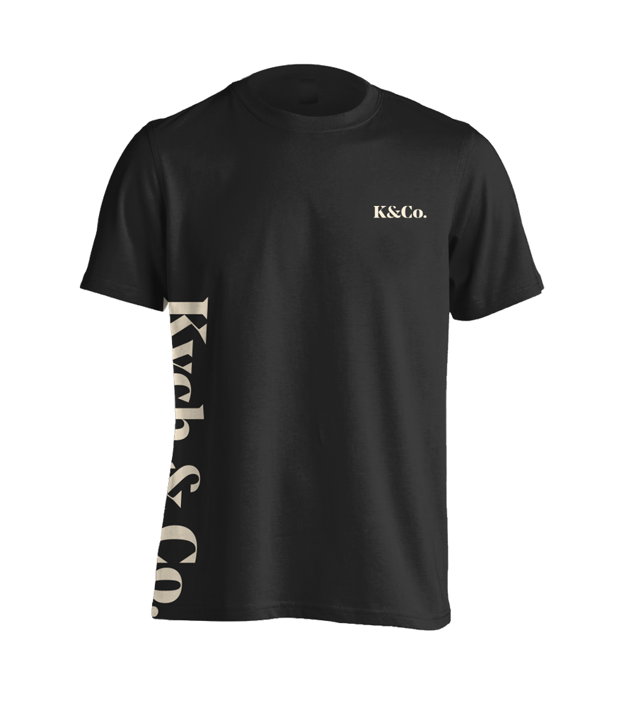
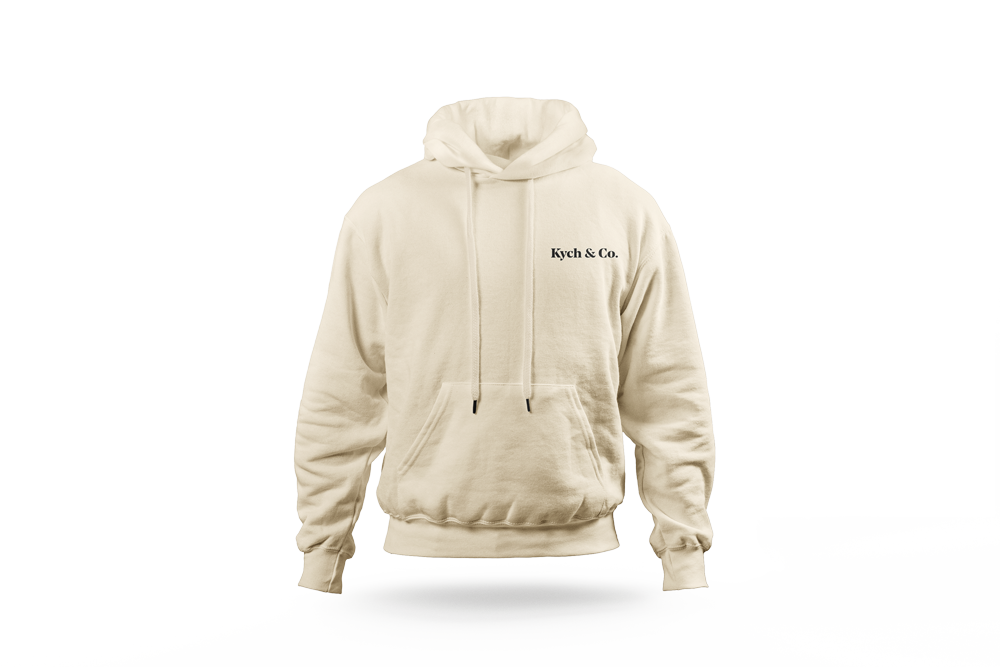
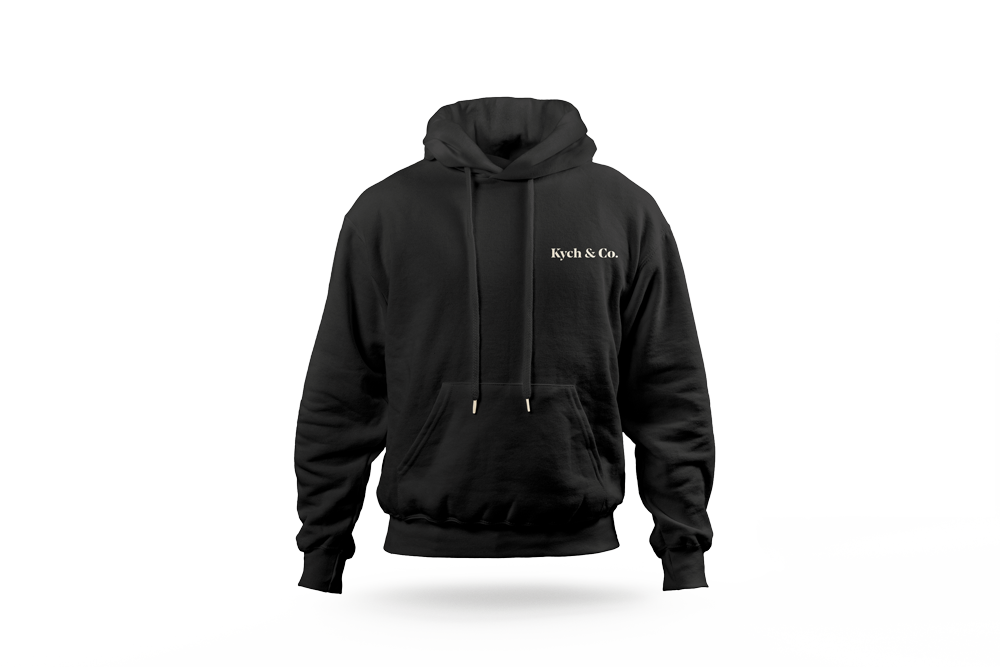
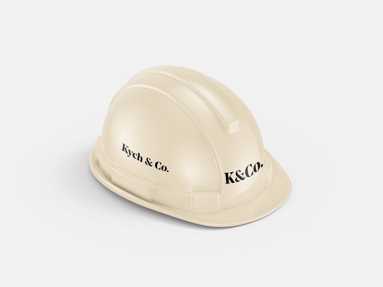
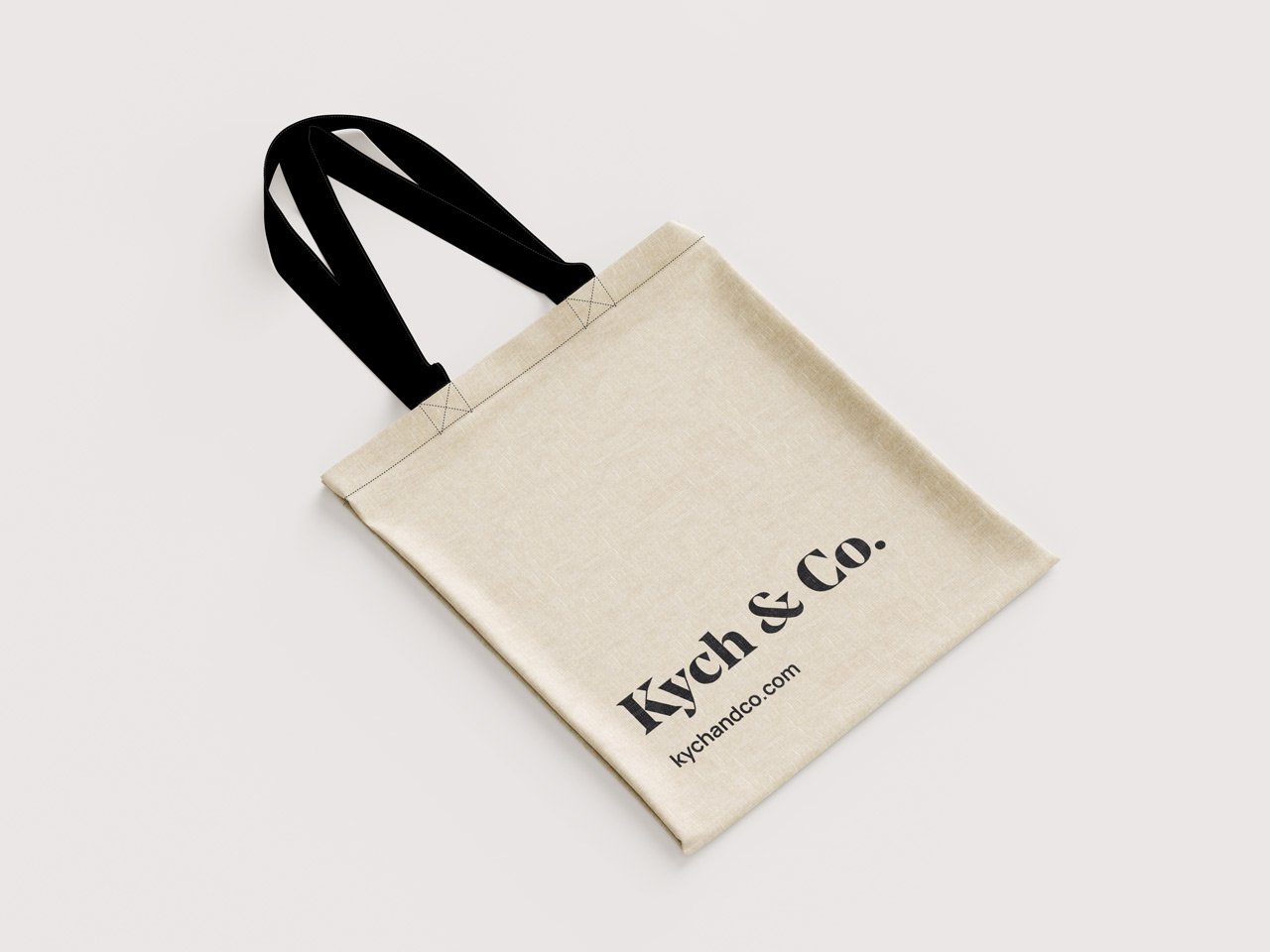
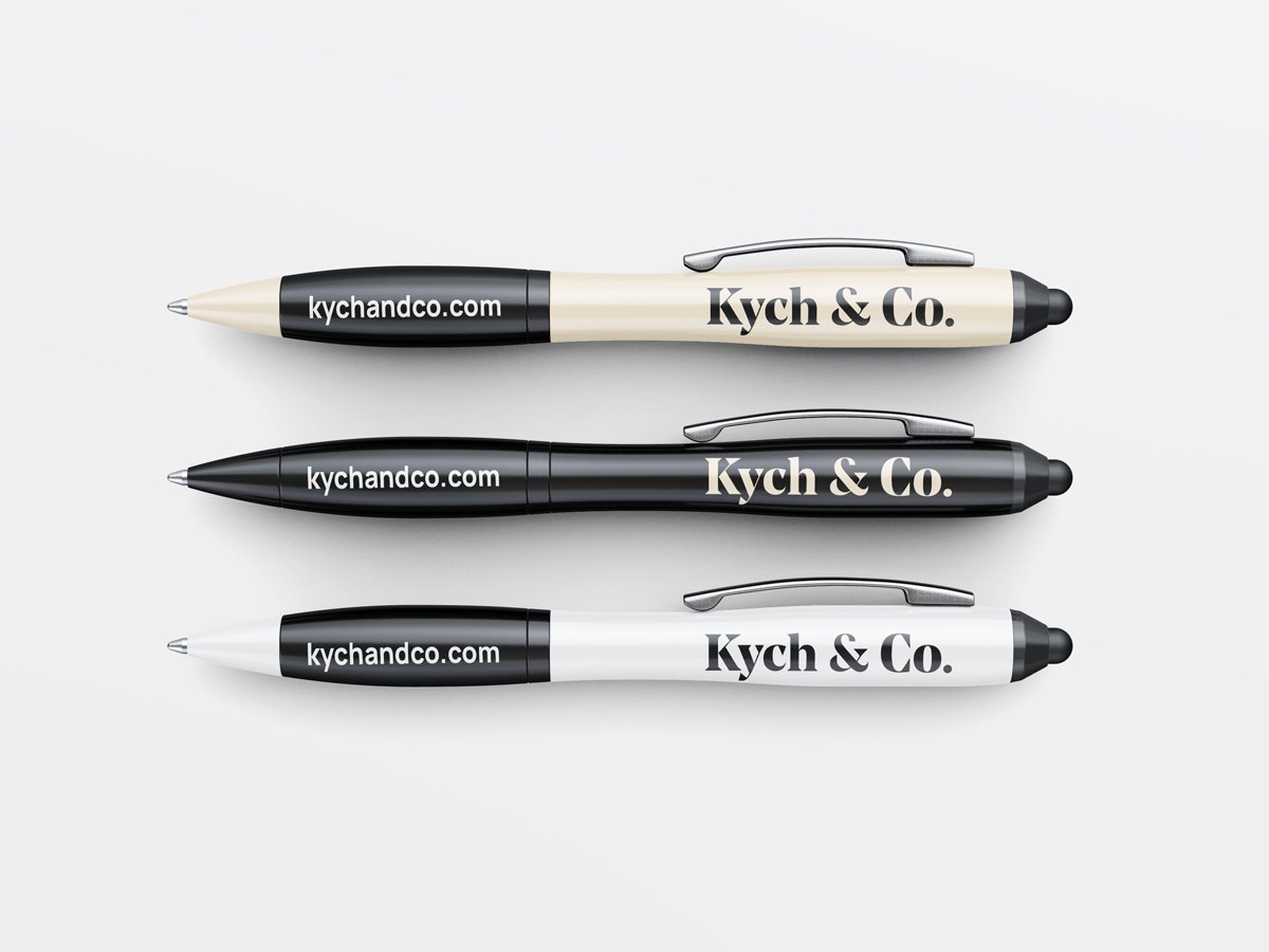
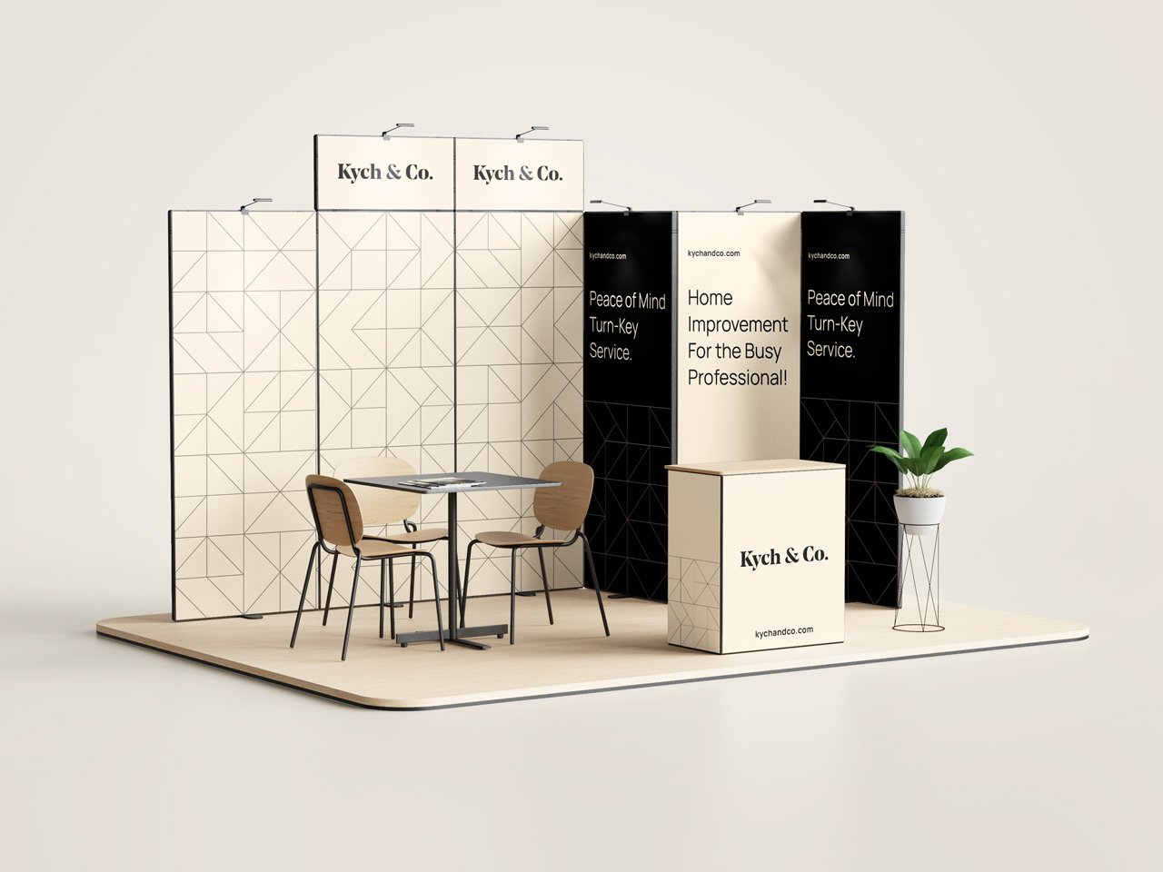
Kych & Co. is a full service design and construction company, who’s primary focus is residential home improvement. With their innovative approach to the overall design and construction process of home renovations, Kych & Co. prides itself on delivering a turn-key hassle-free service to its clients.
With the overall character and mood of the brand having a more buttoned-up, minimal, and ultimately upscale feel, I elected to stick within those paramateres when creating the logo as well. A wordmark was used as the primary logo of the brand as it perfectly captures and personifies the character of the brand based on the customized typeface used.
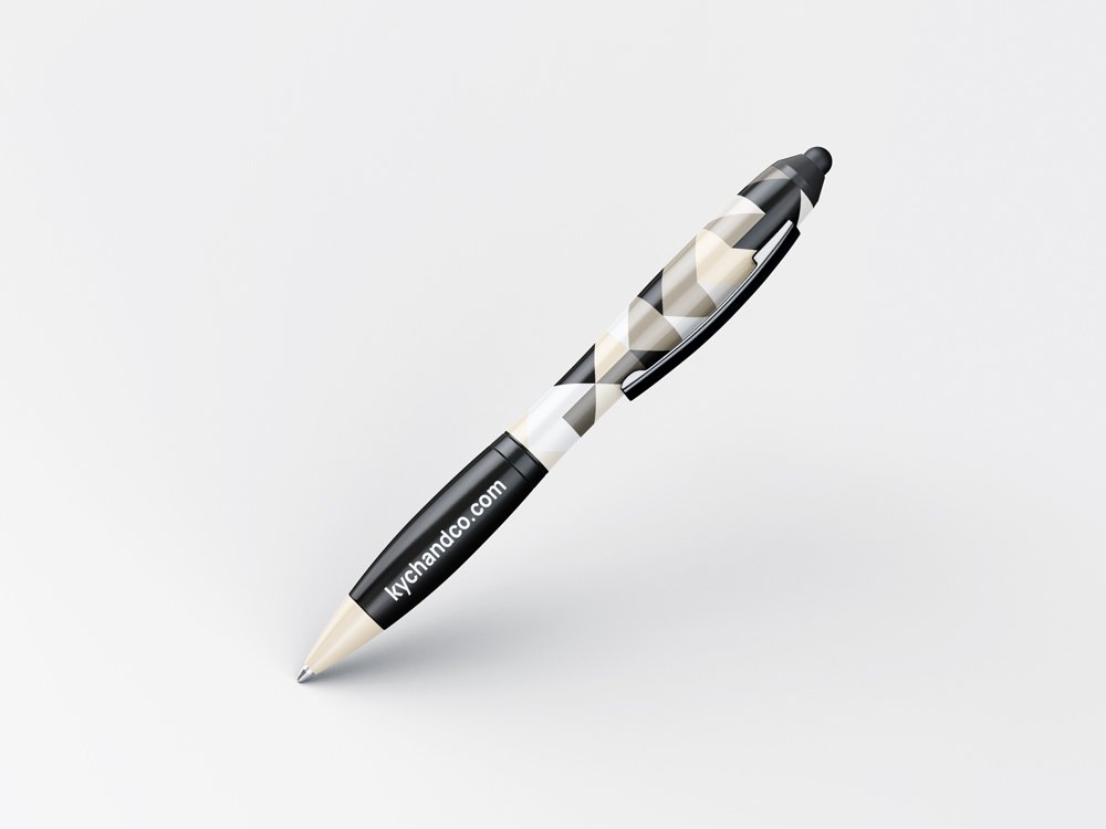
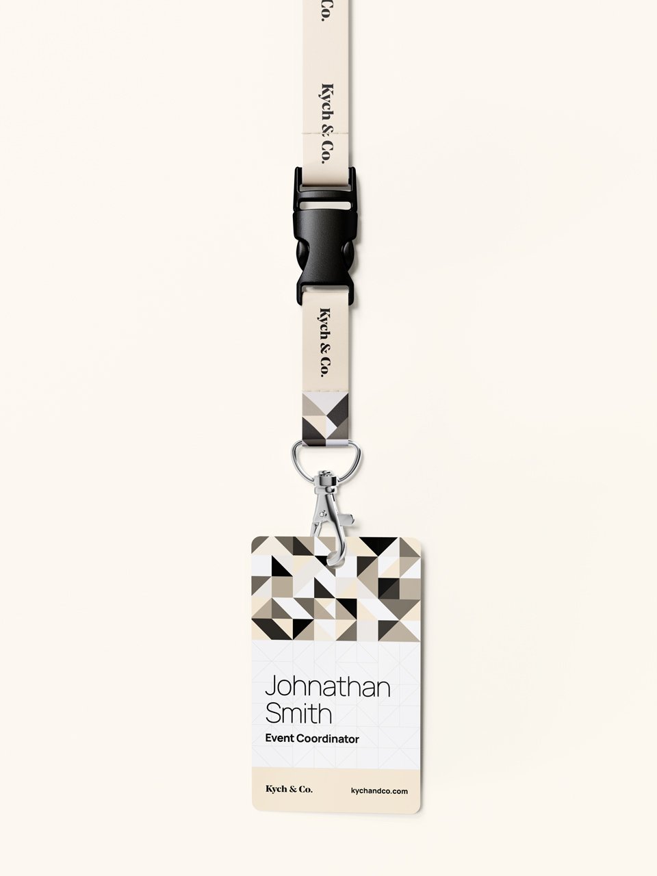
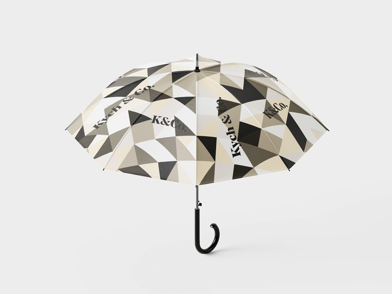
Kych & Co. uses a very innovative and proven project management process that has helped it dramatically streamline the management of projects so well that they eventually plan to release their PM process to the public. The goal was to speak to their level of innovation within the brand identity, which was accomplished with the use of geometric angles, shapes, and even custom patterns.
All of this coupled together made for an excellent marriage that created a sophisticated word mark that perfectly represents the brand it portrays – Kych & Co.
#fef0d8
#000000
#ffffff
#403c36
#7f786c
#bfb4a2
#fef3e0
#fef6e8
#fff9ef
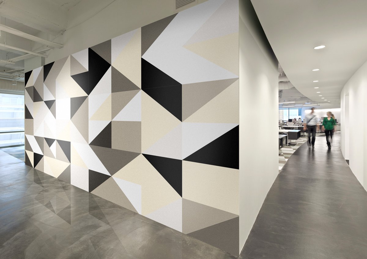
Patterns
This custom seamless pattern is design with triangular shapes to represent the brand’s cutting-edge innovation. It also serves as an additional design element that can be used throughout the brand application.
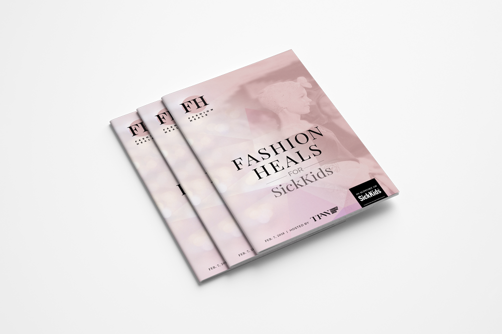
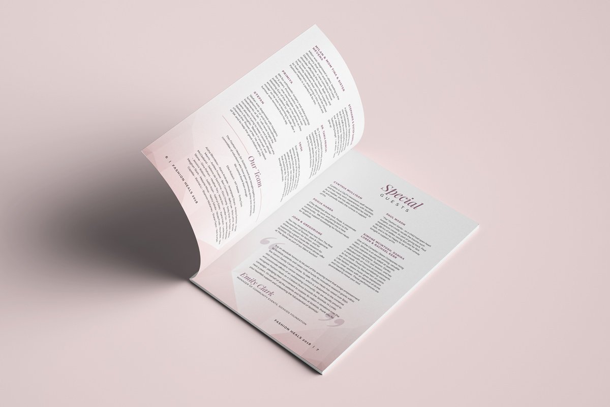
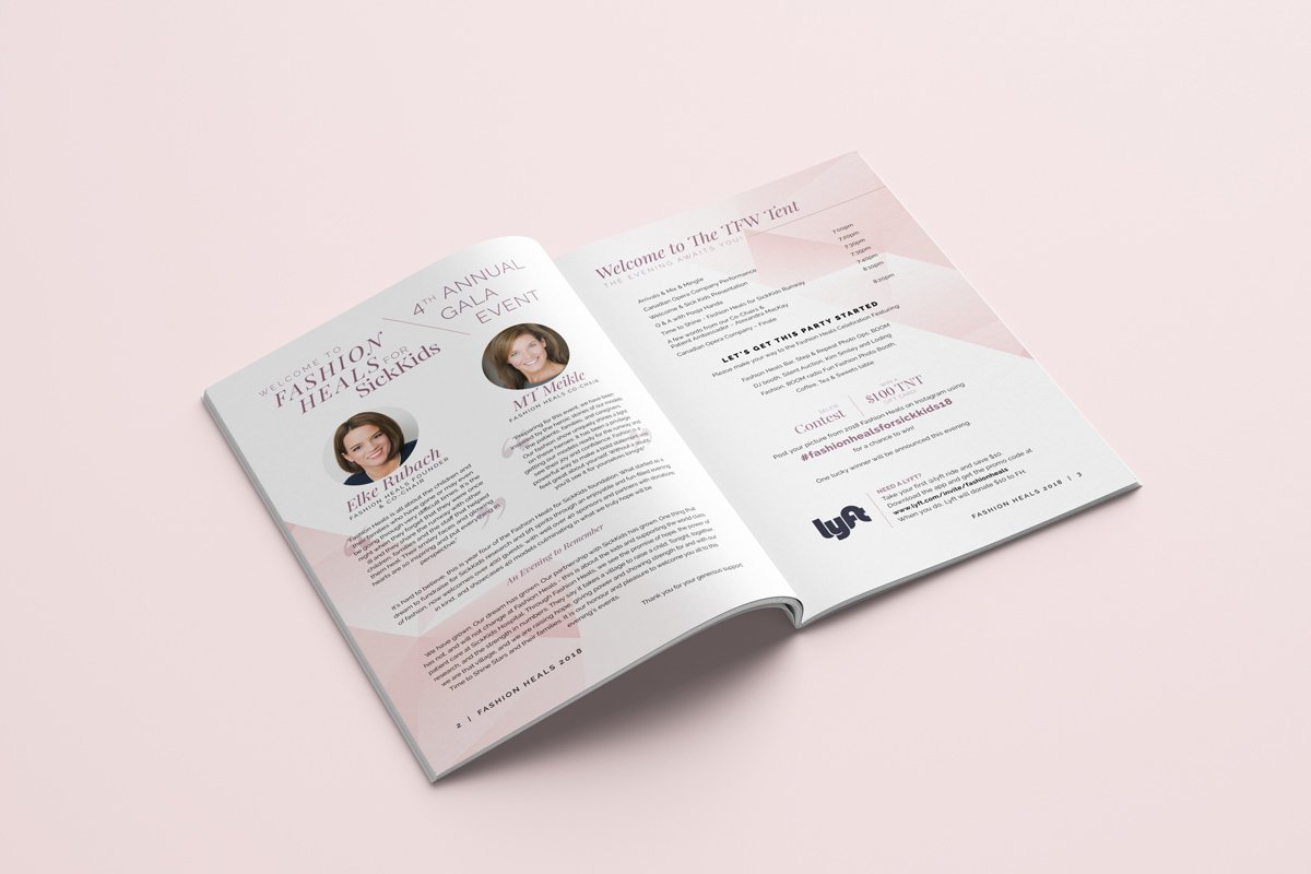
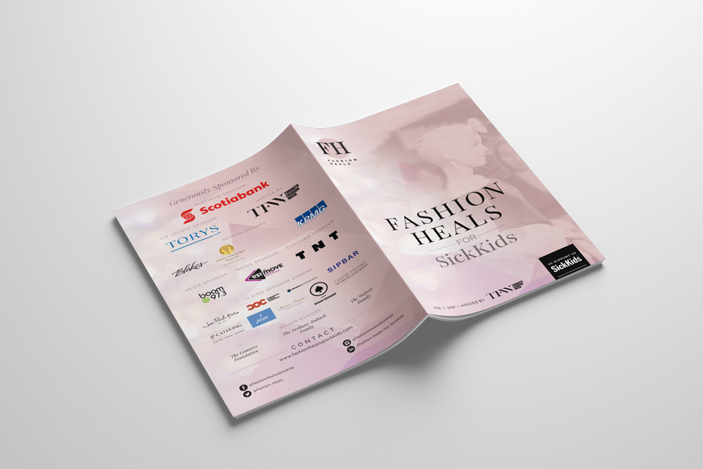
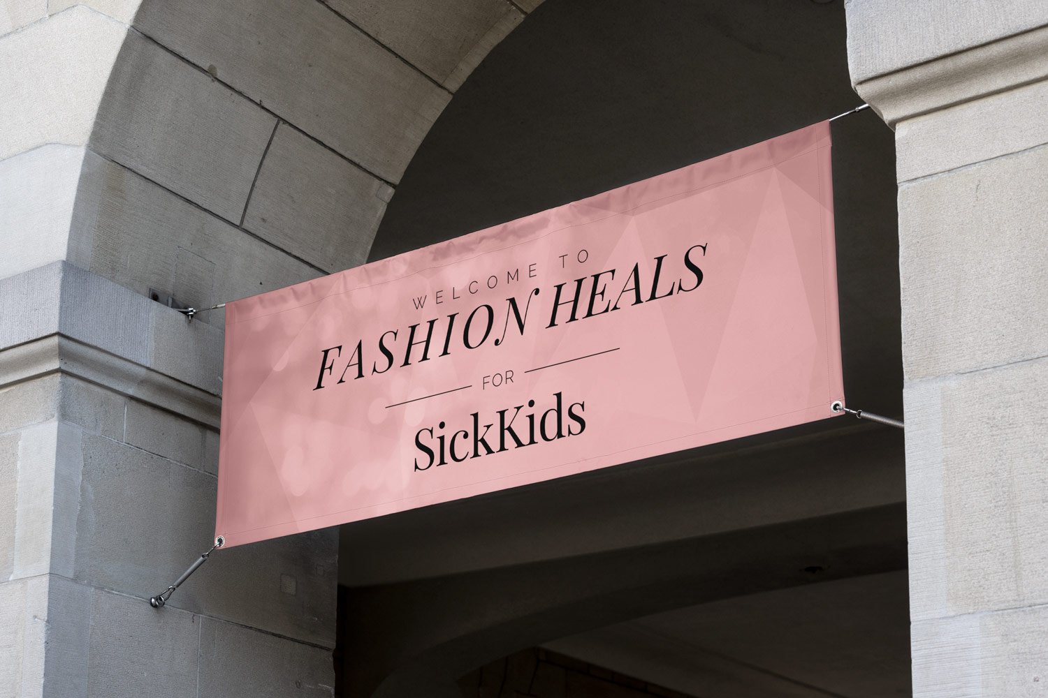
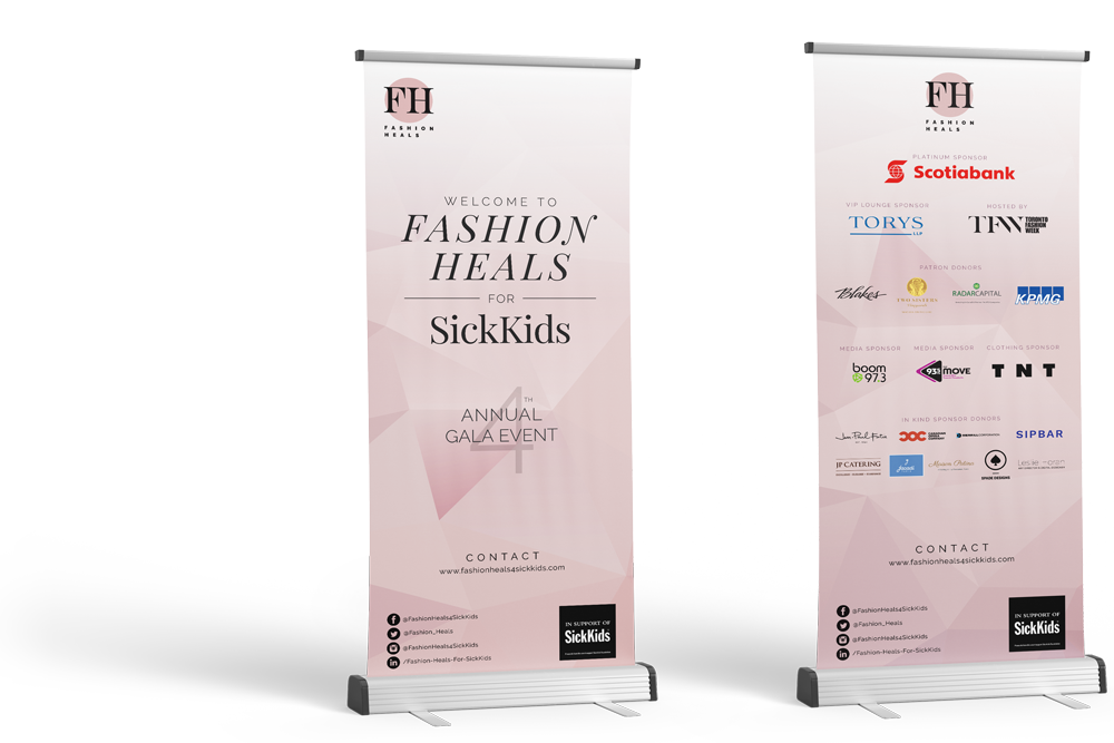
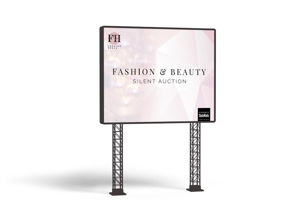
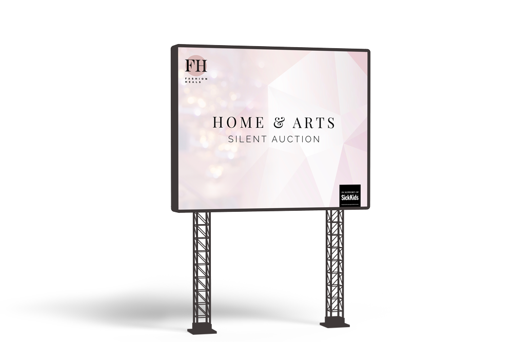
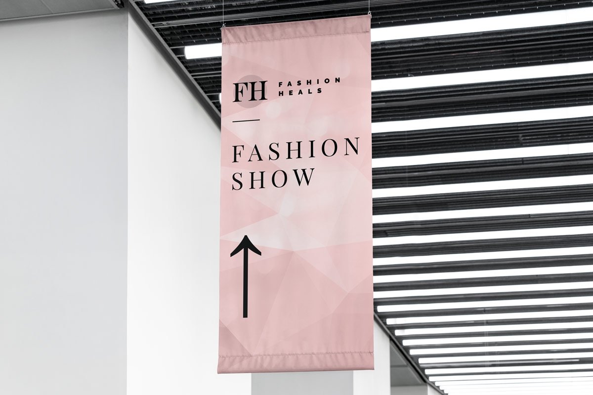
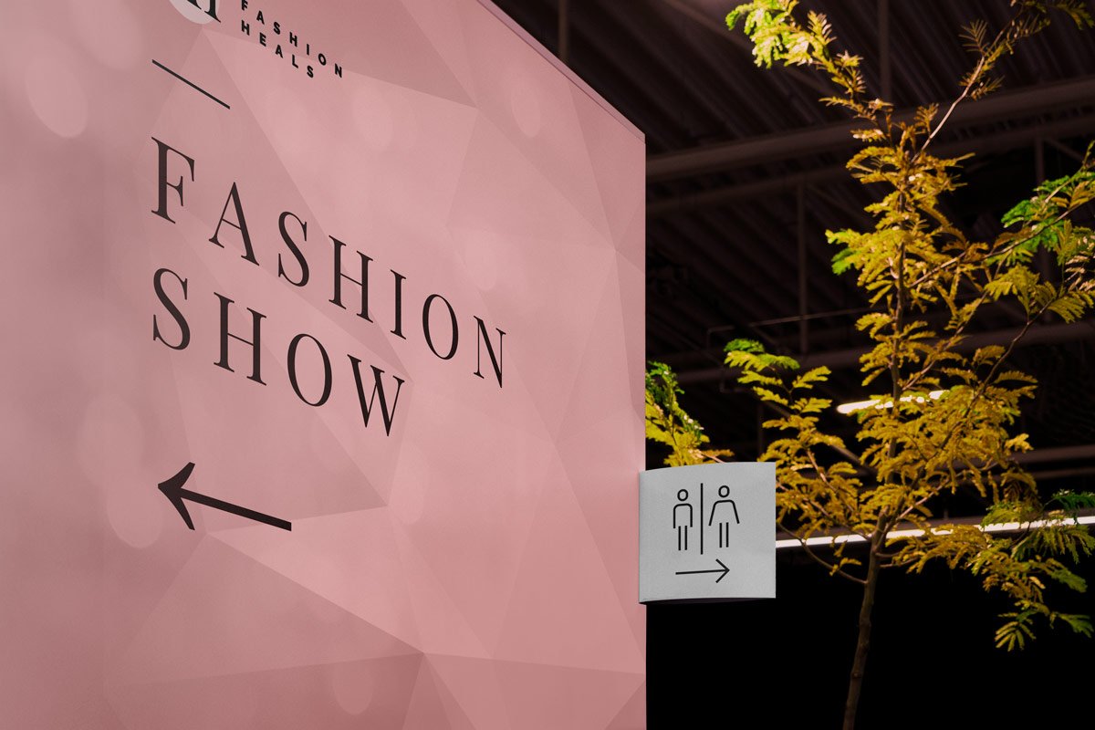
Fashion Heals is a vibrant annual fashion show fundraising event in support of the Innovation Grant at SickKids hospital. The event includes a fashion show featuring past and present SickKids patients, doctors, nurses and employees. The evening is filled with inspired stories, great music, delicious food and beverages and an amazing silent auction.
The Challenge
Being a past patient at SickKids hospital, I understand how crucial the hospital is to children not only in the GTA, but, all over the world and as such, I applied as a volunteer graphic designer and was chosen to be the event’s lead designer. As the event’s lead designer, I was tasked with the responsibility of coordinating with the necessary event admins, staff, teams, and vendors to design and develop all of the event’s print and digital material.