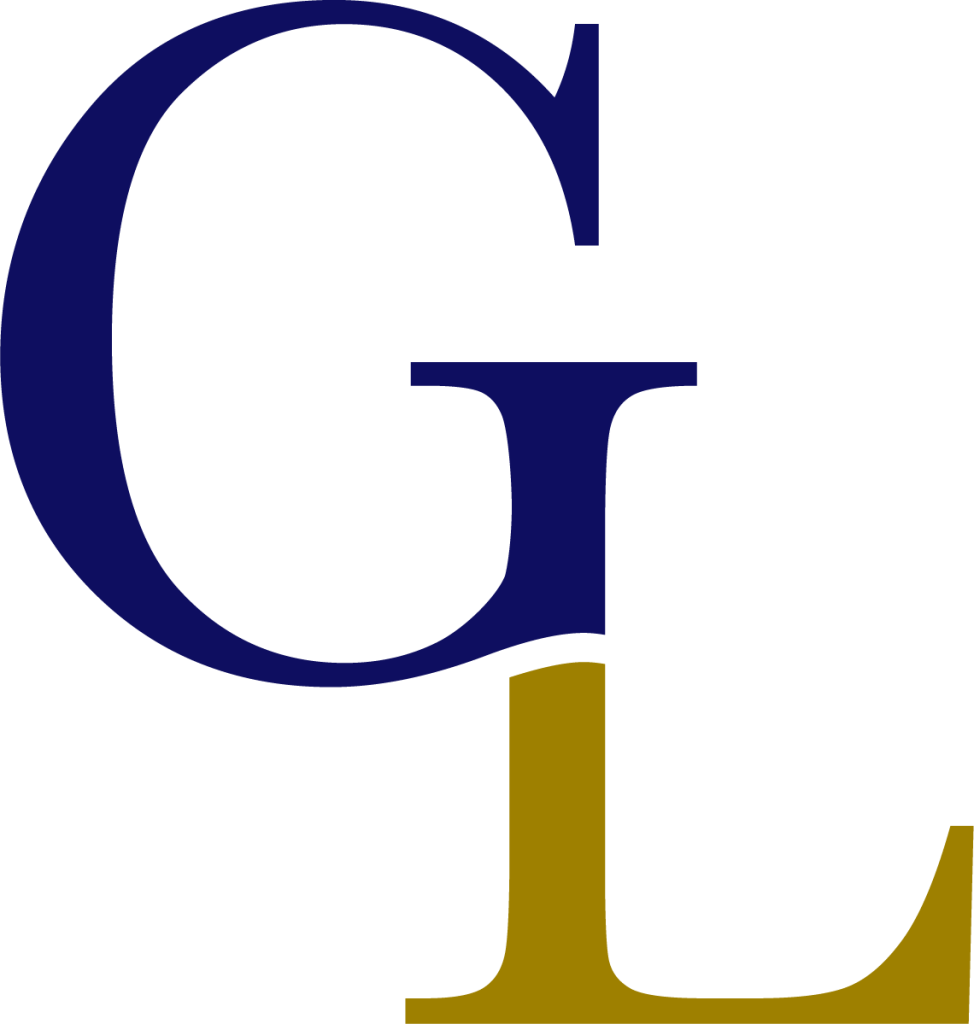
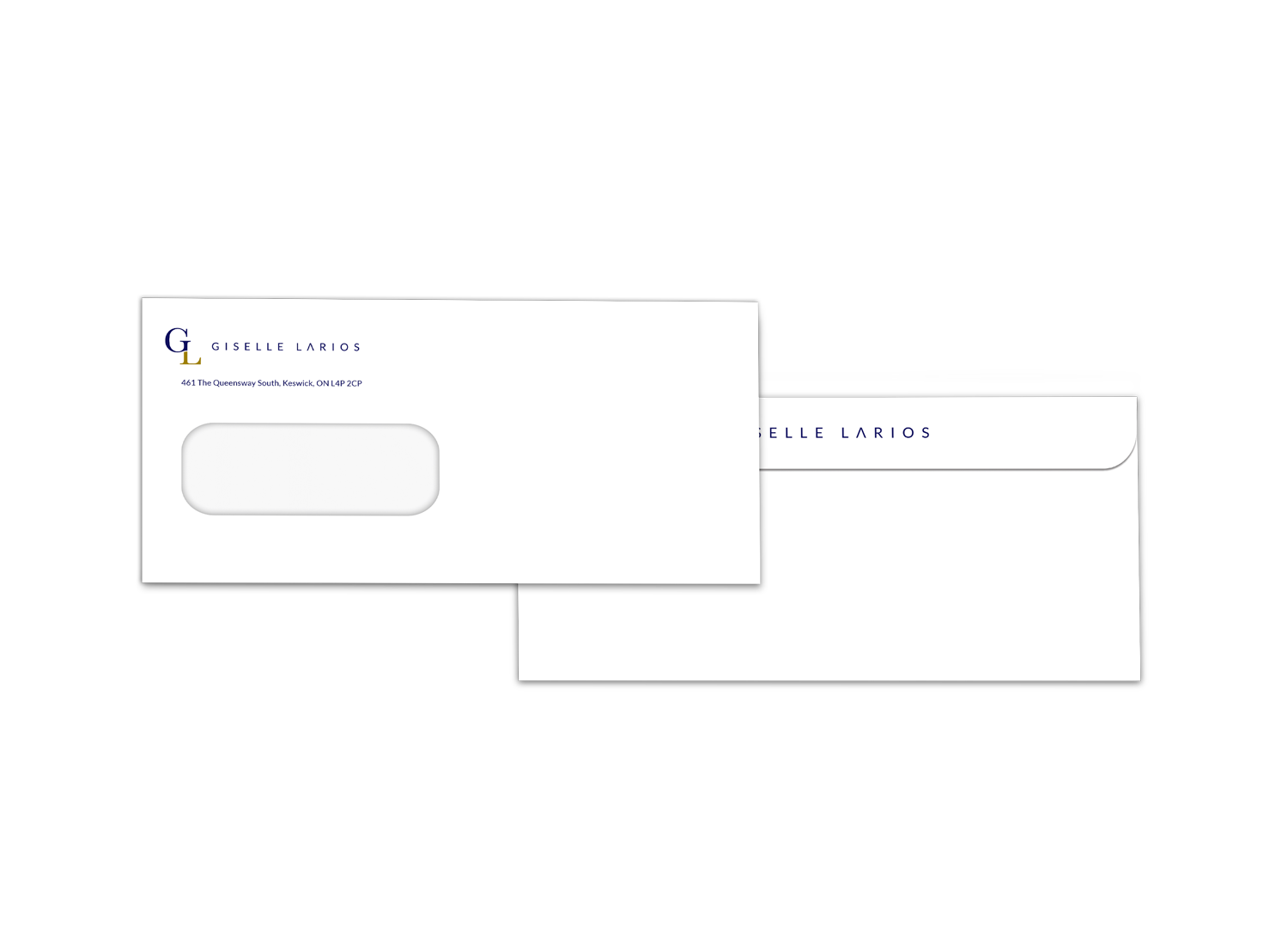
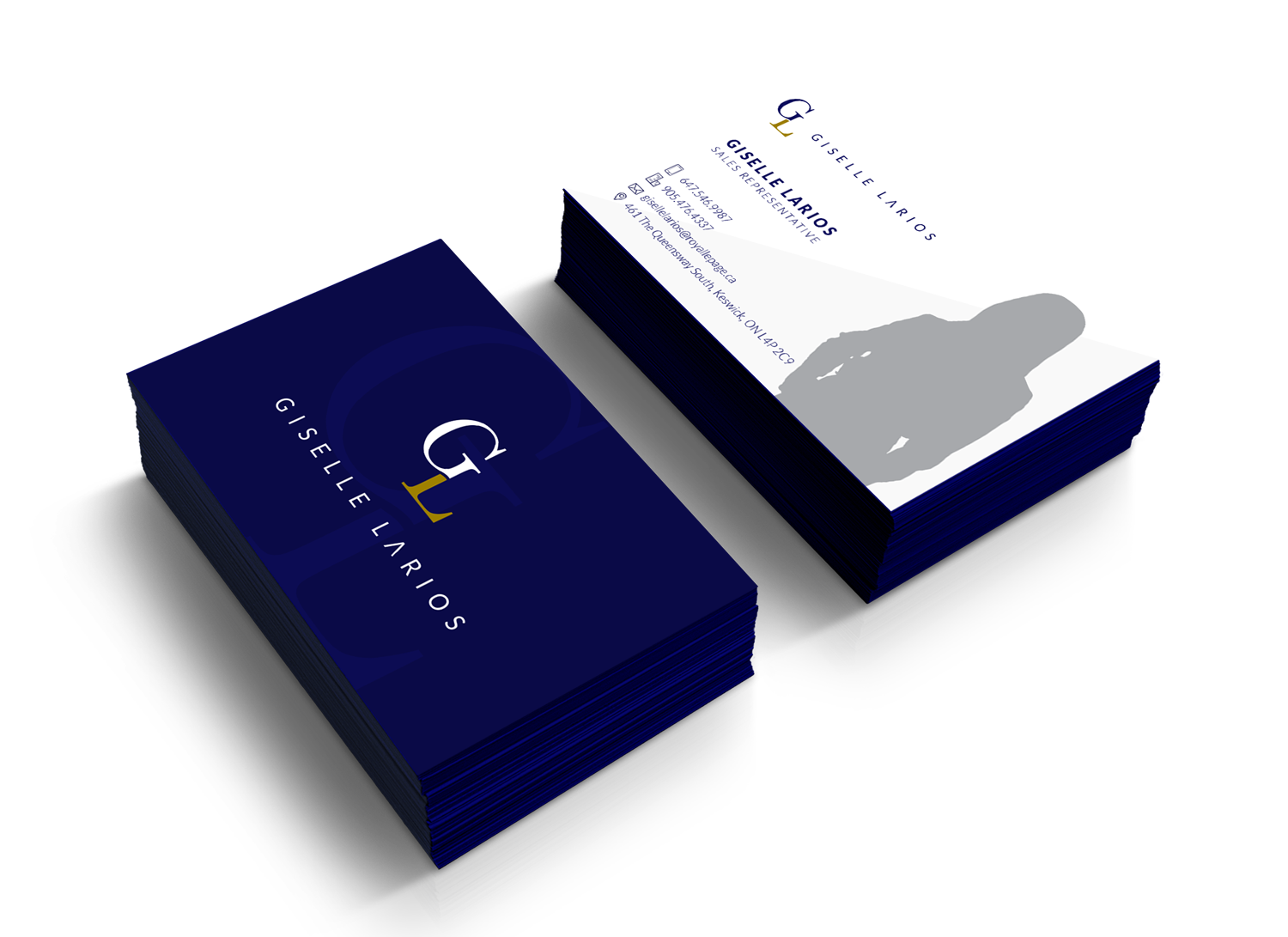
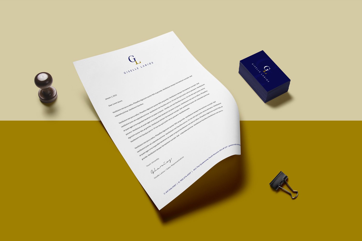
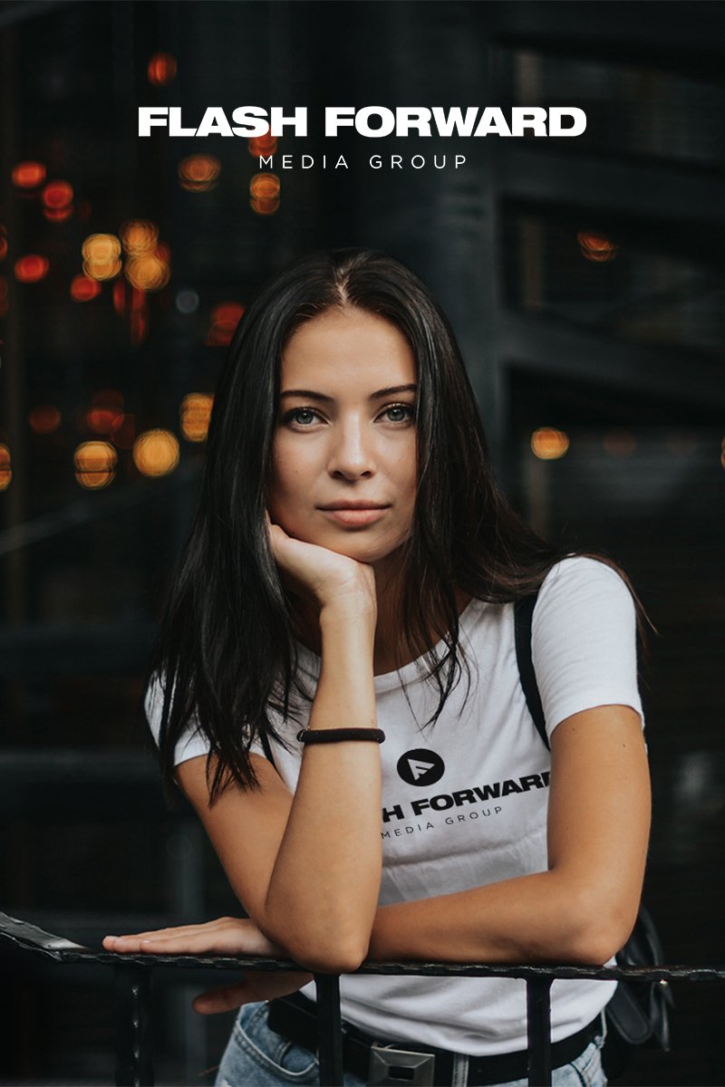
Giselle Larios is a brand representative of the Real Estate Sales Rep – Giselle Larios. Known for aiding clients in the buying and selling of real estate, the Giselle Larios’ brand prides itself on delivering excellent service with real results.
The Brand Identity
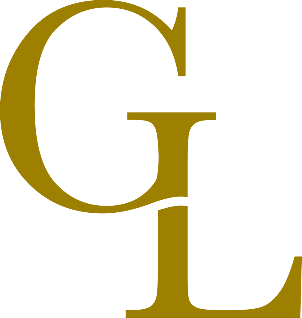
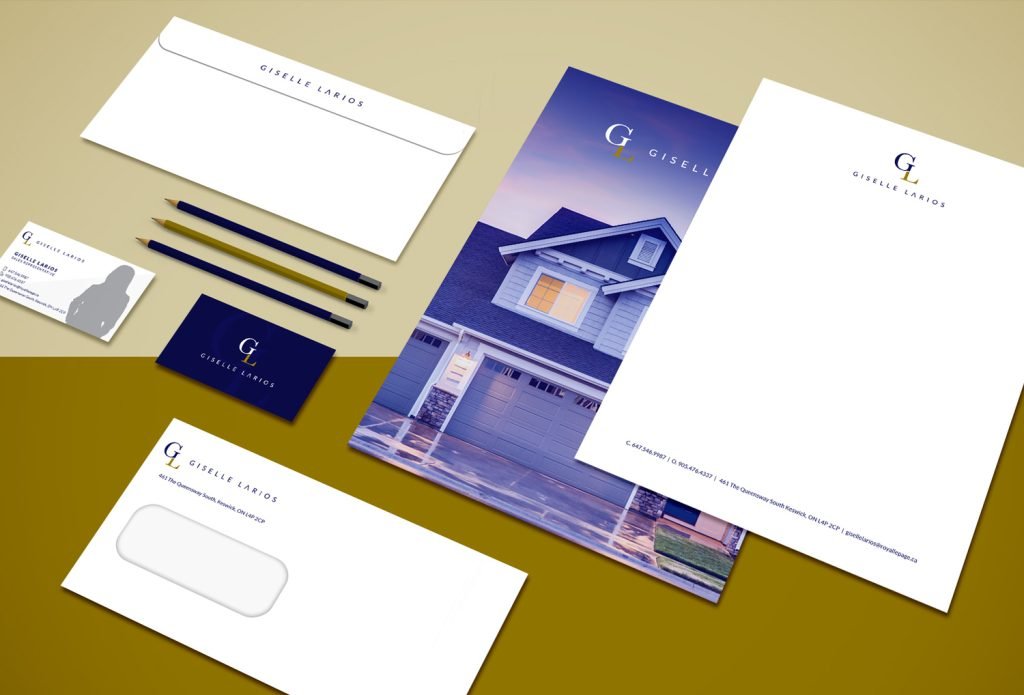
The Giselle Larios logo was designed to be one that is very direct and simple. A ‘GL’ monogram was used as the logomark to represent the initials of the face of the brand – Giselle Larios.
The typeface chosen was used to embody the modern persona of the brand while creating a functioning marriage between the logomark and logotype.
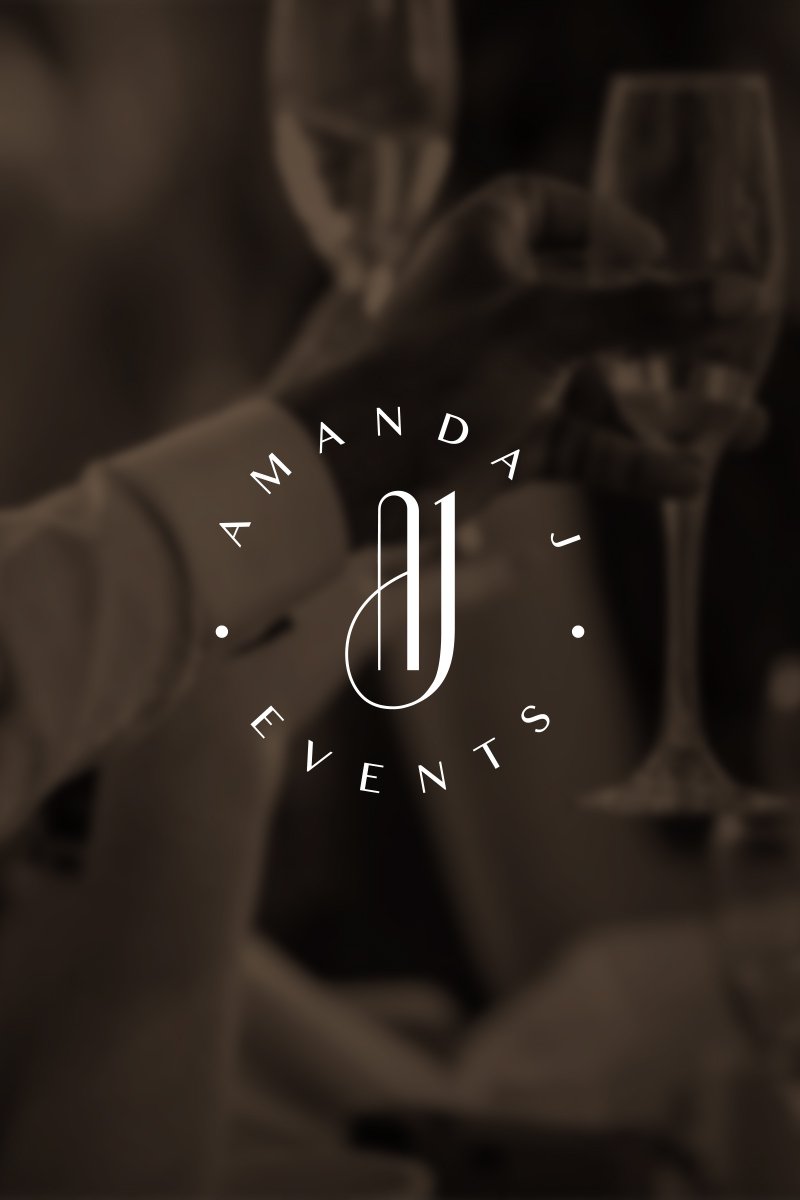
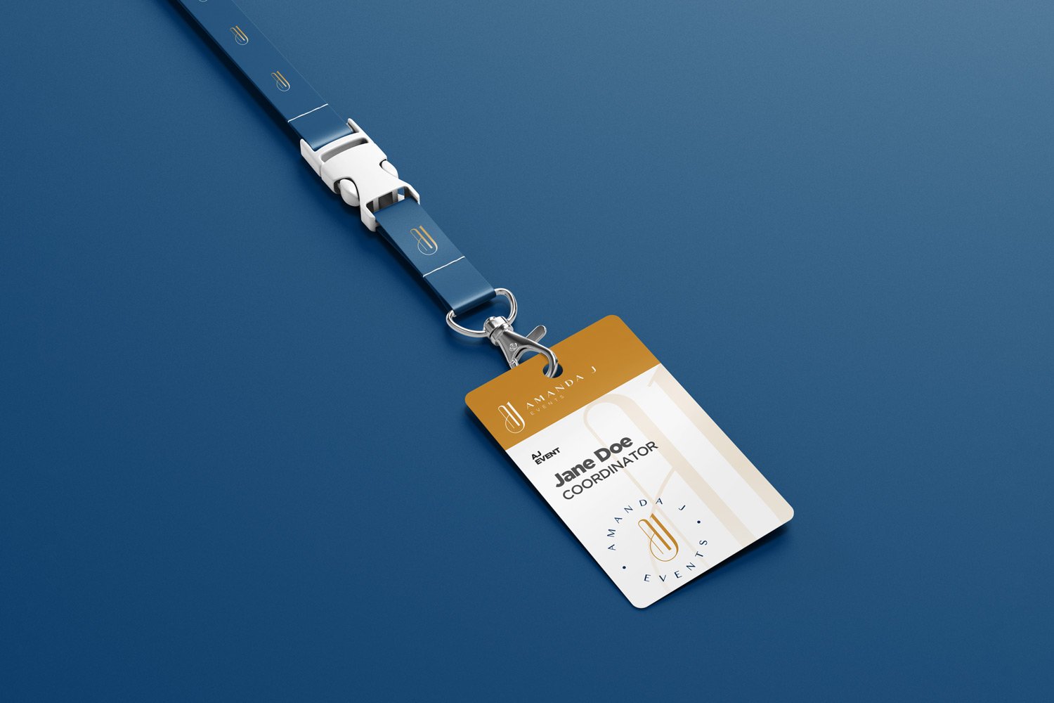
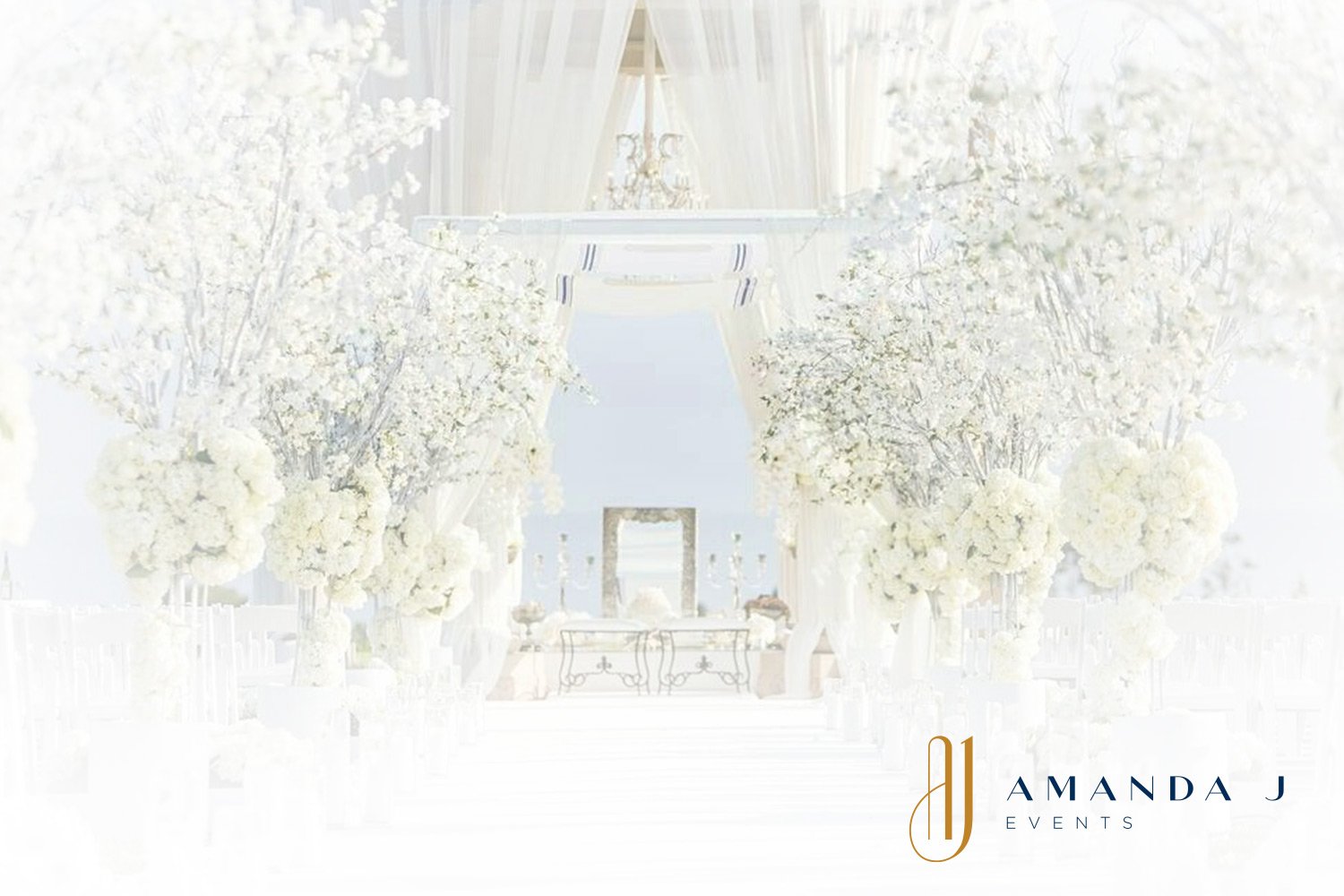
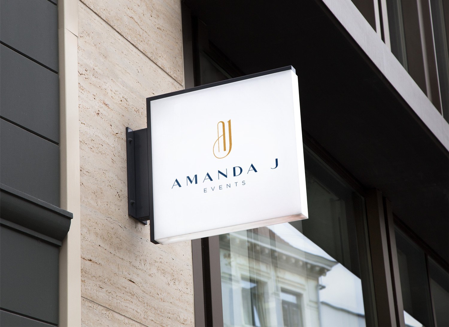
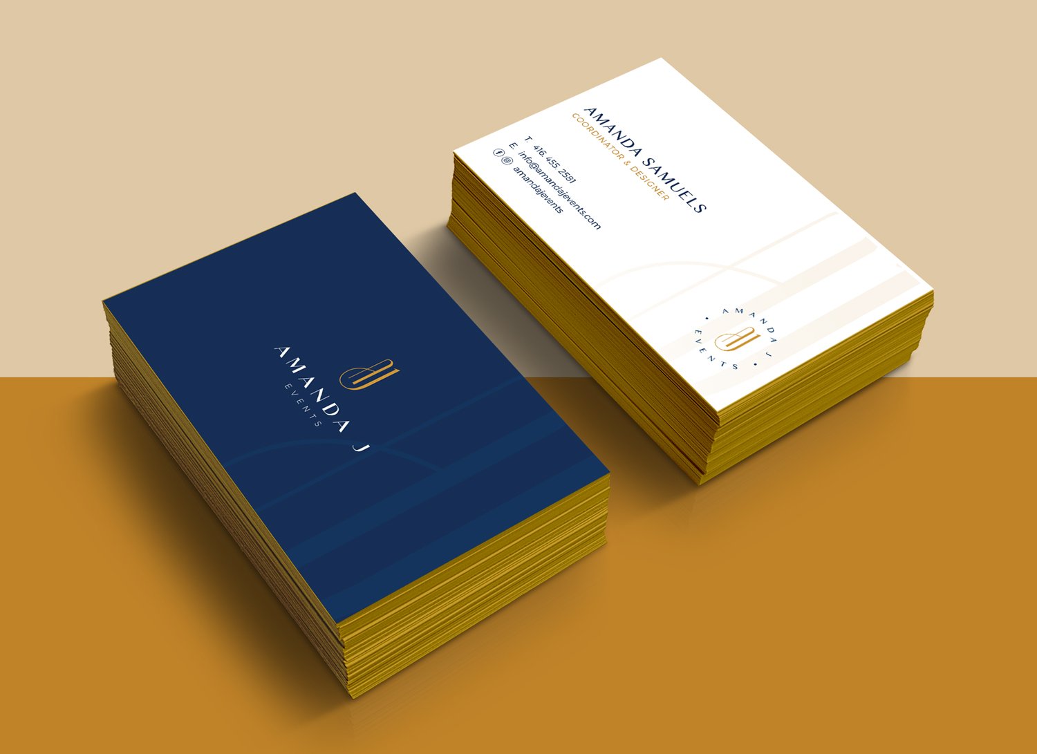
With a high focus on weddings and corporate events, Amanda J Events is an event planning brand centered around bringing its clients’ visions to life, while creating an unforgettable experience for the client to enjoy.
The Brand Identity
The Amanda J Events logo was designed to speak primarily to the modern day strong woman. An AJ monogram was used as the lettermark to represent ‘Amanda J’. The style and feel of the lettermark is strong in its boldness yet gracefully elegant and chic with its smooth curves.
The typeface chosen creates the perfect marriage between beauty and brains as its serious and corporate feel allows the logo to speak to both the corporate and creative worlds it will live in.
The colour palette of the brand is made primarily of a navy blue and gold. Together these 2 colours help to symbolize and psychologically reiterate some of the brand’s character traits. Aesthetically, the marriage between the colours is perfect, creating an unforgettable and subtly luxurious viewing experience.
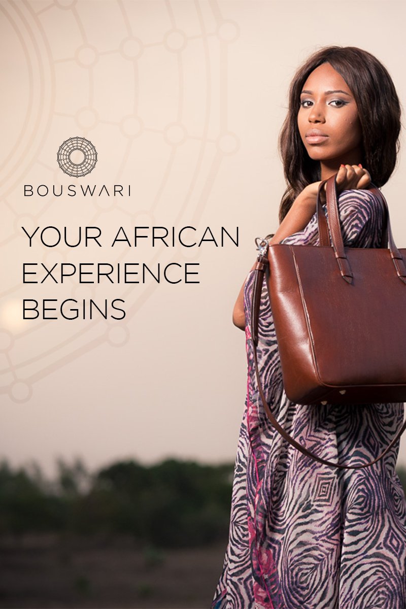
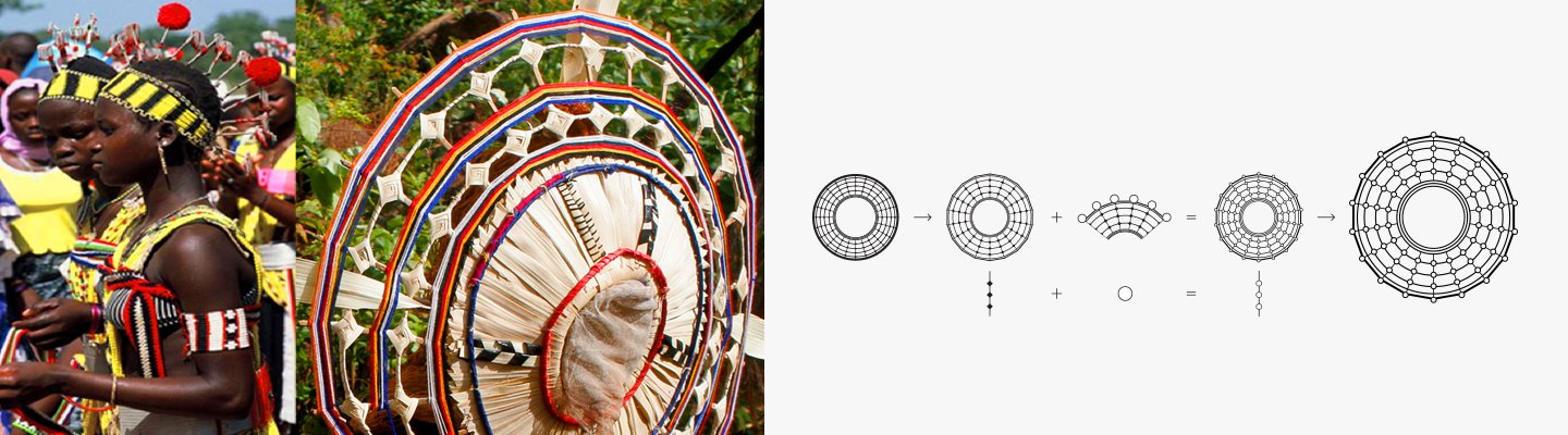
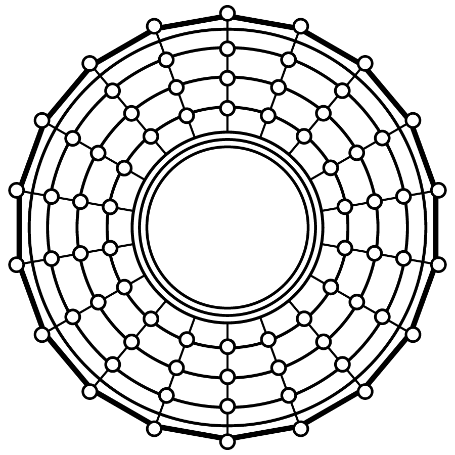
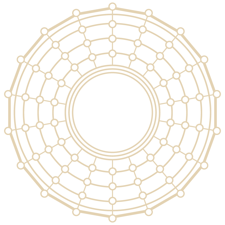
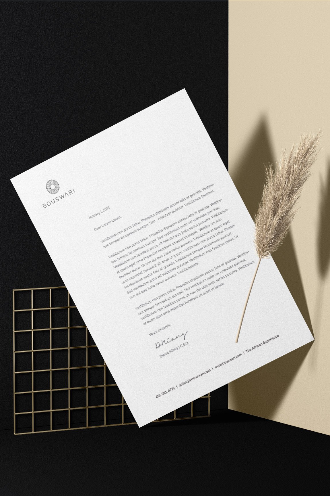
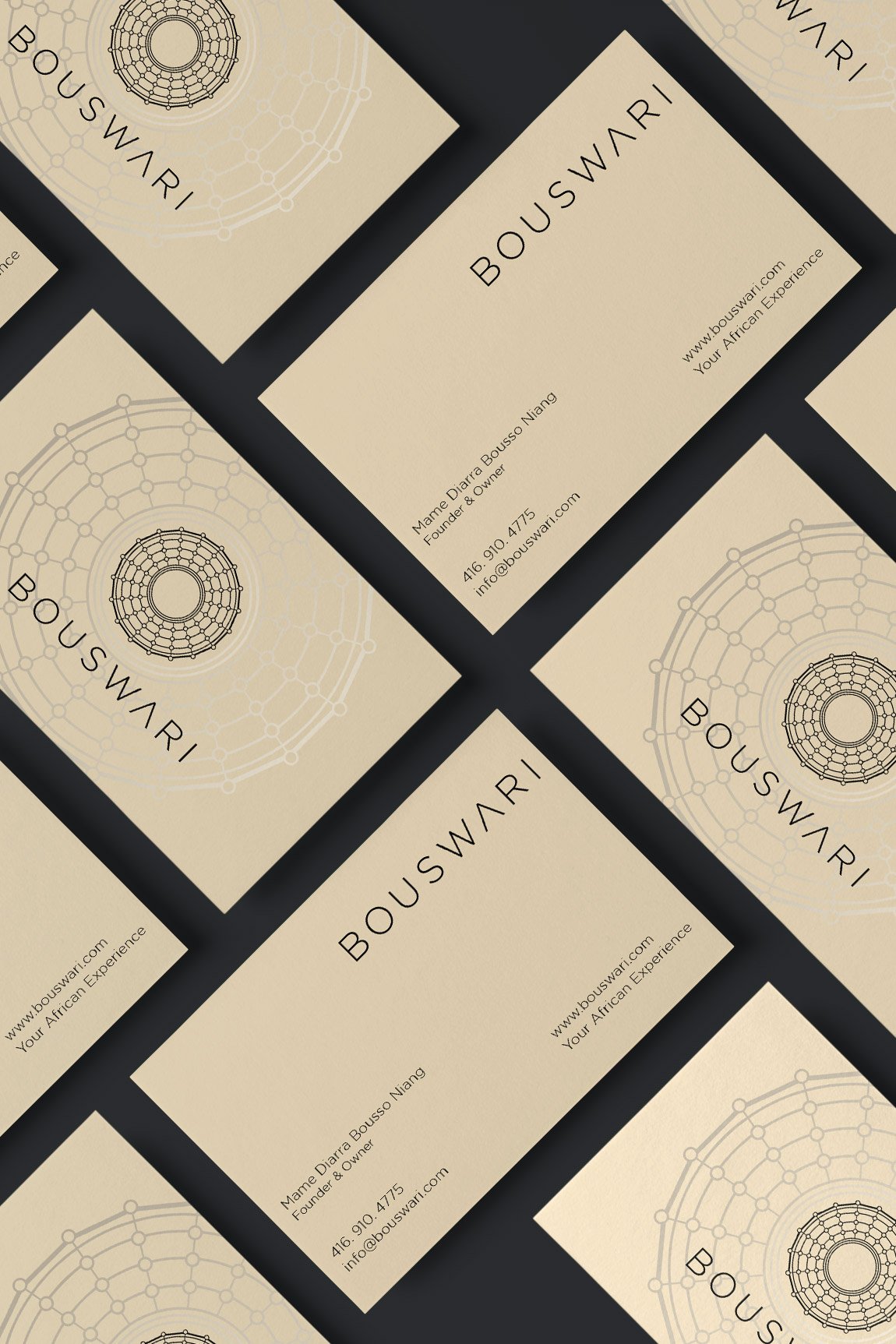
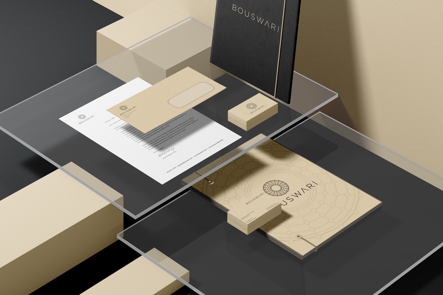
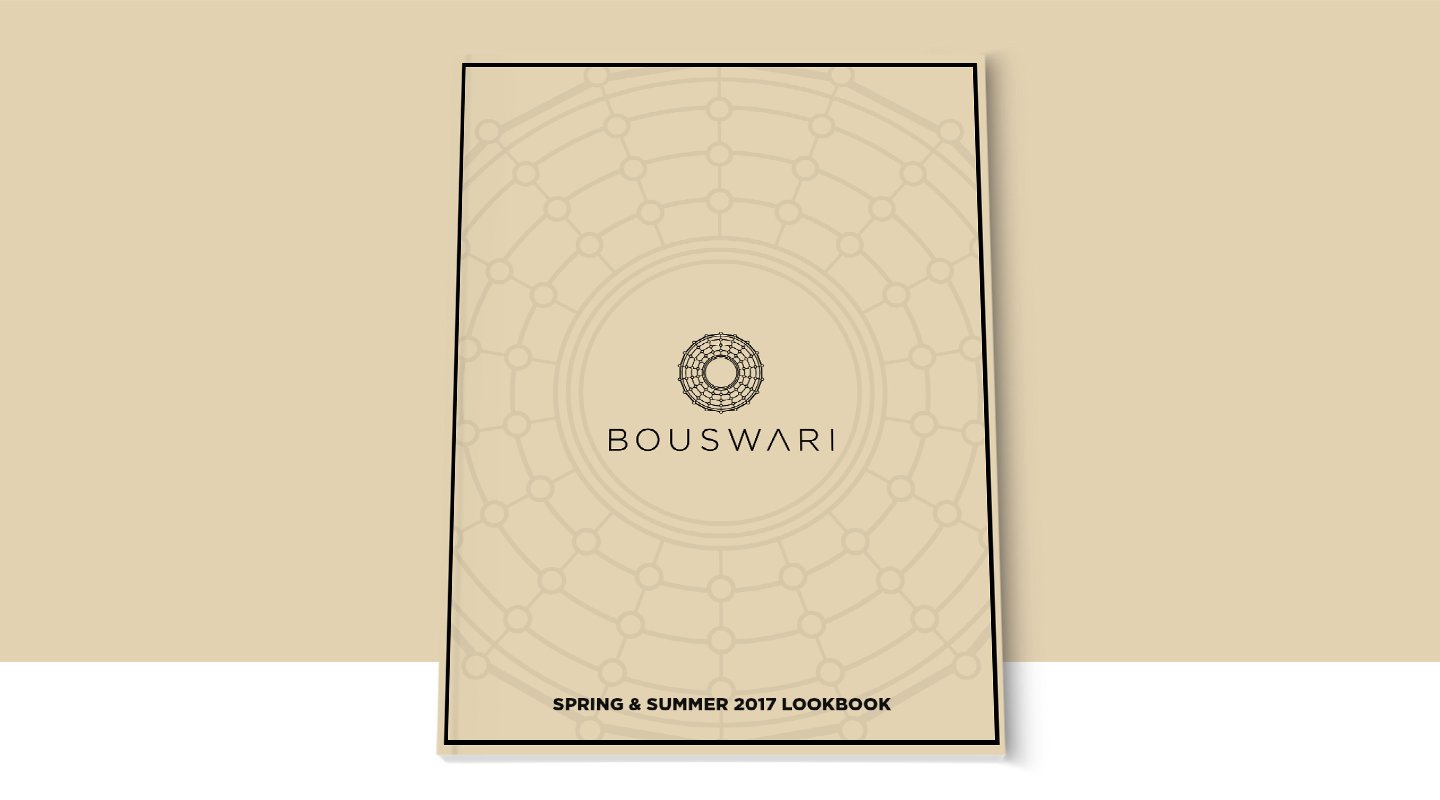
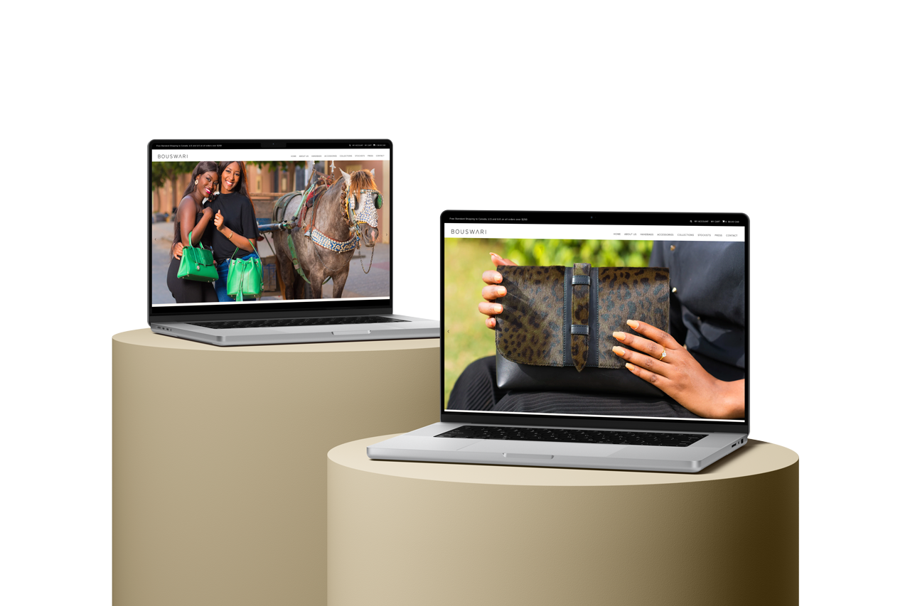
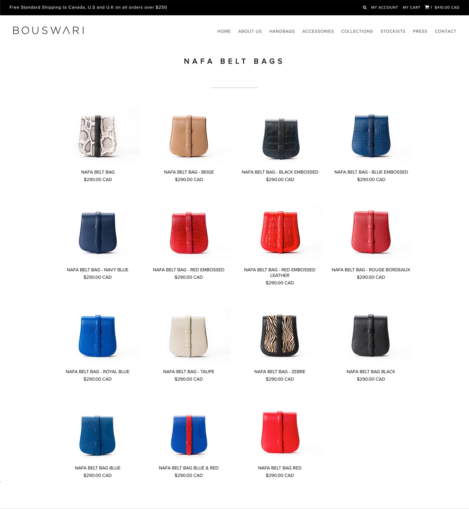
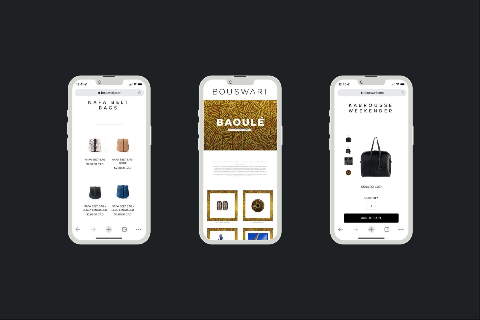
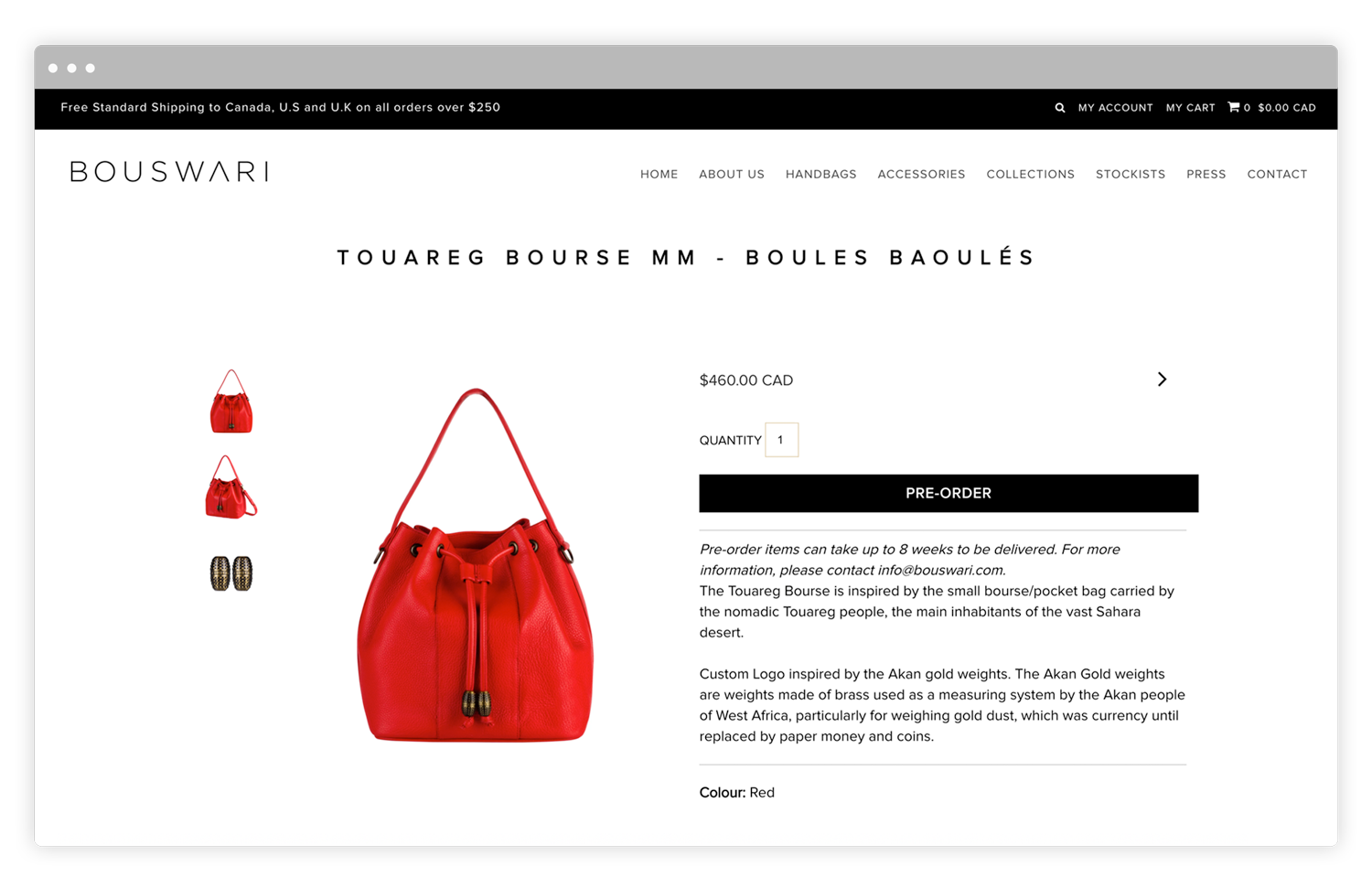
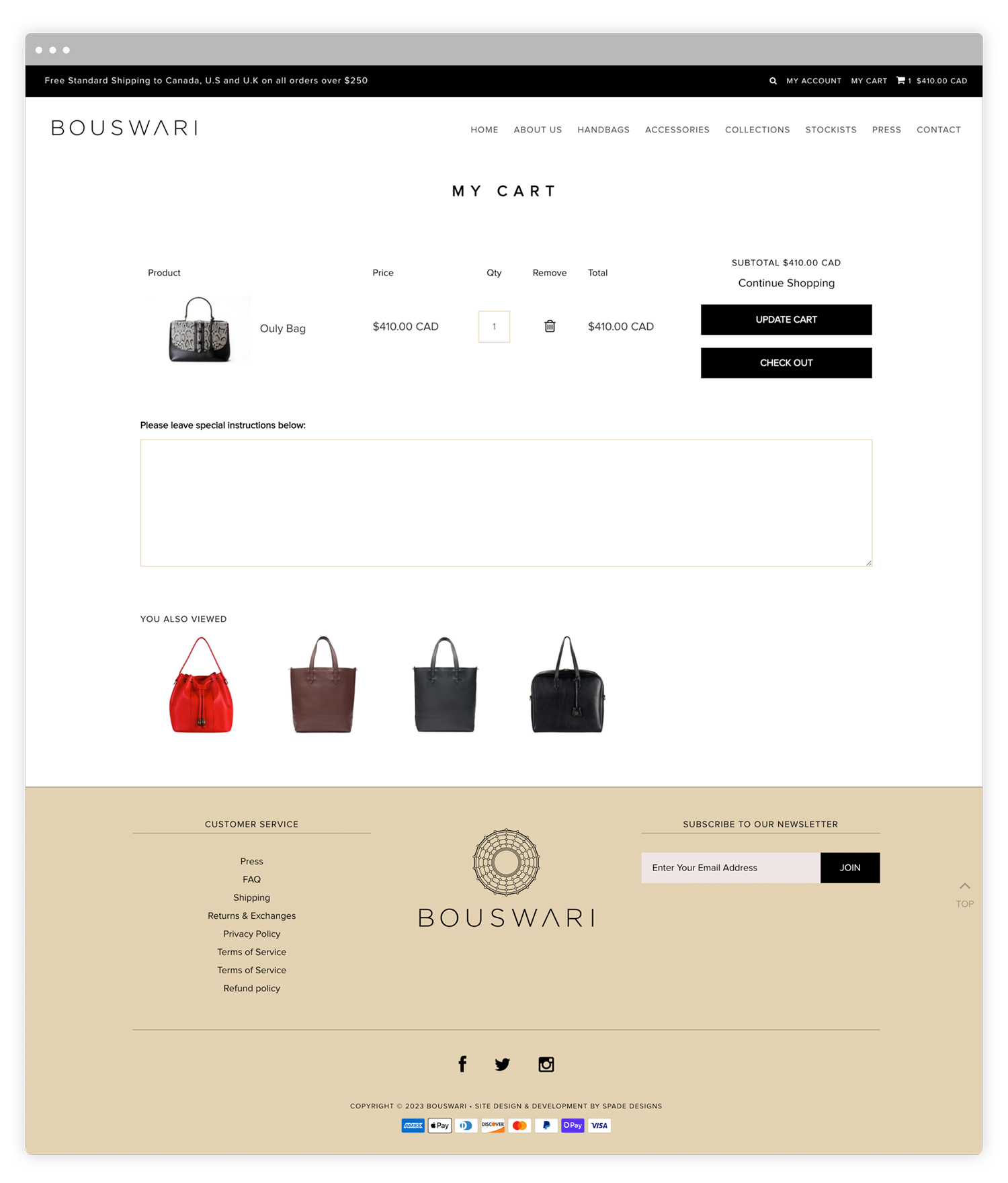
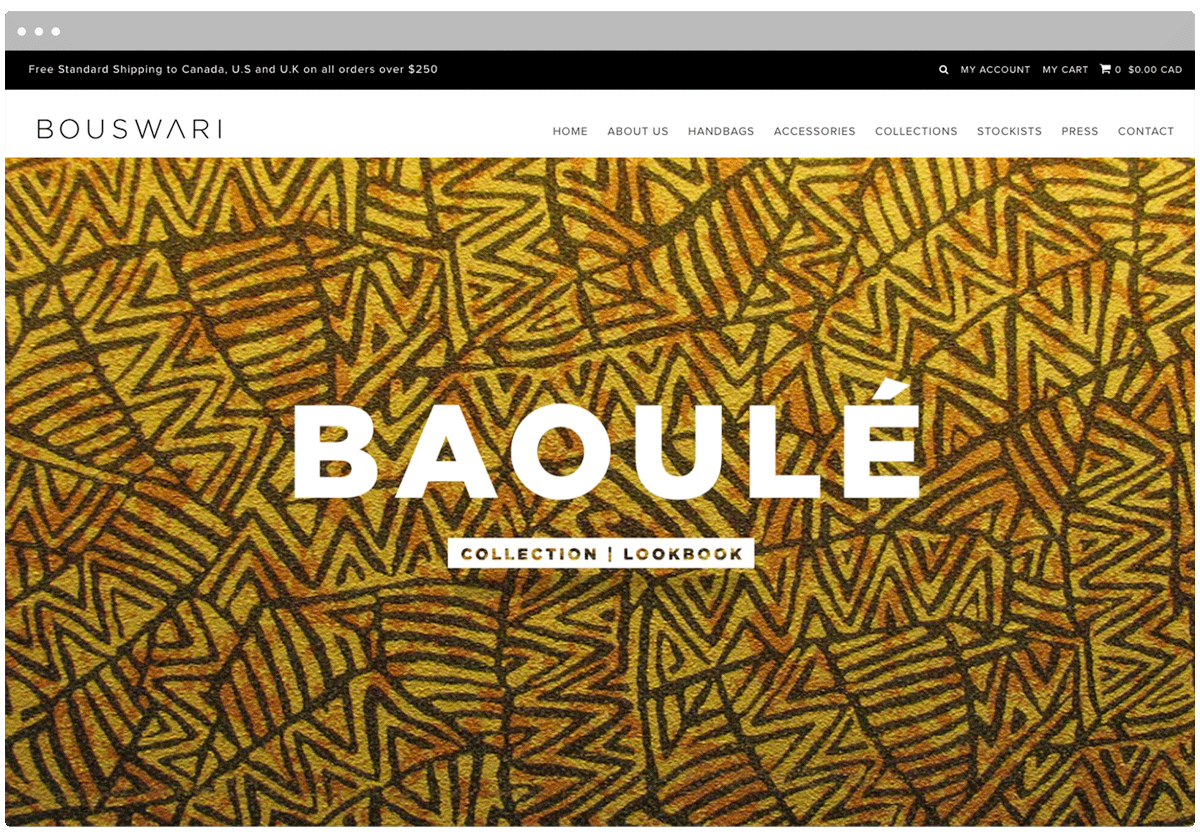
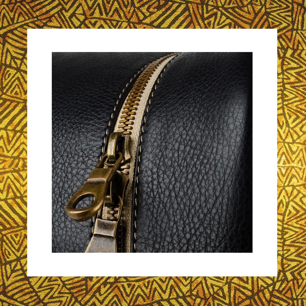
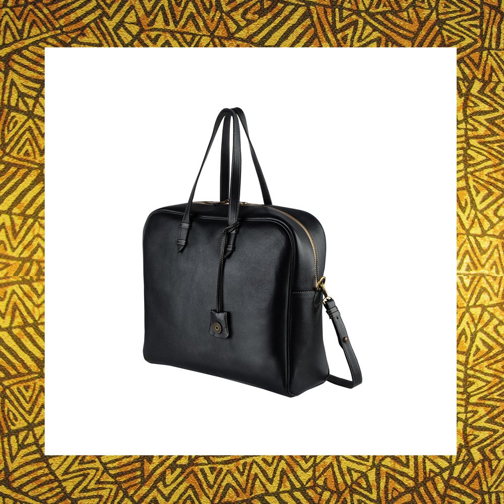
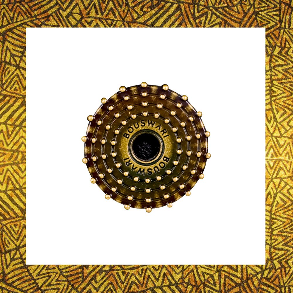
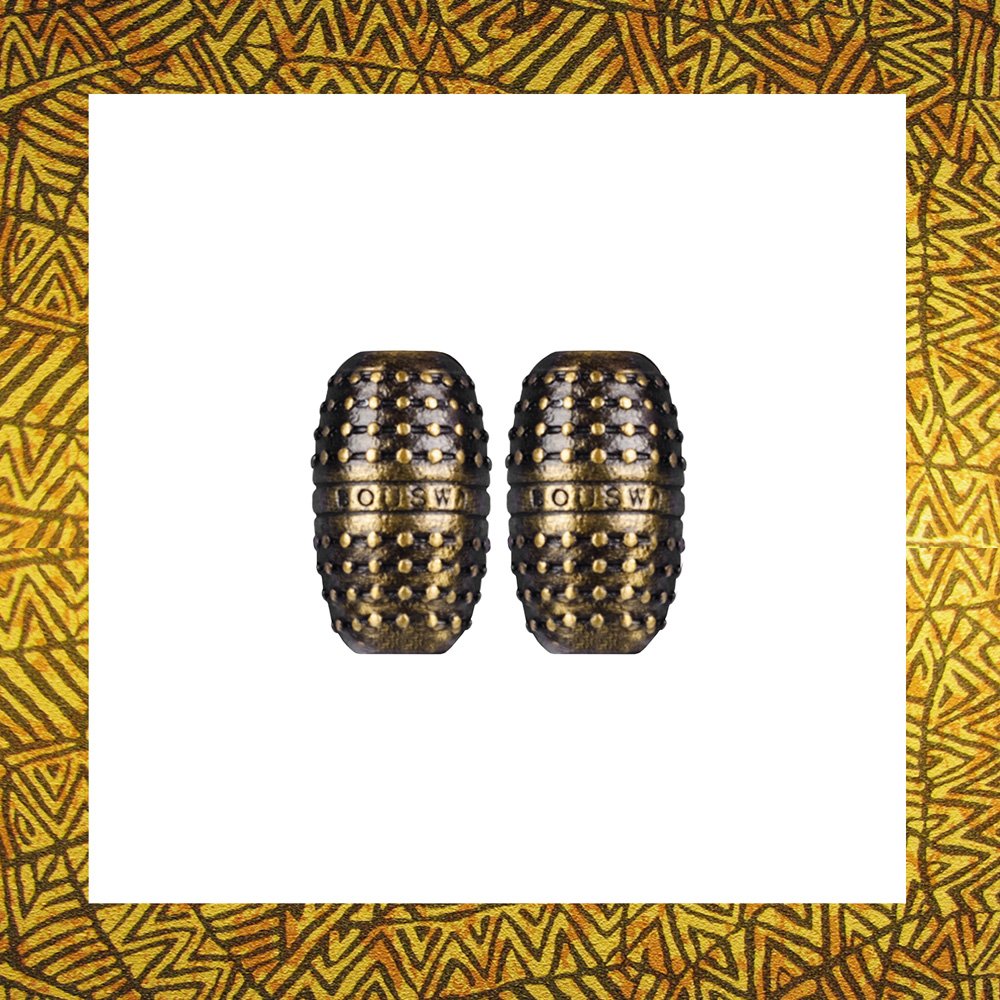
Bouswari is an African inspired upscale bag and pendant company. It sets itself apart from all other companies by combining Canadian & African expertise to create products of luxurious class manufactured primarily in Senegal. The Bouswari brand evokes a feeling of luxury from a fashion point of view. It has a minimalist feel to properly represent the products the company will be producing.
The Brand Identity
The Bouswari brand was designed to evoke a feeling of luxury from a fashion point of view. It has a minimalist feel to speak to its of the upper class target audience as well as to properly represent the products the company produces.
The Bouswari logomark is inspired by the headgear worn by Bassari men and women. During initiation feasts, both genders wear their best costumes. Men in particular wear elaborate straw headgear, depicted in our logo.
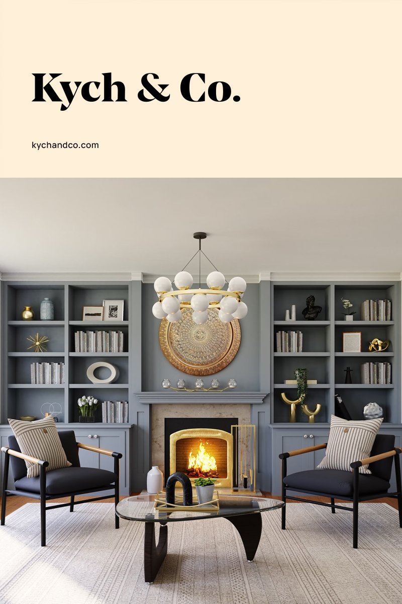
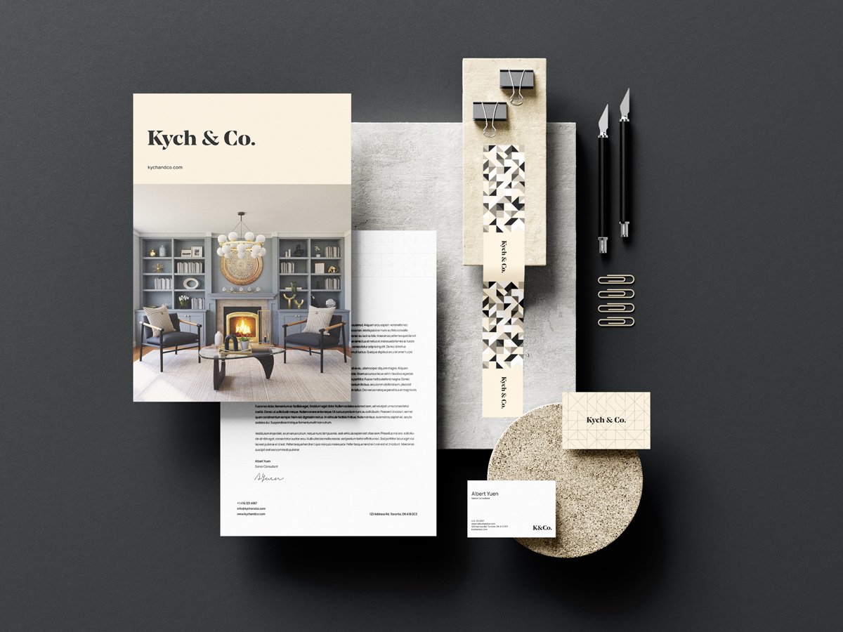
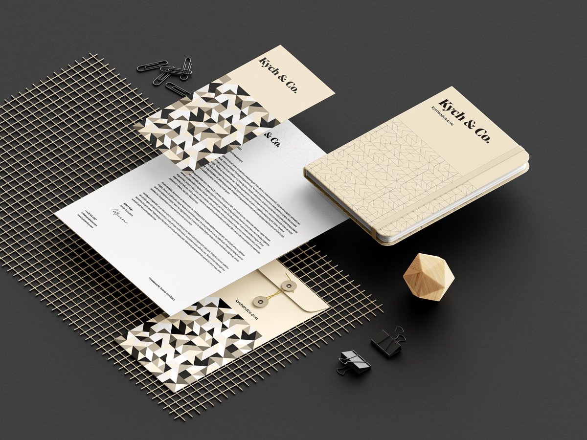
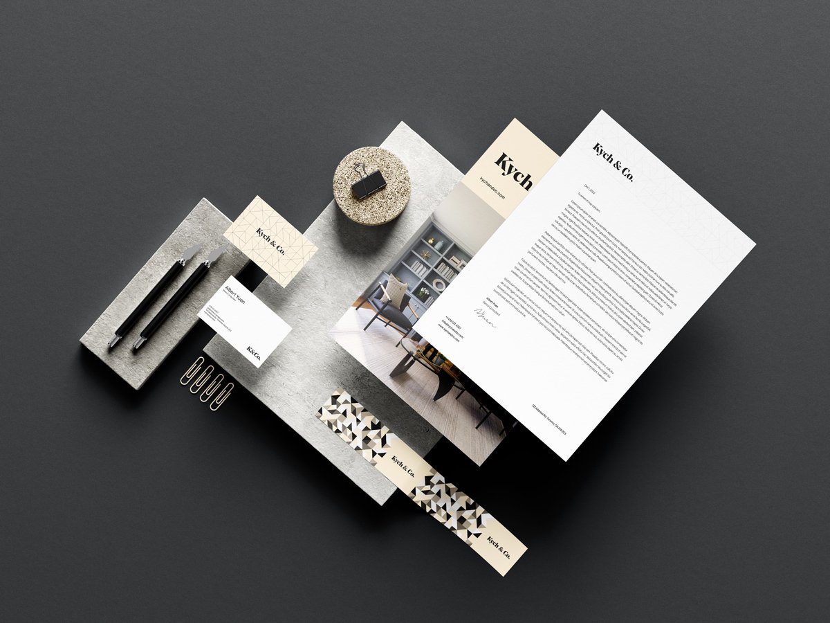
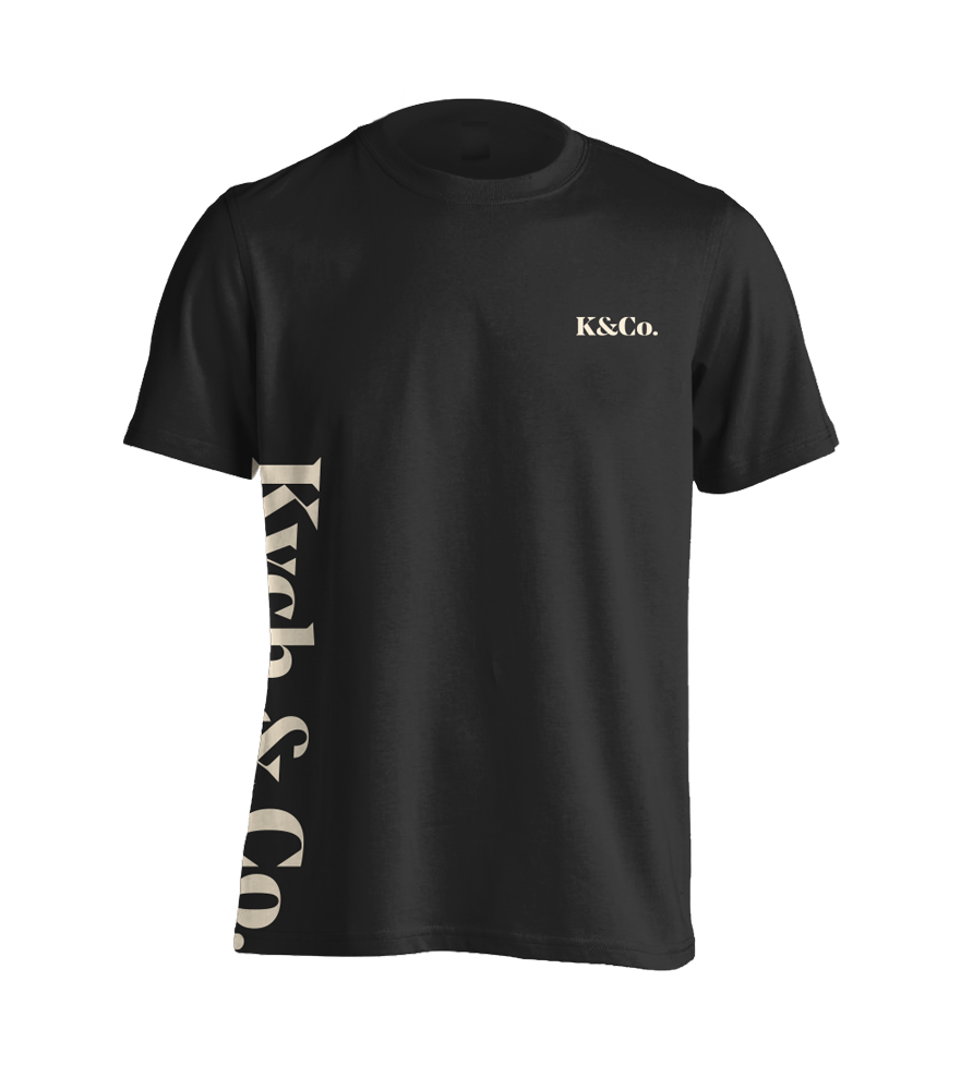
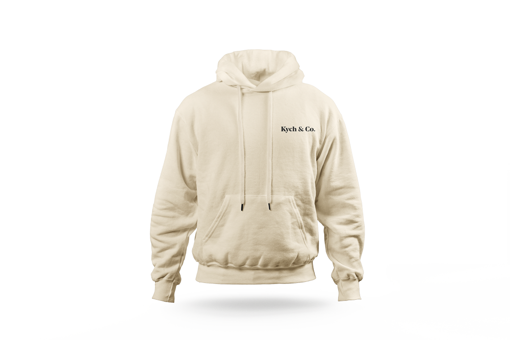
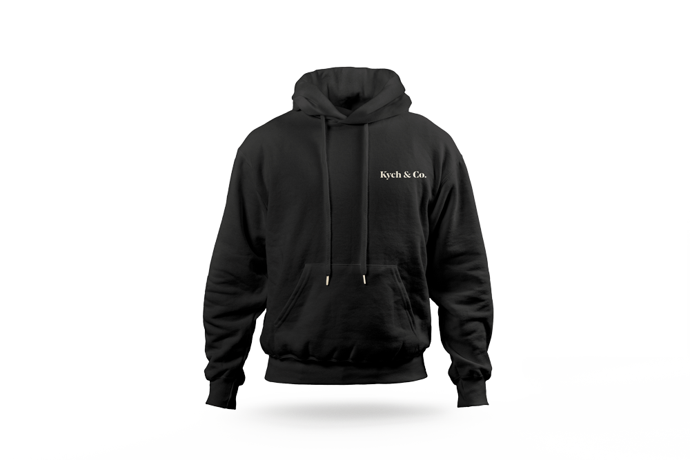
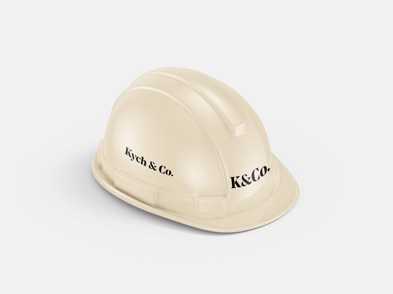
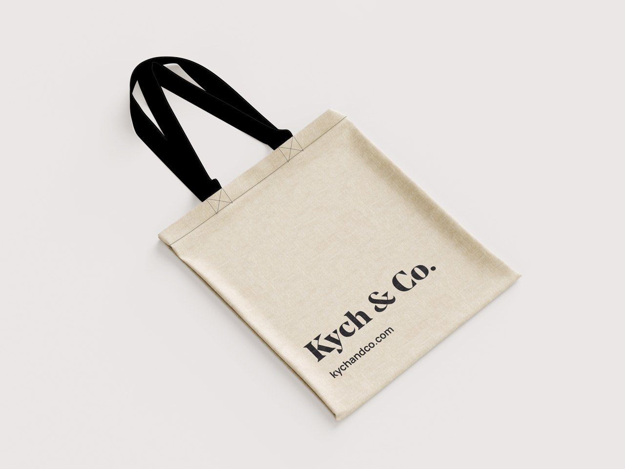
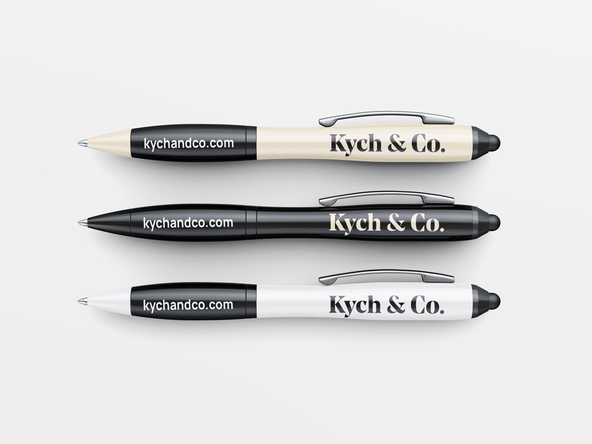
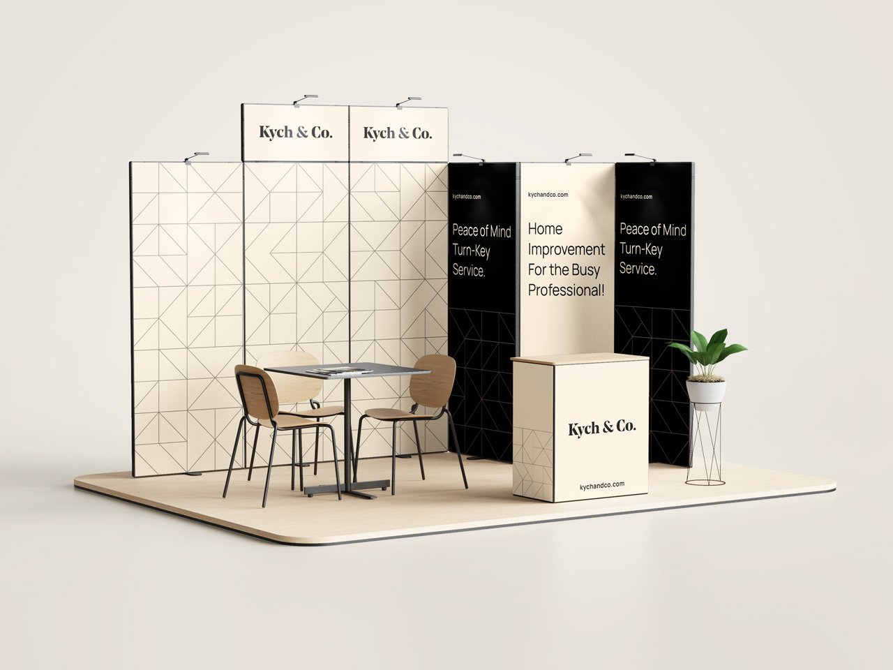
Kych & Co. is a full service design and construction company, who’s primary focus is residential home improvement. With their innovative approach to the overall design and construction process of home renovations, Kych & Co. prides itself on delivering a turn-key hassle-free service to its clients.
With the overall character and mood of the brand having a more buttoned-up, minimal, and ultimately upscale feel, I elected to stick within those paramateres when creating the logo as well. A wordmark was used as the primary logo of the brand as it perfectly captures and personifies the character of the brand based on the customized typeface used.
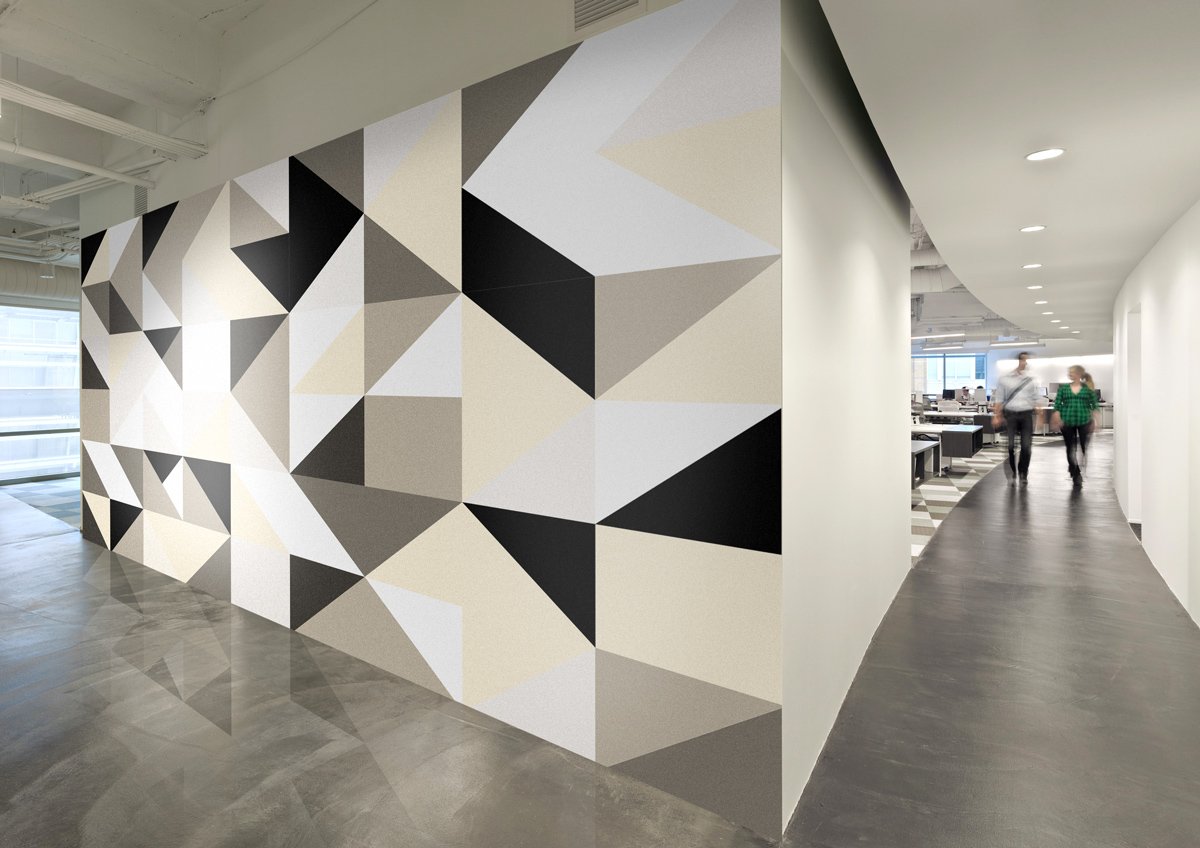
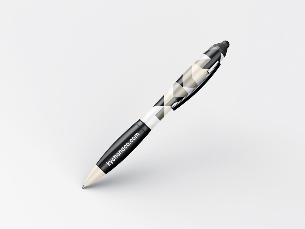
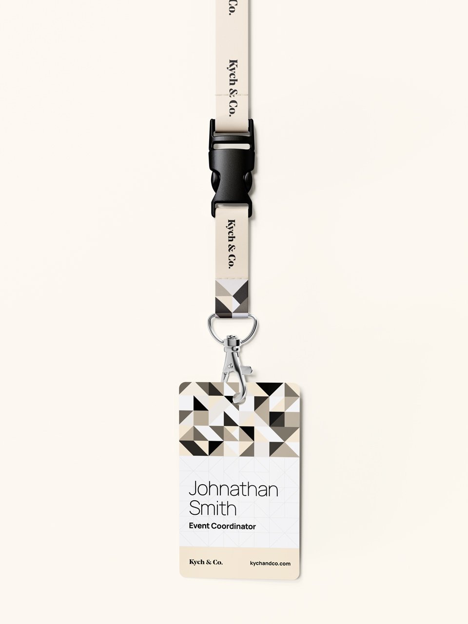
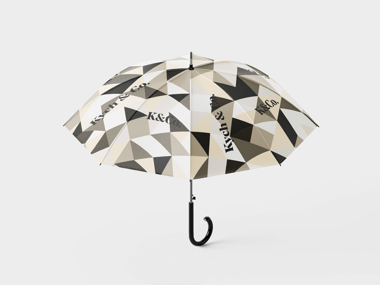
Kych & Co. uses a very innovative and proven project management process that has helped it dramatically streamline the management of projects so well that they eventually plan to release their PM process to the public. The goal was to speak to their level of innovation within the brand identity, which was accomplished with the use of geometric angles, shapes, and even custom patterns.
All of this coupled together made for an excellent marriage that created a sophisticated word mark that perfectly represents the brand it portrays – Kych & Co.
#fef0d8
#000000
#ffffff
#403c36
#7f786c
#bfb4a2
#fef3e0
#fef6e8
#fff9ef
Patterns
This custom seamless pattern is design with triangular shapes to represent the brand’s cutting-edge innovation. It also serves as an additional design element that can be used throughout the brand application.
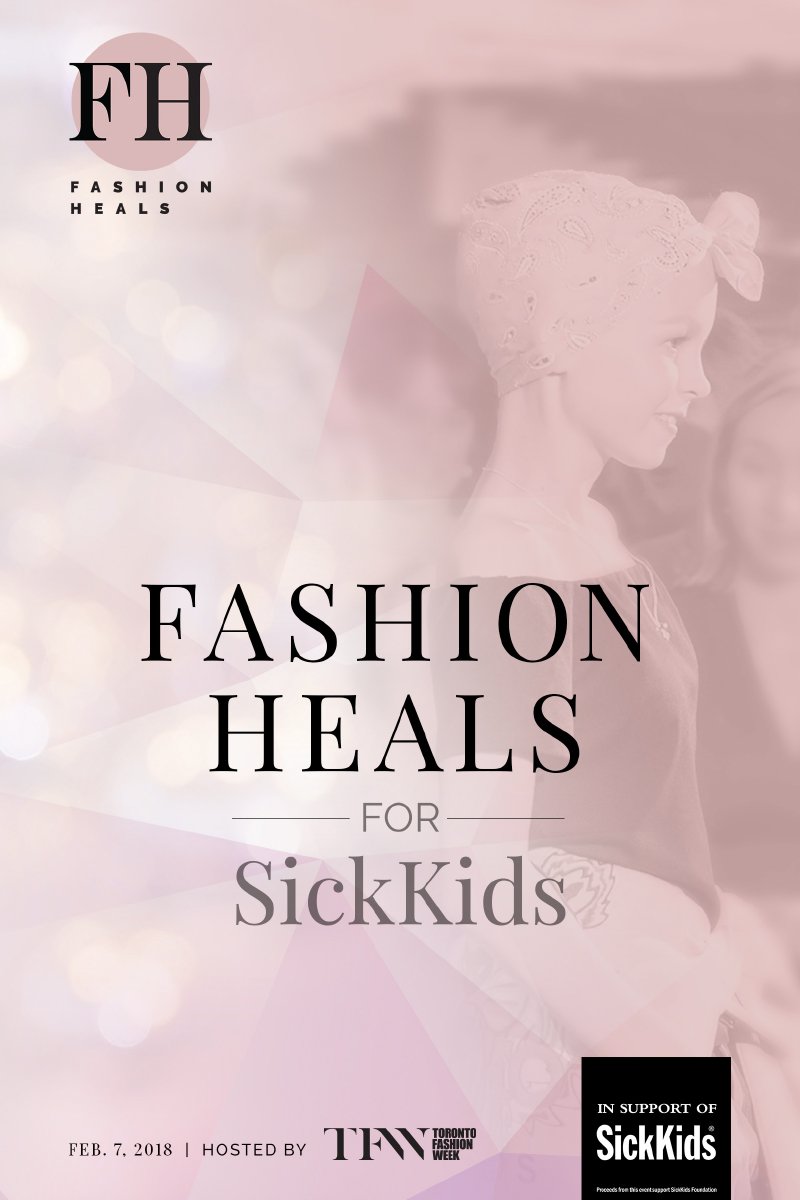
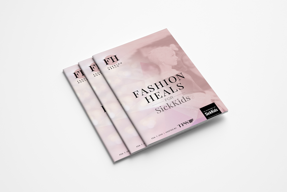
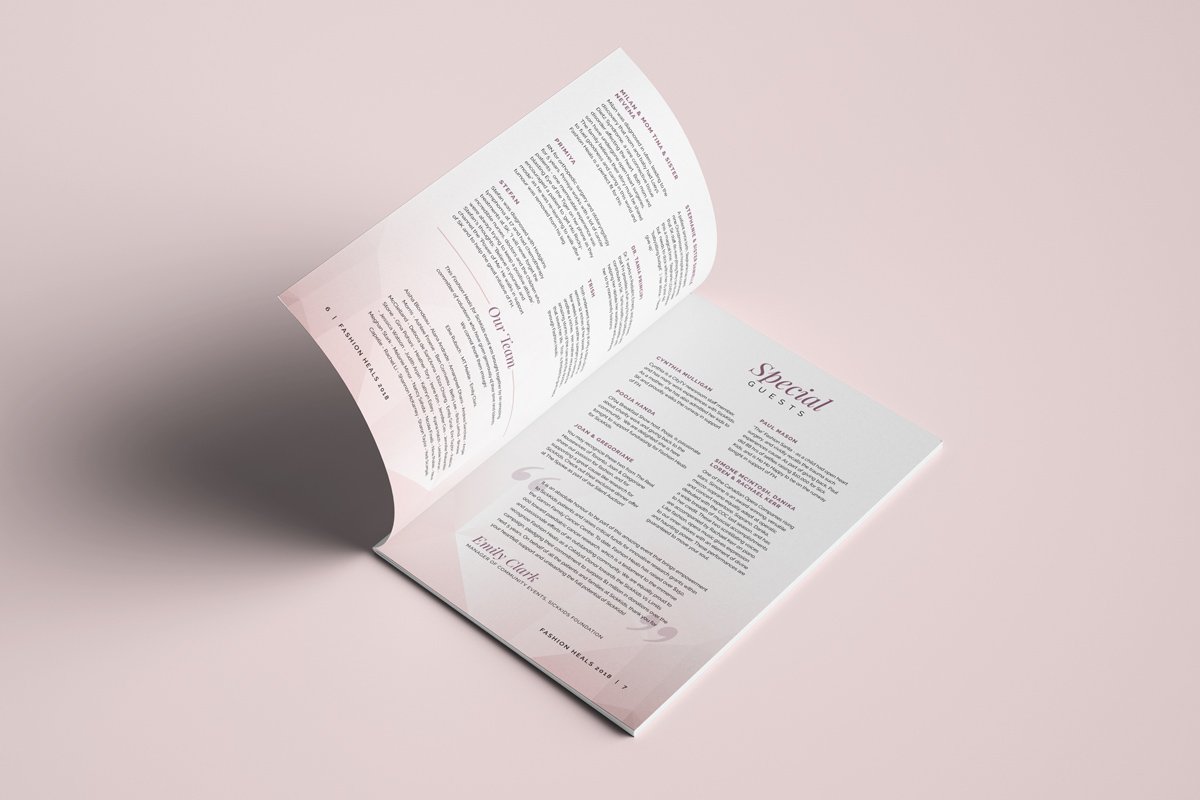
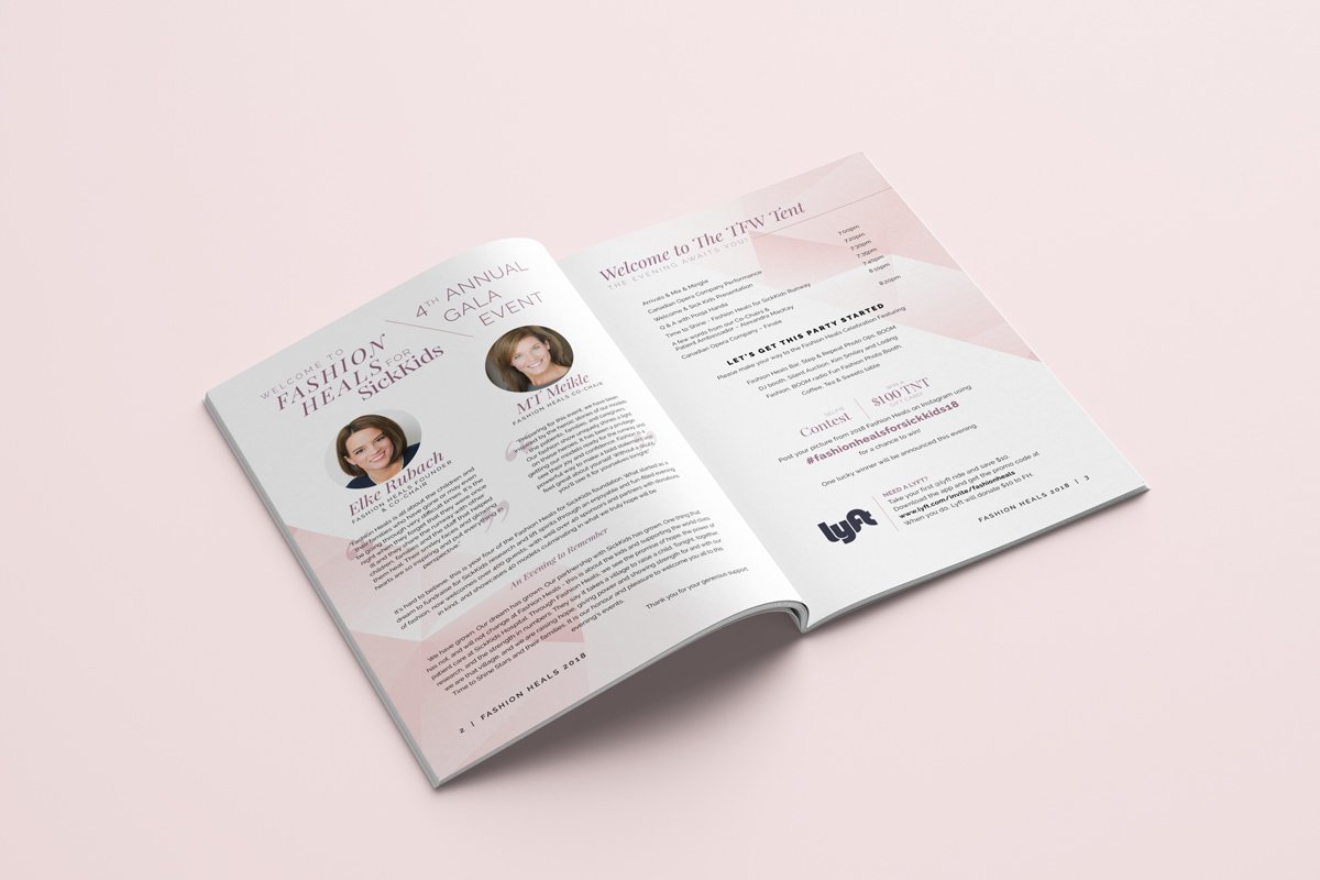
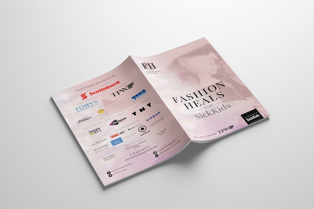
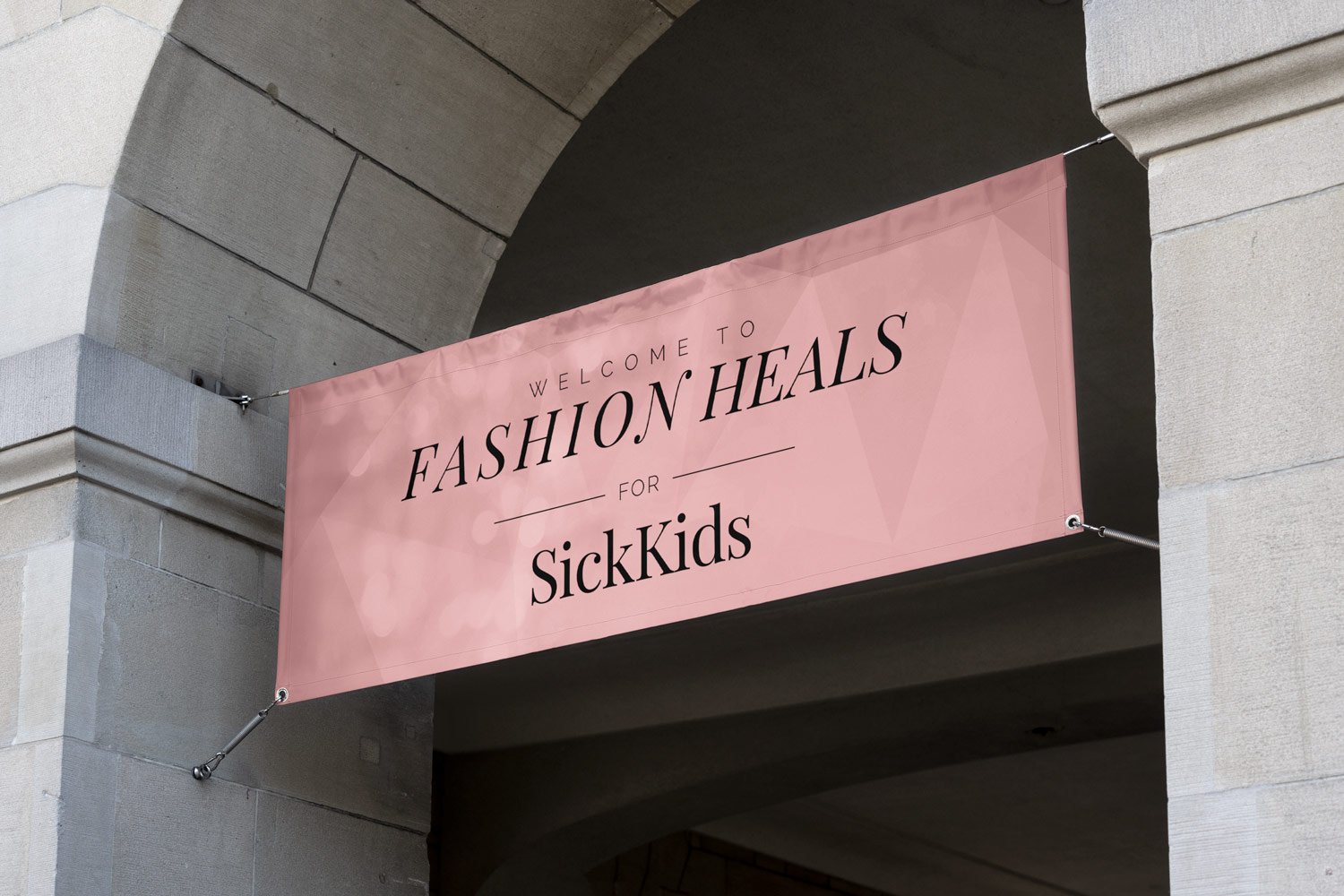
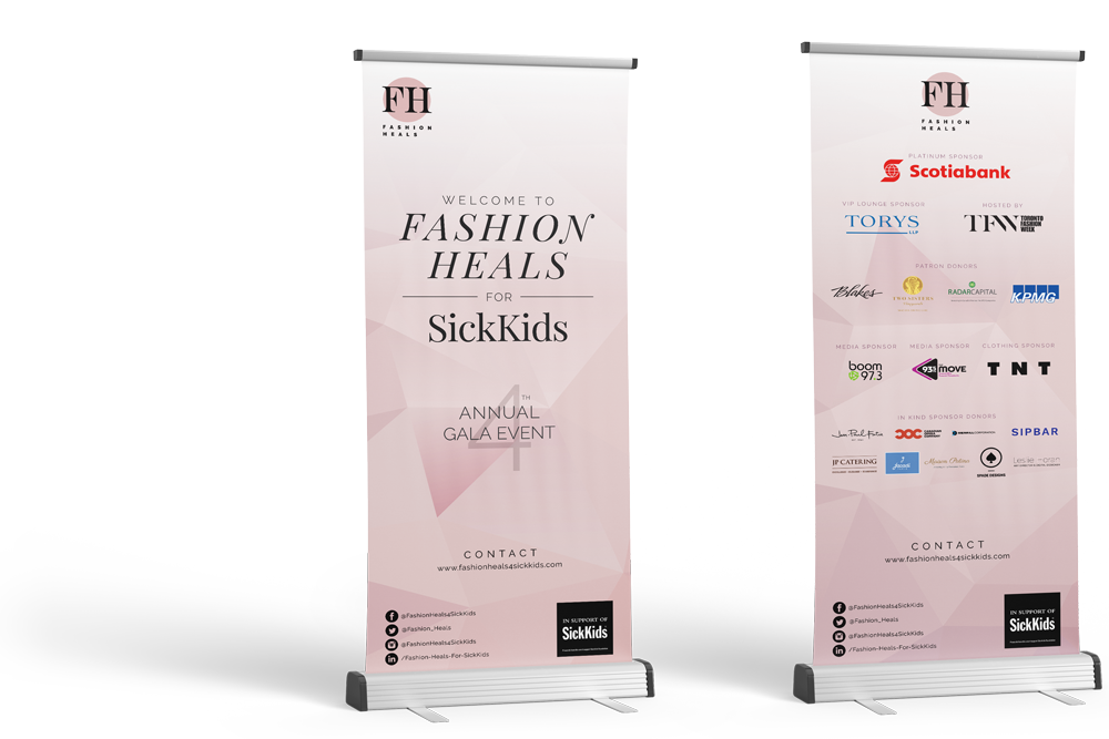
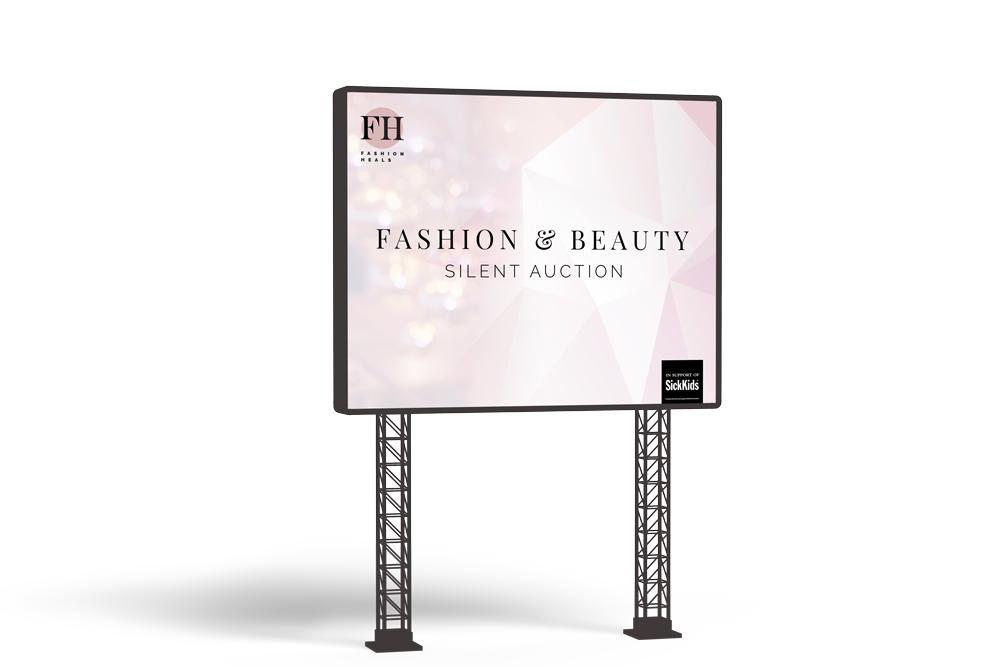
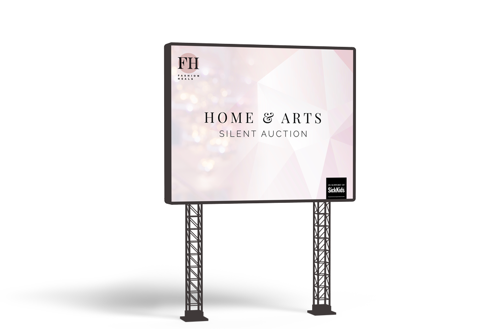
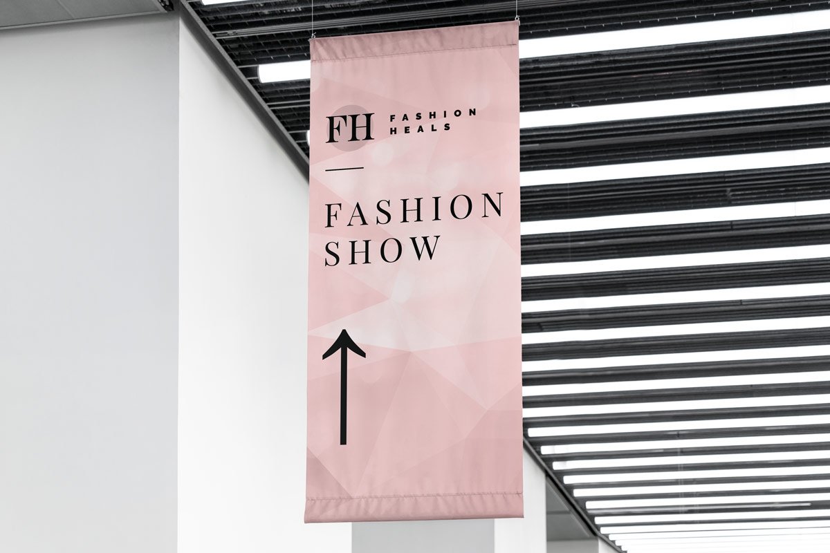
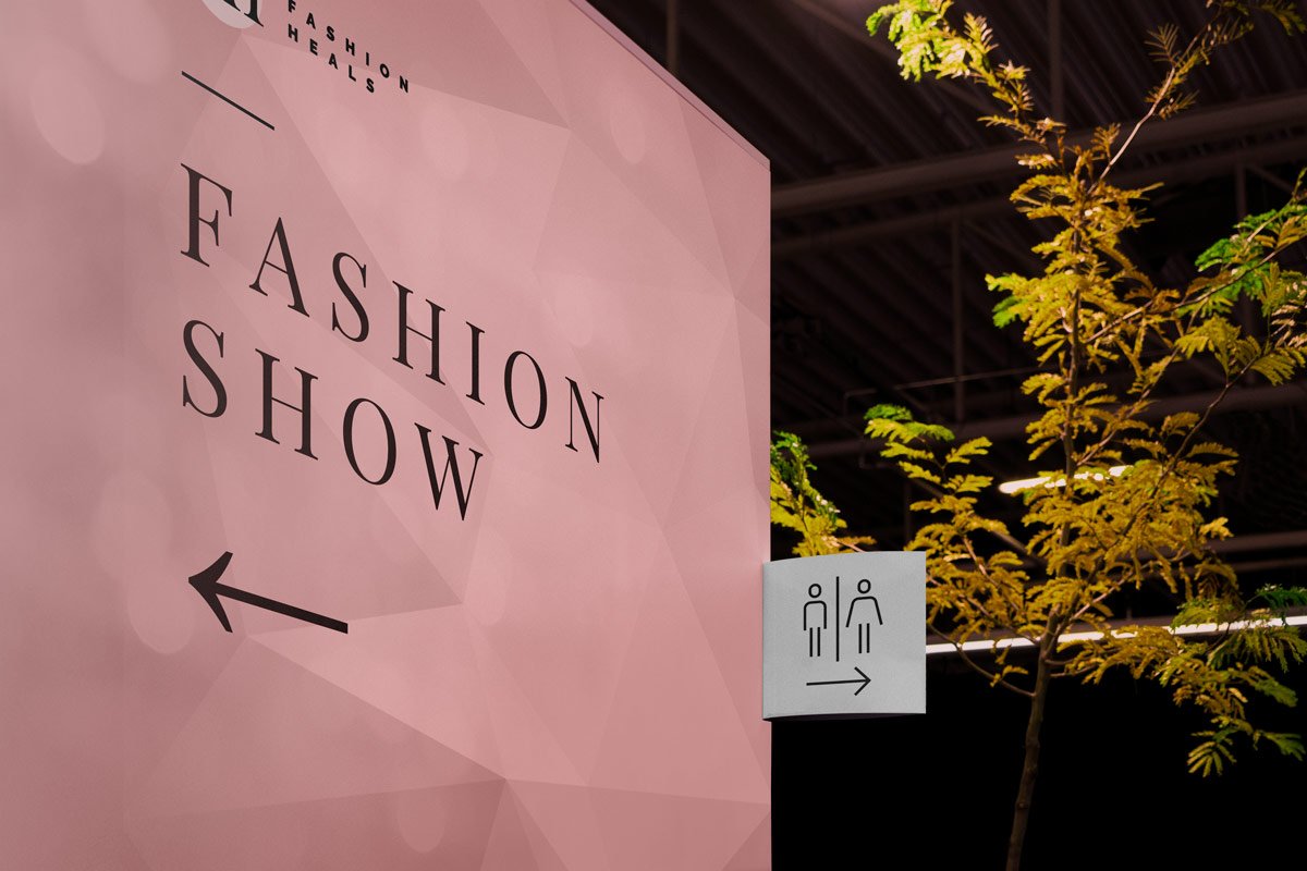
Fashion Heals is a vibrant annual fashion show fundraising event in support of the Innovation Grant at SickKids hospital. The event includes a fashion show featuring past and present SickKids patients, doctors, nurses and employees. The evening is filled with inspired stories, great music, delicious food and beverages and an amazing silent auction.
The Challenge
Being a past patient at SickKids hospital, I understand how crucial the hospital is to children not only in the GTA, but, all over the world and as such, I applied as a volunteer graphic designer and was chosen to be the event’s lead designer. As the event’s lead designer, I was tasked with the responsibility of coordinating with the necessary event admins, staff, teams, and vendors to design and develop all of the event’s print and digital material.
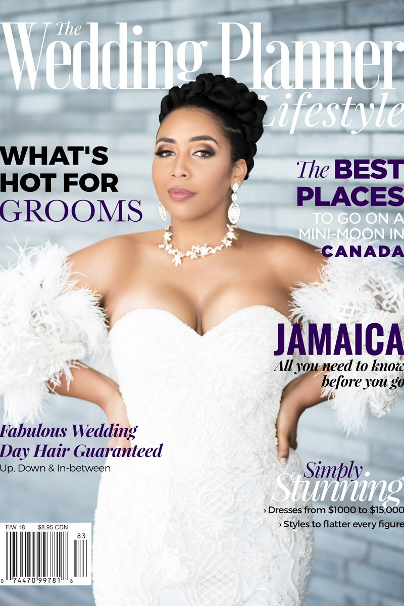
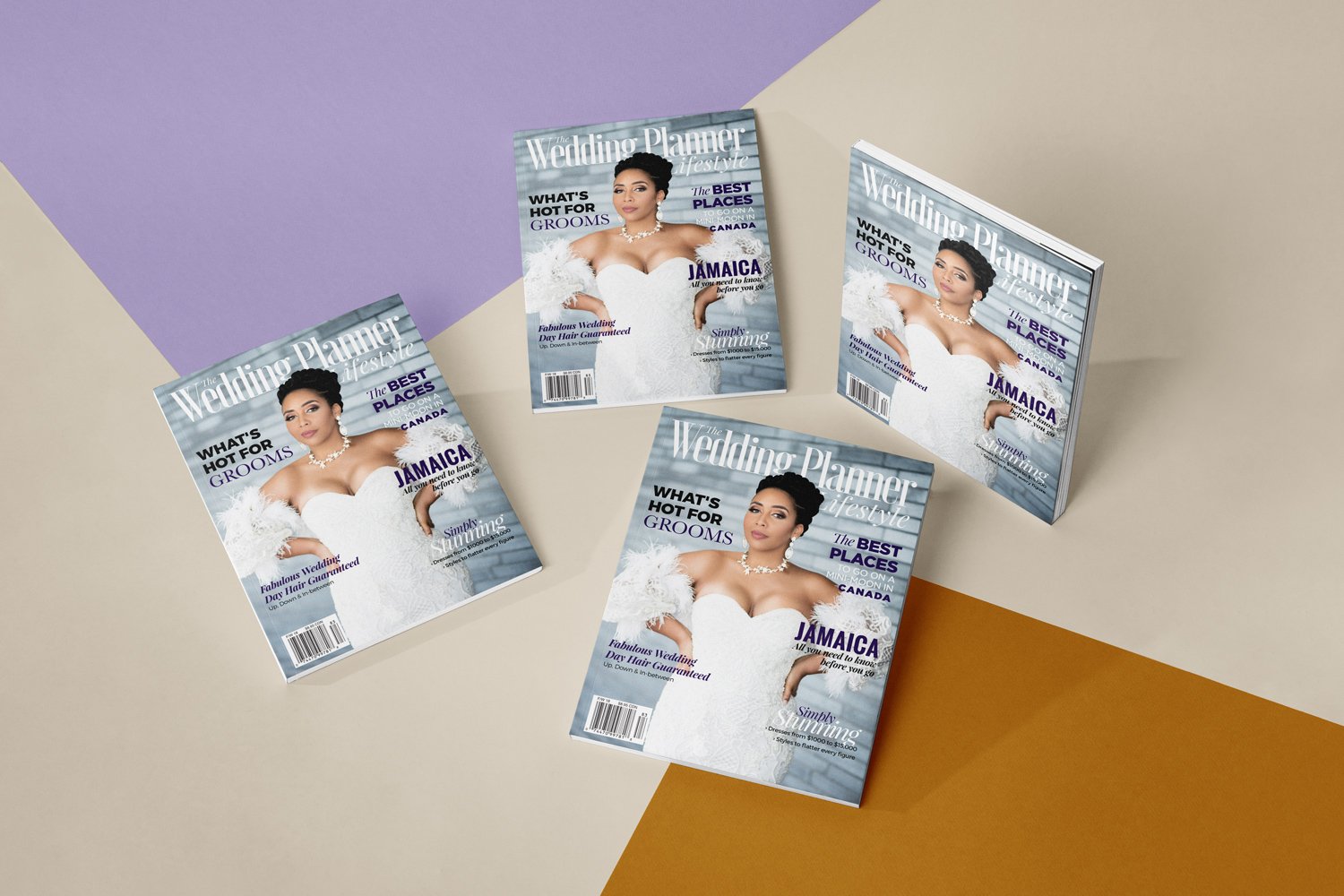
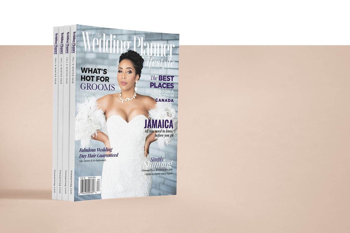
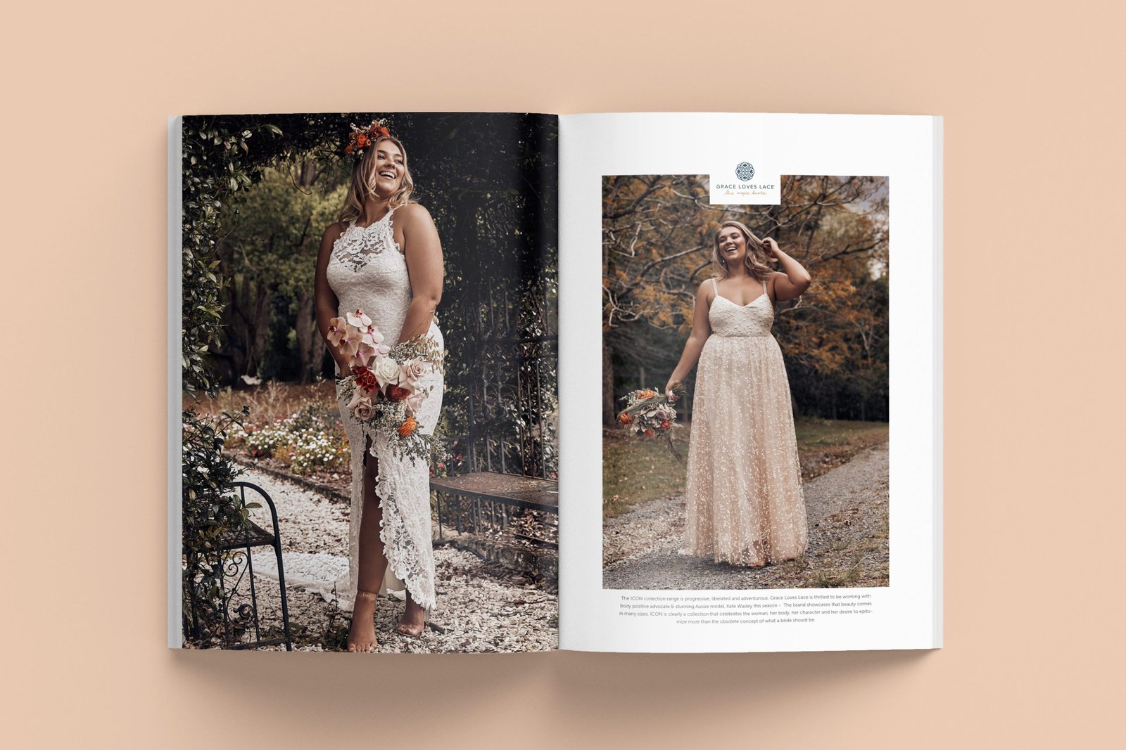
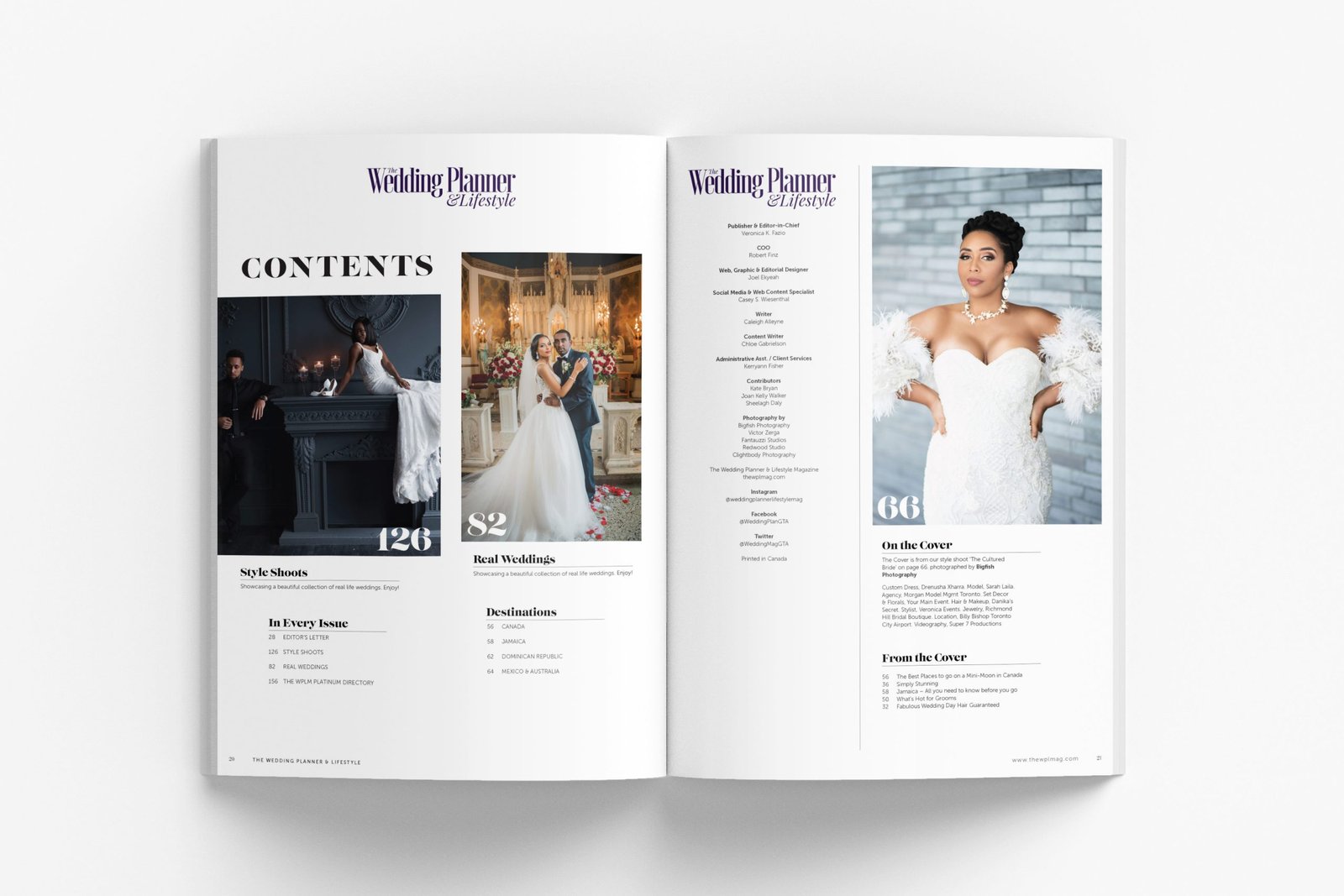
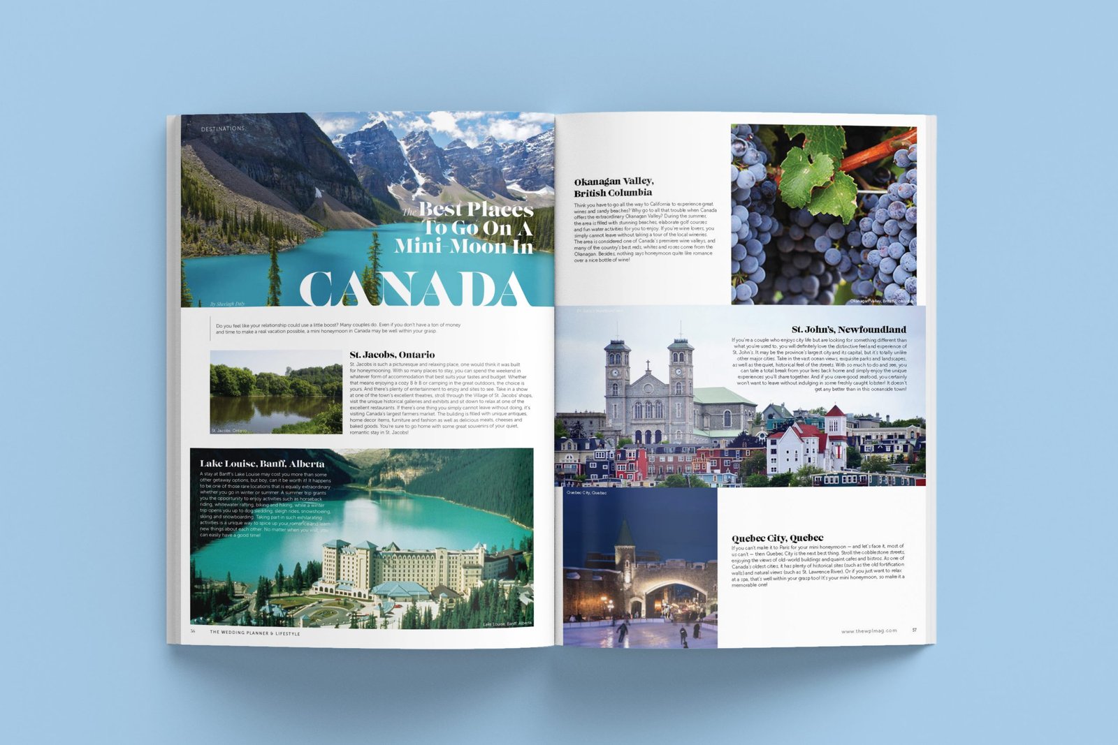
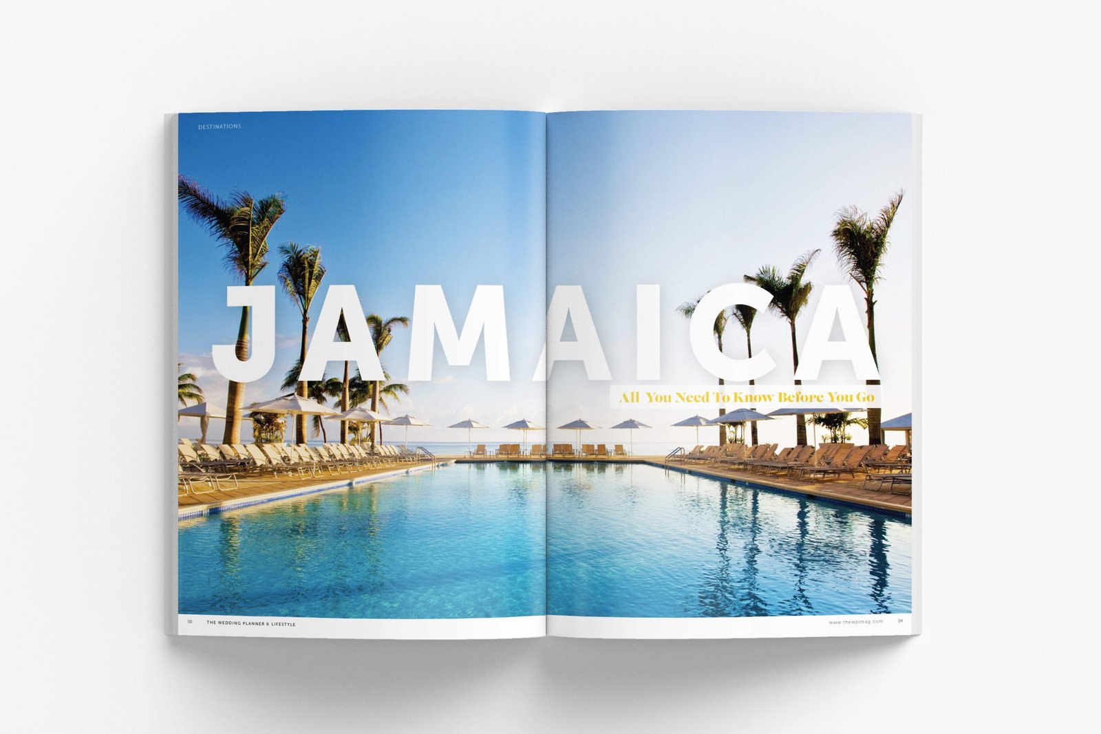
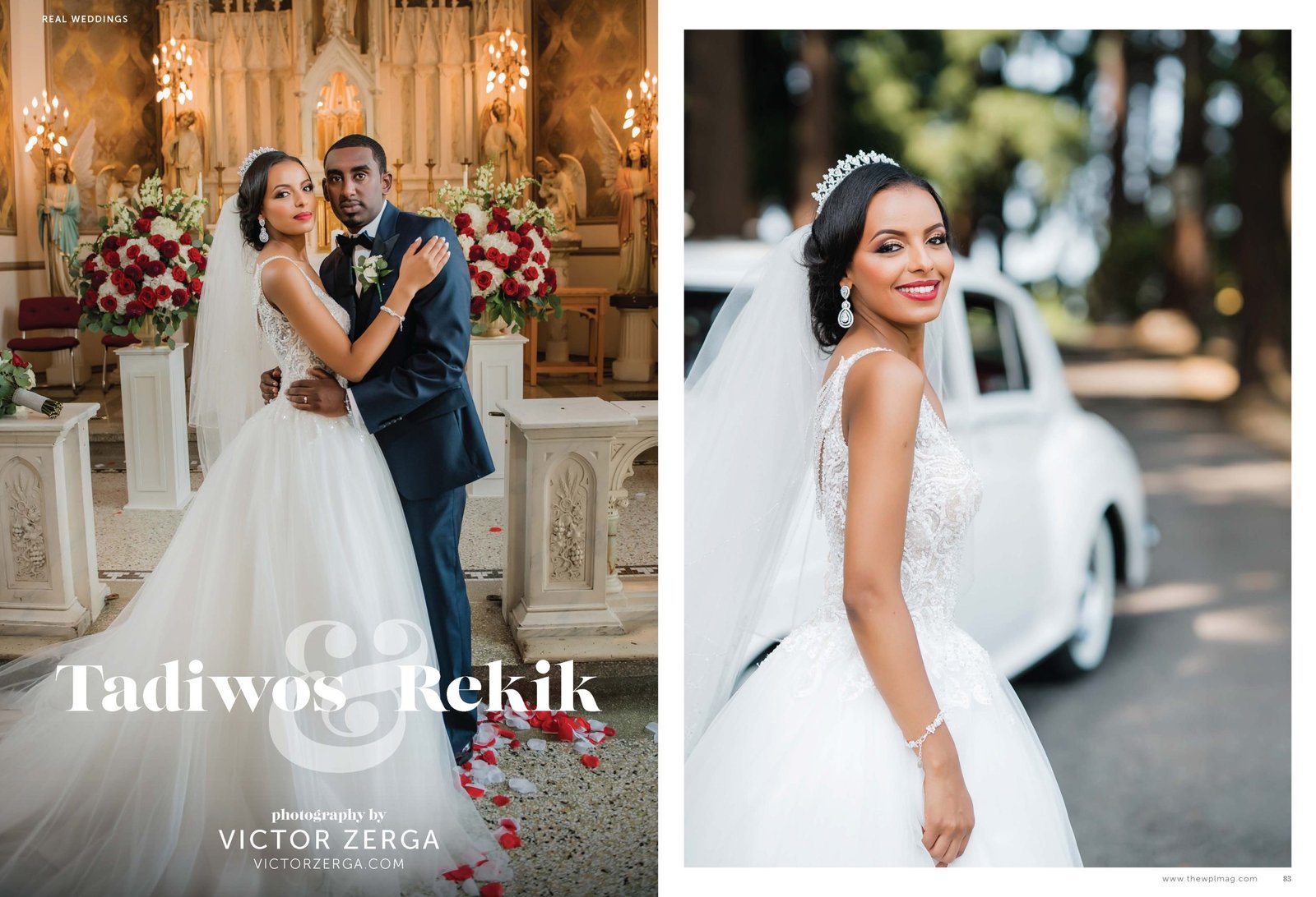
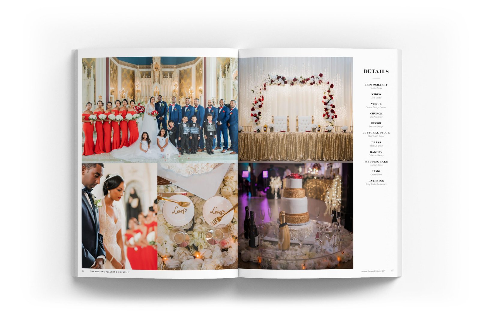
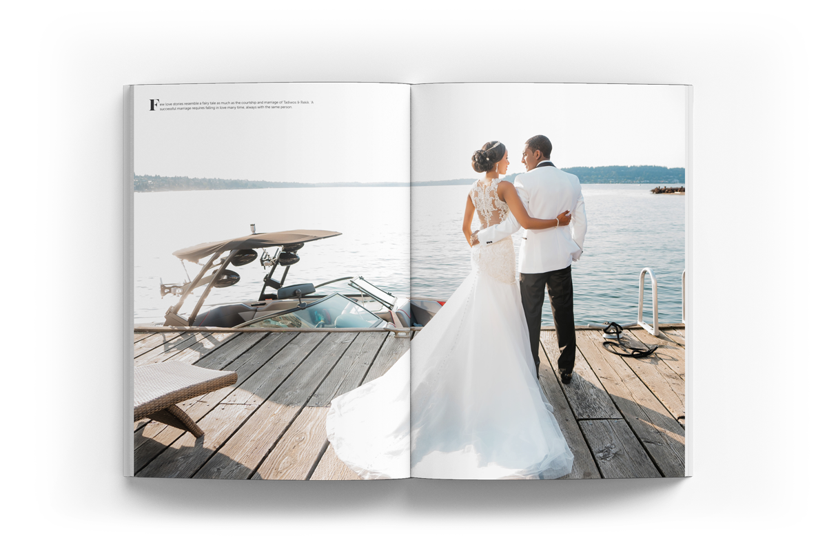
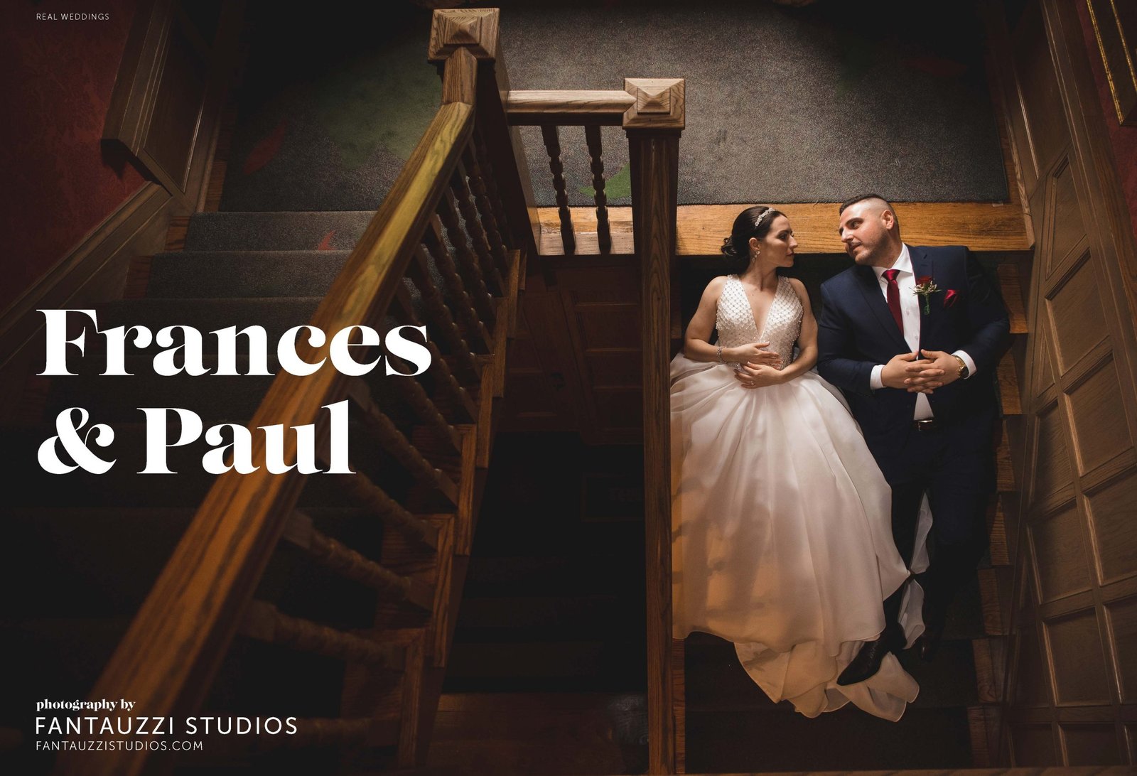
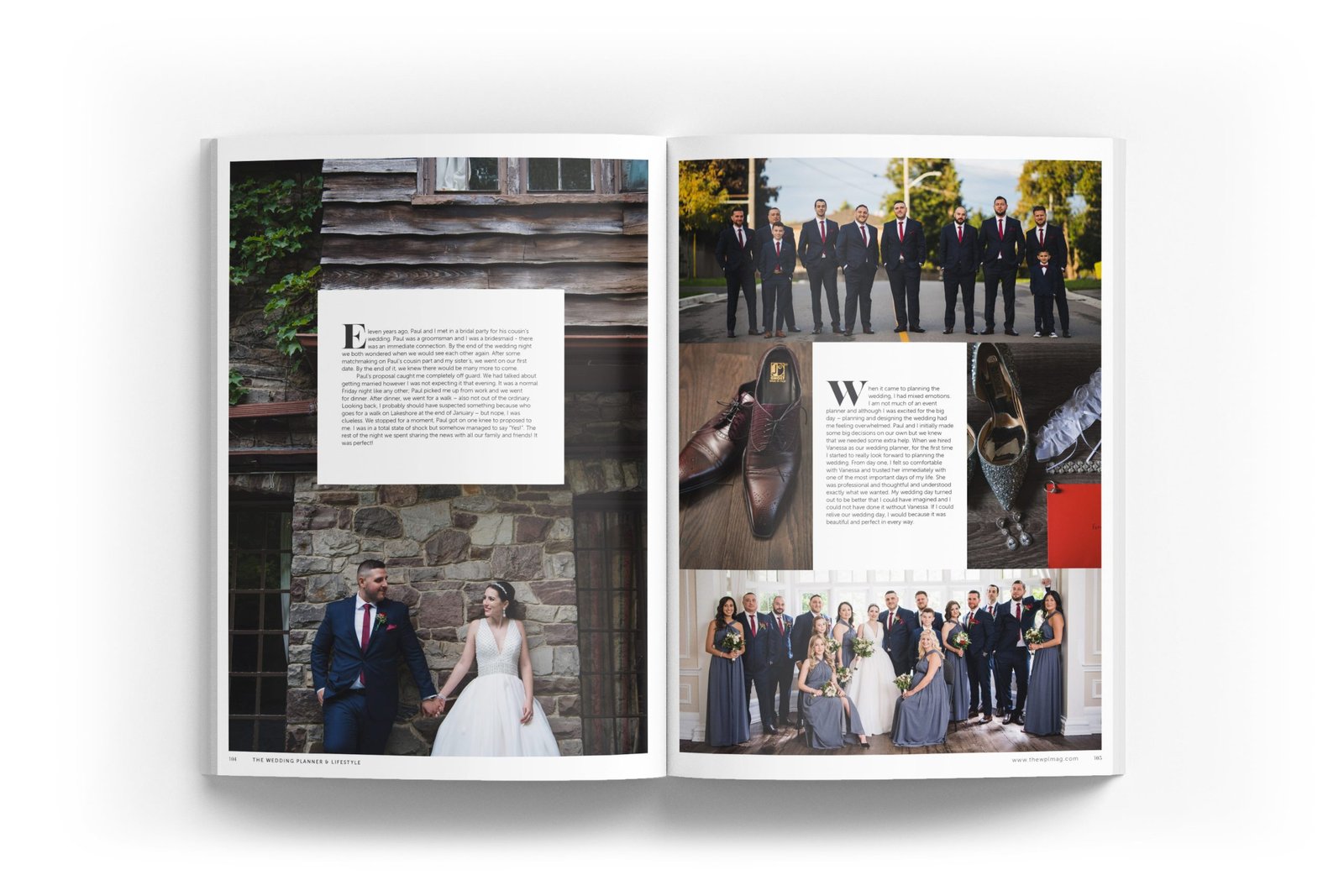
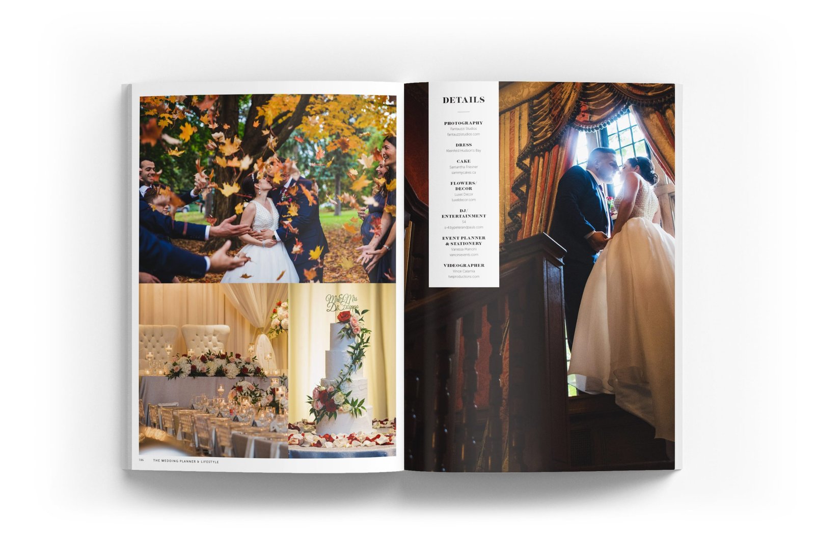
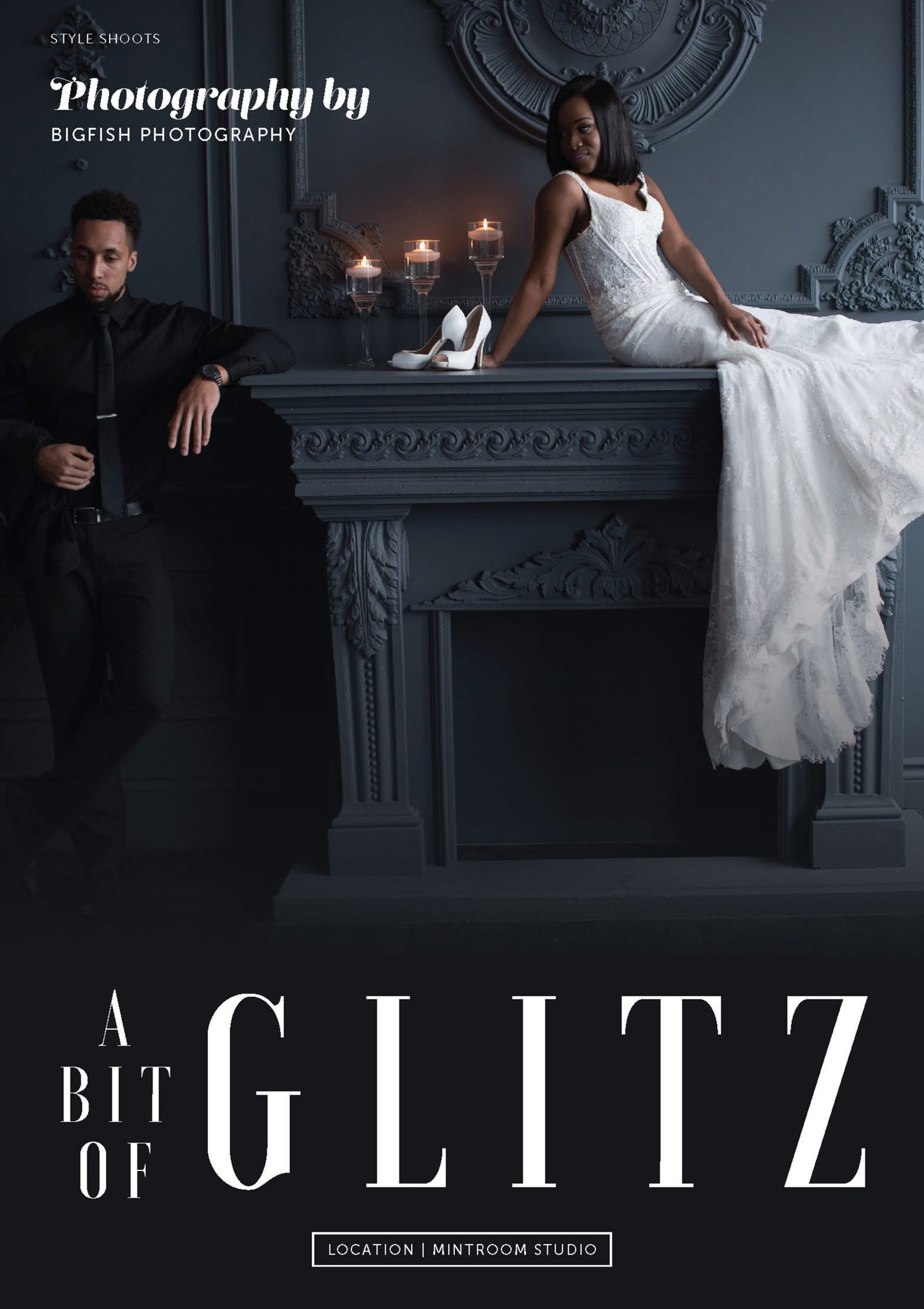
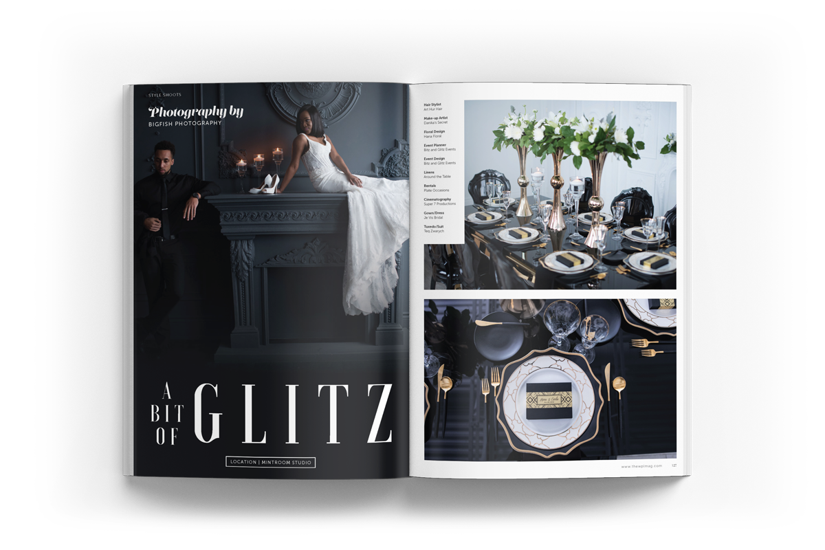
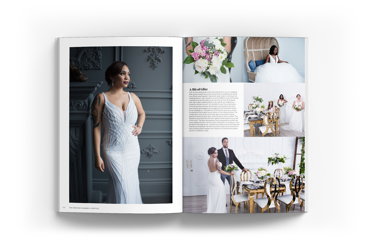
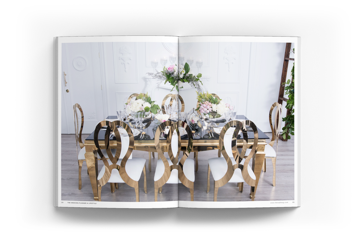
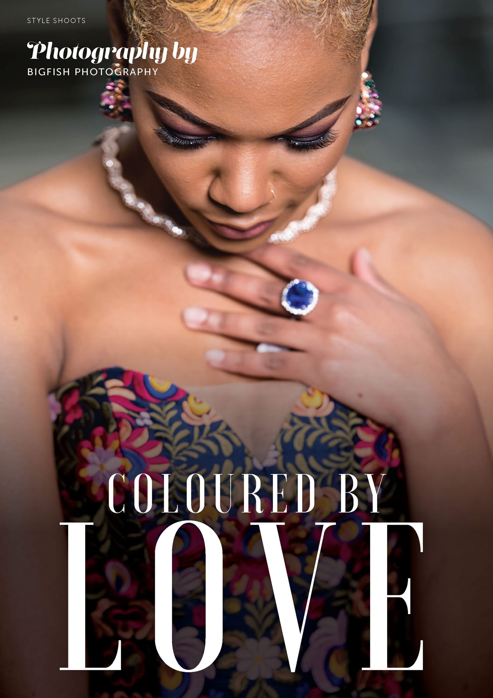
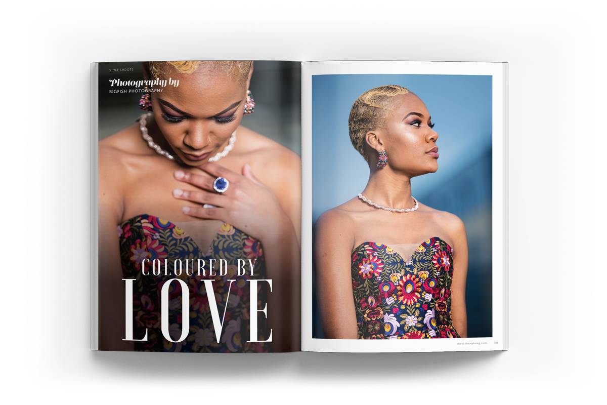
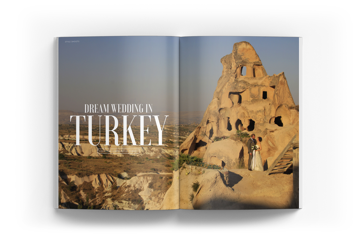
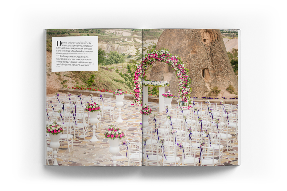
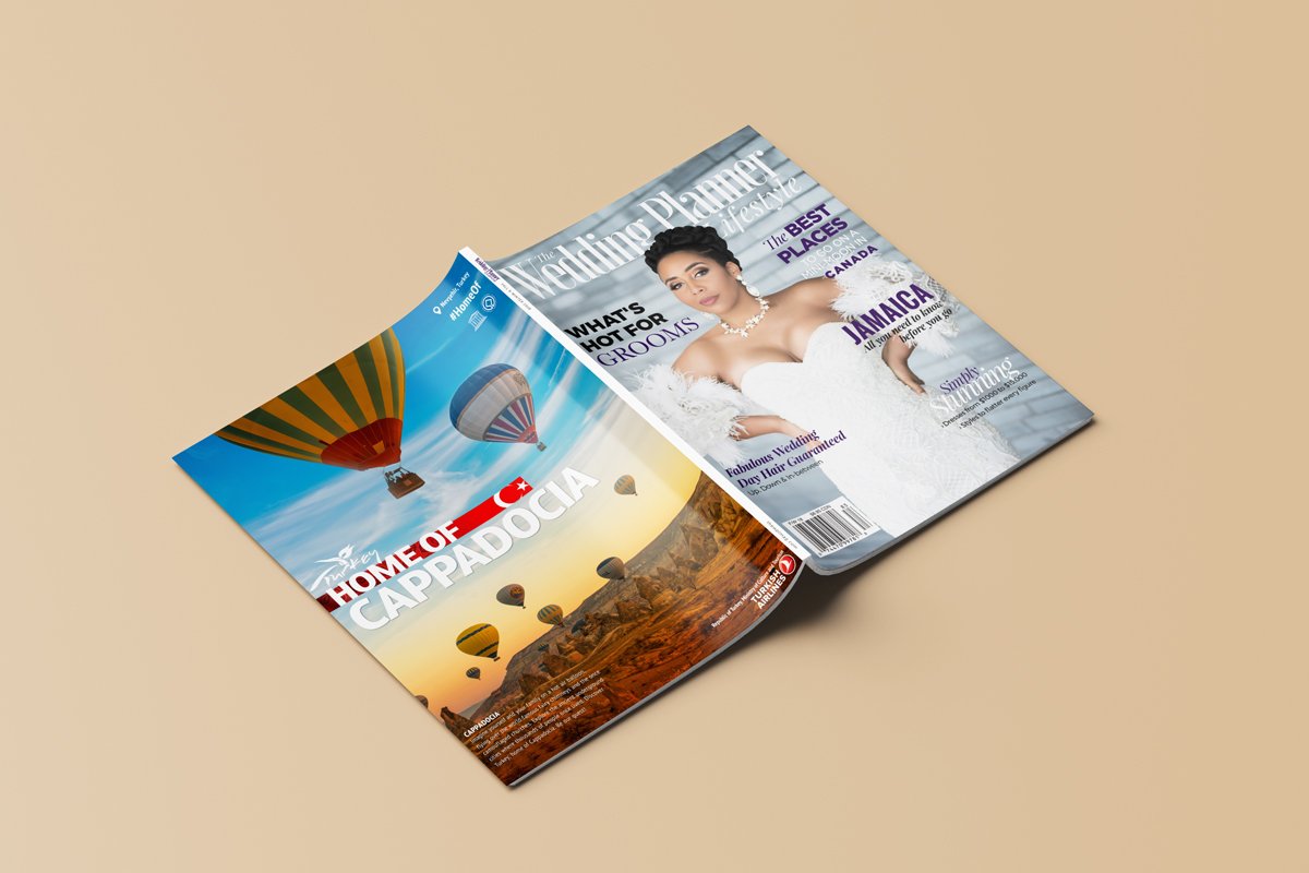
The Wedding Planner & Lifestyle magazine aims to showcase and celebrate love by sharing stories, inspiration and vendors through the magazine.
The Brand Identity
Being in the magazine industry a wordmark was used as the overall logo for the brand. The brand is described to embody the themes of elegance, romance, and royalty. Thus the typefaces chosen were chosen to represent each of those traits.
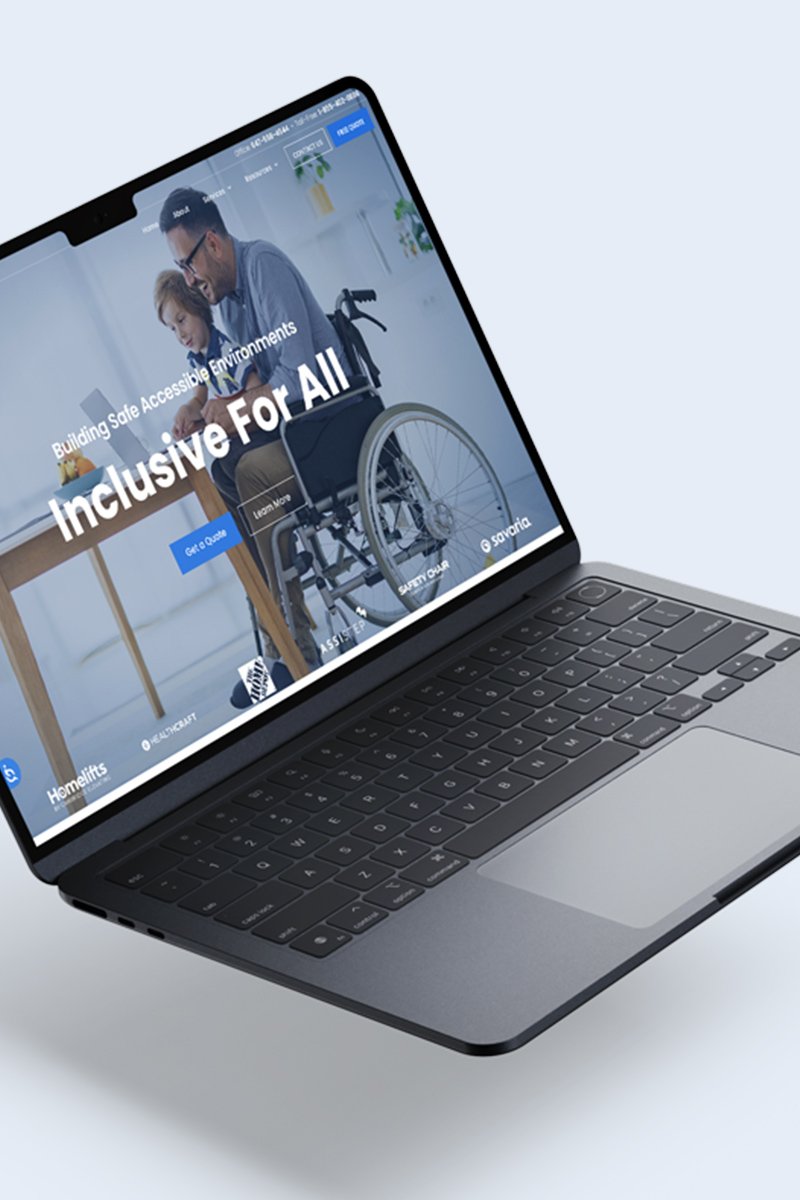
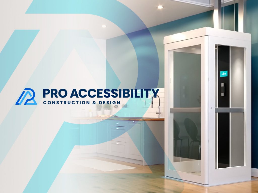
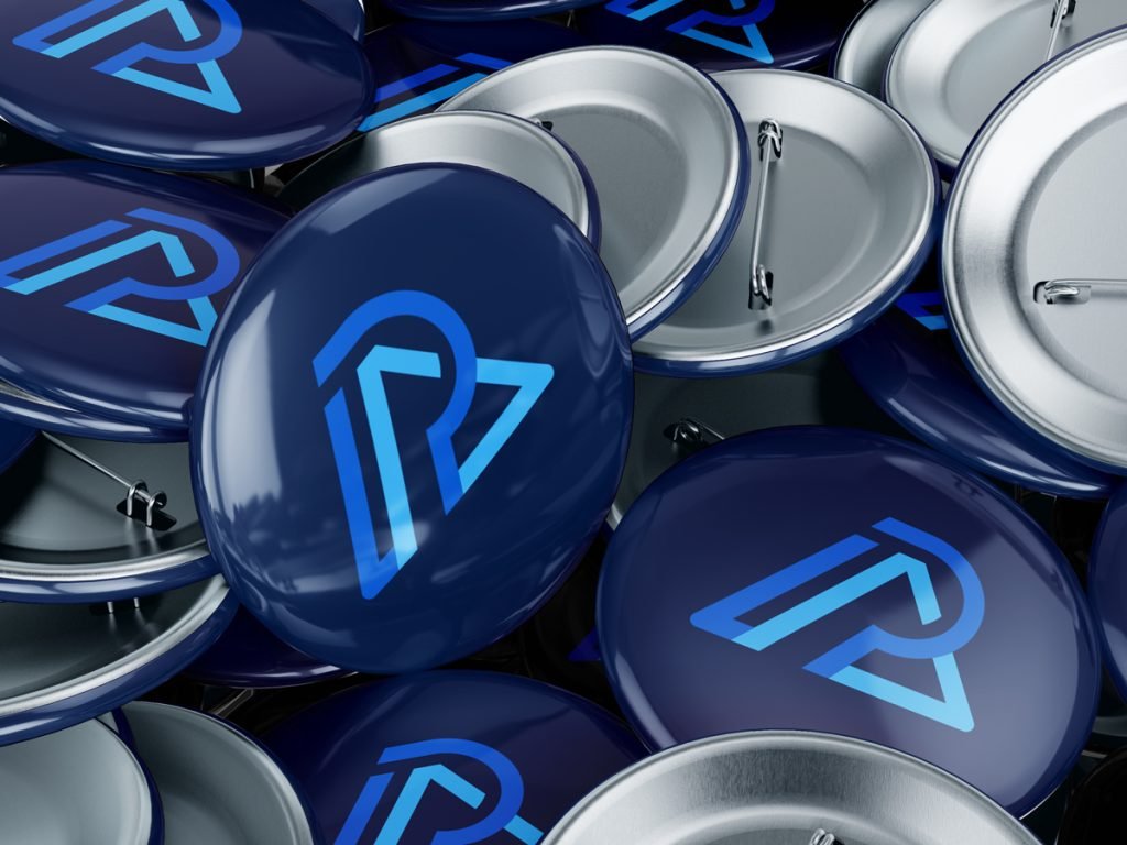
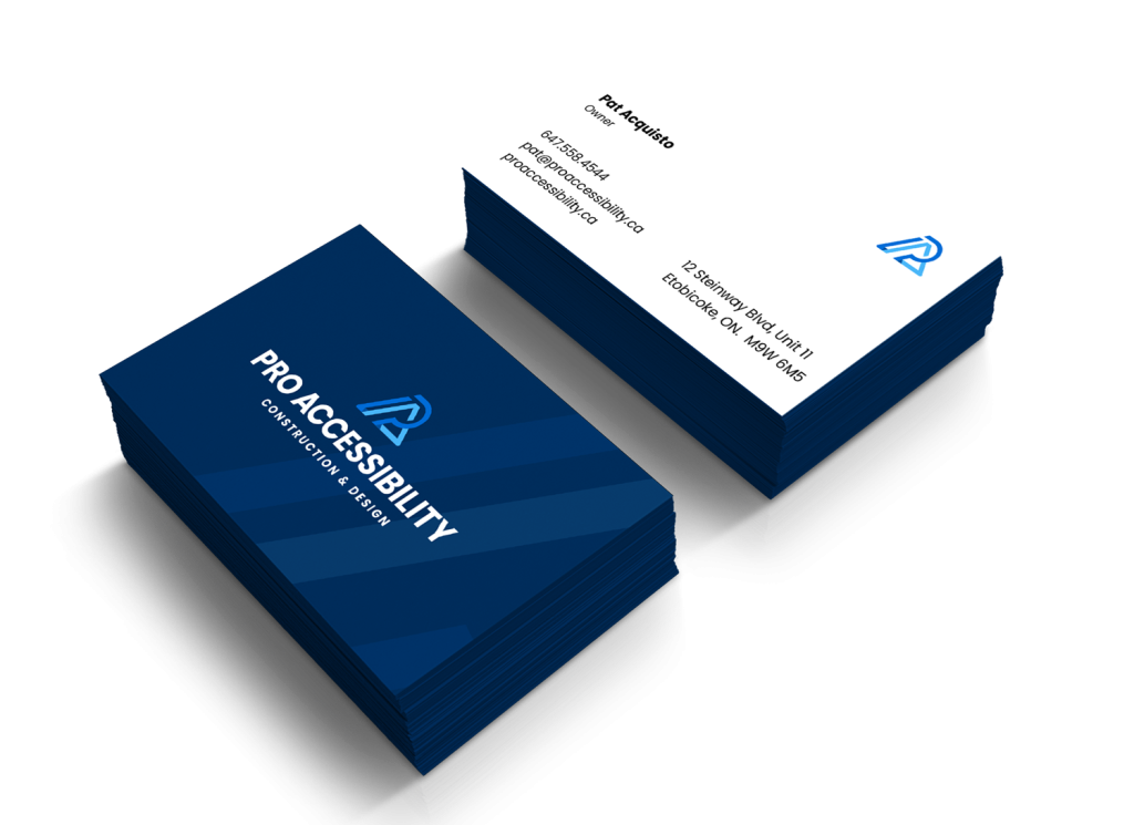
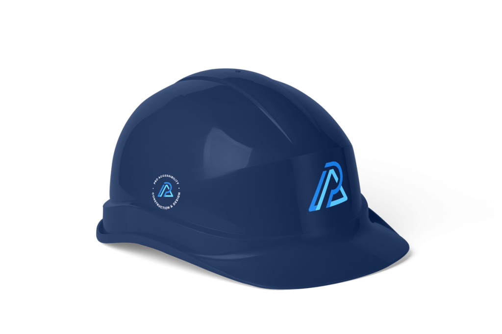
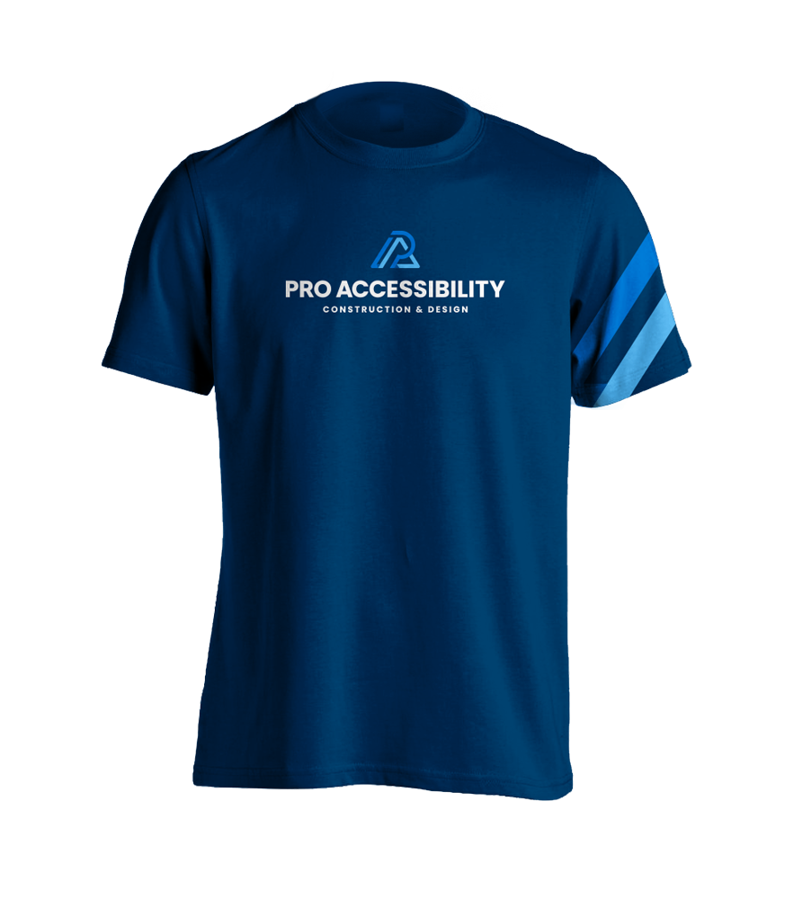
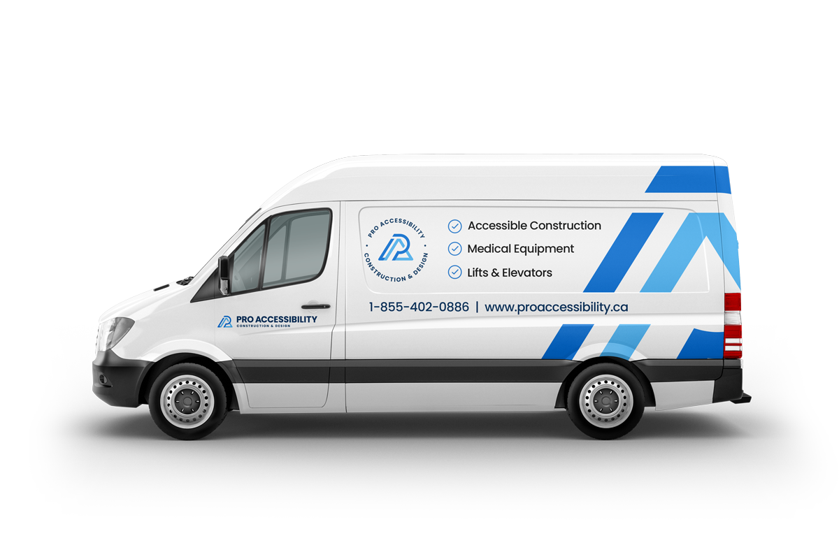
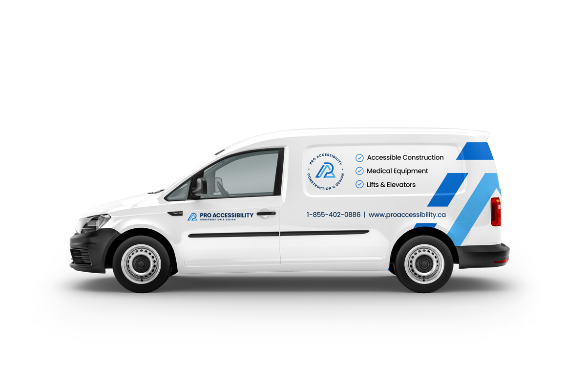
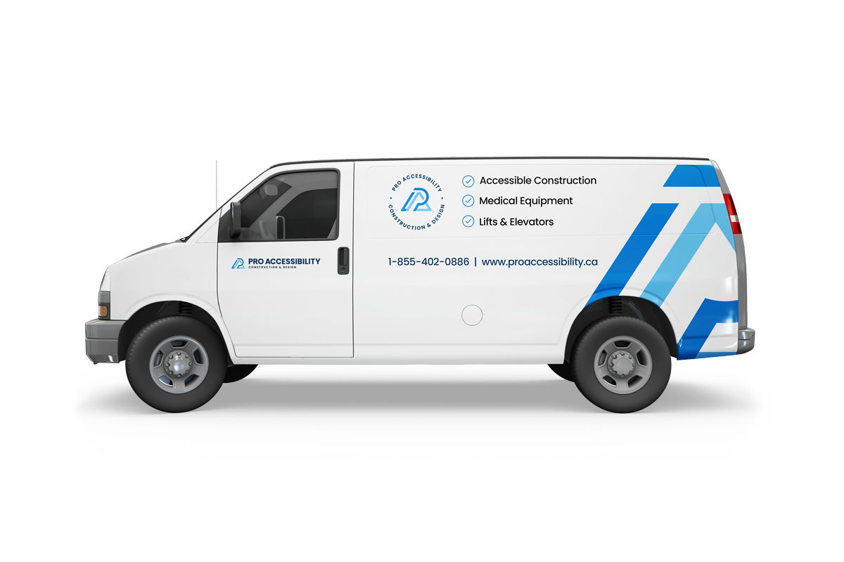
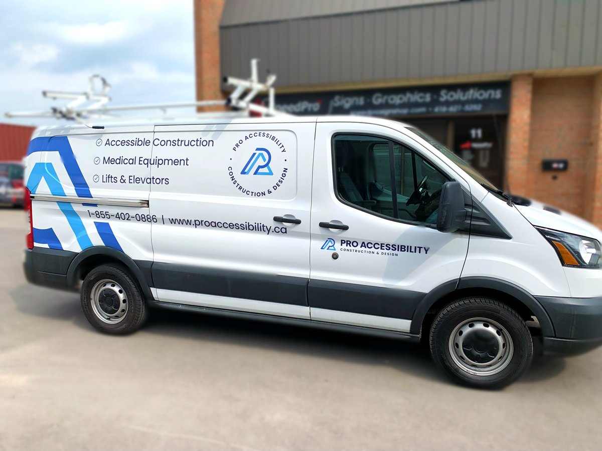
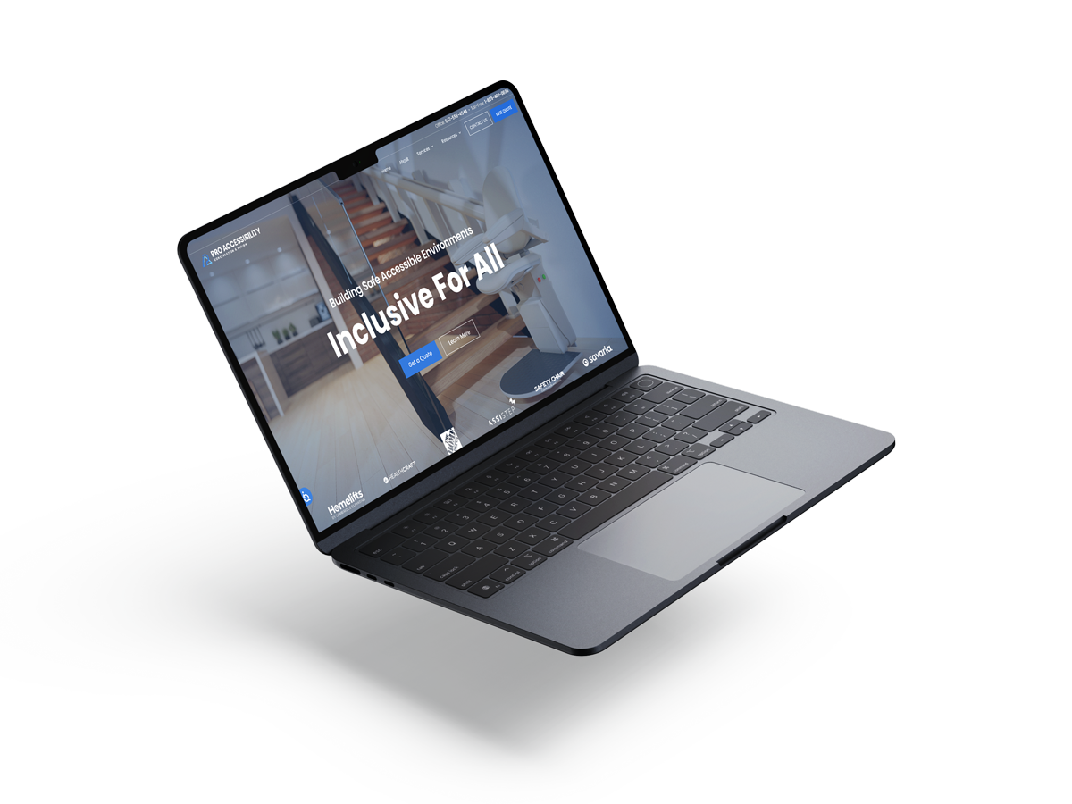
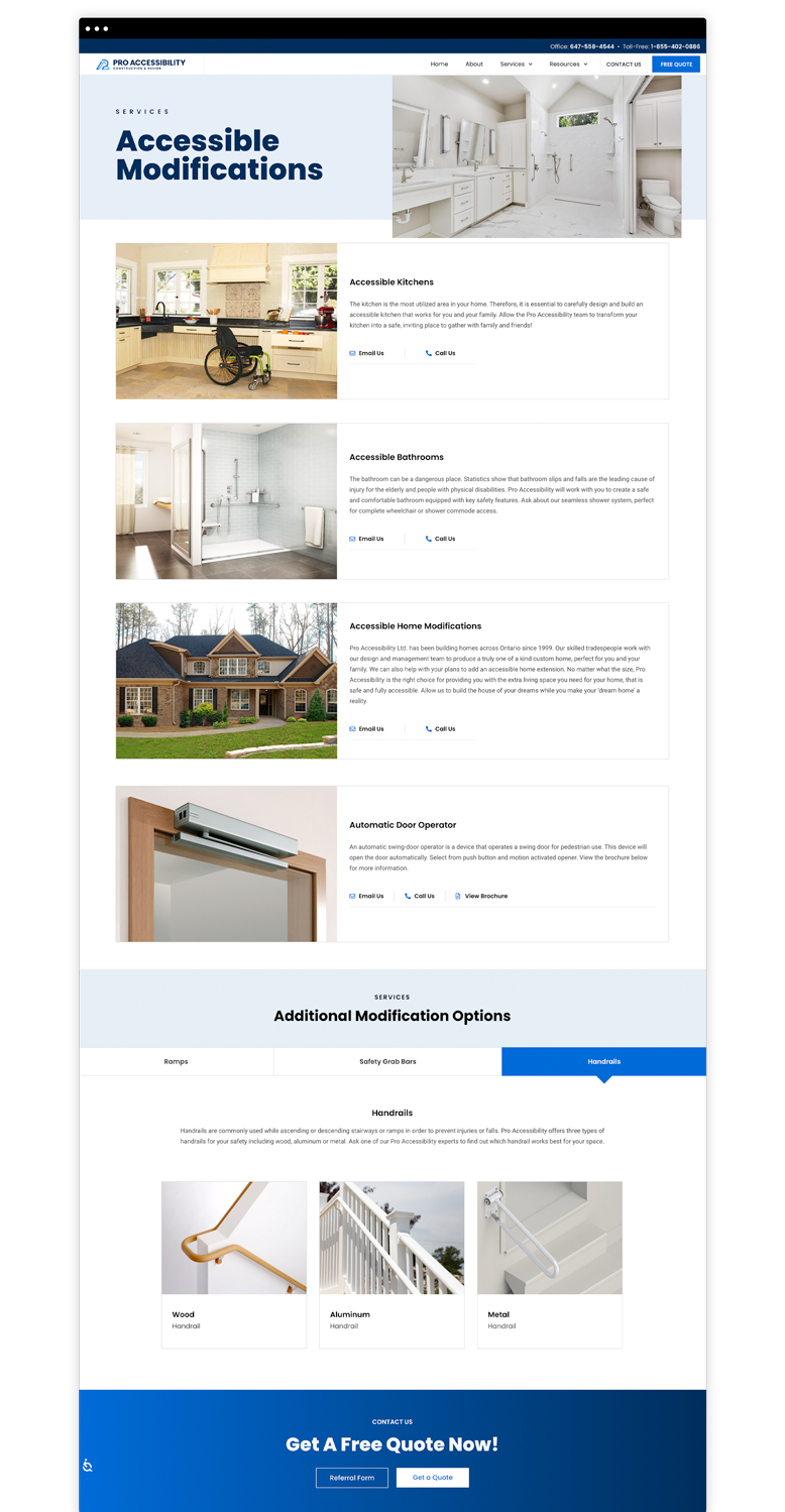
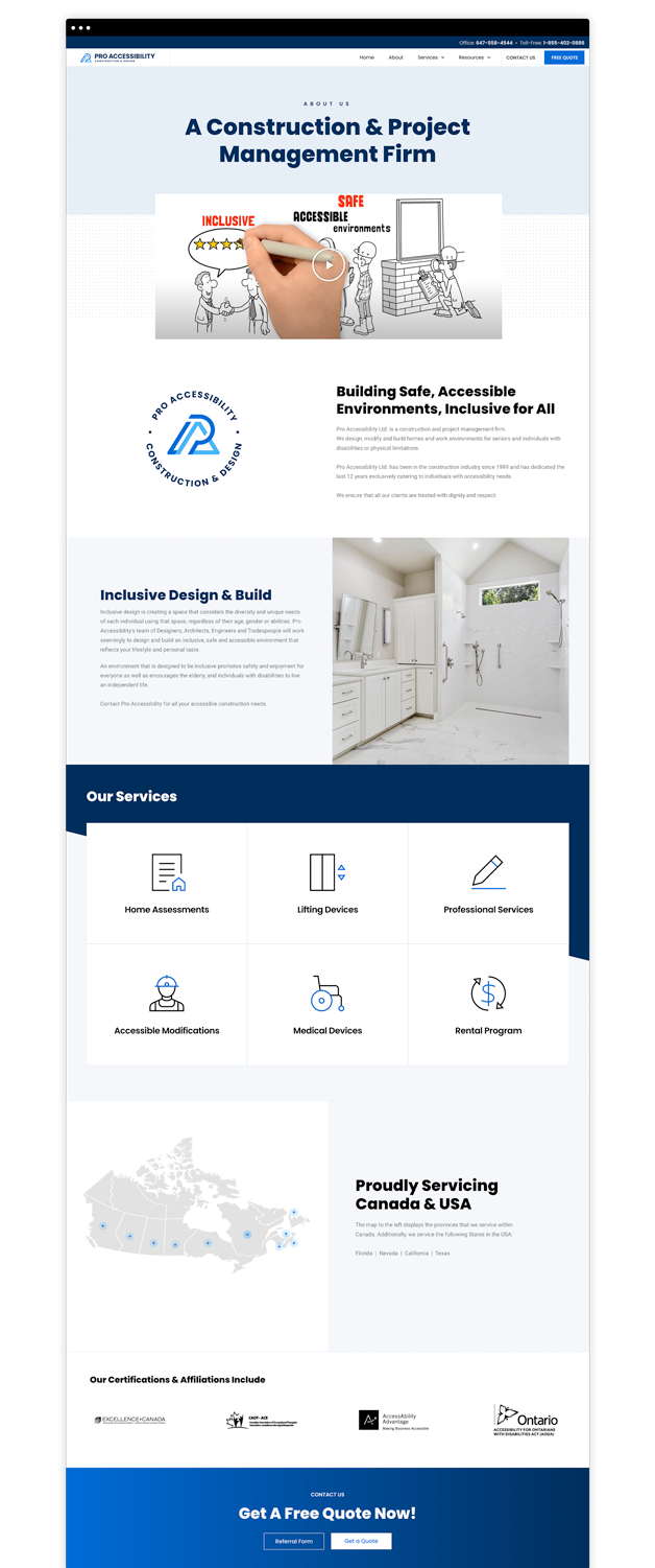
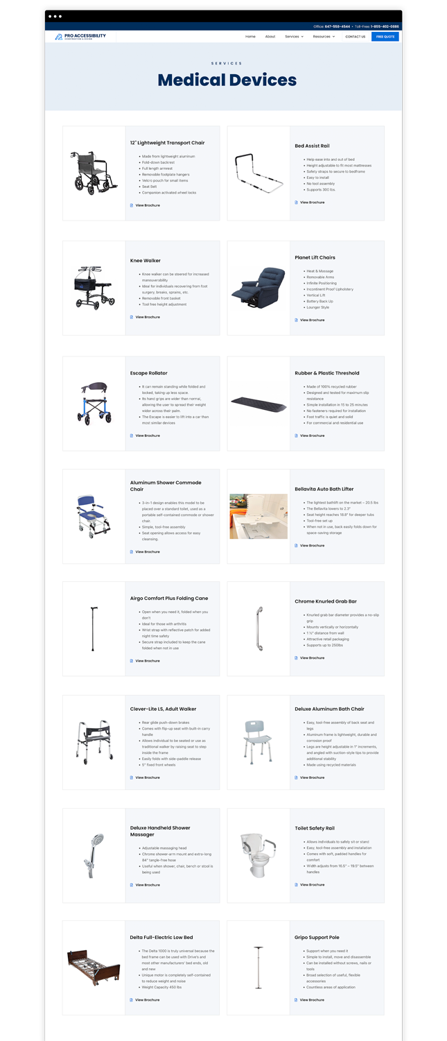
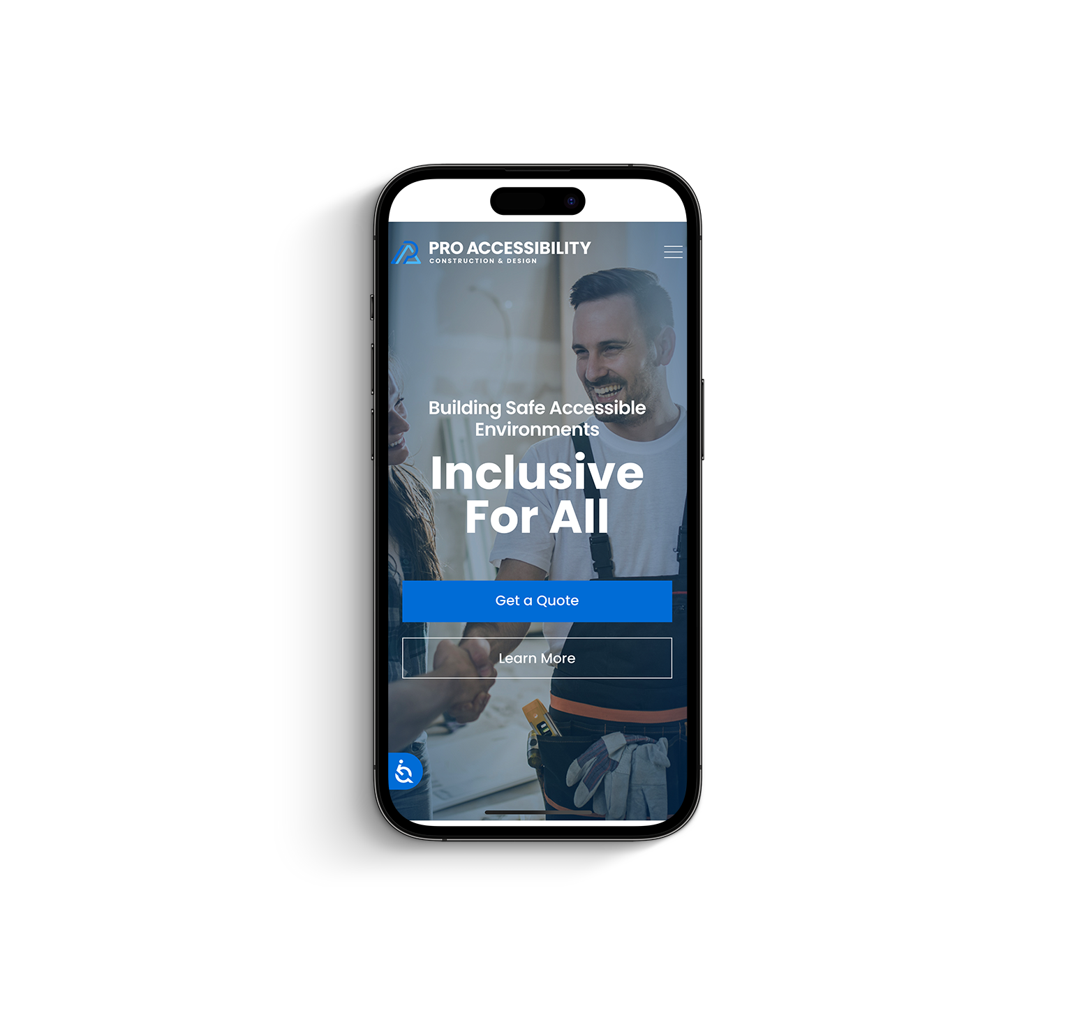
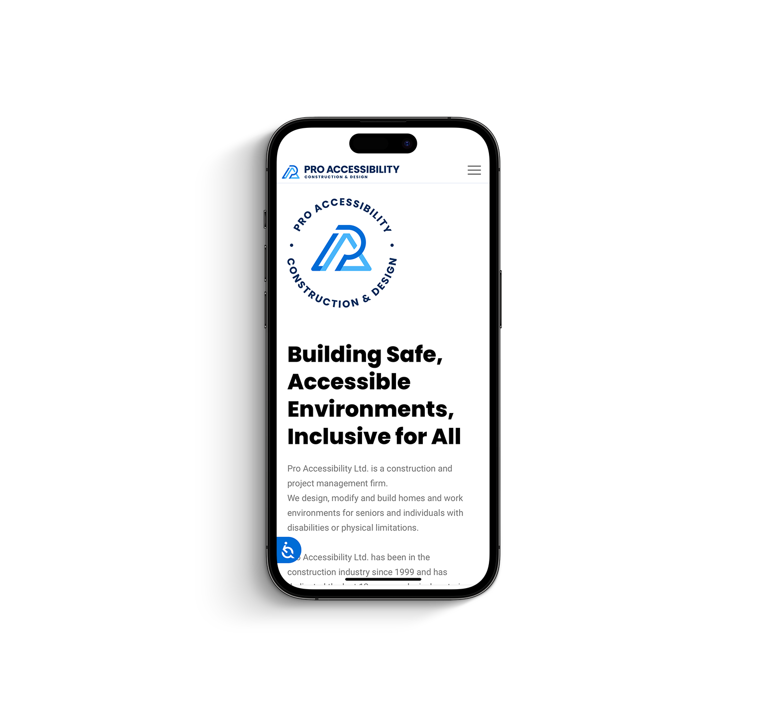
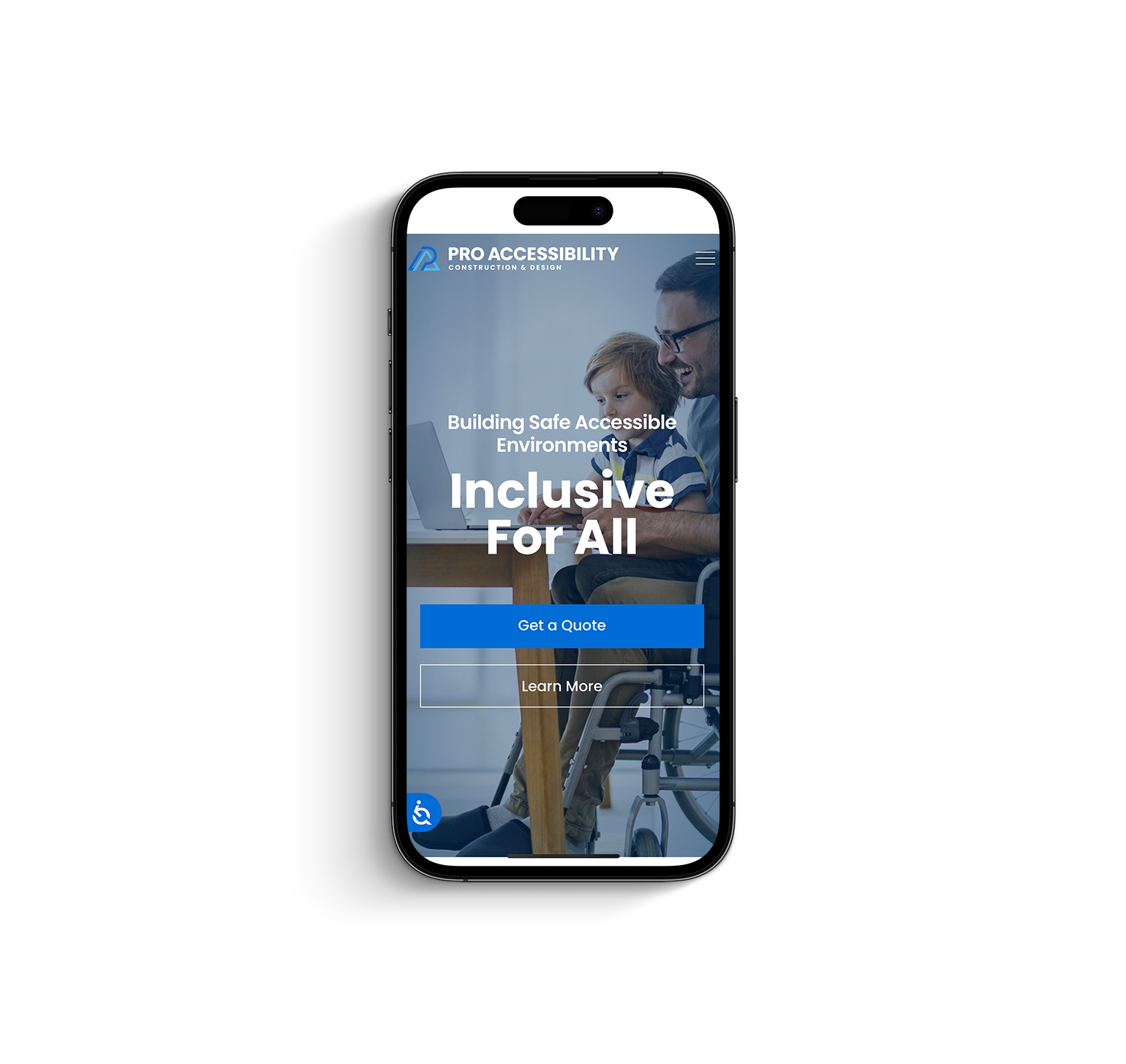
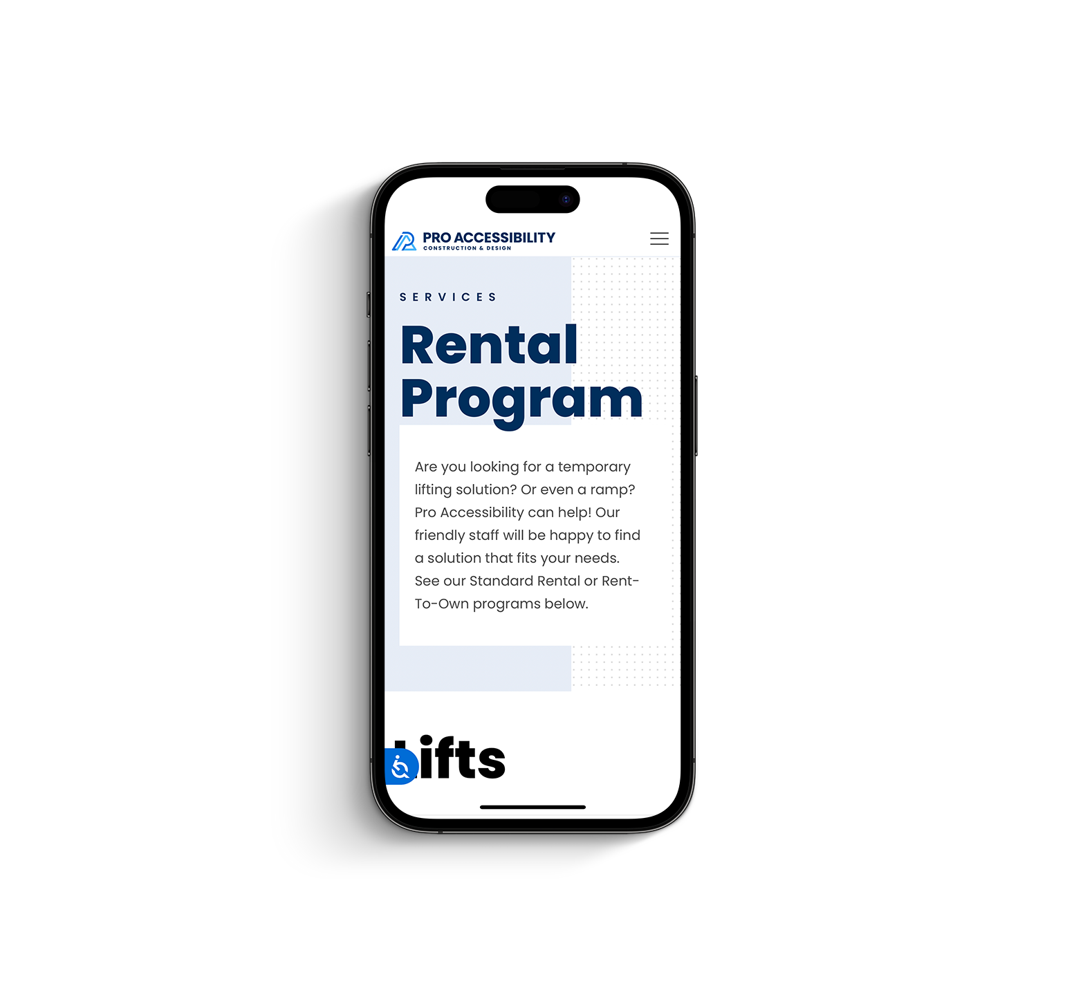
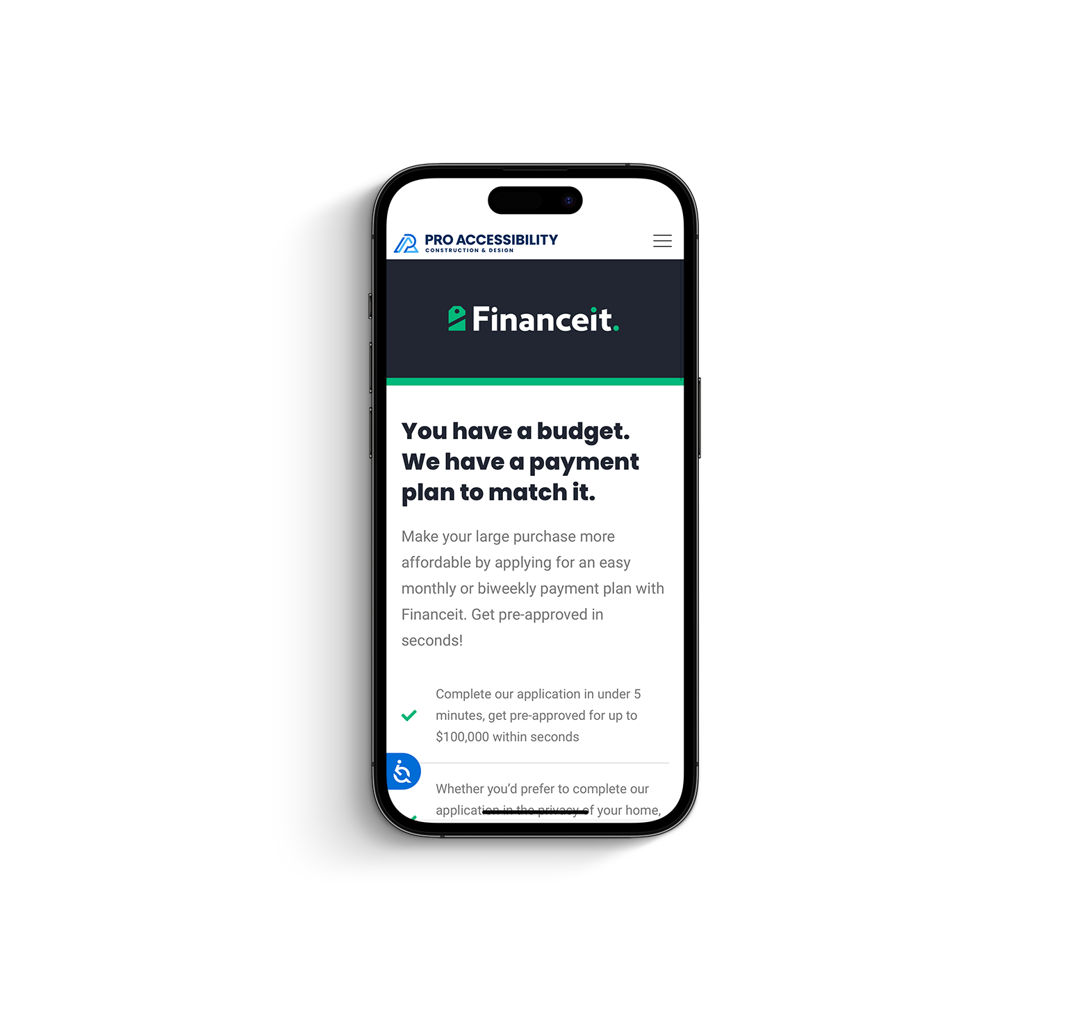
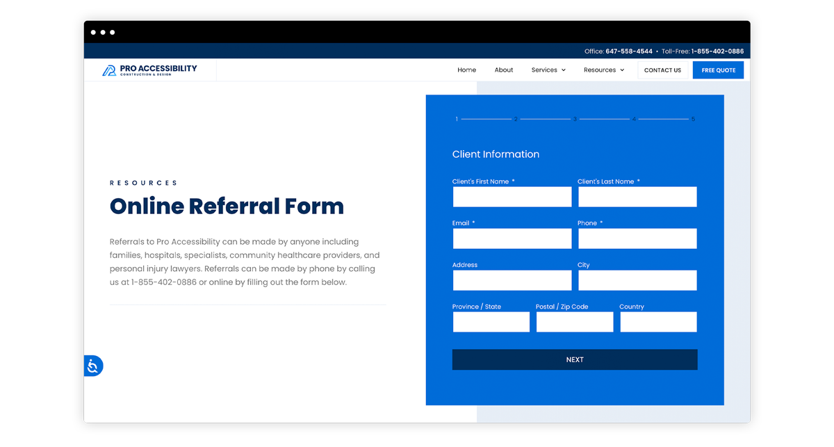
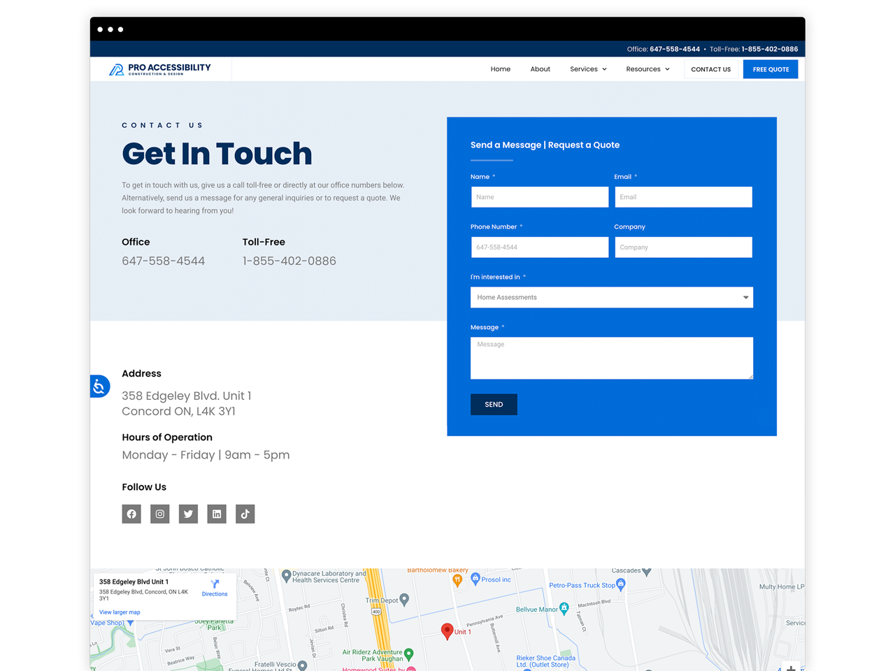
Pro Accessibility Ltd. is a construction and project management firm. They design, modify and build homes and work environments for seniors and individuals with physical and or mobility limitations.
The Brand Identity
The Pro Accessibility logo was designed to embody two of the main values it provides its clients – mobility and structure. Angled lines were used to convey movement and mobility while the strong bold lines along with the letter ‘A’ represent structure. All in all, a ‘PA’ monogram was used to add individuality and character to the logo that will better be suited to represent the brand Pro Accessibility.